
When it comes to successful e-Commerce websites and brands, user interface (UI) design plays a key role in determining the success of those brands.
Ecommerce UI design site visitors allow users to have a seamless experience navigating through the website. Ensuring that your site’s conversion rates are high means users should easily find products that are best for them and ultimately checking-out in one full successful purchase. If potential customers have a positive online shopping experience overall, that is another key incentive that they will return as repeat customers.
If you want to understand some UI foundations, 6 Tips to Achieve UI Design Mastery is a helpful read for understanding the basics of what good UI entails. Let’s dive into some best UI practices to ensure your e-Commerce site converts customers and creates a pleasant shopping experience.
User Behavior & User Experience
User Experience design, or UX design and research, goes hand in hand with great UI design. UX research allows brands to break down their target audience profiles, customer pain points, and how those pain points can be solved.
There are various ways to conduct UX research methods. This can start with surveys and interviews, which allow in-depth answers to customers’ preferences, challenges, and overall experiences. You can also look at Google Analytics to understand how long users stay on a page and what are the top clicks on various pages.
Tools like Hotjar also provide insights and recordings of a user’s shopping journey on the website and how the user navigated on different pages. From these observations and research, you can get a better holistic understanding of what changes may need to be implemented on your e-Commerce website to improve the overall user experience and design.
Search & Navigation
When a customer arrives on your website, they will naturally search for where to go next. This is why having a strong menu and intuitive navigation section on your website is key for allowing users to find what they are looking for with ease.
Hive, a sustainable online grocery store, is an example of having a robust search bar. When you type in a keyword, for example, “vegan,” you see products automatically pop-up that contain the keyword you were searching for. There is also a “Top Suggestions” call out on the left that gives you their top suggestions that contain this keyword. This is a great way as well for e-commerce brands to place certain products in front of customers as well.

In regards to an e-Commerce site menu and navigation bar, the key is to keep things simple. Having main parent categories with nested subcategories that have clear differentiations helps with the organization and clarity of digital product offerings. The menu is crucial for allowing users to easily find product categories they’re looking for and to continue browsing.
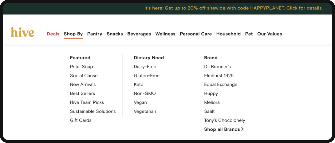
Looking at Hive’s navigation, you can see there are key parent categories: Deals, Shop By, Pantry, Snacks, Beverages, and more. The Shop By section is then broken down into subcategories: Features, Dietary Needs, and Brand. Within each subcategory, you have tertiary categories, which are even more specific. Tertiary categories help direct users to more specific categories if needed, while the parent categories help keep items grouped.
Category Page
When landing on a category page on e-Commerce sites, navigational elements, search filters, and high-quality images are top of mind for best UI design practices.
If we look at one of Patagonia’s category shopping pages, for example, we see that the filters are on the left-hand side and remain sticky as you continue scrolling down the page. You can toggle between different subcategories and select your size and fit filters. There’s even a toggle button that allows the user to switch to in-store pickup and customize which location they would ideally pick up from. On the upper left, there is also a “sort by” drop-down that is organized by:
- Recommended for you
- Popular
- Newest
- Price (High to Low)
- Price (Low to High)
These sorting features allow for more personalized options during the browsing process. The categories and sorting options can be customized to a brand’s products and understand what problems they can solve for their customers.
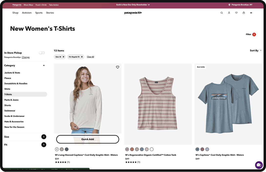
When it comes to product images, you can see below that the image usually changes when you’re in hover mode on desktop. For most industries, and especially for apparel industries, showing the product on a human or a lifestyle image helps customers better visualize the product in real life.
There is also a quick add call to action (CTA) or plus button mobile that allows customers to easily add the product to their cart. Infinite product scroll is a great way to see all the product options; however, if the scroll is too long, you could potentially customers in the decision process.

Product Pages
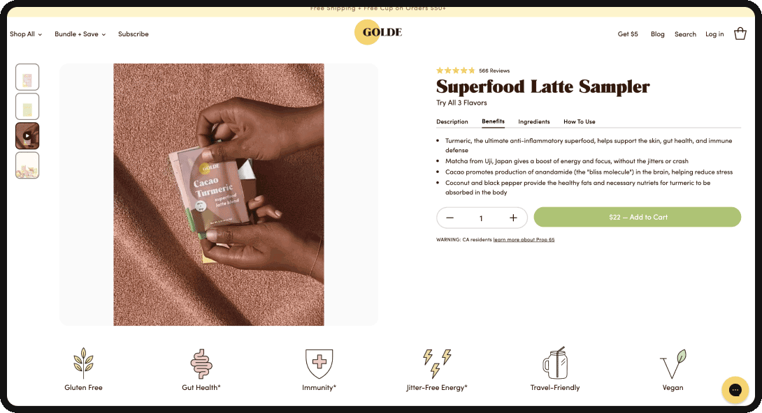
When approaching best UI design practices on product pages, thinking about how to optimize for conversions is always top of mind. Let’s take a closer look at Golde’s product page. On the right side, where the product details, name, and description are, we see that all of the key information is above the fold on the desktop view.
They’ve added the description, benefits, ingredients, and How To Use sections as toggles horizontally to optimize space above the fold. This allows for the primary Add To Cart button to be visible without getting lost in too long of a description. There’s also a highlight of the 500+ reviews that provides trust and social proof when landing on the page.
On the left side, there is a curated image gallery of the product along with a lifestyle image. Deciding what types of people are in these images can help portray the brand’s overall values and target customers. Having a baseline of strong, clear imagery is key for showing off any elements of products. Being able to zoom in on product images to get a more detailed view is also a plus. However, it’s also important to optimize image and video sizes whenever possible to not slow down the site speed.
In general, since responsive design is critical when it comes to e-commerce UI design, on mobile view, you want to ensure users have just as easy of an experience shopping. Consider having a sticky Add To Cart button so that users can quickly add products to their mobile shopping carts.
When you move below the fold on Golde’s product page, you find additional product features that help answer any questions the customer may have. It also includes an extensive customer reviews section which is important for customers to know how other people feel about the product.
The product reviews highlight the product’s taste, quality, results, and feel-good factor – which are unique callouts of Golde’s products. Overall you want the customer to feel confident in their decision and trust the brand. This can be applied across multiple eCommerce businesses.
Checkout Stage
Last but not least, having the best UI practices on the checkout page can be a make or break for a user following through with online purchases.
If we take a look at Golde’s checkout, we see that when the user clicks the Add To Cart button on a product, there is a popup checkout panel that appears on the right side of the window. You can toggle and see what’s in your shopping cart by easily navigating to the shopping cart icon in the main menu.
At checkout, you also want the user to be able to change their online purchases if they want to. In this example, you see the option to decrease the product value to 0, which would remove the item from the cart. You can also easily click out of the “Your Cart” panel and back to the product or category page to continue browsing and comparing options.
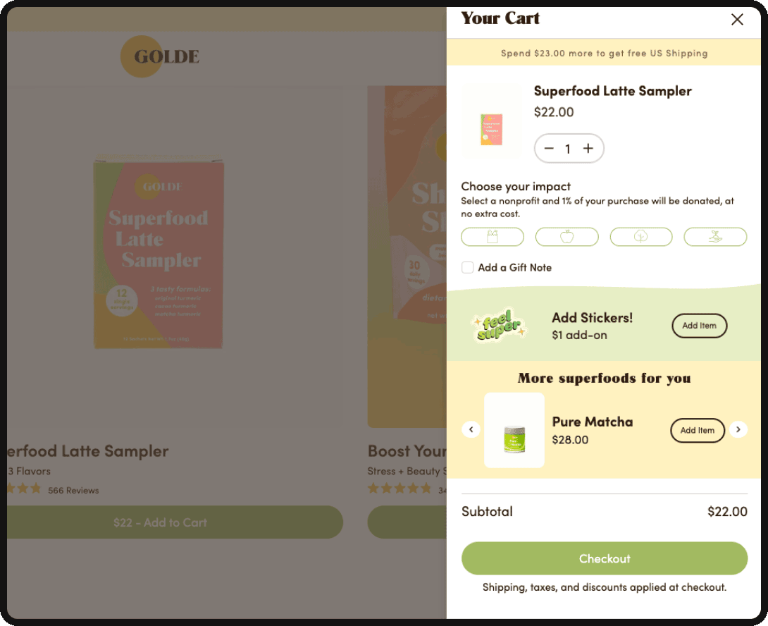
We also see there is an option to select a nonprofit of your choice that 1% of your purchase to go to. This demonstrates Golde’s brand values and is an added good feeling for users at checkout. There is also a section to upsell the user by putting similar products or top sellers in front of online shoppers to drive the average order value up.
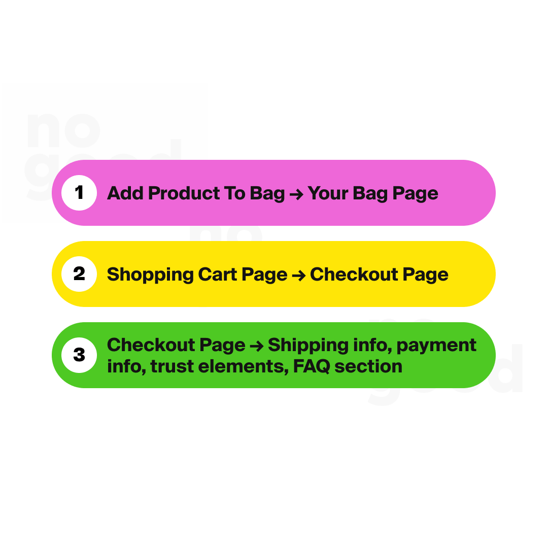
Implementing easy-to-follow steps during the checkout process will help customers get to the finish line. Another example is Patagonia’s checkout page. They have the following user flow and key elements on their checkout page:
- Add Product To Bag → Your Bag Page
- Shopping Cart Page → Checkout Page
- Checkout Page → Shipping info, payment info, trust elements, FAQ section

What’s important to call out here is the use of additional value props right under the “Place Order” call to action button. They reiterate that they are ironclad, guaranteed, have free shipping, and easy returns. This helps customers know that there is limited risk with their purchase process. They even have an added dropdown FAQ section to answer any common rebuttals from customers and clarify any questions about order returns.
Overall Branding & Design
Let’s also not forget about the overall brand identity and design system for an e-commerce brand. The first thing customers notice is what impression and feeling a brand gives them. Is it an impression that lasts even after a site visit or purchase? When creating an initial design system — choosing specific color palettes, fonts, and design elements that are unique to the brand and its target customer plays a key role in creating a strong brand image that can lead to brand loyalty.
Takeaways
The key takeaway from these best e-Commerce site UI practices is ensuring that the customer journey is always top of mind. The interface elements and visual design must be simple enough that shoppers can easily find what they’re looking for.
Allowing for more personalized moments throughout the world-class shopping experience can also help users pinpoint what they’re looking for. Since the ultimate goal is to get the user to a successful purchase, it’s important to instill signs of trust throughout the conversion and checkout journey. Having strong UI principles throughout e-Commerce sites will always support the overall success of the business.