
Hootsuite recently underwent a brand redesign and the results were well received by a number of publications and social media personalities, though the rebrand itself has become somewhat of a cautionary tale of why less is more. We often make the distinction that building a multi-channel strategy doesn’t necessarily mean having a presence on every single channel, and similarly, when it comes to branding there’s a great deal of importance on recognizing which trends are appropriate to pursue, when, and why.
The rebranding process itself is fairly similar to that of developing a growth strategy. You need to research your audience, determine where they are, what their pain points are, which competitors they like and don’t like, what is missing from competitor brands, or what they’ve done well, and all sorts of other data gathering.
This process is designed to help make branding decisions more of a data-driven process than one driven by emotion or personal taste. Designers can look at X, Y, and Z brands and see that they all use the same color scheme, and make an informed decision as to whether or not they want to implement the same colors in their own brand or use a unique color story to set themselves apart. This can not only help inform creative decisions but help to make determinations of which assets will most positively impact conversions and attract new communities to your brand.
What is imperative to avoid, and what it seems as though Hootsuite has fallen into, is trying to do everything all at once — and in doing so, we feel as though they may have missed the mark ever so slightly.
Let’s talk about it.
Rule #1: Be Original:
Color Choices
Originality is a difficult thing to achieve, especially in a landscape that is oversaturated with brands with a finite amount of aesthetic decisions to be made. This is particularly difficult as well as you take into consideration the psychological impact that certain colors or color schemes might have on audiences, pre-existing standards across industries, and numerous other ranking factors.
With this considered, it’s not that surprising to see that Hootsuite’s rebrand may look strikingly similar to that of one of their largest competitors — Sprout Social.
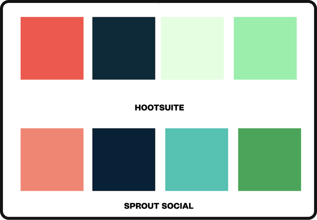
Again, no shade here, it’s a fairly standard practice in the world of branding to use color stories that are familiar to audiences or have a particular psychological effect on audiences.
What does stand out, at least to us, is the decision to borrow so heavily from a brand that isn’t necessarily iconic or instantly recognizable on its own.
From a creative decision-making perspective, particularly for a rebrand, there are a number of different avenues that they could have gone to better set themselves apart from the existing landscape rather than choosing to further blend in. With the exploration and implementation of a color palette that isn’t represented by competitors within their space, Hootsuite could have become a category killer by way of color.
If we look deeper into the competitive landscape, we’ll see that other brands like Buffer and Later have adopted a completely different approach altogether with warmer, more friendly colors, which presumably were chosen to reflect the social aspect of social media.
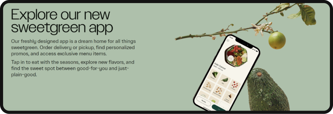
Going a level deeper and accounting for the execution of their colors, we see their homepage is dominated by this minty green. Green can be used to instill feelings of optimism, decisiveness, balance, and refreshment — a tactic that has been exemplified by Sweetgreen and its universal use of green within its latest brand treatment (unsurprising considering its name). Observing the contrast in tones, we can see just how much impact that color can have on user experience and even perception of quality.

While entirely possible that the intent behind the Hootsuite color choice was to stir up users and get them ready to work as they logged into their social media dashboard to start scheduling some Tweets, the color choices aren’t necessarily distinctive enough to garner immediate brand recognition, nor are Sprout Socials colors iconic enough to help them saddle up to their largest competitor in any significant way.
As proof, below is the same graphic from above with the sets of colors mixed up and the names of the brands removed — here’s a quick challenge to see if you can tell the difference between the two.
If you couldn’t tell the difference, it’s because there was no change. This isn’t necessarily a problem, and we can look to the big 3 of fast food (Burger King, McDonald’s, and Wendy’s) as evidence since they all have basically the same exact color story.
This works very well because, despite any allegiances you may have to any of the major fast food chains, the colors will hit your retinas and get your ghrelin (the hormone that makes you hungry) going. And while it’s possible that Burger King in 1954 when it launched (that’s right, it came first) chose Red to symbolize that it’s fast, and Yellow to symbolize that eating there is a joyous occasion, it’s also very likely that those decisions were arbitrary, and that when Wendy’s came on the scene in 1969, Dave Thomas recognized that with the 15 years of conditioning people would see his logo and also get the ghrelin reaction.
This is a mechanism that more brands are beginning to use in their identities, particularly legacy brands who are now adapting their brand treatments to a digital world by creating color stories that sit complementary to those of their new, digital-first, competitors in the space. By implementing colors of similar saturation, or hue, audiences will mentally make a mental association between the two brands, generating immediate brand recall for what would otherwise be an unknown brand, or for legacy brands seeking to reach new audiences.
The same cannot be said in the case of Sprout Social, and by extension of that now, Hootsuite. While Sprout Social in name carries a great deal of brand equity, there’s very little outside of their dashboard or logo that anyone would have any sort of brand recall with — so while Hootsuite may have strategically placed their color identity elegantly parallel to Sprout’s, the lack of existing brand equity doesn’t support the opportunities for growth as an associative mechanism.
Enter the Mascot:
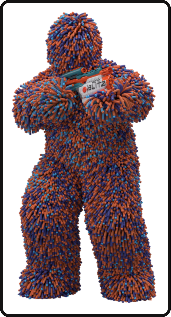
We’ve seen plenty of mascots hitting the brand scene lately, which is a fantastic return to form for brands in their attempts to reach audiences — many finding great success in the practice. It’s well documented that brands are leaning heavily towards the utilization of content creators as a means of having some sort of physical entity to humanize their brands which raises the question, “Why not dart monsters?” To which Nerf has, of course, replied, “Exactly.”
This tactic is incredibly fruitful if executed properly, as evidenced by brands dating back to the Geico and Aflac eras of advertising, and is now being adopted for the TikTok generation. With UGC leading content creation and decisions around content creators being heavily influenced by brands to generate brand recall, it’s undeniable that having not only a face but the right face for your brand is good practice. With content moving away from heavily branded content to more human (or dart monster) centric content, users are now more likely than ever to stop their scroll at the sight of a friendly face, rather than a monogram.
But we’re talking about Hootsuite here, which has had a mascot since October 2021 — a full three months after Duolingo introduced the owl to their TikTok. This is not to say that Duolingo has a monopoly over owl mascots as there’s a rich history of brands using owls as part of their identity from TripAdvisor to Drake’s October’s Very Own.
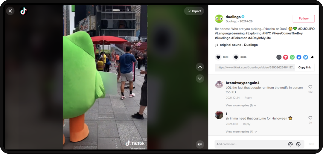
The distinction here comes from the timing, similarities between, and lack of originality of the way that Hootsuite not only implemented the owl mascot into their brand identity, but the missed opportunity to make a meaningful, and arguably necessary, adjustment to the owl introduction. From the jump, the Hootsuite owl was presented as little more than a performative play to gain some social media attention by poking the bear that was and remains Duolingo — to somewhat decent success if we’re being absolutely honest.
While many might see the metrics of this post and count it as a win, as growth marketers we don’t count wins unless they’re replicable. Fast forwarding a few days through their metrics beyond the point of the Duolingo social media battle and the metrics stabilize. While they may have come away from the battle net positive, from a high level the owl didn’t have a measurable impact on social metrics or brand equity — but they had the costume so gotta use it.
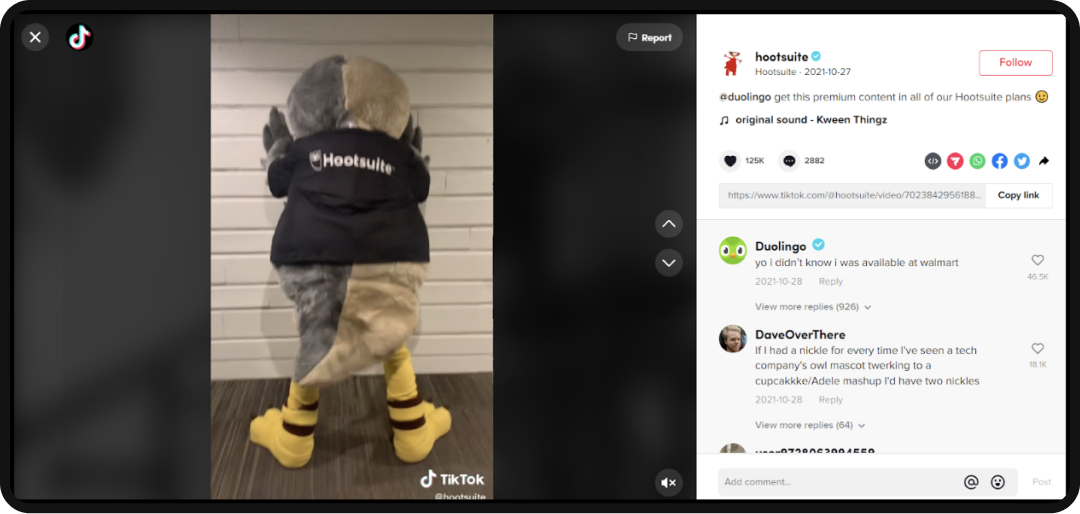
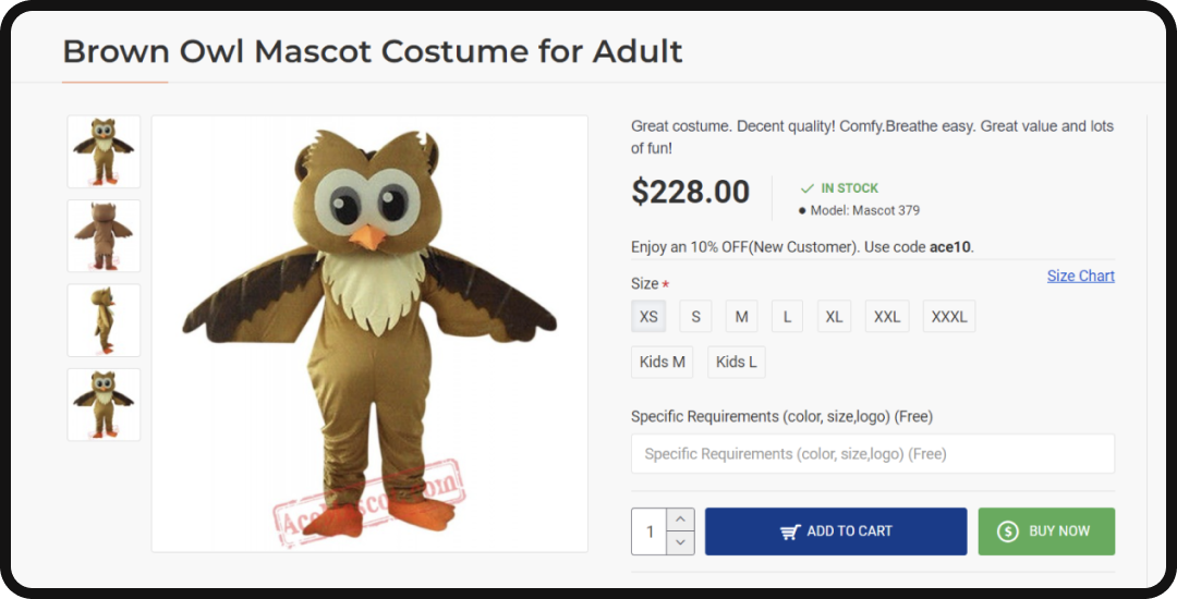
On the bright side, the new owl is consistent with the branding and does seem like it was a more intentional decision from a perspective of branding rather than an impulse buy of an owl mascot costume from Amazon (we don’t know where they got it, we couldn’t it on Amazon but we did find some more on-brand options).
In a similar fashion, Hootsuite tapped in Emily Zugay who is best known for satirical rebrands on TikTok to introduce the new Owly. The results were consistent with the previous introduction of the old Owly in that the post featuring Zugay outpaced their typical social media performance by several orders of magnitude before returning almost immediately to stasis — we will admit their metrics are healthy for their follower count though that’s a whole other deep dive.
Ultimately, the rebrand doubled down on the owl mascot rather than seeing the pattern in the data that points us to implementing a UGC strategy as an extension of their social media plans. Their previous callout of Duolingo went incredibly well, and the collaboration with Emily Zugay did equally as well, which leaves us questioning, “Why not UGC?” A Duolingo collaboration or implementation of more prominent creators as an extension of the brand efforts would leave us tickled and validate the continuation of the Owl as not just a mascot, but a brand entity as it exists as a part of a broader narrative for the brand.
What we would have loved to see from the rebrand as a push forward as opposed to the lateral step that was made would have been the implementation of an avatar or nod towards the world of Web3 or at the very least augmented or virtual reality.
This would have made sense for the brand considering most, if not all, social media platforms are in some way dipping their toes (if not their whole dang legs) into the world of Web3, whether through NFT avatars or token economies on the platforms, or ar/vr as a reaction to the somewhat recent shift that Meta has taken with their focus on the metaverse.
Making Owly digital just makes sense to us and could have set them apart from their competitors by flexing their digital-first muscles in a landscape that is 10000000% digital first. It’s a relatively small detail that could have made waves in the world of digital PR, and by association made their competitors look like they were antiquated and positioned them to be the platform of choice for Web3 loyalists across all social channels.
The Fonts:
We love a custom font, and absolutely support the practice from a branding perspective. From the inception of Cereal for Airbnb back in 2018 to the recent introduction of Instagram Sans, it’s a power play that many brands are recognizing as a subtle strategy for brand recognition — with hopes that the font created, licensed, or purchased for your brand becomes as synonymous with your product or category as Helvetica became to anything designed in the 2000’s.
Fonts are, from a performance perspective, driven by utility and should generally serve function over form. Most individuals outside of marketing and branding may have never even noticed that Airbnb created its own font 4 years ago, or draw the connection between brands using similar or even the same font pairings in their brand treatments.
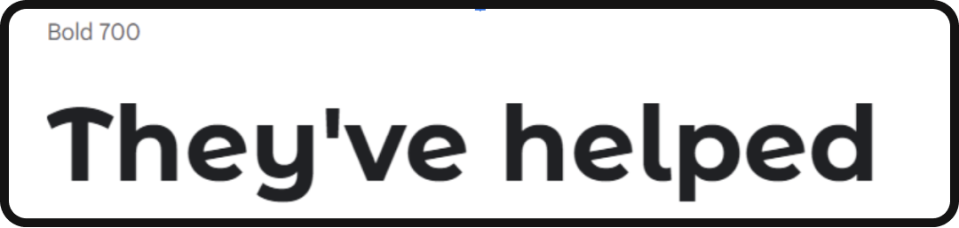
Because of this, many brands forego the process of creating a custom font or do as it seems Hootsuite has done in creating a variation on an existing form. We immediately recognized Montserrat Alternates when we first saw the rebrand, as given away by the curvy T — with the apostrophe lending visible distinction between Hootsuite’s take and the original.
Ultimately, it’s entirely suitable from a functionality perspective and sits well within the current design climate for how they’ve executed their font decisions. The curved T, however, begs for the opportunity to be repurposed as a design element considering how distinctive it is to the font itself, and how much it draws the user’s attention.
Had it been incorporated into the wordmark of the brand and then brought into other visual assets to add distinction to the font and the brand, there suddenly becomes a great opportunity for the brand to be immediately recognizable anytime the curvy-t is used in a visual asset.
A great example of this would be Baskin Robbins and the 31. It’s something that has been cleverly incorporated into their logos since 1945. Originally, the 31 was fairly overt and was just the stylized number in the center of the logo, but as the brand continued to evolve and take shape, it became the icon that we know now — incorporating the 31 into the brand’s initials of BR.
The difference is unmistakable between the two. Baskin Robbins created a brand element that is iconic to their brand and has helped them to build brand equity around their 31 flavors, while Hootsuite has a weird T. And while we are deviating slightly from the fonts, the conversation does shine a light on the lack of continuity or distinguish with brand elements that we’ve seen thus far from the rebrand.
So let’s talk about that now.
Brand Elements:
There are two sides to this discussion, the actual brand elements and the general aesthetic that they’ve chosen for at least the launch of the new brand.
Taking a quick peek at their social, there’s definitely a presence of some icons for their highlight reels which are fine. There’s nothing either remarkable or offensive about them, and while we didn’t immediately find them in a quick skim through The Noun Project, considering that it was our first impulse to look there for them does say a little bit about the execution.
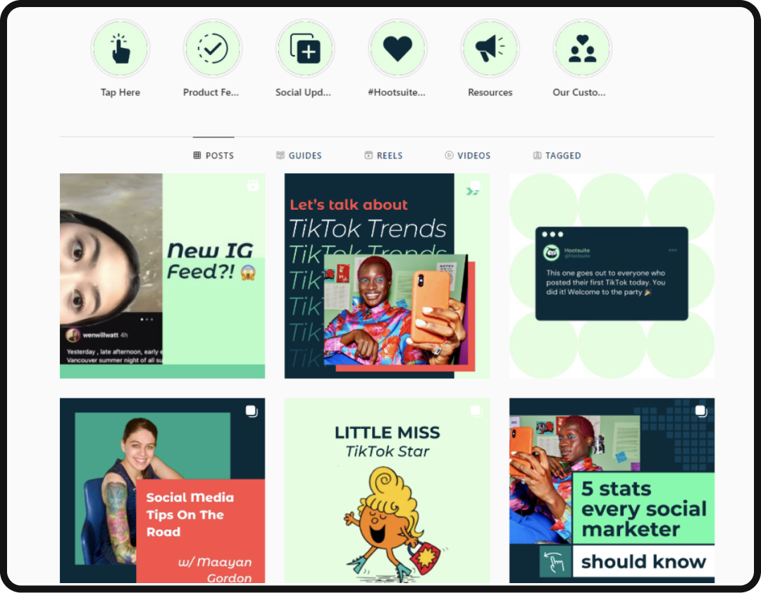
Giving the font some attention here since it’s what brought us to this section anyway, this is definitely a place where we’ve seen fonts really shine with other brands as a means to grab attention and visually distinguish social feeds from others.
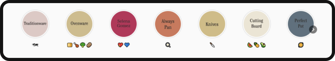
As evidenced by Our Place, we can see how something as simple as the highlight reels section of a feed can be elevated and draw attention to itself through not only the choice of fonts but also emojis if you’re into that sort of thing.
Diving deeper into some of the brand elements and stylistic choices, there are a fair number of styles and trends in play that individually could have been utilized for a suitable rebrand for Hootsuite, though, collectively become too much. The execution of a good brand is, at its essence, mixing different elements together in a holistic way in order to create something that is new and different — that’s what we love about the process.
The results that we’ve seen with Hootsuite, however, show the importance of data and intentionality as a component of the process. Individually, the trends detailed below are all ones we love and have seen executed brilliantly in our travels across the internet, however, when all combined together they lose the impact that they wield on an individual basis.
A more holistic approach and one we expect to see brought to prominence in the future is for brands to experience incremental, test-driven, brand adjustments as opposed to the comprehensive rebrands we’ve historically seen where entire social media feeds are deleted and replaced overnight.
This approach will allow brands to not only implement new trends more organically, without the heavy risk that complete rebrands pose in the instance that they are not well received.
This also allows audiences to more organically adjust to new brand decisions and changes since people are generally resistant to change.
The below stylistic choices that Hootsuite has made, will likely go through this process where, over the course of the coming months, their team will monitor and adjust the new brand elements in order to determine which are or aren’t resonating with their audiences and adjust accordingly. This process, if reverse engineered, can be more interactive for audiences, as they can essentially vote with their engagement to help shape the brand to their liking.
The Styles:
Alegria:
Also known as a corporate art style, there’s a decent amount of representation of the flat art style that rose to prominence over the past decade by way of Google, Meta, and other tech giants.
The style itself is loved by many but has become somewhat oversaturated in recent history — to the point that some brands are starting to use it in an almost satirical way.
It’s unlikely that the style is going anywhere anytime soon, as it’s easily scalable and iterable, and due to the lack of detail in the character representations, it also checks the box for inclusivity as there’s no distinction of race or gender within the illustrations.

Digital Collage:
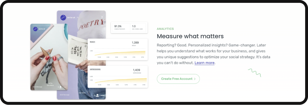
Digital collage has been everywhere lately and makes an appearance here in the form of geometric shapes, paired with lifestyle photos, iconography, and nature-driven photography. From a holistic perspective, the idea of incorporating collage makes sense considering their tool does provide users with the ability to manage an amalgam of accounts and generally mash together any number of workflows across social channels.

High Gloss Lifestyle:
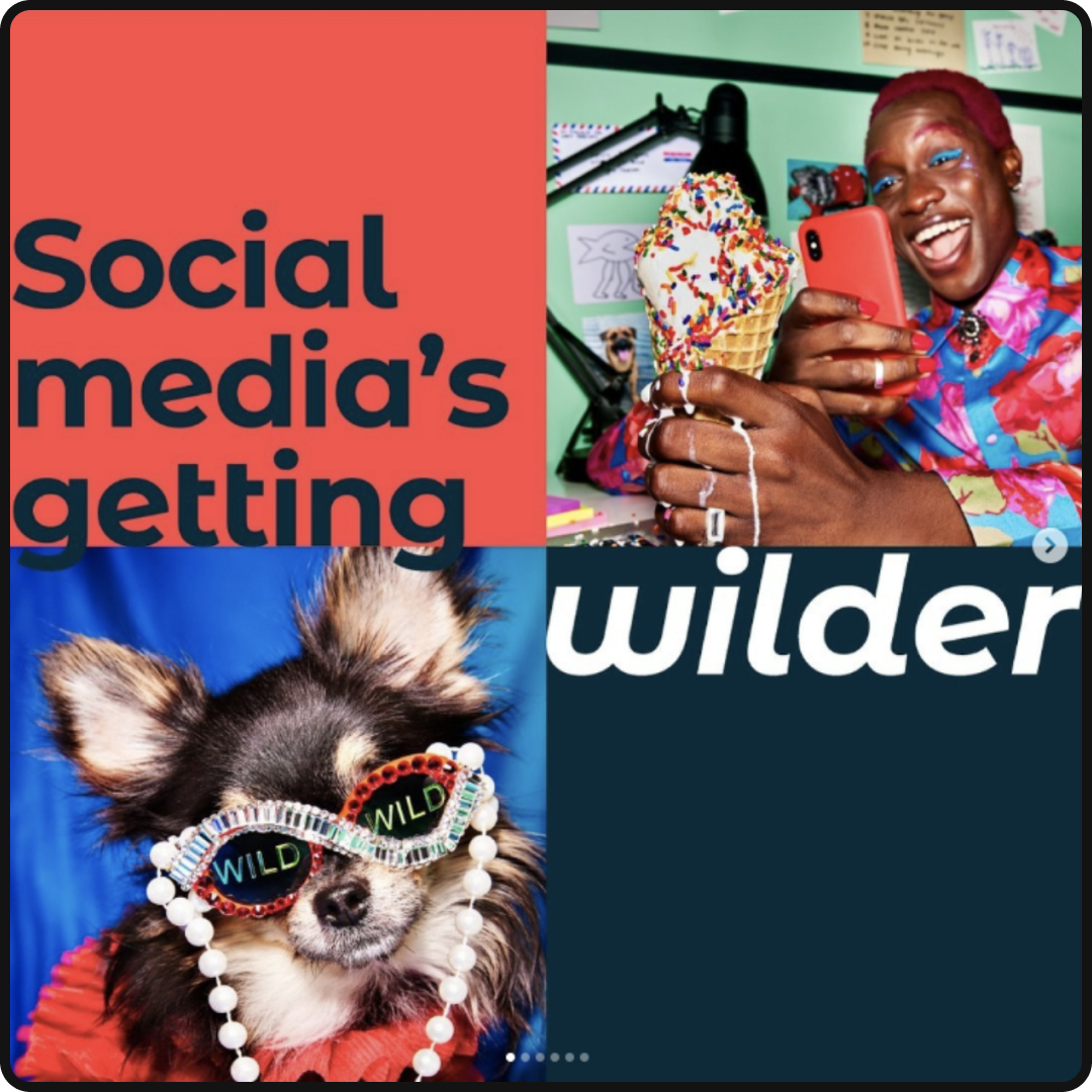
Sitting in stark contrast to the new era of the content creator aesthetic, the lifestyle photography used for the rebrand reflects a high-gloss, high-contrast, lifestyle that rose to prominence during the era of the Instagram influencer. Paired with messaging around the “wild nature” of social media, the intention is clear that they’re implementing the Ellen Von Unwerth aesthetic as a way to stop the scroll and grab attention — attention grabbed. This style sits in stark contrast to the more toned down, DIY feel of photography found on sites of their competitors like Later.
Brand Soup:
Intentionality and data are behind every decision that we make and for good reason — it answers the why. As the internet becomes more internet than ever before, it becomes increasingly difficult to stand out from the crowd, and for audiences to take notice. Because of this, “because it looked cool” is no longer a sufficient justification for creative decisions.
Additionally, as audiences become more niche and fractured, it’s important to reflect the audiences you’re trying to reach, in the places when it’s appropriate, at the times that it’s necessary. If that sounds like an insurmountable task — it is. However, by way of testing things, observing the results, and making decisions based on those observations, brands can determine their audience preferences, and have that be the brand rather than everything being the brand.