
As we further explore and approach a technologically advanced era, design trends are evolving to incorporate digital tools in a greater and more impactful way. Flat animations are developing a three-dimensional form, print textures are recreated using digital software, and more!
The first step to discovering the next trend in design is to notice what is currently being done and what people like about a certain trend so it can be further developed and utilized. Here are a few design trends in 2022 that are growing popular among design and marketing industries!
Collage
The technique of collaging typically involves the combination and arrangement of cutout images on a flat sheet of paper. Collages allow people to express their creativity in abstract ways, using items and images of things they have in front of them rather than having to create them themselves. With the introduction of technology and software, such as Photoshop, creating collages using digital mediums has greatly increased in popularity.
Using digital software as a form of collaging has allowed people to incorporate moving images, such as gifs, stickers, and illustrations. These moving elements allow people to create eye-catching imagery and share them with people around the world. Incorporating illustrations once required a person to sketch a collage before pasting random images together; however, with the popularization of Procreate and Photoshop, people can simply draw in their illustrations and move objects around easily.
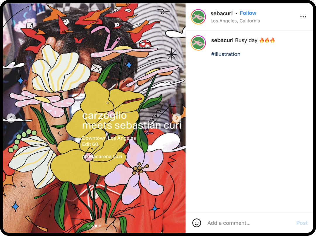
Sebastian Curi creates emotion and meaning through his vibrant and loud illustrations.
Typically, handmade collages are put together using glue and tape but digital collages have the leniency of changing the position of an image or getting rid of it altogether. Illustrations also give people the opportunity to incorporate their personality into the work. For instance, if a person wanted to add a character they’ve created into a collage, they could simply draw/paste the drawing in.
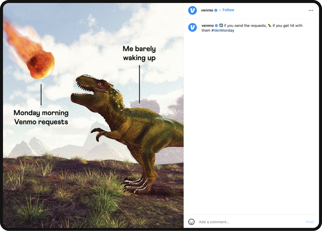
Venmo uses the collage method to create an amusing post that illustrates a surprised dinosaur seeing a meteor, referencing how people can request payments from others first thing on Monday morning.
3D Design
Three-dimensionality has also made an appearance in design trends nowadays as people are beginning to gravitate towards animating flat illustrations into figures. Using software such as Cinema 4d, Maya, etc., designers are bringing elements of their design into bubbly models! Although many objects and character designs were making a presence in the beginning stages of the trend, designers are now finding ways to incorporate three-dimensionality into typography, texture, and more.
Animation
With the growth of TikTok over the years, people have begun to realize the great impact of videos when advertising a brand. TikTok has shown designers that short videos can effectively communicate a message, tell stories, build brand narrative, and catch the attention of customers within a matter of seconds; making still pictures with long written-out captions less necessary and interesting to consumers.
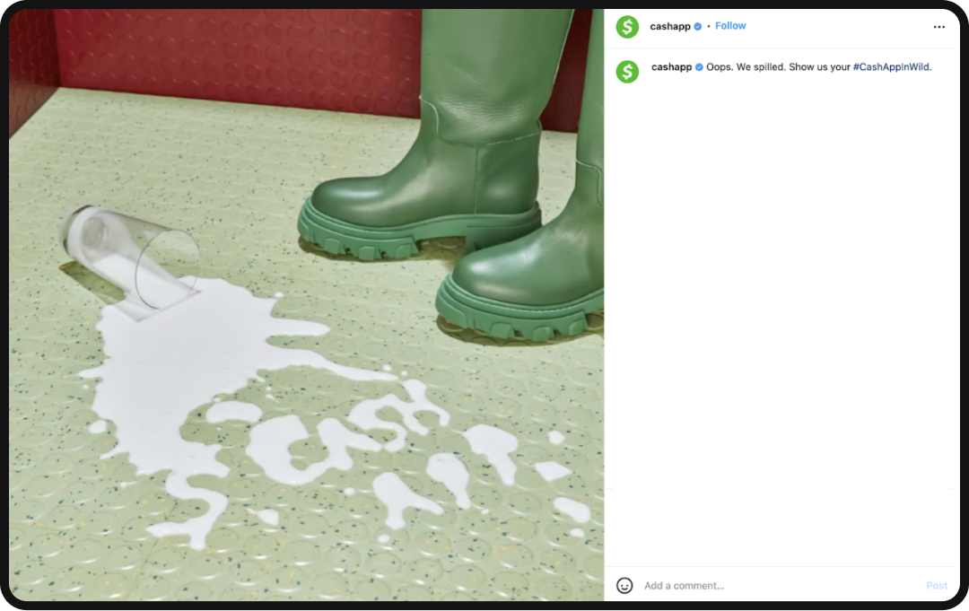
Here, Cash App renders a short gif of spilled milk forming the words “cash app” and then merging into one another. This captures the attention of the audience as it is a gif and contains a simple design that does not overwhelm the viewer.
3D Animation
Animation also allows companies to incorporate music, giving 2D, 3D, and 4D visuals a greater impact on consumers. Music plays with people’s sense of hearing and can cause a person to feel a certain emotion in addition to what they are seeing. Sound can also appeal to a specific audience if they recognize the music from another popular platform. TikTok is an example of how music can unite a specific audience together, allowing a company to appeal to them through sound.
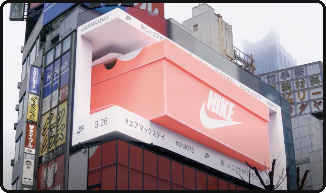
For instance, Japan has recently released a billboard advertisement for the Air Max 1. This advertisement utilizes three-dimensionality to create an immersive experience and create an eye-catching illusion that the objects shown in the video (shoe, box, etc.) are popping out toward the viewer.
I’d say they successfully caught the attention of passersby, as well as many people worldwide.
Soft Gradients
Gradients disappeared for a short period of time due to people’s preferences toward solid figures; however, as time passed, people began to miss the immersiveness and soft feeling gradients add to a design. In addition, gradients allow designers to create a sense of depth in a subtle way. Nowadays, many UI/UX designers will encourage the use of gradients in the background to evoke a sense of calmness. By doing so, the user will feel more inclined to purchase a product or use a certain function with more ease.
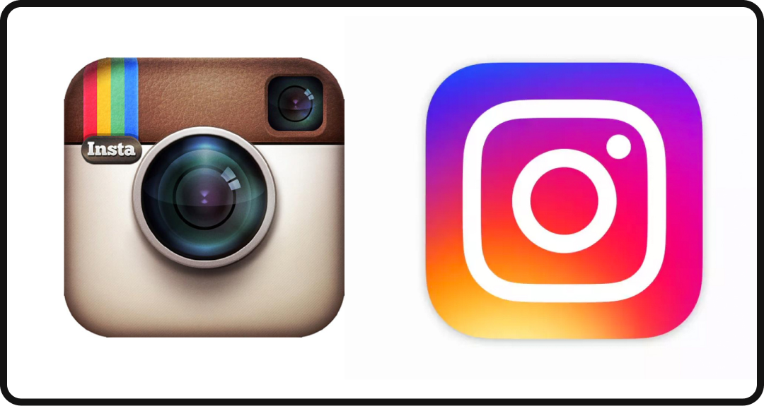
Instagram is one example of a company that changed the way they utilize gradients in their brand. At first, the gradient was used to create shadows and make their logo appear more three-dimensional; however, with their rebrand, they embrace the flatness of the new logo and use gradient background to make their brand appear vibrant.
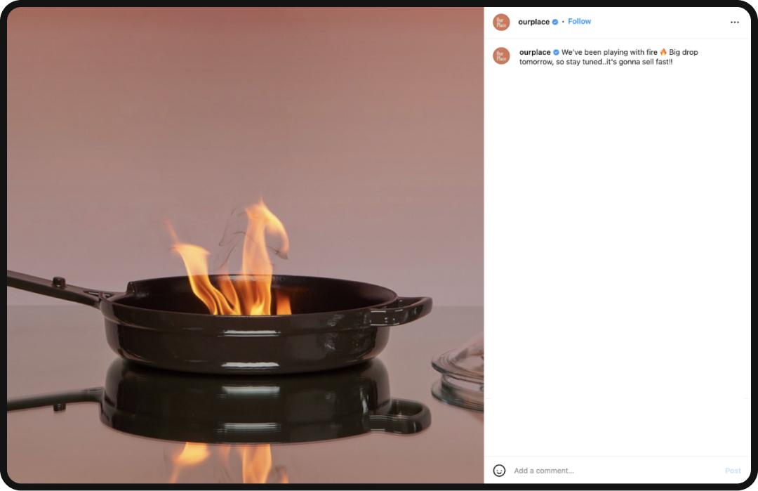
Our Place, an at-home kitchenware company, is another example of a business that uses gradients to create a warm and cozy atmosphere. Since their mission is to sell modern kitchenware inspired by heirlooms from different cultures, it’s important to the story behind the idea of how their products can bring families together and enhance the home-cooked meal experience, they utilize gradients to soften their marketing approach toward their consumers.
Expressive Sans Serif
While sans serif typefaces have been popular for quite some time due to their bold personality and ability to state a message in an effective way, expressive sans serifs are growing in popularity amongst many brands of the younger generation. As many companies are rebranding to utilize a simple sans serif font as their main typeface, designers realize that type should be effective as well as expressive to stand out from other brands.
Expressive sans serif also deviates from an effective font as it contains the “personality” that a brand is attempting to obtain. Designers also realized that with an effective and expressive sans serif typeface, no further imagery would be needed or incorporated to capture the attention of a consumer. Since expressive sans serif is scalable, meaning that they can scale up to cover an entire artboard or they can scale down to be within a sticker or logo, they can be used in versatile ways, differing from the traditional typefaces.
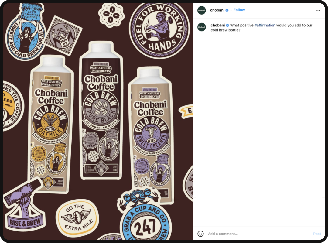
Chobani, a yogurt company, rebranded in 2017, deviating from a cold aesthetic to a 70s hippie-inspired brand. They went in this direction because they wanted their main typeface to evoke an inviting, relaxed, and creamy feeling that their brand encourages. Thanks to type designer Berton Hasebe, Chobani’s current typeface exists and has inspired other companies to utilize expressive sans in dynamic ways that allow the type to stand alone as the main source of imagery.
Grain/Riso Texture
As we begin to shift into a direction where digital mediums and forms of advertisement make a greater difference than ephemera, people have worried that the designs will lose a handmade sense that crafts acquire. Due to the development of software, adding a grain, riso, noise, etc. texture can be done with a simple click of a button. Not only can a “human-touch” feel be added to a design piece, but it could also be adjusted to a person’s liking.
Grain and riso-like textures appeal to the younger audience as it gives images a film camera, old ephemera, and retro print feel to modern pieces. This can also be appealing to the older audience, who miss the past and gain a sense of nostalgia when looking at riso-inspired designs.
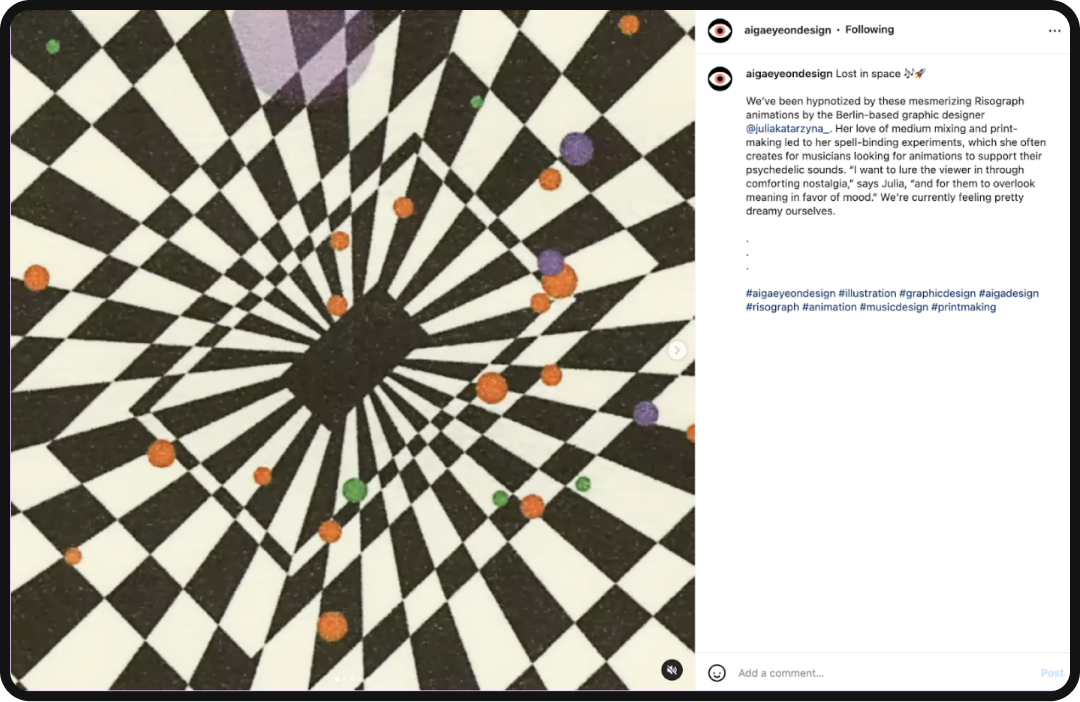
Julia Schimautz is a Berlin-based graphic designer who uses riso=inspired grainy textures that inspire viewers to feel a certain way. Due to her artistic approach, many musicians have asked her to design an album cover that makes a listener feel entranced in a psychedelic way through visual and auditory means.
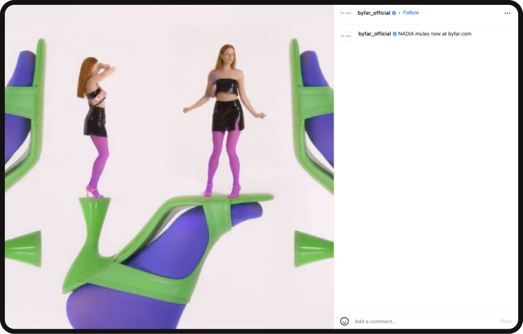
Retro Futuristic Colors
Adding on to the many present-day design trends inspired by the past, the modernization of retro colors is making an appearance. Designers are taking inspiration from 90s nostalgia and saturating colors to appear futuristic and appeal to the younger generation. They’ve realized that consumers of the younger audience want to make a statement through bold and expressive tones. In order to match the aesthetic appeal of this crowd, the brand and design should match the energy to whom they’re aiming to speak to.
By Far came out with a summer 2022 line, where the color palette deviates from the pastel soft tones, into bold saturated tones that could be seen commonly in 1990s posters. For instance, in 1995, “Clueless,” we can see solid pink, purple, and green colors that have been brightened to fit the modern aesthetic.
Conclusion
As we continue to use digital media as a form of communication and advertisement, it’s important for designers to be aware of design trends that appeal to present-day consumers. In addition, utilizing the digital media and understanding the potential it has to create a greater impact beyond stagnant images, will allow brands to stand out from their competitors.