SaaS, or Software as a Service, has become the resident juggernaut in today’s software industry, revolutionizing the model for which software services are delivered to users every day worldwide. You’re likely multitasking with SaaS products as you’re reading this; think Slack, Shopify, and Stripe, to name a few.
Having settled into its role as the dominant player in its space, as creatives, our natural next step is to establish how we approach performance design to propel growth for these competitive SaaS brands.
What is Performance Design for SaaS?
The design process for performance design in SaaS involves improving the visual user interface (UI) or user experience (UX) of existing products.
The goal is to enhance user experiences, increase customer satisfaction within the target market and drive desired conversions and business success. It involves combining creativity and problem-solving but, above all, having the two meet at functionality.
Performance design for SaaS stresses the same core values as product design as a discipline; however, it does have a few nuanced differentiations that can make for better performing creative.
Product Design Foundations & Applications
Before diving into the specifics pertaining to SaaS, we have to first lay the groundwork for what defines good design practices from a digital product perspective.
Starting with UI, performance design should work to ensure the creation of user-friendly, visually appealing, and intuitive interfaces. Here are key UI design best practices followed by how they relate to SaaS:
- Consistency: Design elements such as colors, fonts, icons, and layout should be consistent throughout the interface.
- For SaaS: Consistency makes the UI more predictable and easier to navigate, especially when guiding consumers along multi-step app flows through CTAs and conversion.
- Calls-to-Action (CTAs): CTAs should be designed with visual distinctions to guide users through the desired actions.
- For SaaS: Often, with SaaS, there are multiple desired actions, addressing user demands for a free trial or subscription. Design CTAs as you would typography with a clear hierarchy. CTAs can be a filled shape, outlined shape, and/or just a regular hyperlink.
- Use Clear Space: Clear space should create a sense of balance and improve visual clarity.
- For SaaS: Most consumers engage with their SaaS experience on a smaller device window. (E.g. their phone or tablet) Effectively clear space helps draw attention to important elements, reduces visual design clutter, and alleviates consumer anxieties around those elements when experiencing the product.
- Typography and Messaging: In the same breath, fonts, font sizes, and type hierarchy should work to be both legible and provide ease in the lift to consumers when asked to digest messaging around the what and hows of the product.
- For SaaS: Content and subject matter can often be dense and jargon-heavy in SaaS. When designing for performance in this area, less is not always more here, as it’s ok to expend more character counts to effectively communicate in layman’s language what the product’s benefits are.
- Utilize bullet points whenever possible to break up content blocks, making them scannable.
- Optimize for Intuitiveness: The elements showcasing the products themselves should be easy to understand.
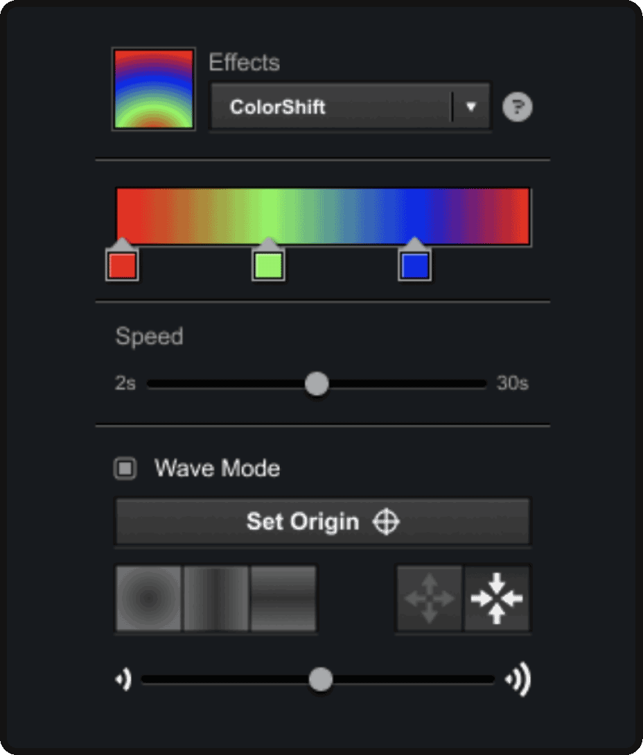
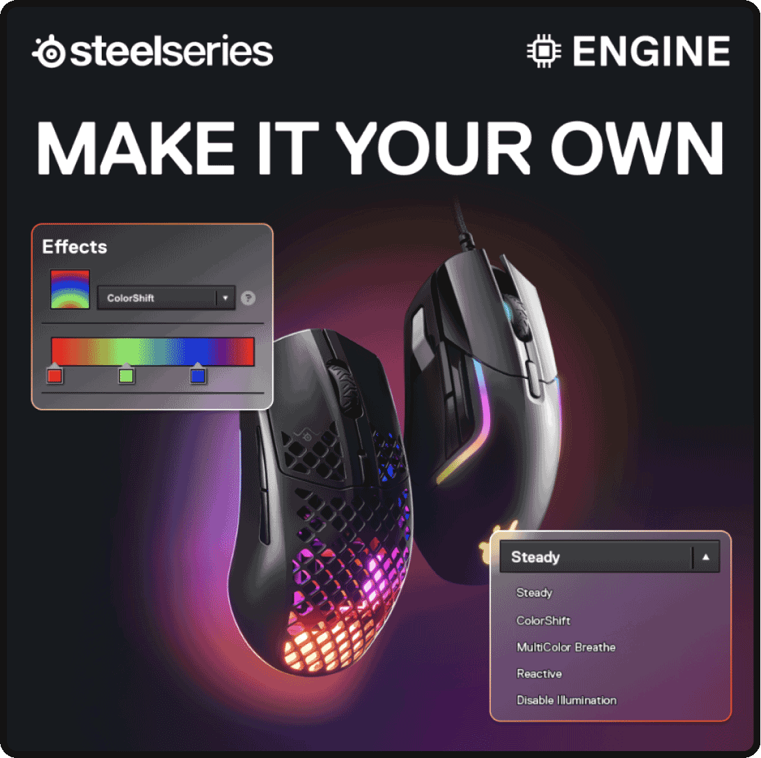
- For SaaS: Showcasing dashboards, interfaces, dropdown menus, etc., are common when it comes to SaaS. Simply here as much as possible. Rather than displaying the whole dashboard or entire menus, isolate and recreate just the elements in a discussion. Consumers should be able to tell exactly what they’re looking at and why.


Moving into SaaS UX, Performance design should aim to create seamless product experiences that align with business goals and provide a competitive edge by removing user-centered roadblocks. Here are hallmark UX design best practices and how they can be leveraged for SaaS:
- The Consumer’s Journey: Customer journeys and product flows should guide more than they direct. Designing from the potential customers’ point-of-view is crucial here.
- For SaaS: Whether the design application is a landing page, emails, or app flows, the who, what, values, and benefits of the product should always be sectioned and presented in visually identifiable content blocks to best optimize the user attention and overall customer experience.
- For landing pages and emails, more specifically, the AIDA framework is a great place to start.
- A/B Testing: Utilize A/B testing to experiment with different design variations and allow future design decisions to be informed by key performance indicators (KPIs).
- For SaaS: Saas often casts a wide net for capturing consumers. Some are more savvy about the consumer pain point they are solving, while others may be newer or more casual about approaching it. A/B testing should be implemented to target the array of well-thought-out client personas. (E.g. headlines, benefits copy, light/dark mode, etc.) Winning design elements should be double-downed and iterated upon to expedite the process of developing the product’s niche and core demographic.
- This helps SaaS brands more effectively utilize their marketing spend as well!
- Accessibility: This one’s pretty straightforward. Well-performing design should be in service to everyone.
- For SaaS: As small screens are the primary purveyors of design, SaaS UX design for all instances of the product needs to be accessible and accommodate users with disabilities. Making image content, CTAs, and color contrast perceivable to consumers are just some of the many ways to ensure content is adequately accessible.
- WebAIM is a great resource on this.
- Responsive Design: Along those same lines, ensure the product experience is designed to be responsive and function well across different devices and screen sizes. Conduct regular usability testing to validate effectiveness, minimizing the occurrence of error messages.
- For SaaS: While design work remains largely created and previewed on desktop, mobile has become a primary way consumers experience our software applications. For starters, when translating design elements between the two devices, prioritize left and center alignment for all elements. Avoid horizontal scrolling to be mobile-friendly, and limit column layouts to no more than 2 50/50 columns.
- Optimize for Time: Slow load times on digital experiences are a leading point of frustration and deterrent for hopeful consumers.
- For SaaS: SaaS products vary in complexity, often relying on more visual elements, images, or motion than others to communicate their ideas and various solutions. Performance design here takes a technical seat. (E.g. Wherever applicable, leverage the smaller file sizes of SVG and JPEG, compress videos into shorter GIFs, and make all text live and, thereby, readable as soon as the page is accessed.)
Let’s recap!
Simplify, Simply, and Simplify Again
- A major and prevailing specific for SaaS is to distill the presentation across the board. Following common practices, Copy should be straightforward, following essential design principles, and light on technical and/or industry-specific jargon. Imagery should be deliberate. Show only the menus, options, and UI elements within the product that are the point of focus. Lastly, streamline the experience with the collaboration of the design team. Landing pages should resemble emails, paid ads, etc., and dense information should be optimized for the specific viewing audience and devices.
Don’t Deviate (too much)
- SaaS attracts a wide range of audiences, some looking for a solution while others are merely curious. Contrary to our open experimentation philosophy on performance creative and design, SaaS appears to be one of the industries that benefit from leveraging these product design best practices, operating more of a slow-turning wheel. Lean into A/B testing results and social proof, iterating over time on messaging and creativity.
In this comprehensive guide to performance design for SaaS, we delved into the world of Software as a Service and its revolutionary impact on the software industry. As creatives, we explored the essential process of enhancing user experiences and customer satisfaction through performance design.
From UI design best practices to leveraging UX strategies, we learned how consistency, clear space, and intuitive interfaces contribute to seamless product experiences. A/B testing and accessibility played vital roles in refining our designs and aligning them with key performance indicators and business goals.
By optimizing for time and addressing performance issues, we gained a competitive edge, catering to the needs of our target audience and potential clients. Through this slow-turning wheel of design experimentation, we discovered the power of simplification and social proof in captivating our diverse user base.
As you embark on your journey of performance design for SaaS, remember to lean into these proven practices and iterate on your messaging and creativity. With the collaboration of your design team, create a user-centered experience that leaves a lasting positive impression.
Now equipped with these insights, go forth and craft exceptional SaaS products that stand out in the digital space, ensuring success in customer acquisition, retention, and growth. Embrace the potential of performance design, and let your SaaS brand soar to new heights!


