I once heard a designer say, “Good design is obvious, great design is invisible,” and its meaning has stuck with me ever since. This statement means that a great deal of thought and effort goes into the things we don’t think about. Good design allows for minimal frustration and difficulty when completing a task. It will enable the user to interact with anything and immediately understand how to operate software, what to press, and how to quickly access the information they’re looking for.
Designers who tirelessly enhance user experience can be seen as doing the “invisible” work since they’re improving processes that non-designers might not realize are designed well. Micro-interactions, which I believe fall into this invisible design category, are a very subtle design detail that separates good design from great design.
What are Micro-Interactions?
Micro-interactions are exactly what they sound like: the small user interface (UI) details that are important for the quality of user experience with a product. More specifically, micro-interactions are trigger-feedback pairs, meaning that they have a trigger, either from the user or from the system, which prompts visual feedback through small changes to a user interface. Despite being small, these micro-interactions are very important for a few reasons.
Micro-Interactions to Encourage Engagement
Implementing micro-interactions is an easy way to create more user engagement in your design. Often through minimal changes to the design system, adding a few strategic micro-interactions can have huge benefits for the user experience of your interface.
Out of all the categories of different purposes for micro-interactions, they mostly fall into this category because these subtle and often enjoyable interactions are mostly seen as nice-to-haves in the design since they’re not the main function of the interface.
When looking to find great examples of micro-interactions, think about the most tedious online services that require a lot of effort from the user. Perhaps you’ve encountered some government websites, or application processes that do not encourage engagement and are more of a burden to work through.
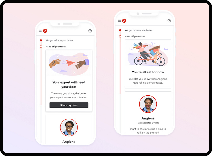
A great example is filling out taxes online, and more specifically, how some tax services keep the user engaged throughout many different categories and sections of information uploads. Turbotax by Intuit is a great example of a product that gamifies its form design, offering dynamic illustrations and rewarding you with positive messages like “nice job” and “you’re almost there” as you move closer to the final submission.

Micro-Interactions to Display System Status
One of the best examples of this interaction is through Siri, the digital assistant on iPhones. If a user says “Hey Siri,” there’s an immediate visual response on the screen, no matter what the user is doing. If you have an iPhone nearby, try it on your device now – what do you notice? And more importantly, what do these visuals indicate about Siri’s status?
During this audio command, abstracted waveforms are displayed on the screen, which indicates that Siri is listening to you and waiting for all of the information to be conveyed. Apple designed Siri to be full of micro-interactions that display an active system status throughout every interaction.
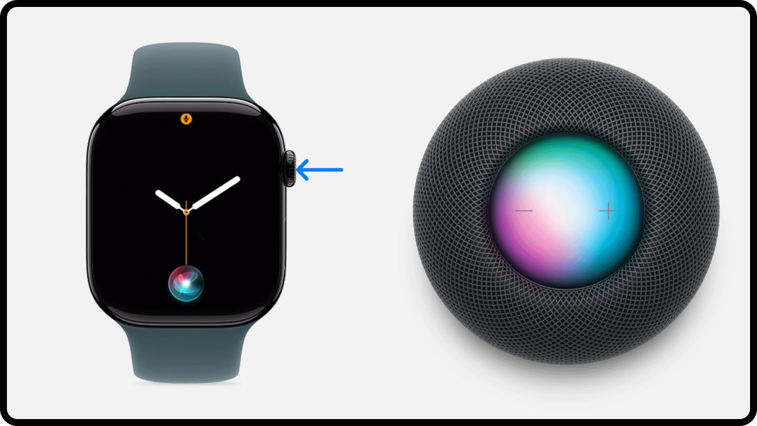
Siri is implemented on all Apple products, which makes it interesting to see how it takes on different forms depending on the product. Siri appears in a similar way on Apple watches, with the circular audio responding to voice commands even in the small format of a watch. On an Apple Homepod, you can touch the top of your Homepod, or say “Hey Siri” to activate the micro-interaction, which fills the top screen and pulsates in a similar way depending on your audio command.

Micro-Interactions for Error Prevention
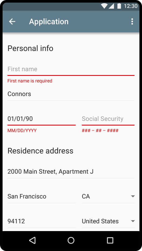
Error prevention is most commonly seen when completing digital forms, where the user needs to manually enter information. Think about the last time you created a new account. What happens when you need to confirm your password, but it doesn’t match the previous password entered? More often than not, an error message automatically appears below the box with the message, “Your passwords do not match.” Depending on the way the form is designed, there might even be more visual cues like the text box highlighted in red.
According to Material Design, error messaging is vital to clearly communicate what is happening, describe how a user can solve it, and preserve as much information the user has already entered as possible. These are affordances, or visual cues, that help improve user understanding and reduce frustrations when users are prompted to complete a form.

Look familiar? Error messages appear in many shapes and sizes. Quickly scanning this screenshot indicates to the user what they need to adjust. But again, there are some “invisible” design elements, which are great examples of micro-interactions. Here, the interface displays these error messages with 3 subtle changes to display this error. Can you name all three changes to the interface? The error message is displayed, the underline thickness expands, and the color changes to red.
Micro-Interactions for Communicating Brand
As you can see, micro-interactions separate good design from great design. But what can really elevate these interactions across the board is connecting them to the overall brand mission and values. Fun branding can come through in these different micro-interactions to enhance the user experience by adding some unexpected joy.
A great example of this is in Slack, which hides small moments of joy in some of their interactions. Slack, like most of the leading digital products, has realized that less is more in terms of prioritizing intuitive interactions. Less ornamental design elements means that only the necessary information is being displayed in each frame.
They’ve infused small moments of playful branding in small areas that don’t distract the user. In this example, you can see Slack has added a cute text emoji of what seems to be a character reaching out for a hug. This completely unnecessary interaction helps Slack infuse their product with some personality in a less intrusive way.

Micro-Interactions in Action
Here at NoGood, we use the task management tool ClickUp. Like other tools, ClickUp allows users to create and assign tasks, take notes, look at interactive dashboards, and communicate with team members on a project’s status. With so many interactive features and countless tasks, notes, and communications going on all at once, it’s paramount that ClickUp maintains intuitive interactions so that the user can easily accomplish their tasks with visual cues and text indications that support their goal. Micro-interactions provide the necessary feedback to keep users informed and engaged. Without them, seemingly simple tasks become confusing and tedious.
A great example of this is through the use of ClickUp’s hover effects. As stated above, ClickUp is a beast of customization and tracking anything you could think of. There’s a lot of information, buttons, status updates, clickable interactions, and more.
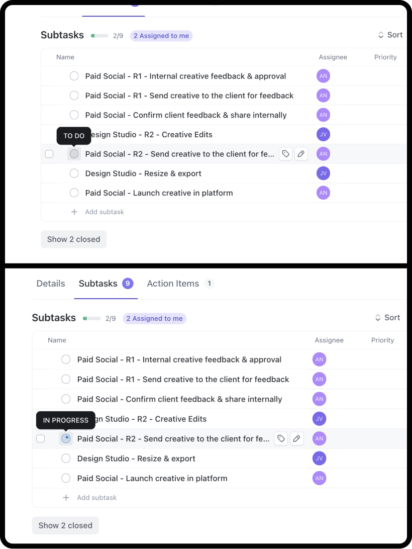
Essentially, everything is clickable on any given page. With so many different options for the user to interact with, and with the intention to not over-complicate each page, ClickUp has added a hover state to every clickable item that helps indicate to the user what the click action will do. This is extremely useful in giving more guidance to the user and helps with accessibility.
Adding a hover state helps the user get more instructions on every clickable item in real time, which means that interactions with the software are less difficult, helping the user complete their tasks as quickly and efficiently as possible.

In this image, you can see the ClickUp hover interaction for the status update symbol for subtasks. Without the hover, users might not understand what this symbol indicates or what clicking this might do. Additionally, once clicking, the visual updates with a color and percentage filled in, indicating the status of the subtask in real time.
Tips for Implementing Effective Micro-Interactions
Crafting effective micro-interactions can transform user experiences from tedious to actually enjoyable. Here are some helpful tips for designers & developers to consider when crafting an interface:
1. Prioritize User Needs
The primary goal of these micro-interactions is to enhance usability. Each micro-interaction should serve a clear purpose, whether it’s providing feedback, guiding a user through a task, or preventing errors. Always ask yourself: Does this interaction add value to the user experience? If not, the added interaction might not be necessary and could make the user experience more difficult or confusing.
2. When in Doubt, Keep it Simple
While it might be tempting to include elaborate animations or effects, simplicity is often best. Overly complex interactions can overwhelm users and detract from the overall experience. Aim for subtlety and elegance to maintain focus on the task at hand.
3. Provide Feedback
Acknowledge user actions with visual or auditory cues. Whether it’s a button changing color when clicked or a sound confirming a successful action, feedback reassures users that their actions have been recognized and processed. If you have a long form or tedious task, how can interactions encourage the user to keep going? This not only boosts confidence but also keeps users informed throughout their journey.
4. Offer Guidance
When designing the user flow, think about the edge cases where the user might need more guidance than others to complete their task. Whether it’s a progress bar in a multi-step form or a subtle animation showing the next step, clear guidance can prevent confusion and improve task completion rates.
5. Ensure Accessibility
It’s essential to design inclusive micro-interactions that are accessible to all users, including those with disabilities. Consider different input methods, such as screen readers or keyboard navigation, and ensure that all users can perceive and understand the interactions without hindrance. If you aren’t designing for these interactions yourself, include the necessary information that will help these users, such as adding alternative text for images.
The Dark Side of Micro-Interactions
Ethical considerations are important when designing these interactions. Designers should avoid using micro-interactions to manipulate users or hide critical information. Transparency and respect for user autonomy should guide the design process to ensure that interactions enhance the user experience without exploiting it.
I often find that airline websites try to subtly influence you to continue with upgrades or added costs. When visual cues guide the user into unintentionally making purchases instead of easily completing their task, it’s an intentional choice from the product designers to choose profit over usability. This is extremely important to avoid and call out whenever possible.
Powerful Micro-Interactions, Positive User Experience
Micro-interactions might seem like tiny details in the grand scheme of digital design, but they’re pivotal in crafting a great user experience. By focusing on these subtle elements, designers can transform their products from merely functional to genuinely enjoyable. Strategically planning out interfaces to offer immediate feedback, guide users seamlessly through tasks, and even express a brand’s personality is a necessary layer for successful product design.


