Design isn’t just about aesthetics; it’s about understanding how humans perceive and interact with visuals. Whether you’re designing a website, crafting a logo, or developing a product, integrating principles from psychology can significantly enhance the effectiveness and appeal of your creations. Here are five key principles rooted in psychology that can elevate your design game.
5 Psychology of Design Principles to Enhance Your Visuals
1.Hick’s Law
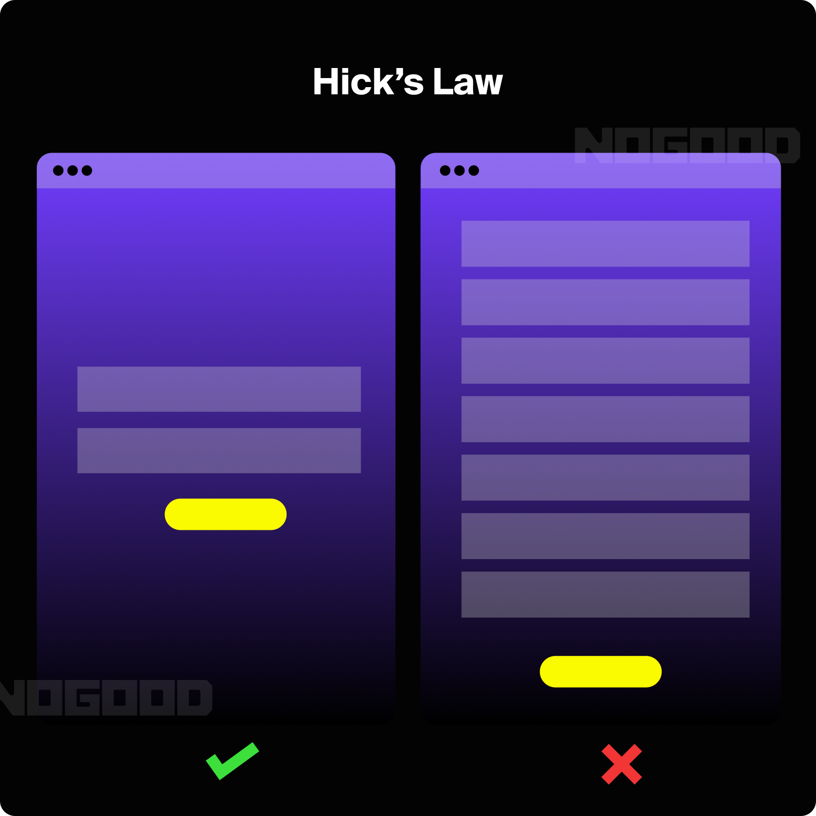
Design should always aim for clarity to avoid overwhelming users. Hick’s law states:
“The time it takes to make a decision increases with the number and complexity of choices available.”
Consider the difference between a bulk store with 30 different cereal brands and a local food store with only 5 options. It’s much more challenging to decide from a larger selection, and you might second-guess your choice which ends up leading to more frustration. An excess of choices might cause users to abandon your product or service altogether, feeling that the effort to make a decision isn’t worth it.
Therefore, designers should minimize options, such as buttons, images, and pages. Reducing unnecessary choices can improve usability and decrease cognitive load. Cognitive load refers to the mental effort required by our working memory. Just as computer processors have limited capacity, so do our brains. When we exceed this capacity, our performance declines, and we may feel overwhelmed. Users engage with your product to achieve specific goals, so avoid confusing them with too many options
2. Gestalt Principles
Gestalt principles, established nearly a century ago, remain highly relevant today. The term “gestalt” means ‘unified whole’ in this context, and the theory examines how people perceive visual elements in relation to each other. These principles explain how humans instinctively group and connect elements. For designers, this knowledge is crucial as it directs the viewer’s attention, clarifies the hierarchy of elements, and effectively communicates the design’s intent.
Applying Gestalt principles helps designers create harmonious and easily comprehensible compositions that guide the viewer’s eye and convey information effectively.
Similarity
The principle of similarity suggests that when elements look alike, people group them together and assume they serve similar functions. Similarity can be defined by attributes such as shape, color, size, texture, or value, helping to indicate relatedness or differences among elements.
For instance, color can either unify or distinguish elements. Aside from helping users quickly process information, similarity also helps to create visual cues like colors or shapes to create a sense of familiarity that can help your users navigate your website.
It also helps to create a sense of brand identity and consistency which can help build trust and familiarity with your users. For example, a logo that uses similar colors and typography to the rest of your website can improve user recognition.

Continuity
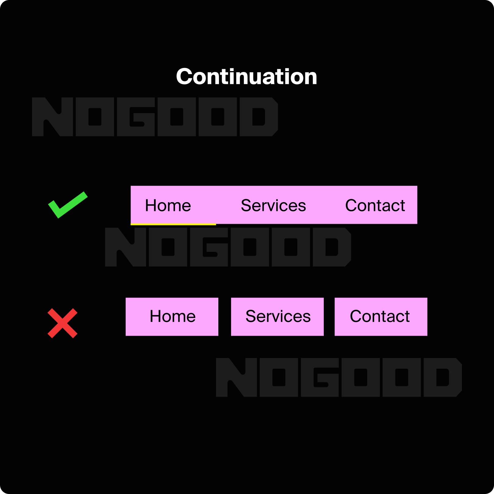
Continuity refers to the natural tendency of the human eye to follow a smooth path from one object to another. When designing, use this principle to guide the viewer’s eye along a desired path by placing important elements along this route.
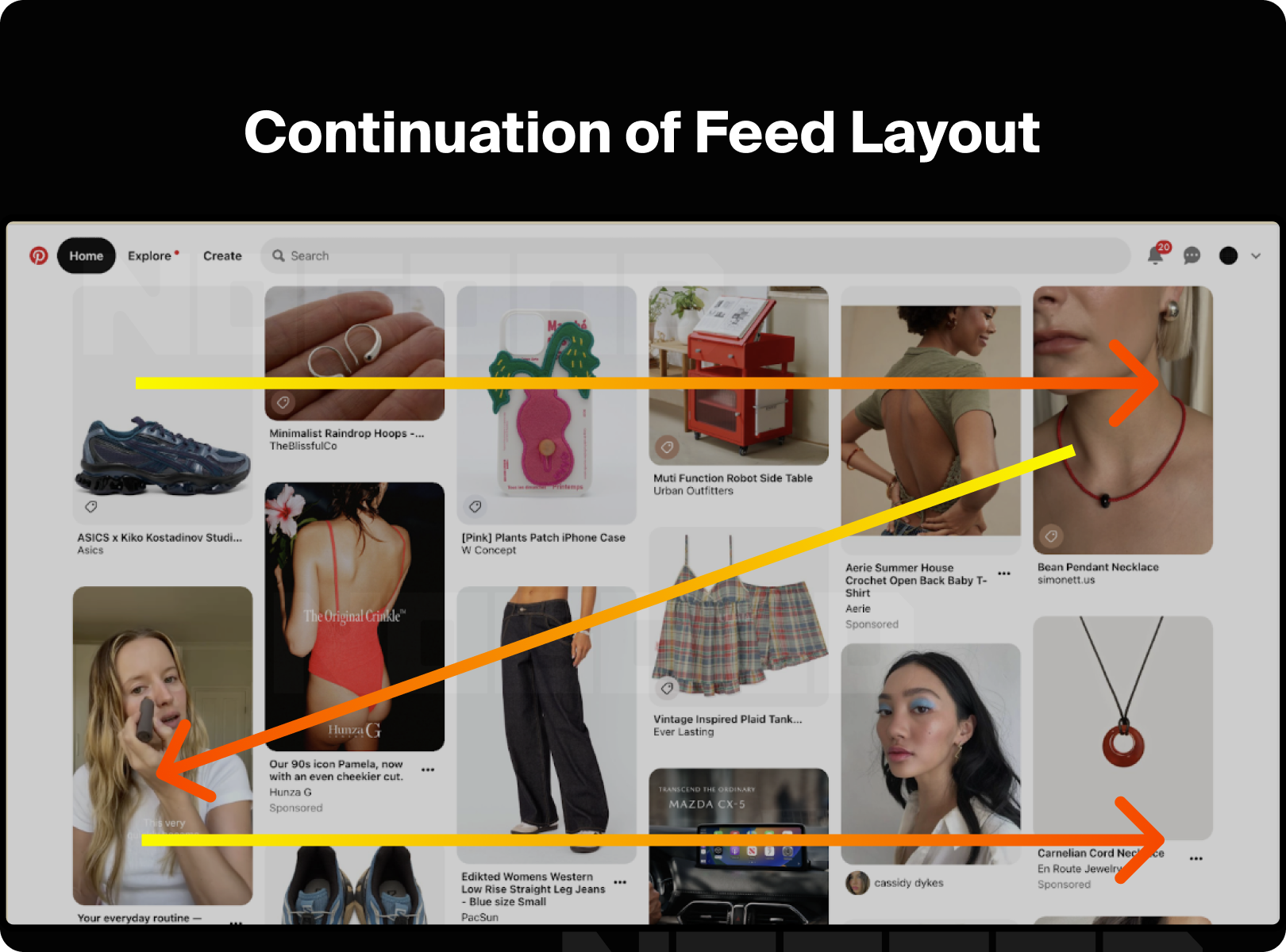
Consider the Pinterest UI. Image blocks are all different sizes, however, they’re arranged in columns which create unbroken vertical lines of negative space between the pictures. The continuity principle is apparent here, encouraging users to move up and down to view more content.
Closure
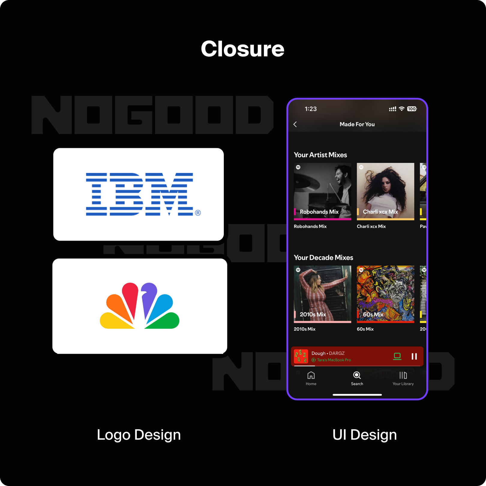
Closure is based on the eye’s inclination to perceive complete shapes even when parts are missing. Our minds fill in gaps to form coherent shapes, showing our preference for completeness. For example, we can still see the circle and rectangle below, even though the lines are broken.
Proximity
The principle of proximity states that elements placed close to each other are perceived as related, even if they differ in color or shape. Proximity helps group elements together and can enhance clarity. This is evident in form design, where text near a field indicates what information is needed. If text were placed farther away, it could lead to confusion.
Common Regions
Related to proximity, common regions suggest that objects within the same boundary are seen as a group. Use borders or visible separators to distinguish between different sections, even if elements are similar.
The principle of common region builds on the idea of proximity by emphasizing the role of spatial boundaries in grouping elements. According to this principle, objects that are enclosed within the same visual boundary or region are perceived as belonging together, regardless of their individual characteristics. This principle highlights the importance of visual containers, such as boxes, backgrounds, or any form of delimiters that group elements. By using borders or distinct backgrounds, you create a clear visual separation between different sections or categories, making it easier for users to understand and navigate the content.
For example, in a user interface, placing form fields within a shaded box or a bordered area helps users to see that these fields are part of a specific task or section, such as contact information or payment details. This grouping can prevent confusion and streamline the user experience by clearly delineating different parts of a form or page.
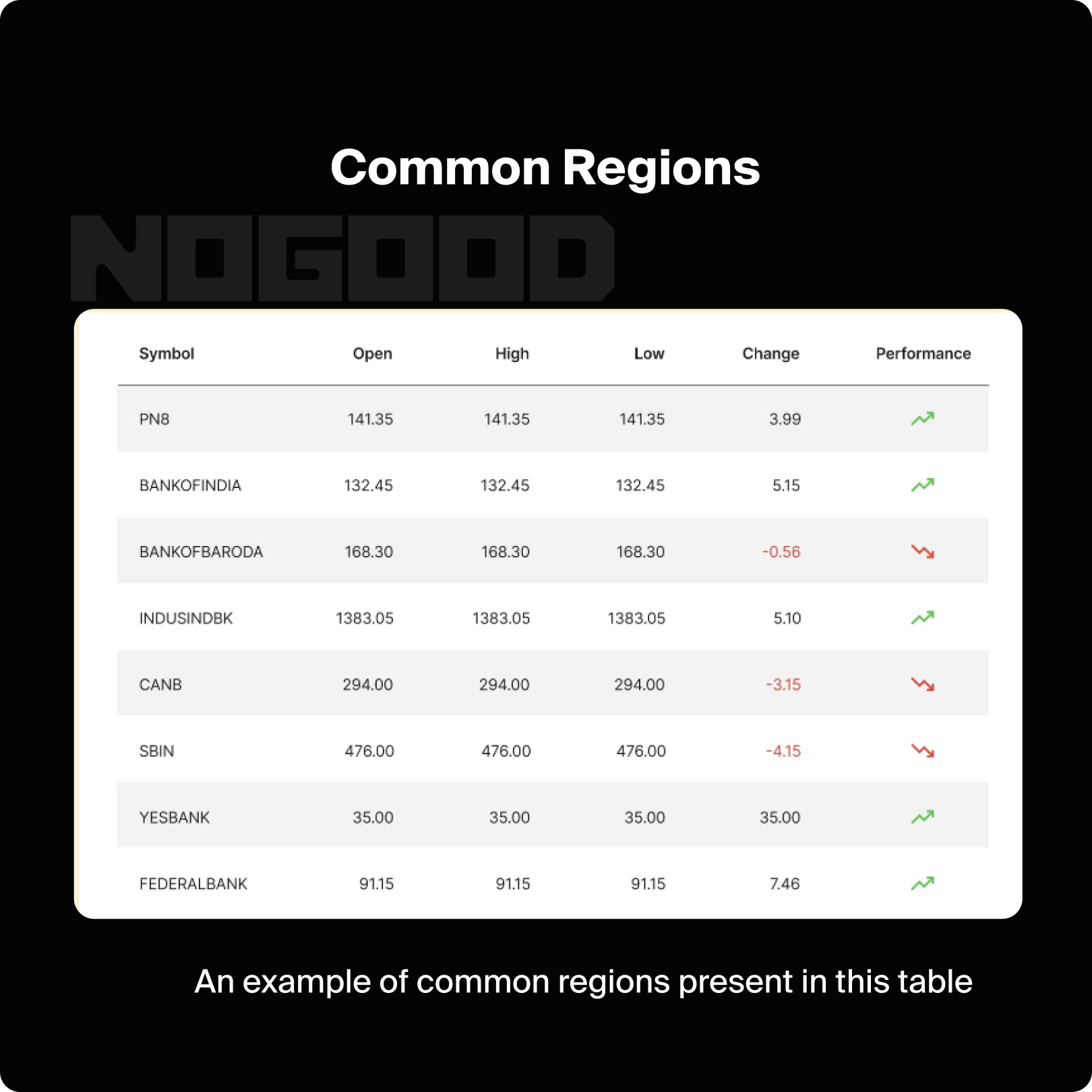
Common region can also be used to create visual hierarchy by grouping related items together while distinguishing them from unrelated content. This approach helps users quickly grasp the organization of information and focus on the most relevant sections without being overwhelmed by disorganized or scattered elements.This can also be helpful to attract the users attention to some important sections..
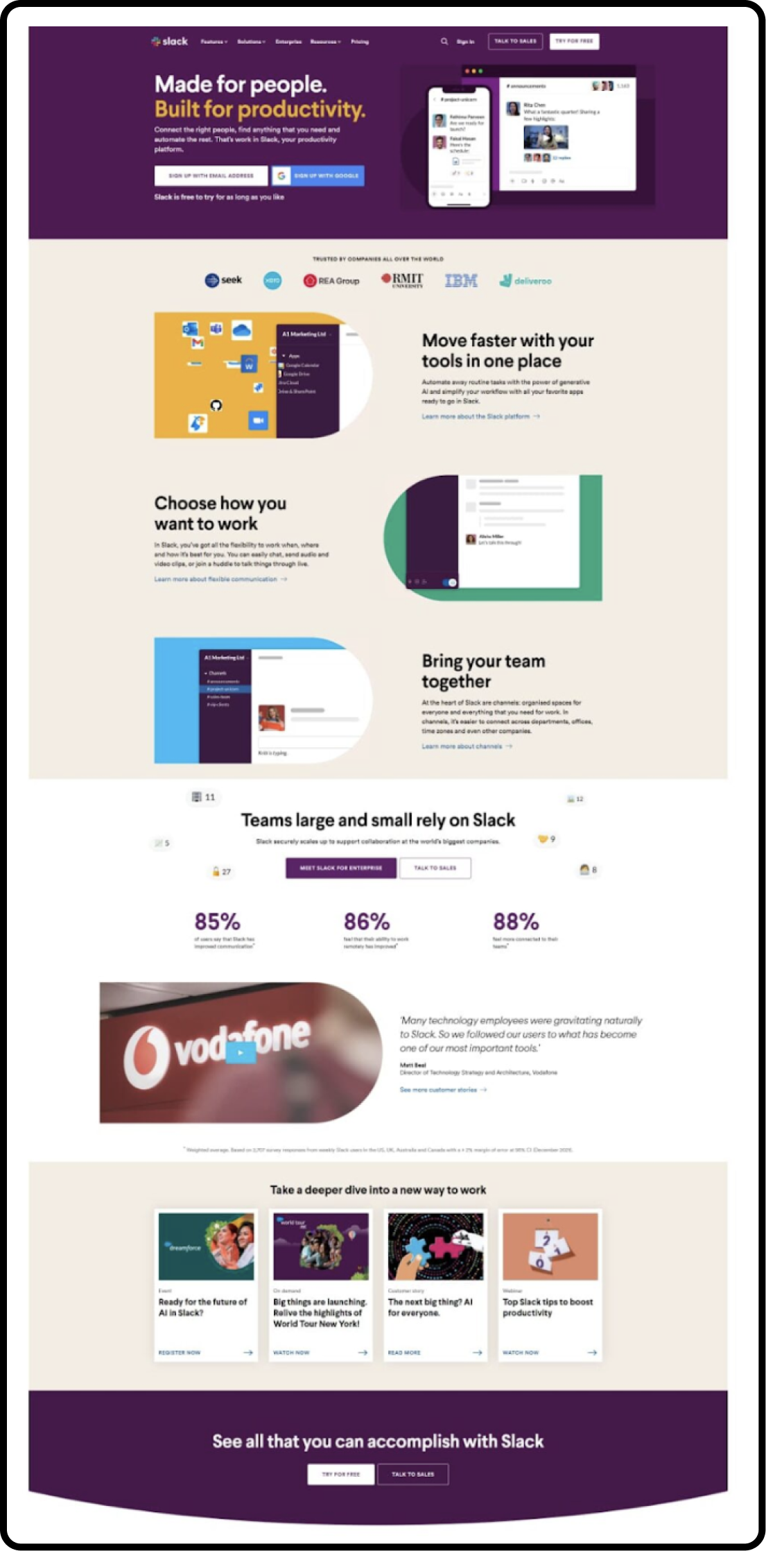
The Slack website makes a very good use of the common region principle. They have all the sections segregated by the regions – even though this module with a white background is also a kind of a common region. They are actually setting up the priorities through the background colors. The first and the last section are the most important sections in their visual hierarchy, that’s why they are grabbing most of our attention quickly.
Focal Point
The focal point is a crucial design element that draws the viewer’s attention to the most important part of a composition. It is the area of a design that stands out visually, commanding immediate attention and guiding the viewer’s focus. This principle is essential for ensuring that key information or calls to action are not overlooked.
To create an effective focal point, designers use various techniques to make certain elements stand out from the rest. These techniques include:
Contrast
Utilizing strong contrasts in color, size, or brightness can make an element more noticeable. For example, a bright, bold button on a neutral background will attract more attention than a subdued one.
Size and Scale
Larger elements tend to draw more attention. By making a key feature significantly bigger than other elements, you ensure it becomes the focal point of the design.
Position
Placing important elements in prominent positions, such as the center of a layout or the top of a page, can naturally draw the viewer’s eye. The top-left corner is often where viewers start looking, so placing crucial information there can be effective.
Color
Using vibrant or contrasting colors for key elements can make them stand out. For instance, a call-to-action button in a bright, contrasting color will catch the viewer’s eye more readily than a button that blends in with the background.
Whitespace
Surrounding an element with ample whitespace can also create a focal point. By isolating an element from other content, you make it more noticeable and important.
For example, in advertising, a promotional offer or key message is often highlighted using a large, colorful banner or an eye-catching graphic. In web design, important calls to action such as “Sign Up” or “Buy Now” buttons are strategically placed and styled to ensure they capture the user’s attention.

Figure/Ground
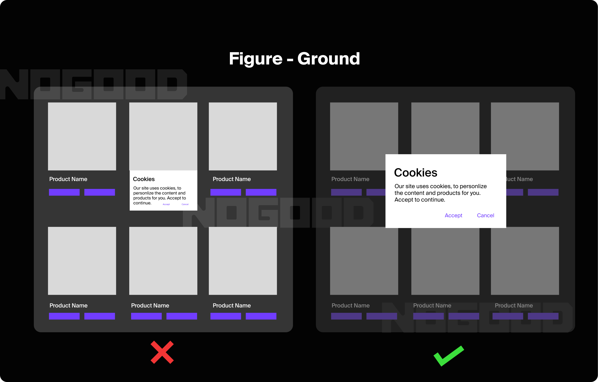
The figure/ground principle is central to visual perception, distinguishing between an object (the figure) and its background (the ground). This principle helps us interpret and prioritize what we see by clearly defining the focal point and its surrounding context. In design, effectively applying figure/ground ensures that key elements stand out and are easily identifiable against their backdrop. Techniques such as using high contrast, distinct colors, and adequate spacing help the main elements—such as text or buttons—become the figure, while the less critical content recedes into the background.
By simplifying the background or adding depth and shadow, designers can further enhance this separation, making important elements more prominent. For instance, a vibrant button on a muted background will attract more attention than if it were surrounded by similar colors. This principle also aids in creating intuitive designs, guiding the user’s focus precisely where it needs to be. Mastering figure/ground helps ensure that critical information and interactive features are both recognizable and engaging, ultimately improving the user experience by making interactions clearer and more effective.
3. Color Psychology
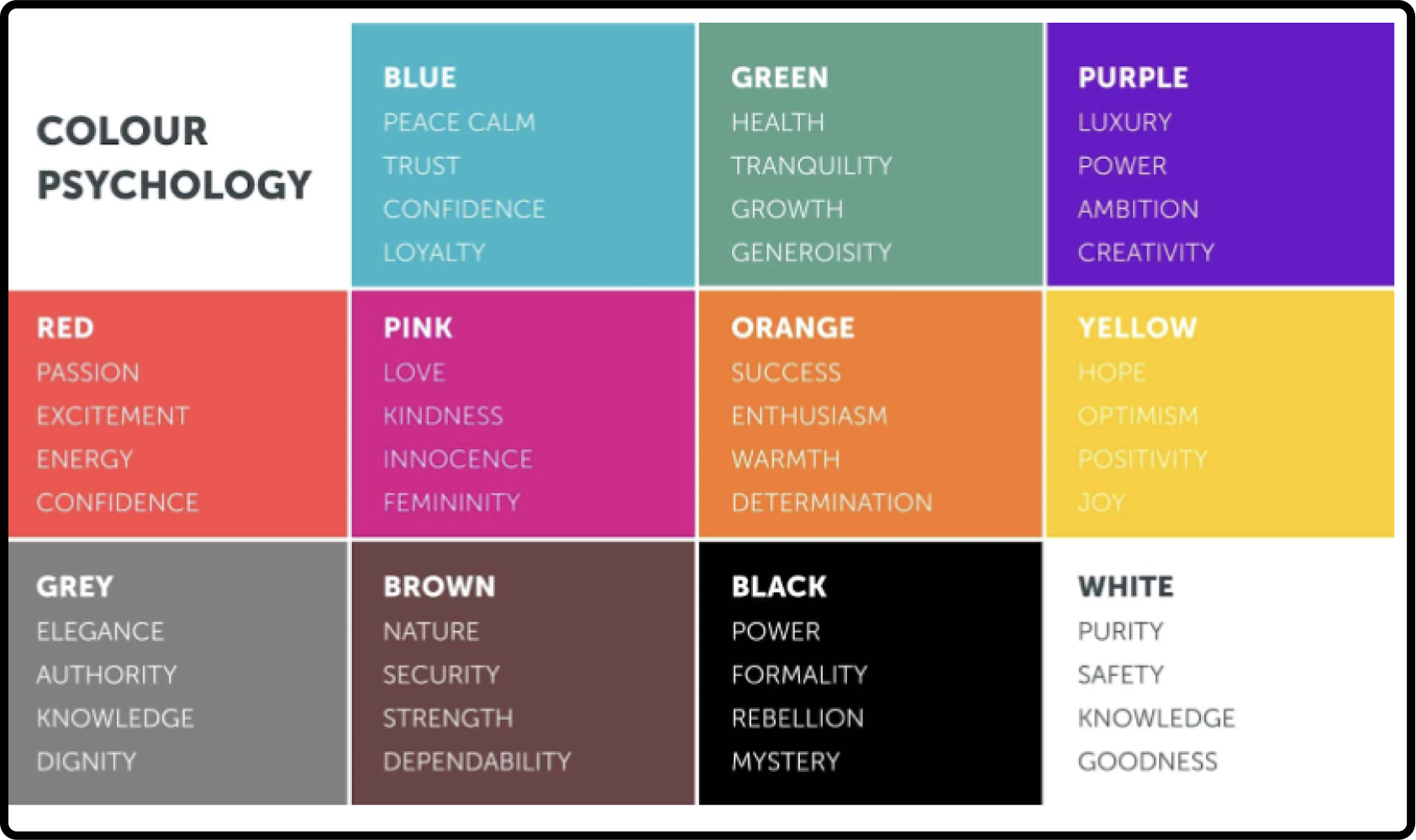
The study of color psychology is relatively recent, yet the fascination with color and its effects has ancient roots. Historically, colors were utilized in various cultures for healing and emotional influence, as well as in spiritual rituals. Why does color exert such a significant influence on our lives? What impact does it have on our physical and mental states? While individual reactions to color can vary, certain color effects are widely recognized.
Warm colors, such as red, orange, and yellow, fall within the red spectrum and are known to elicit a range of emotions. These hues can create feelings of warmth and comfort, but they may also provoke feelings of anger and aggression.In contrast, cool colors like blue, purple, and green, which are found on the blue end of the spectrum, are often associated with calmness. However, they can also evoke emotions such as sadness or detachment.
Understanding color psychology helps designers select appropriate color schemes that align with the intended message and audience preferences.
4. Typography and Readability
Typography affects how information is perceived and understood. Key considerations include:
Font Type and Size: Selecting an appropriate font type is crucial for readability. Serif fonts, with their distinctive strokes and lines, are often used in print for their classic and formal appearance, whereas sans-serif fonts offer a clean and modern look, making them popular for digital screens. Font size should be large enough to read comfortably without straining the eyes. Generally, body text should be between 16-18 pixels for web content to ensure legibility across various devices.
Line Spacing and Length
Proper line spacing, or leading, improves readability by preventing the text from appearing too dense. Adequate spacing between lines helps guide the reader’s eye smoothly from one line to the next. Similarly, line length should be optimal; text lines that are too long can cause eye strain and disrupt the reading flow, while excessively short lines can make reading cumbersome. A typical recommendation is to keep line lengths between 50-75 characters.
Contrast and Color
High contrast between text and background is essential for readability. Ensure that there is sufficient contrast to make the text stand out, particularly for users with visual impairments. Using a dark font on a light background or vice versa is a common practice. Additionally, avoid using too many different colors or font styles in a single piece of content, as this can distract or confuse readers.
Hierarchy and Emphasis
Effective typography also involves creating a clear hierarchy to guide readers through the content. Use different font sizes, weights, and styles to differentiate headings, subheadings, and body text. This hierarchy helps readers navigate and understand the content structure, making it easier to find key information.
Whitespace and Alignment
Incorporating whitespace around text elements prevents visual clutter and enhances readability. Proper alignment of text—whether left-aligned, right-aligned, centered, or justified—affects how easily readers can follow and absorb the information. Consistent alignment contributes to a clean and organized appearance, improving the overall reading experience.
Clear and thoughtful typography enhances readability and user experience, facilitating effective communication of the intended message.
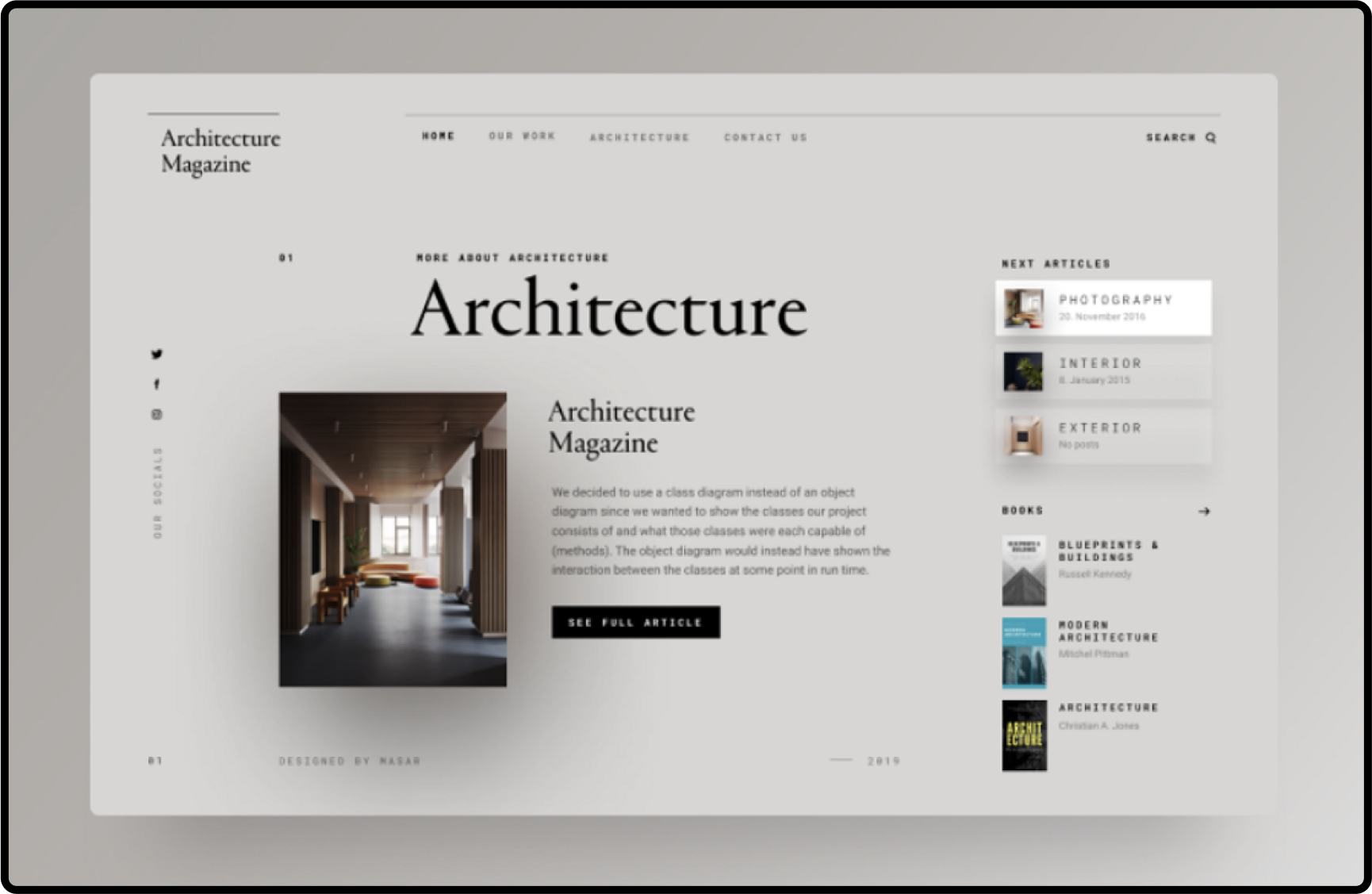
4. Cognitive Load Theory
At its core, Cognitive Load Theory aims to enhance learning and problem-solving by understanding the constraints of human memory. It divides cognitive load into three types—intrinsic, extraneous, and germane—each impacting how we process and retain information. Intrinsic load pertains to the inherent difficulty of the content or task, extraneous load refers to the way information is presented, and germane load relates to the effort invested in understanding and integrating new knowledge.
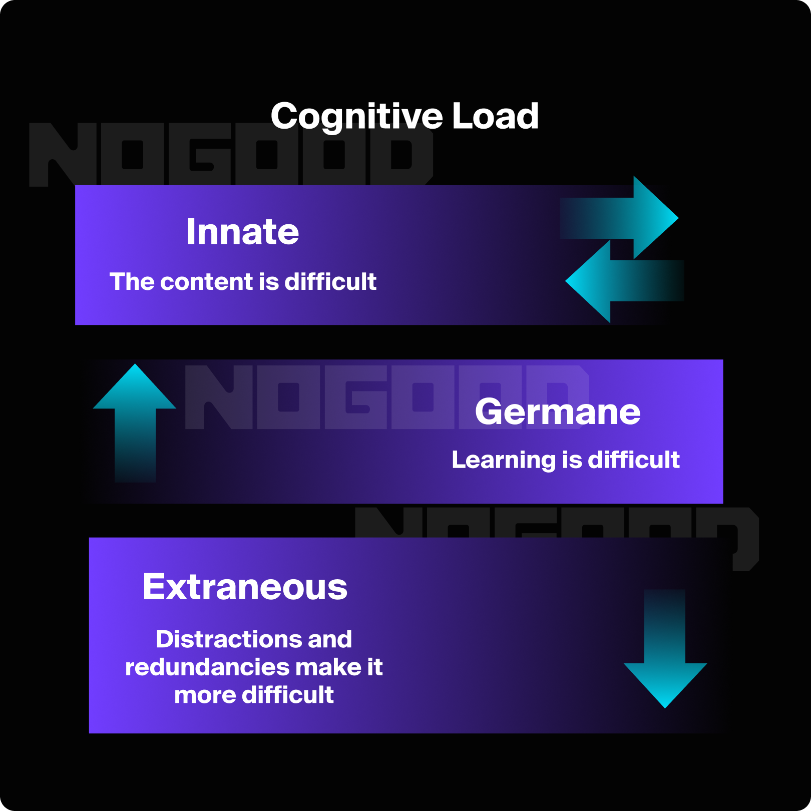
In the context of design, applying CLT means creating interfaces and interactions that align with these cognitive constraints. By managing and reducing unnecessary cognitive load, designers can make information more accessible, learning processes more efficient, and user experiences more intuitive. Effective design guided by CLT not only enhances usability but also promotes clearer communication and better decision-making. Understanding and applying these principles helps create environments where users can focus on the task at hand without being bogged down by cognitive overload.
Design Strategies to Manage Cognitive Load:
- Simplify and Prioritize Information: Present only the most relevant information and prioritize content to avoid overwhelming users. Use progressive disclosure to reveal details gradually as needed.
- Utilize Visual Hierarchies: Organize information with clear headings, bullet points, and visual cues to guide users through the content. Effective use of typography, colors, and spacing can enhance readability and comprehension.
- Incorporate Consistent Design Patterns: Consistency in layout and navigation reduces the cognitive effort needed to understand how to interact with the interface. Familiar patterns help users quickly learn how to use the system without having to relearn different elements.
- Provide Clear Feedback and Guidance: Offer immediate feedback to users to confirm actions or provide corrections. Clear instructions, tooltips, and error messages can help users understand and correct their mistakes without additional cognitive strain.
- Leverage Multimedia: Use images, videos, and infographics to complement textual information. Multimedia can often convey complex information more efficiently and make learning more engaging.
.
5. Emotional Design
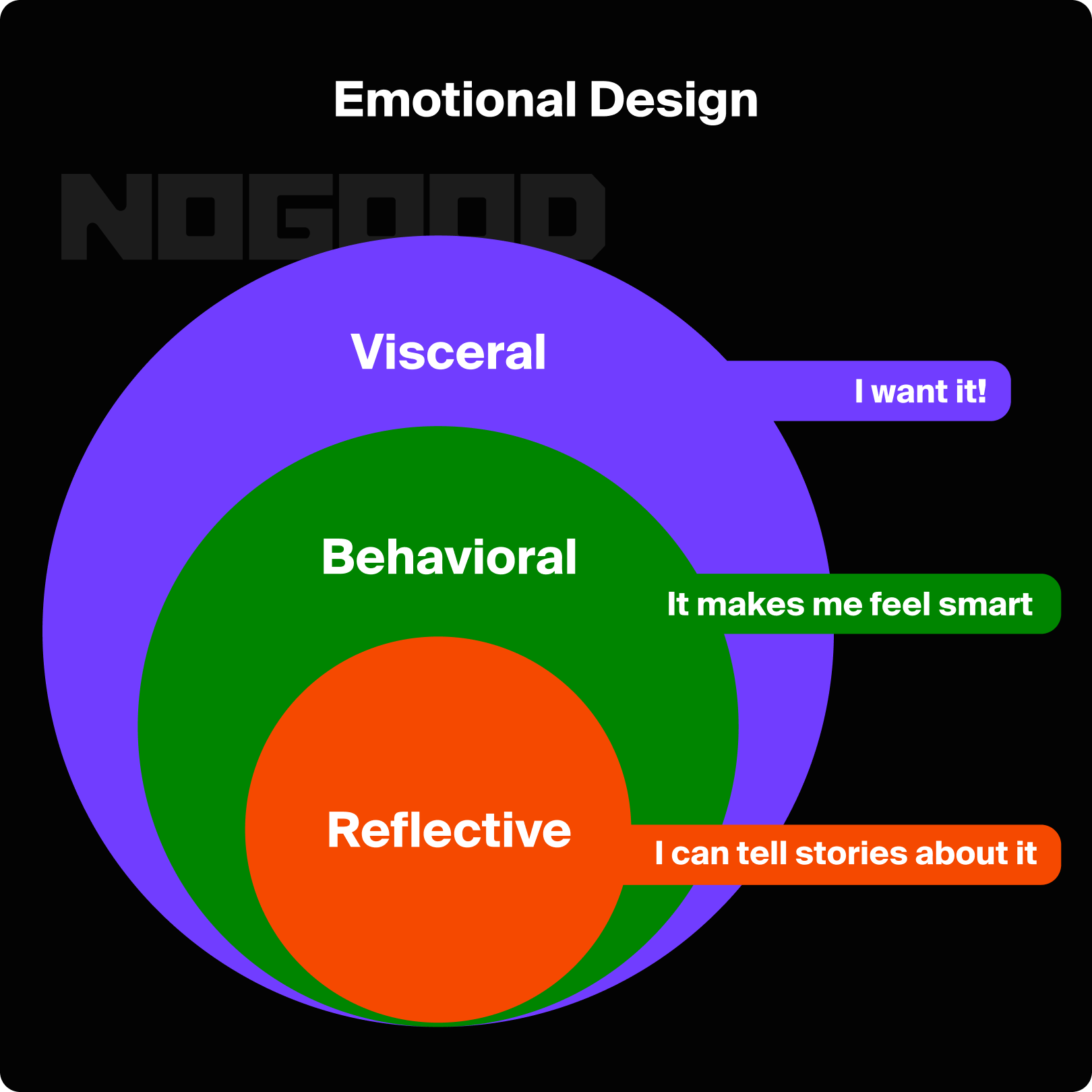
Don Norman’s book on Emotional Design set the standard for defining how emotions have a crucial role in the human ability to understand the world, and how they learn new things. According to Norman, emotional design is pivotal in creating products that not only function well but also resonate with users on an emotional level. He identifies three levels of emotional response: visceral, behavioral, and reflective. The visceral level relates to immediate, automatic reactions to a product’s appearance, such as whether it is visually appealing or aesthetically pleasing. The behavioral level focuses on the usability and functionality of a product, emphasizing the importance of ease of use and effectiveness. The reflective level pertains to the personal significance and long-term impact of the product, including how it aligns with users’ values and self-image.
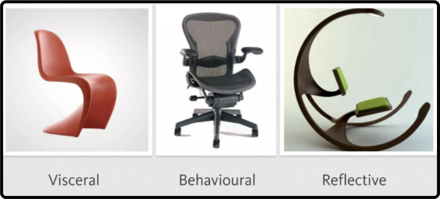
Norman’s theory underscores the importance of integrating emotional considerations into the design process to foster a deeper connection between users and products. By addressing all three levels of emotional response, designers can create more engaging and satisfying experiences. For example, a well-designed product should not only be attractive and user-friendly but also evoke positive feelings and resonate with users’ personal identities and values. This holistic approach to design helps build stronger user loyalty and satisfaction by creating products that are not only functional but also meaningful and emotionally rewarding.
Here are some ways to better implement emotional design in your product or service:
1. Understand Your Users’ Emotions
- Conduct interviews, surveys, and usability testing to gain insights into your users’ emotional needs and preferences. Understanding what users value and how they feel about different aspects of your product can guide design decisions.
- Develop detailed personas and user scenarios that reflect users’ emotional contexts and motivations. This helps tailor your design to resonate with users on a deeper level.
2. Design for Visceral Appeal and Uniqueness
- Invest in visual design to ensure that your product or service is attractive and appealing. Keep an eye out for what’s trending, what’s overdone, and what you can do to stand out from the crowd.
- Consider how your design engages multiple senses. For example, incorporating pleasant sounds, tactile feedback, or even scents can enhance emotional impact.
3. Create Positive Emotional Touchpoints
- Incorporate small, delightful features or unexpected positive interactions that can create moments of joy and surprise for users. These can range from playful animations to rewarding feedback.
- Design elements that evoke specific emotions, such as nostalgia, excitement, or comfort. Understanding the emotional triggers that resonate with your audience can enhance engagement and loyalty.
6. Iterate Based on Feedback
- Use feedback from users to refine and enhance the emotional aspects of your design. Regular updates based on user emotions and experiences ensure that your product evolves to meet users’ changing needs and expectations.
- Test different design approaches to see which one elicits the most positive emotional responses from users. This can help you fine-tune your design for maximum emotional impact.
Final Thoughts
Integrating these psychology-driven principles into your design process can transform your creations from visually appealing to impactful and meaningful. By understanding how humans perceive and interact with designs, you can craft experiences that resonate, communicate effectively, and leave a lasting impression. Whether you’re a seasoned designer or just starting out, incorporating these principles will help you create designs that not only look good but also fulfill their intended purpose with clarity and effectiveness.


