
Nowadays, marketers work regularly with large lumps of data. Due to its complex and often chaotic nature, thousands of rows of numbers can be overwhelming when trying to digest with the bare human eye. Therefore, creating data visualizations has become a significant skill set that allows us to comprehend what’s presented to us, draw connections, and come up with conclusions. It is a skill that the better you get at it, the more efficient the decision-making process becomes, allowing you to keep close sight of your northern star in an ocean full of often distracting data.
Big data visualization is usually done via a data visualization tool that collects the entirety of the data source and distills it into “bite-sized chunks” that can be visually analyzed based on the context or dimensions and metrics set. Data visualization tools vary significantly in difficulty levels and features. Choosing the right fit is often dependent on your specific data visualization needs. However, in general, the best data visualization tools are the ones that can handle multiple, vast sets of data in one data visualization; for that metric, Tableau established itself as one of the best.
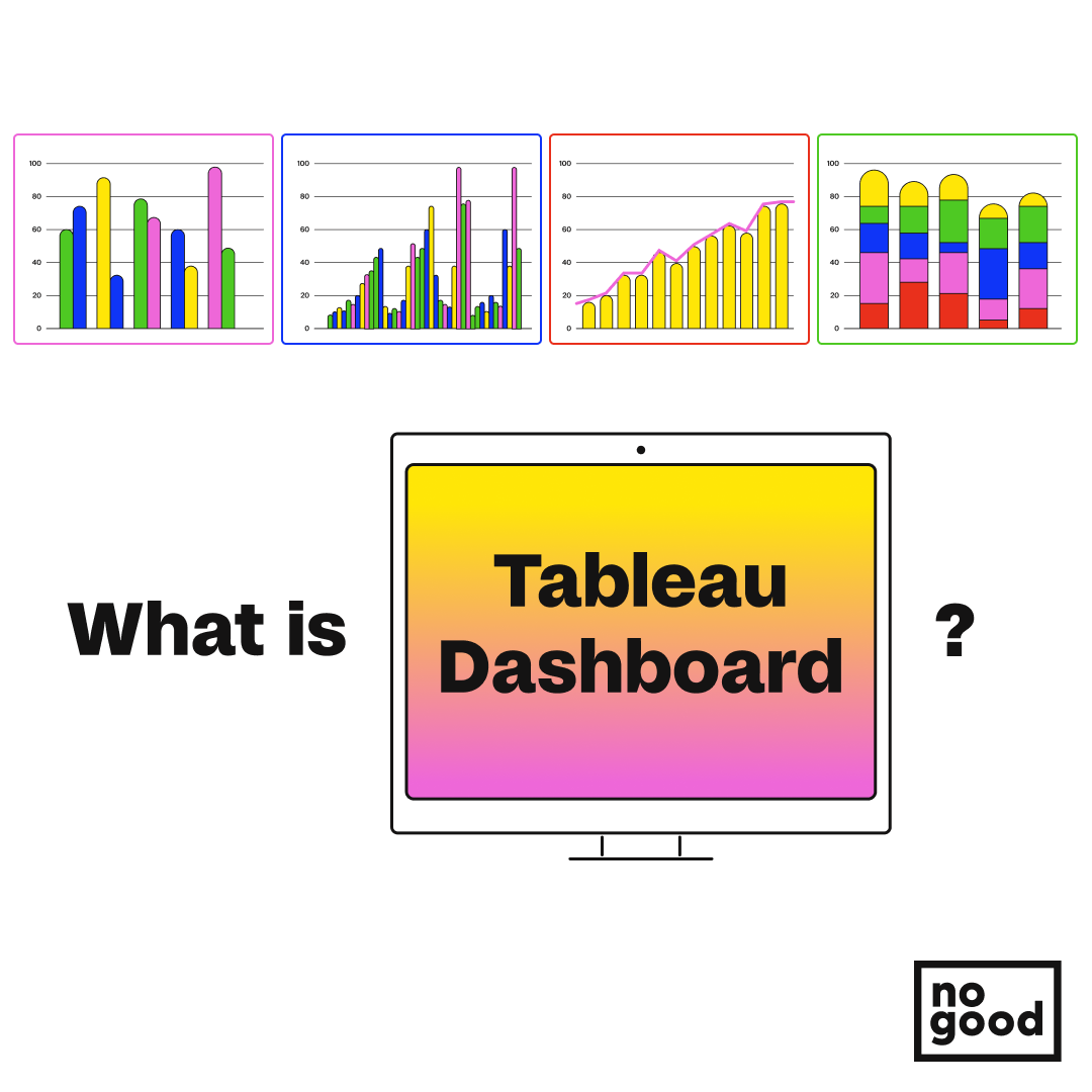
What is Tableau?
Tableau is a data visualization tool well established in the BI (Business Intelligence) along with Power BI industries. It comes in desktop and web (online) versions and has a free public offering. Tableau has a specific and clear role: to simplify and condense data to a point where it can be presented and easily understood by the entire team, not just the data analysts. Tableau repurposes data into outputs of charts and graphs that can visualize trends and correlation patterns. The ability to handle data from tons of import options and often at the same time makes Tableau one of the more robust data visualization tools available in the market.
What makes Tableau unique?
Off the bat, Tableau is one of the most accessible data visualization tools to learn as it doesn’t require many prerequisite skills nor any beforehand knowledge of programming. Tableau is highly user-friendly as it can work with any data types. This means you can utilize and learn Tableau for any field you are in without confinements. You can also get to experiment first with Tableau public or Tableau online to understand the know-how before committing to any billing plan. When comparing Tableau to other data visualization tools, Tableau allows the user to utilize a variety of shapes, figures, labels, colors, etc., to illustrate the relationship between various data variables while also automating recurring processes by pre-setting up calculation fields.
How to set up Tableau?
Connecting the data source:
There is a big range of platforms Tableau can connect with. Your data source can be anywhere from a spreadsheet (like Excel) to fully fledged data servers (like MySQL or Oracle database). To connect with your data source, choose the file or data services you need from the left-hand side of the Tableau desktop.
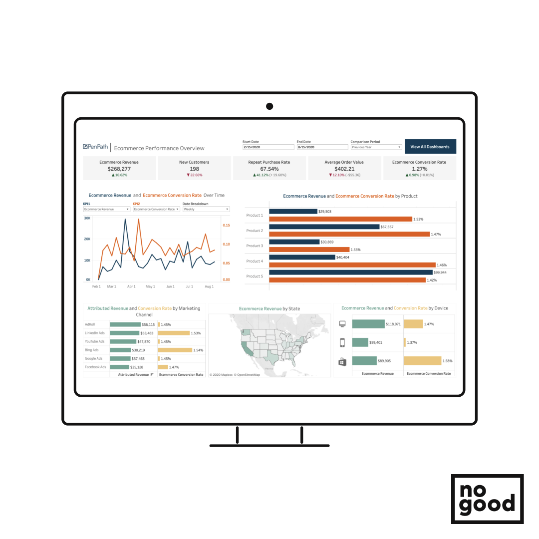
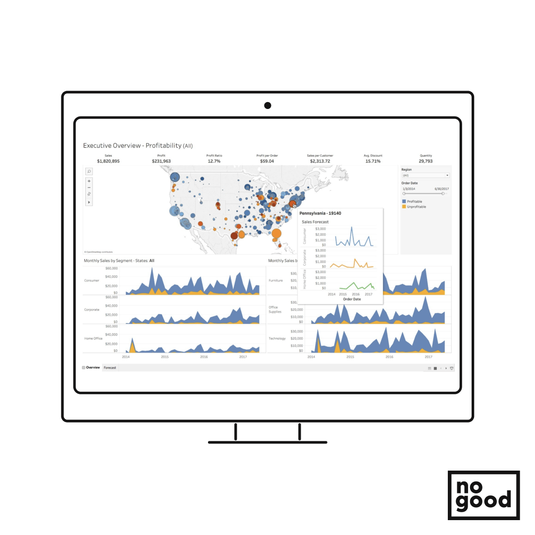
With your data source connected, you can start playing around and exploring the different ways you can construct your Tableau dashboards. Tableau already has prebuilt report templates that you can use. When building your charts or graphs, Tableau gives you a quick overview of every chart and how to employ it and then you can drag and drop any metrics or dimensions you need in order to adjust it. For example, pie charts compare two or more independent variables against each other. In contrast, a bar chart measures the effect of a single independent variable on a dependent variable (for example, the impact of time on fruit ripeness). Understanding which type of graph/chart suits your data is essential to working efficiently and analyzing it in a way that suits its context and dimension. At the same time, everything you are building on Tableau will eventually get published and saved to your Tableau server where you can access it from anywhere.
Benefits of data visualization:
1. Make your KPIs more clear:
Sometimes all we want is to give a brief overview of how a marketing campaign performed in relation to a specific KPI. Or perhaps we are unsure of the sales metrics and KPIs to watch for. In that case, for your needs in data visualization, consider employing indicators. For example, integrating “a gauge indicator” representation enables you to rapidly determine whether your progress is below or above the objective.
A tip regarding that would be to use color coding, such as red/green or up/down pointers so the differences between data are more obvious. Even better, you could design your unique images and indicators to tell an attention-grabbing story.
2. Find the optimum way of presenting your data:
While often you can present your data in multiple forms, there is usually one that stands out from the rest in terms of optimization and one that works best based on your client’s needs. As mentioned above, there are dozens of graphs/charts you can utilize on Tableau to present your data.
The optimum chart/graph is the one that would score the highest if you assess it in terms of readability, how quickly it can portray your story, and whether it would lead to any misinterpretation when looking at it from a neutral perspective. Set your goal to visualize data that speaks for itself and is as straightforward as possible. For example, pie charts and bubble charts present magnitudes of data in terms of size/angle. The greater the circle/rise, the larger share this piece of data contributes to the whole set. The subtle difference is that while pie charts are pictorial representations of data, a bubble chart can be thrown on an X-Y axis providing a scatter plot that can present both magnitudes and trends when compared to just extents for pie charts — which in some cases is a more optimal approach when looking for share time graphs. Mastering how to pick the optimum presenting format isn’t easy but essential when looking to escalate from good dashboards to great ones.
3. Sort your data, and save time:
While this may be a more pronounced tip, it is often forgotten, and its effects can be detrimental. When creating charts, most commonly scatter graphs and bar charts, a straightforward way to make your chart easier to understand and outline trends is to sort your data. Data sorting is any procedure involving putting the data in a meaningful order to make it simpler to comprehend, examine, or visualize. Sorting is a simple technique that visualizes data in a way that makes it simpler to understand the story the data tells. Both raw and aggregated data (scatter plots) can be sorted (charts, tables, etc.). There are a few typical sorting applications when working with any data. Data cleaning, which is the process of sifting data to check for anomalies or potential outliers in a data pattern, is one of these applications. Sorting frequently rates items and develops action plans for lesser rankings. To interpret data accurately, it is crucial to correctly organize visualizations (tables, charts, etc.).
4. Put life into your numbers:
When you want to present visual data to alert the viewer about a specific value or magnify the significant difference between given values, an easy trick is to utilize colors and shapes in your arsenal. Sometimes presenting aggregated data in tables or graphs does not grab the attention of potential differences in comparable data, which could take longer to notice or even be neglected altogether!
5. Campaign enhancement:
Businesses may better plan, and enhance their marketing initiatives with data visualization. You can visualize marketing campaign data to find the appropriate target demographic and create personalized content that is more likely to result in a sales conversion. Concentrating on what is most effective, you may optimize budget allocation while making changes to your campaigns in real time based on campaign performance visualization.
6. Messaging optimization:
Data visualization allows you to examine the best content types for various lead categories. Knowing which kind of information attracts a given audience most effectively and which distribution method produces the best results, you can tailor your content. You may improve the lead nurturing process and raise the likelihood of a sale by sending your leads more tailored messages.
7. Churn rate forecast:
Churn rate is a term used to describe the rate of customer attrition or the proportion of customers who discontinue utilizing your goods or services during a predetermined time frame. You may instantly spot the early warning indicators and be informed of the probable loss of a customer with the aid of data visualization. This allows you to make necessary adjustments and keep the client before it’s too late. Additionally, you can use business data visualization to upsell or cross-sell your products depending on customers’ previous purchasing patterns.
8. Boost the timeliness and effectiveness of your reporting
Additionally, it may be configured to gather data from various sources and turn it into a pure data stream for analysis and display. Data standardization shortens the time it takes for businesses to respond swiftly to shifting markets or making any type of changes. It is evident that data visualization can create new opportunities for enhancing any marketing or company endeavor. Because data scientists are professionals in data management, businesses frequently use them to explore long-term investment opportunities.
9. Fostering engagement:
By nature, data visualization is interesting. There are many figures involved when you offer data about the ROI of content marketing, for instance, right? The board will be able to see all the points you emphasize that will impact them if you can demonstrate the results of your campaigns with a captivating and well-made visualization. You can increase the effectiveness of this material by utilizing certain strategies, such as data storytelling. People are more likely to respond favorably if they comprehend what you are saying and the evidence you are presenting to support your opinions. Graphics provide immediate gratification.
10. Helps you have a clear objective and test a hypothesis for your data:
Having a vague objective might be one of the deadliest mistakes you could make in data analysis. As data visualization sets up data analysis, clearly understanding what you are looking at is critical to constructing dashboards that tell a well-organized story. You need to ask yourself, “What question will my visualizations answer?” You can then make your data sets as outcomes for clearly set hypotheses with your data visualizations answering the question of possible trends and the ability to conclude. And for data analysis, a clear objective allows for proper data collection with visible outcomes. These outcomes allow for solid interpretations and robust research such as the Gartner Magic Quadrant one. In addition to providing the whole IT community with much-needed guidance, Gartner was founded to conduct high-quality, unbiased research on the rapidly evolving IT market. Gartner can identify the current IT standards and the industry trends that may materialize in the future because to its worldwide reach and presence in more than 100 countries.
Conclusion
We can infer that data visualization provides many advantages. It enables quick and efficient communication. Your capacity to recall crucial information is enhanced and it distributes information more easily across all media. This allows you to make decisions more quickly and accurately.
It assists you in determining the variables that influence consumer behavior and highlights areas of your business or project that require development. For the purpose of achieving particular objectives, it is possible to forecast sales and time frames.
It is crucial to remember that every data measure offers different information to stakeholders. The value will be greatly increased by gathering focused measurements that offer particular insights. Businesses that invest in data visualization will eventually reap the rewards.