
During the early stages of starting a company, most businesses will establish a general foundation of how their brand will look, feel, attract consumers, etc. They combine these elements into a “brand guideline,” which helps the company stay consistent with its identity. Now that we’ve understood guidelines consist of typography, photography, color, logo, etc., how can companies evolve their guidelines to stand out from other competitors?
Through a rebrand or refresh, businesses are able to modify their brand to fit their current tone of voice. You may wonder, what’s the difference between a rebrand and a refresh?
A refresh typically involves a brand changing its appearance, such as revealing a new logo, color palette, font, etc. By altering its visual assets, a business can appeal to a newer generation or consumer group and it can “freshen” up its overall look. A rebrand, on the other hand, is when a company changes its identity and tone of voice. This is a change in how a brand will tell the story of their business to consumers and approach them in a different way.
To further explain the difference between a refresh and a rebrand, this article will cover different examples of brands that redesigned their guidelines with the intention of modernizing their overall look and brands that changed their identity completely.
Baskin-Robbins
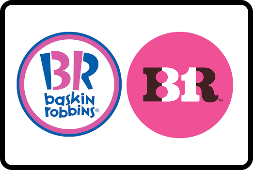
In April 2022, ChangeUp, a design studio based in Ohio, assisted Baskin-Robbins in its rebranding. Previously, Baskin-Robbins emphasized their “31 flavors” and how consumers could try a new flavor each day for a month; however, after more than 75 years of being part of countless celebrations worldwide, they developed a new slogan “seize the yay.” According to Vice President of Marketing and Culinary at Baskin Robbins, Jerid Grandinetti, this new tagline encourages people to stay young, seize the day, and celebrate every moment with a sweet treat.
To incorporate its new manifesto into the new brand guidelines, ChangeUp did research on Baskin-Robbins’ history and upbringing. They were heavily inspired by its circus roots and wanted to add a modern touch to the overall look. Despite the change in identity and overall look, the designers of ChangeUp kept the tradition of highlighting the number “31” in the logo.
Dunkin’
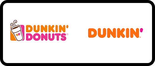
In January 2019, Dunkin’ Donuts rebranded and shortened its name to Dunkin’. Because this company has successfully grown to attract consumers worldwide, reducing its name to “Dunkin’” was another way to modernize its brand, appeal to a younger audience, and initiate what the future looks like for the business. For this project, Dunkin’ partnered with JKR, a creative agency based in London, New York, and Shanghai, to create a shift in how Dunkin’ is presented to consumers.
While many consumers noticed the drop in “Donuts,” they did not have a problem with recognizing the brand. In fact, people found the simplification of the name to be beneficial and necessary for the company to expand. Consumers would no longer correlate Dunkin’ with donuts since the shop provides other menu options, such as a variety of drinks, coffee, food, and more.
JKR also designed a bold new logo, typeface, icon set, color palette, etc. to go with the rebrand and capture the future of Dunkin’. Despite it being a rebrand, JKR has also carried visual elements from the previous guidelines, and added more curves and pop to the overall look.
Meta
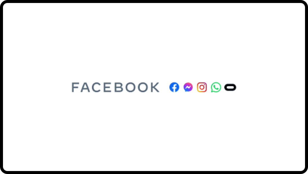
In October 2021, it was announced that Facebook, Messenger, etc. would be combined under the rebranded name Meta. Meta, also meaning “beyond,” would take the company to a virtual world where people can interact with others through an avatar and live life in a new realm.
The logo was designed to be tangible, flexible, and interactive to represent the dynamism of the Metaverse. While the shape of the logo does not resemble the underlying platforms (such as Instagram), Meta continues to utilize the saturated blue hue that people commonly associate with Facebook.
With the new name and symbol, Meta encourages users to join the virtual world where everything is the same but more flexible. Flexibility is emphasized throughout the branding as everything is constantly moving and/or changing in shape. They also include documentation of different perspectives that can be exhibited when entering the virtual world, showing that the Metaverse allows people to be creative and live in a realm where there are no limits.
Coinbase
In 2021, Coinbase had a successful refresh with the help of Monikers, a design studio based in San Francisco. With this refresh, it was important to highlight how Coinbase was not only a safe environment but it allows everyone to invest, store, send, and use money without the involvement of the government or banks. This would give people the freedom to make global economic decisions any time of day, as long as they have a phone and internet connection.
Wanting to highlight this versatile and safe platform, Monikers took inspiration from wayfinding signs to redesign a clean, simple, and modern look that reinforces their goal of providing a balanced, accessible, and flexible space. The brand refresh consisted of a change in logo, typeface, color palette, layout, and motion, which all contained elements of stability and balance. For instance, after many logo iterations, they landed on a c within a circle (resembling a coin icon) due to its simplicity.
The brand also utilized motion to stress how Coinbase prioritizes freedom and safety. By being straightforward and clear with the overall brand refresh, consumers were able to understand what Coinbase provides and utilize the platform with less confusion.
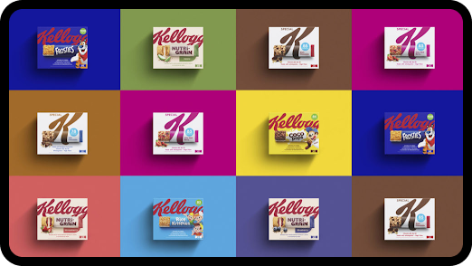
Kellogg’s
In 2019, Kellogg’s collaborated with Landor and Fitch to refresh their brand, after seeing a decrease in interest from consumers. By creating a consistent and balanced type-to-image hierarchy, Kellogg was able to make a prominent presence as a snack/breakfast business on store shelves.
By creating a cohesive and balanced brand system, Kellogg was able to establish a strong presence as a breakfast/snack provider for consumers. The business name expands to take up the limited space of the package, whereas a photographic image of what the product is, appears on the bottom. This allows Kellogg’s name to clearly show and be seen on store shelves. In addition, the photographic element on the bottom follows what has been done previously. The difference, however, is the name balance between the large type and image, which share the small space that is available for design.
Through this refresh, Kellogg reminded people of the different cereals/snacks that were frequently consumed in the past. They also reestablished their presence through their cohesive design across a variety of products.
Instacart
In March 2022, Instacart worked with Wolff Olins to refresh its logo, color palette, and brand system. Inspired by brands that utilize motion to symbolize movement and transformation, Instacart continues to use an “approachable” carrot in its logo but takes advantage of the stem to create an arrow. This arrow represents how simple it is for consumers to add products to their carts and communicates the various options it provides. Due to its versatility, the arrow is frequently repurposed in its display ads, which shows how people can use Instacart to quickly purchase grocery items.
Meanwhile, Instacart has also refreshed its colors to be brighter and appeal to the younger audience. Each color represents a category of food (ie. “kale” green, “turmeric” yellow, and “guava” pink), ultimately livening the entire brand system. With this change, Instacart has made a greater presence among the younger generation who utilize delivery services for a multitude of purposes.

The Art of the Refresh
When observing these rebrands and refreshes, they all share the commonality of adding motion throughout their guidelines. Explaining brand guidelines using animation instead of words, make it easier to understand how to use certain elements. Also, animating the guidelines helps emphasize a brand’s tone of voice that they are attempting to capture through its rebrand/refresh. An additional benefit of creating an animated guideline is the introduction of a soundtrack that plays in the back. Music allows people to feel a certain way, which words can only do if they are written with a poetic intention.
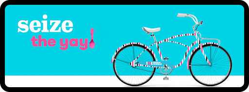
We can also see the addition of product mock-ups that are applicable to the consumer and go further beyond a hoodie, shirt, etc. Creating products that resonate with the business empathizes with what mood a company is attempting to capture through its brand. For instance, Baskin Robbins presents a bicycle that does not seem to correlate with ice cream. At first glance, it could seem out of place; however, bikes can remind people of the past when they would chase a neighborhood ice cream truck with their friends. This also allows Baskin Robbins to share its tagline “seize the yay” as bikes give people joy from the beginning, middle, and end of a journey.
Hitting Refresh
Whether it is a rebrand or refresh, it’s important for companies to make modifications to their identity and visual look as trends continue to change over time. By observing case studies of recent brand guidelines, evolving businesses can get an insight into what the next design trends are. Being ahead of the curve can not only gain more attention from consumers but it can also set an example for what a successful rebrand or refresh looks like. As Baskin-Robbins puts it, “Seize the yay” not the past.