Imagine trying to navigate your computer using only text commands. Turning your brightness up, opening an app, or closing a tab would mean typing out a string of code and memorizing complex syntax. Sounds really inefficient, right? This is where Graphical User Interfaces, or GUIs, come into play, fundamentally changing the way we interact with technology.

What is Graphical User Interface (GUI) Design
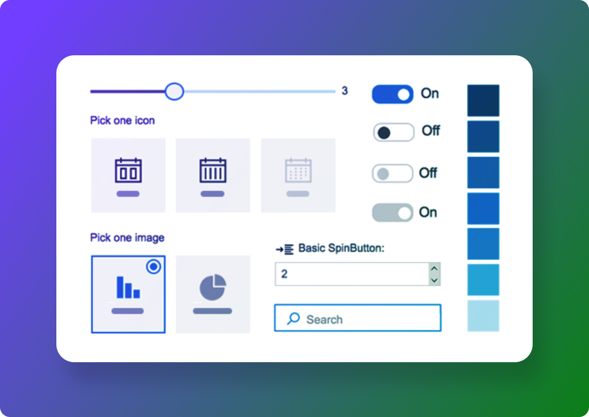
GUIs use visual elements like icons, buttons, and menus to make digital interactions more intuitive and user-friendly. Some of the most generic examples of GUI design are buttons that you can click on in apps or a dropdown menu on an online store that expands. Designs as simple as an X to close out of a tab, or a triangle play button on a YouTube video are examples of GUI design that has made the act of interacting with digital products much easier. Believe it or not, these micro-interactions didn’t always exist, although they seem so standard in any digital interface now.
From the early days of clunky interfaces to today’s sleek and intuitive designs, GUIs have come a long way. They’ve not only made our interactions with technology more efficient but also more enjoyable. So, whether you’re swiping through your smartphone or clicking through a software application, you have GUIs to thank for making all of these interactions much more seamless and engaging for users.
Early History of GUI Design
Although these icons and symbols are now standard in every interface, they didn’t always exist, and neither did interfaces in general. Ever since the first large-scale mechanical computer was invented in 1931 by Vannevar Bush, computer scientists and engineers have been working diligently to make them easier to use. For the first thirty years, computers didn’t include any windowed interface or mouse. It was not until 1973 when the Xerox Palo Alto Research Center (PARC) developed the Xerox Star, the first research system to incorporate windows, icons, and a pointing device, laying the groundwork for the future of graphical user interfaces.
After the Xerox Star became available for commercial use in 1981, Apple released the Apple Lisa in 1983 with the goal of making navigation easier for new users. Since computers were just beginning to be available for everyday people, without research or technical computer training, the idea to make computers easier to use was incredibly successful. In their approach, Apple implemented drop-down menus, folder-based directories, and early widgets that could be moved around on a desktop. In other words, Apple was pivotal in popularizing GUIs by making computers more intuitive with recognizable physical references.
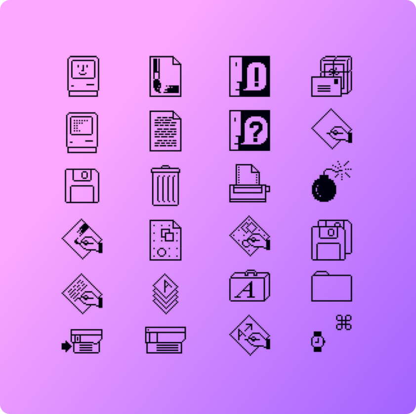
From there, it was clear that implementing GUIs in personal computing was here to stay, given the success of Apple. Susan Kare, a fine artist and sculptor was hired at Apple to design icons for the first Mac, released in 1984. This was the first time an artist was brought in to contribute to computer design and innovation and this key integration has shaped the visual landscape in GUI design to come. Kare, relying on her education in mosaic design and needlepoint, created simple icons in a 32×32 pixel grid, such as the first trash bin, save, loading, finder, and file icons, which most are still used today in a variation of the original design.

The Significance of GUIs in Design
Today, GUIs are everywhere. ATMs use them to guide us through financial transactions effortlessly. Smartphones, with their intuitive touchscreens and app icons, allow us to perform a myriad of tasks with just a few taps. Personal computers, whether running Windows, or macOS, rely heavily on GUIs to enable users to navigate the system, manage files, and run applications with ease.
Central to GUI design is the WIMP model, which stands for windows, icons, menus, and pointers. This model has been the cornerstone of GUI design since its creation, providing an organized and familiar way for users to interact with their devices. Windows allows multitasking by letting users open multiple applications simultaneously. Icons serve as visual representations of programs and files, making them easy to identify and access. Menus organize commands and features in a hierarchical structure, and pointers enable precise navigation and selection. These four elements appear in almost every digital interface today and are generally similar from program to program. Without these four elements, users would be interacting with chaotic and confusing interfaces.
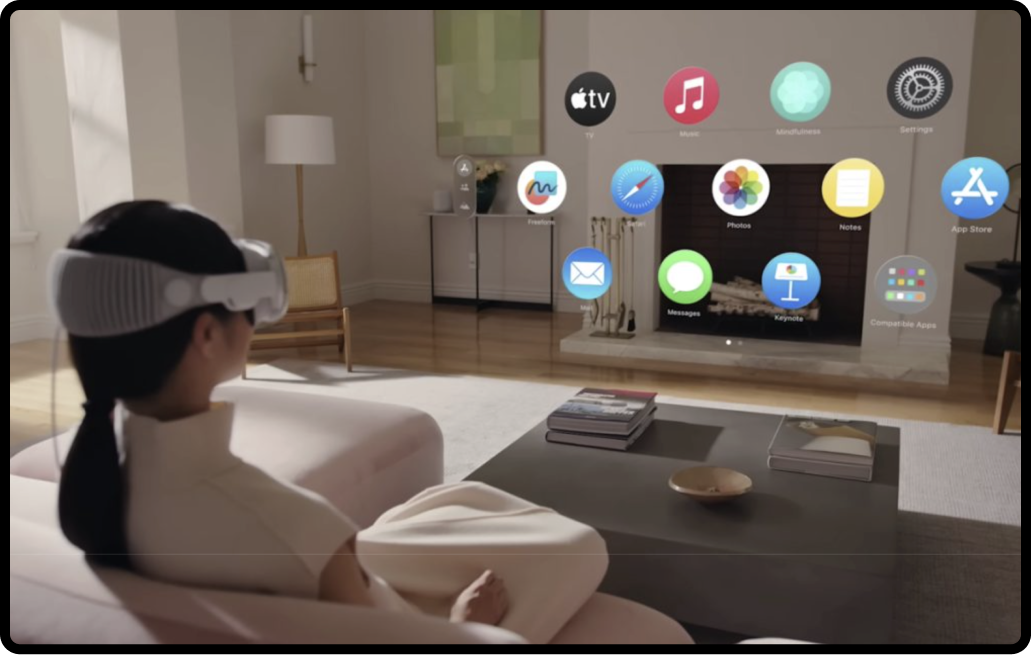
However, GUI design hasn’t remained static. With mobile devices and recent advancements in technology, we’ve seen a shift towards post-WIMP interfaces. These interfaces often incorporate gestures, voice commands, and even 3D interactions or retina tracking, providing more natural and immersive ways to interact with our devices. For instance, smartphones now support swipe gestures and voice assistants like Siri and Google Assistant, and technology like virtual reality (VR) headsets use 3D interfaces to create more engaging user experiences.

App icons and graphics in Apple Vision Pro are seen here to be more accessible compared to the small typeface sizing. Without reading the app name, can you identify what each app stands for?
Best Practices for Seamless GUI Integration
Consistency
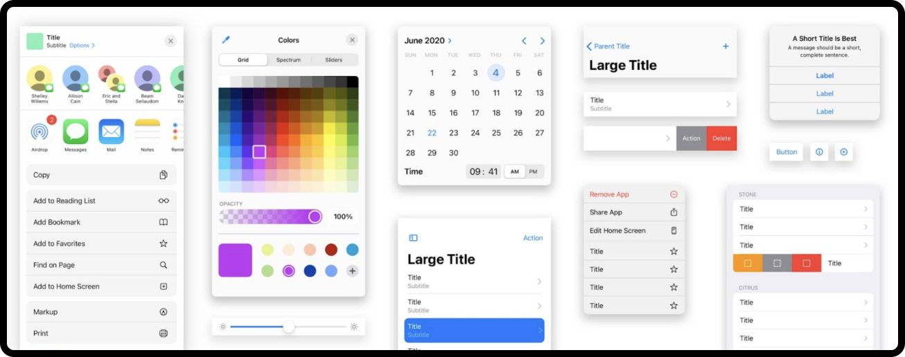
Consistency is key to creating intuitive and user-friendly interfaces. It ensures uniform visual elements, layouts, and navigation, making it easier for users to learn and predict how things work. Apple and Google’s design systems are great examples here. Apple’s Human Interface Guidelines and Google’s Material Design both emphasize consistent use of colors, typography, and spacing, which helps users feel at home across different apps and platforms. Many designers refer to these documents as a baseline of modern UX design.
Simplicity
Simplicity in design isn’t just about making things look clean; it’s about making interfaces easy to understand and navigate. Minimalism and clarity reduce cognitive load, allowing users to focus on what’s important. Think of the clean interface of Google’s homepage or the straightforward layout of a weather app. Buttons and menu items aren’t scattered around, everything is organized in menu bars or drop-downs in the top corners of the window. These designs prioritize essential elements, ensuring a hassle-free user experience.
Feedback
Feedback is crucial for guiding users and keeping them informed. Visual cues, status indicators, and messages let users know their actions have been registered and what they can expect next. Imagine how frustrating it would be to wait for a screen to load without a percentage status indicator. A loading spinner indicates that an action is being processed, while error messages help users realize there are mistakes to be corrected. This kind of feedback enhances user experience by making interactions transparent and predictable.
Design a Graphical User Interface in 5 Steps
- Take a step back and ask yourself about the target audience for your design. Consider who they are, their main needs, and what they aim to accomplish when using the interface. Often, developing user personas is involved in this process so that designers can understand pain points, skills, goals, and incentives to use the interface. If possible, bring the user into the design process first, and listen to their perspective and goals directly.
- Lay out the foundation of the visual system with user experience at the forefront. In order to design the best interface, think about different ways to simplify and reduce the steps required to get something done. If you can remove unnecessary windows or buttons, do it! This will make the process less complicated and ornamental. Prioritize accessibility and usability.
- Create consistency in your design system. Once you understand the user flow, and have the simplest designs, think about ways to standardize each essential element of the design. If there are 3 types of buttons needed in the interface, don’t style them completely differently. Add variation, but design them to feel like they exist within the same system. Perhaps using the same typeface or different colors of the primary palette is enough to differentiate them while creating a consistent layout. Consider spacing as well to create a cohesive experience.
- Refer to universally recognized symbols and standards for designing interfaces. There is a reason that including symbols is commonplace in most instructions and complicated processes. Symbols are more concise and universally recognized. For example, an arrow in the NYC subway means the same thing as an arrow in subways around the world. The same applies to symbols in GUI design. Symbols and standard interaction patterns like swipe gestures or hover states make the interface familiar even if you are encountering it for the first time. Think about it– if every website or interface had a completely different symbol system or interactions, it would be as if it’s a different language and the user would be lost. Guidelines and design frameworks like Apple’s Human Interface Guidelines or Google’s material guidelines help with design consistency.
- Prototype and test the user experience and conduct usability testing. This review and testing step is essential in the design process since it allows you to gather feedback from real users identify any pain points and iterate on the design. Testing early and often helps refine the design before development begins, reducing revisions and headaches.

The Future of Graphical User Interface
Looking ahead, speech recognition is set to play a more prominent role in GUI design. As algorithms become more sophisticated, voice-controlled interfaces will become more intuitive and responsive, further simplifying user interactions. Additionally, augmented reality (AR) is becoming increasingly commonplace, and revolutionizing how we interact with both digital and physical worlds.
It’s important to note that inclusive design should be the cornerstone of GUI design. It’s essential to create interfaces accessible to all users, including those with disabilities. This means incorporating features like screen readers, voice commands, and adjustable text sizes, which so often take a back seat in the design and development process. Prioritizing inclusivity not only broadens your user base but also aligns with ethical standards and legal requirements your work should be upholding.
Despite these advancements, the core principles of GUI design—usability and user experience—remain crucial. GUIs will continue to evolve, but their primary goal will always be to make technology more accessible and user-friendly. Moving forward, the importance of intuitive, efficient, and inclusive designs will be essential as interfaces and technology evolve.


