There’s no question that Artificial Intelligence is all around us. So how can you keep up as a creative? For us here at NoGood, the use of AI is making us change the way we think, collaborate, and design. Let’s take a look at how we’ve used certain tools, methods, and tips that are leading the industry today and how you can use them to your advantage.
AI and Human Collaboration
Similar to Photoshop, Illustrator, and more, AI can be a tool to help streamline your creative process. From design programs to social media platforms, AI features are showing up everywhere, and brands are making quick use of them. Design styles and techniques all correlate to the technology of its time.
And just like any program, there’s going to be a learning curve. That’s why it’s essential for modern day graphic designers to adapt, making it not a question of if they’ll use AI, but when they’ll use it.
With everyone having access to these advanced tools, intention and ingenuity will be the key to standing out. From initial concepting and layout design to troubleshooting the generated imagery, AI still requires our human expertise to create high quality creatives that represent brands authentically.
Let’s take a look at how we’ve used certain tools, methods, and tips that are leading the industry today and how you can use them to your advantage.
Our Most Commonly Used AI Design Tools
Nowadays, you can find a different type of AI tool to help you with just about anything. Here’s some tools our design team has found most useful when integrated into our creative workflows.
Adobe Photoshop’s Generative Fill
Arguably the AI tool we use most often since our performance ads need to be made in different sizes for different channels. If an image needs more space for copy, then a quick solution is to generate more of the background. What might’ve taken ages – either to photoshop the original image or source another one – can be done in a matter of minutes.
Here we start with the original vertical image of a woman sitting on the grass. Since we also needed to make a 1×1 size, instead of scaling it to fit, we just generated more of the background. That way there’s much more space for our text and CTA.
Many times you don’t even need to type in a prompt to create the rest of the background. Just select the area and click “generate” and Photoshop does a solid job at matching the environment.
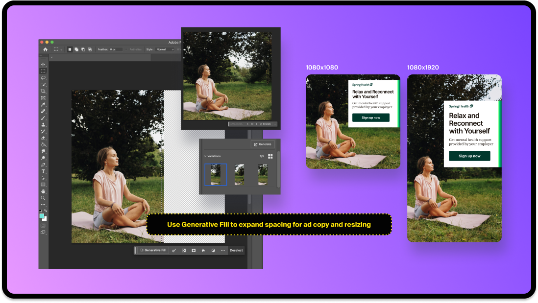
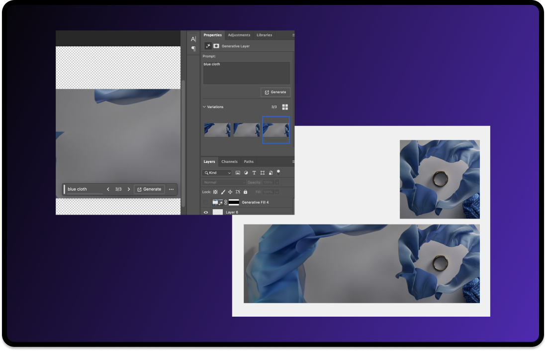
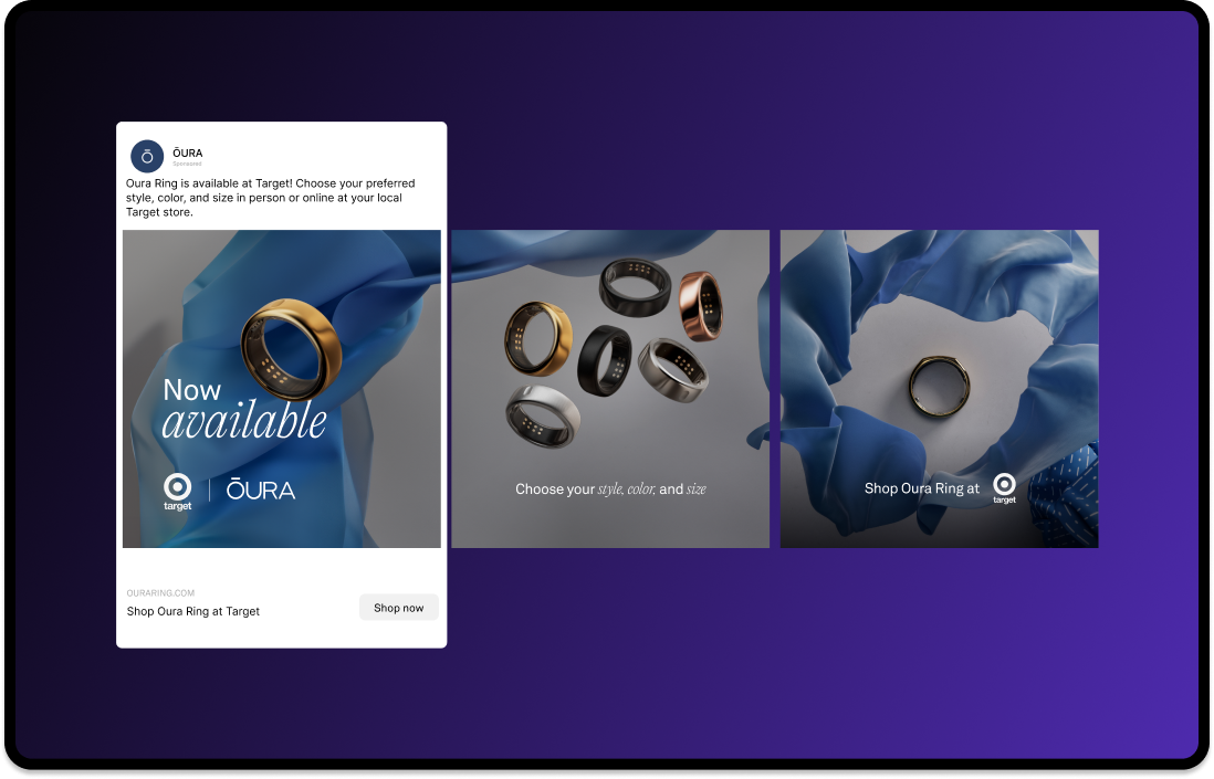
Here’s another example of using the Generative fill to expand the background for a connecting carousel post. Select the area and type a prompt of what you want.
Tip: If the generation isn’t coming out right, you can start by generating smaller parts. Once you get the right look, select and generate the rest. If you’re looking for detail, sometimes it helps to generate section by section rather than a whole giant area at once.
Pros and Cons of Photoshop’s Generative Fill:
- Advantages: Saves time, easy to use, and non-destructive, which means the AI generation can be modified without affecting the original image.
- Disadvantages: Prompt input and results can be inconsistent, and image quality can end up looking strange.
Midjourney
Our team typically uses this tool for concepting ideas and forming backgrounds or objects whenever we lack resources or photography. It does take a bit of trial, error, and even luck to get what you’re looking for. Of course it won’t be able to generate the client’s actual product in the image, so the final ad would still need some editing.
For our SteelSeries Easter Sale graphic, the goal was to simply have the SteelSeries headphone hatching out of an egg. Here we tried getting specific with the prompt, typing in “smaller black headphone facing the side, inside of an orange easter egg that is hatching with pieces of egg shells on the floor.”
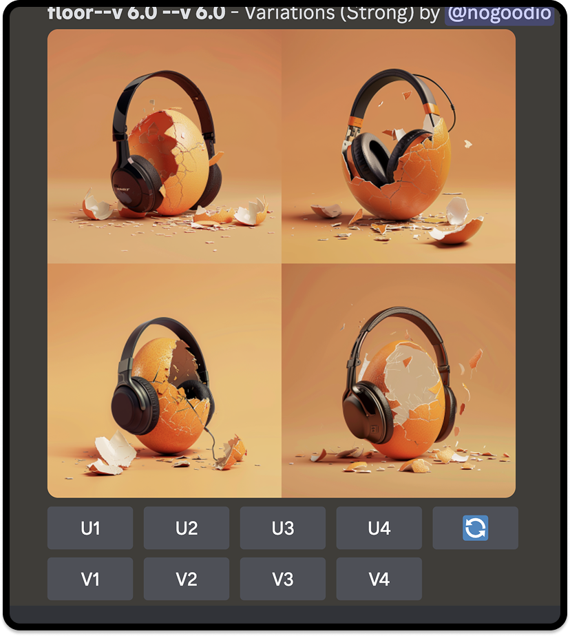
As you can see, the prompt is getting a little misinterpreted. It looks like the egg is wearing the headphones instead of headphones coming out of it.
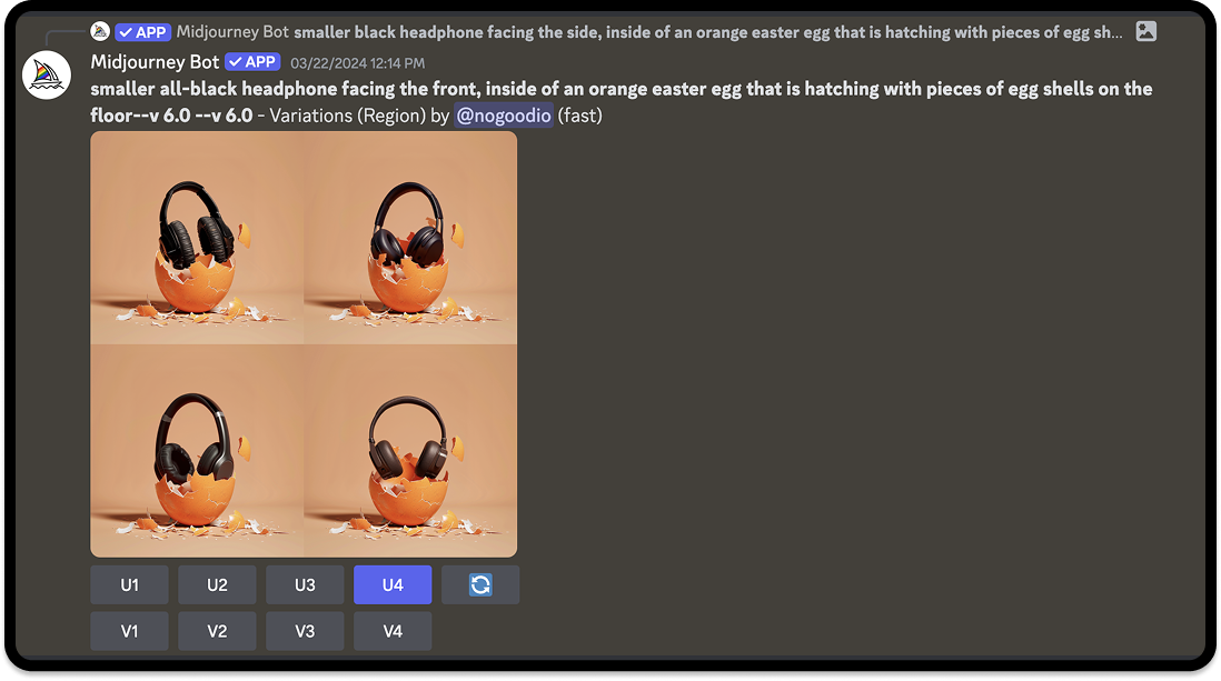
The issue we usually come across with Midjourney is inconsistency. Even changing a few words in this prompt, from “facing the side” to “facing the front” caused pretty different results compared to before. After multiple attempts, we settled on this variation.
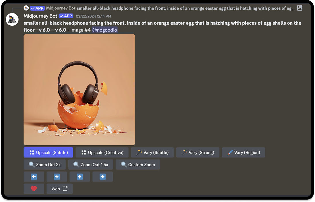
Since this generated headphone was just a placeholder, the final step was to Photoshop SteelSeries’ headphone with the same angle in its place. We always want to use the actual product, since that’s what we’re advertising. After some retouching and color correcting, here was the final result:

Pros and Cons of Midjourney:
- Advantages: High quality image generation, fast and efficient, great for concept ideation.
- Disadvantages: Lack of precision/control over finer design details, Discord interface might be more inconvenient for some users
Adobe Firefly
Adobe Firefly is great if you’re trying to be even more accurate/specific when it comes to the shape and material you want to generate. The workflow is generally the same, but the most notable benefit of this tool is being able to create your own composition and style references.
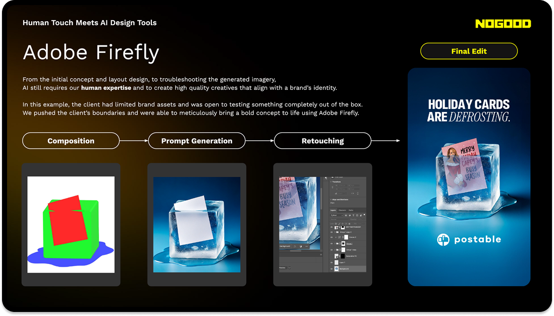
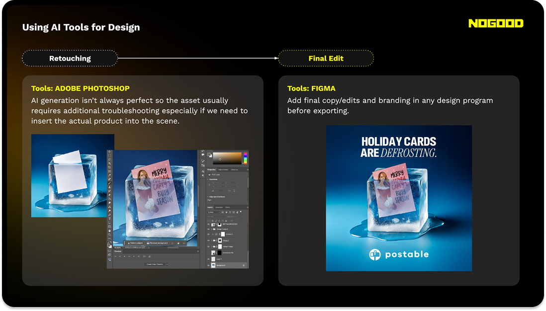
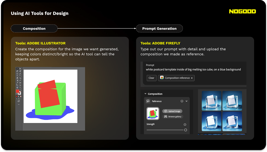
Pros and Cons of Adobe Firefly:
- Advantages: More precise image generation since you can reference compositions and styles. Easy interface. Trained on Adobe stock and licensed content for reduced copyright concern.
- Disadvantages: Credit plan/subscription based.
A Deeper Dive Into Our Ideation and Process
AI-generated work is becoming more and more common, but we can’t become complacent and over-reliant on AI. If everyone is making visually appealing ads, then what’s it going to take now for people to stop scrolling? With AI at our disposal, we can use it to think of bigger, more out-of-the-box ideas for our clients, ideas that can bring storytelling or emotional depth to a brand. Here we’ll go through step by step on how we utilize AI generation to boost our human creativity.
1. Ideation
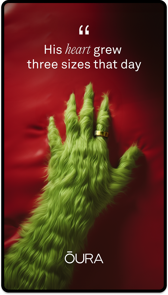
To prepare for the holidays, we wanted to tie Oura to the seasonal spirit in a creative way. The client wanted bigger ideas, so this was a good opportunity to try something new. The goal was to create something tongue-in-cheek that would be different than the typical gift-giving ad.
There’s two things we can keep in mind when it comes to forming a creative idea: correlation and causation. The Oura Ring is a smart ring that helps track heart rate, stress, sleep, and more. There’s a few questions we can start with to get our ideas flowing. Who can benefit the most from this ring? This leads us to think, “Who’s most stressed during the holidays?”
Now let’s take it a step further. What happens when this person uses the product? Will they be less stressed? Will they be happier? With these questions we can start developing the story. The grumpiest, most stressed person during the holidays (the correlation) has a change of heart and becomes happy again (the causation) thanks to Oura Ring. Who better fits this story than the Grinch himself?
2. Prompt Engineering
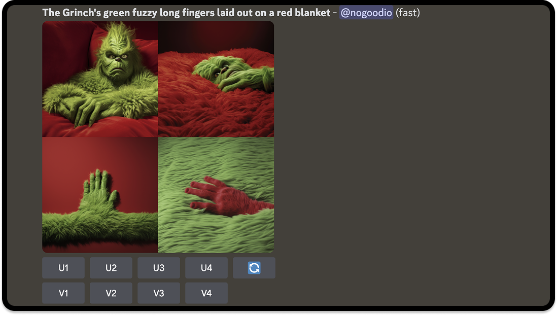
Due to budget constraints, we weren’t able to hire the Grinch as our model. However, thanks to AI image generators, we were still able to carry out our concept. We knew we wanted the grinch’s hand laid out in a clear way and had to describe our vision in specific details. Using Midjourney, we typed up multiple descriptions to feed into the prompt.
Prompt: The Grinch’s green fuzzy long fingers laid out on a red blanket.
Results: Strange options including the Grinch’s face, which was not what we wanted.
Prompt: The Grinch’s green fuzzy hand with sharp pointy fingers laid out on a red blanket.
Results: Fingers were almost too “human,” or the hands were misshapen.
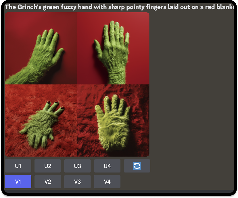
This process took much longer than anticipated. What helped, however, was being able to choose which variation (V1 – V4) we liked the most. Once clicked, Midjourney will create 4 more options similar to that variation.

After countless variations and lots of back and forth, we stumbled upon a good enough view and angle of the hand to move forward to the next step. Each prompt wasn’t too far off from each other, so we just had to keep generating until we were satisfied.
Click the “U” button with the corresponding number (1 through 4 starting from the top left to the bottom right) to select your image. You can also choose to vary your image, zoom out (which will typically expand the background), or upscale the image.
Prompt:The Grinch’s green fuzzy hand with pointy fingers laid out on a red blanket.
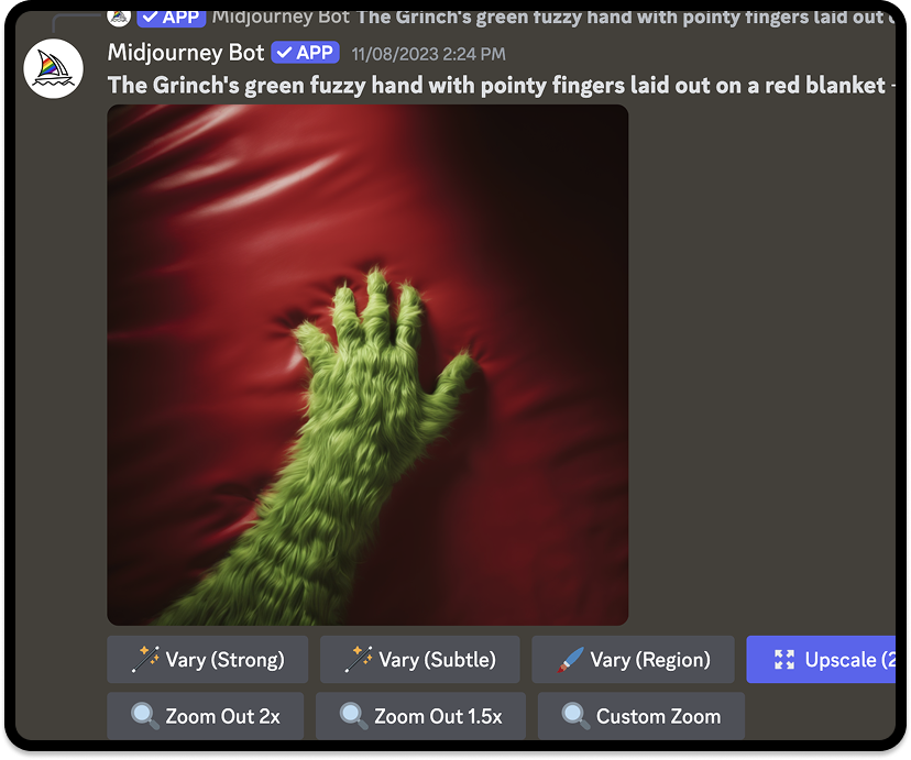
Dissecting this final prompt, details like “green fuzzy” and “pointy fingers” gives Midjourney the texture and details it needs to know to do its job. It’s also important to include what you want for the background, in this case it’s the “red blanket.” You can go into further specifics by even describing the image style, whether you want it photorealistic, 2D, etc.
3. Photoshopping
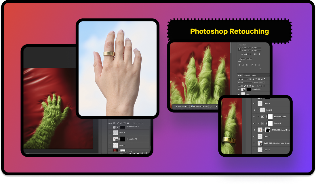
The generated image still wasn’t quite there yet. The Grinch’s fingers are known for being long and sharp, but the ones we kept getting from Midjourney felt too stubby or not pointy enough no matter the prompt.
We also needed the actual Oura Ring on the hand, definitely not an image-generated ring. So the hand/fingers were altered in Photoshop along with adding the Oura Ring from the client’s photography. This was where our design skills and oversight played the biggest role.
The composition we chose was clean enough to where we could easily add the ring in a similar position. It was also important to us that even though this was a silly concept, the execution still needed to look professional, and the layout needed to be simple and not too distracting from the product itself.
The Pros and Cons of this Approach
Of course the use of AI can raise multiple concerns about a brand’s authenticity and originality. For designers, we’re not promoting AI generation in our creative work as art but using it as a vehicle to push our ad/brand’s message across to audiences.
Understanding both the advantages and challenges help to strike the right balance between an easier workflow and human ingenuity. What AI lacks is typically what the designer needs to make up for.
Pros
- Efficiency: Speeds up the design process, especially when image editing/photoshopping.
- Accessibility: With the increase in AI tools, high-quality design and new skills are more accessible to team members.
- Cost-Effective: Saves money on creative production and reduces the need for outsourcing.
- Enhanced Creative: AI can help with quick brainstorming and quality execution.
Cons
- Limited Control: With a heavy reliance on prompts, AI outputs can be inconsistent and lack nuance if the designer isn’t able to add any additional creativity.
- Brand Identity Challenges: Some brands’ style or restrictions might be too unique or complex for AI to align with.
- Copyright Concerns: It’s important to note that the AI tools you use do not infringe on copyrights and existing artwork. Tools like Adobe firefly are trained on licensed content and can be used for commercial purposes.
Our AI Advantage
Maintaining transparency to your clients/audience and giving credit to the source of your creation is always a rule of thumb when incorporating AI into your design. When briefing the client, it’s helpful to provide different solutions or tools for executing complex ideas so everyone is aware of the scope of the project. Be wary of your brand’s needs and standards, as well as factoring in timelines for trial and error in AI experimentation.
For our Oura ad, we first pitched the Grinch concept to see if they were open to it. Then we presented a round of executions, informing them of the AI tools we used, to see if they still liked the direction. We emphasized to the client that although it was heavily made with AI, we made sure that the concept was what made the ad special and that the ring was still spotlighted.
With the rapid expansion of AI technology, there’s a growing and valid concern of career displacement in the creative community. If we don’t want our jobs to be replaced by AI, then we should learn to use and manipulate AI to our advantage. AI still needs to be fed by human thoughts and overseen with human eyes in order to be utilized to its fullest potential.
Our team is always adapting and looking for the latest problem-solving programs to enhance our creative ads and processes. We leverage AI through prompt engineering, image generation, and more, while making sure that our ideas and creativity still stem from us.
Partner with a top tier Performance Branding Agency

