Designing for growth also means understanding conversion-centered design principles. This includes utilizing a strong hierarchy of information that actually converts users and creating personalized experiences. Other user interface indicators can sprinkle visual points of interest as well as help navigate viewers through a page more easily.
Learn more about these key principles and see to start applying them for results.
What Does Conversion Mean in Design?
Design that makes people stop, think, or take action means the design was able to capture the viewers attention successfully. Evoking some kind of emotion or action in someone means something about the design spoke to the individual looking at the piece of art. This same concept applies to performance branding best practices when thinking about creating designs that convert. Conversion design means something about the layout, choice of imagery, or combination of elements (typically combined with emotive copy) leads a user to take action and want more.
Ready to elevate your design strategy and boost conversions?
The Top 5 Principles of Conversion Design
1. Layout & Hierarchy of Information
One of the top principles of conversion design to consider when creating an effective landing page is the overall layout of the content. The AIDA framework is a popular marketing framework that follows users’ typical thought processes and rebuttals and aims to guide them through a landing page, anticipating what they want to know in order to convert. Those blocks typically follow this format:
Attention
The hero block is the first thing people see when they land on a page. That means ensuring there is an eye-catching visual that speaks to the product, and the value that a brand can bring to someone is key. This can include focusing on product user interface elements or using imagery that is more human-focused, depending on the audience you want to speak to.
Adding motion or video into the hero block can also be effective if it adds additional value or communicates the values of a brand effectively. Brands with more playful or dynamic brand guidelines can get super creative with the introduction of the page by adding interactive elements or breaking away from the typical left and right block layout or middle alignment.
In addition to imagery that grabs someone’s attention, it is important to establish trust with the audience with a social proof statement, or awards or number of users to help guide users down the page.
Interest
The next section that typically follows the Attention block is the Interest section. Here, it is important to hone in on the value users can get by using your product or service. This means leaning into brand value props and depicting them in a way that is digestible. Typically, sets of three are always a good place to start so it does not overwhelm viewers and can focus on the main takeaways. It is important to lead with value and add supporting feature callouts and details as needed.
Based on the design system and guidelines this section can vary however in look and feel. A popular format that is also easy to follow is the right and left block text and image alternating block, such as in this Inflection AI landing page that was recreated in unbounce for Pi, and AI client. It also included a “How it works” section that explains what the company does for its users.
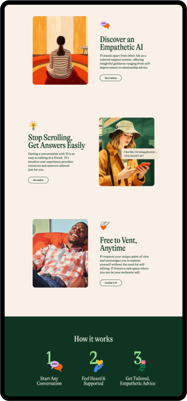
Alternatively, these blocks can include three main cards followed by bullet points or icons. This section could also be interactive with dropdowns. It is important when thinking about best performance branding and conversion practices that the information should still be clear and easy to follow so that users are not searching for the information.
Desire
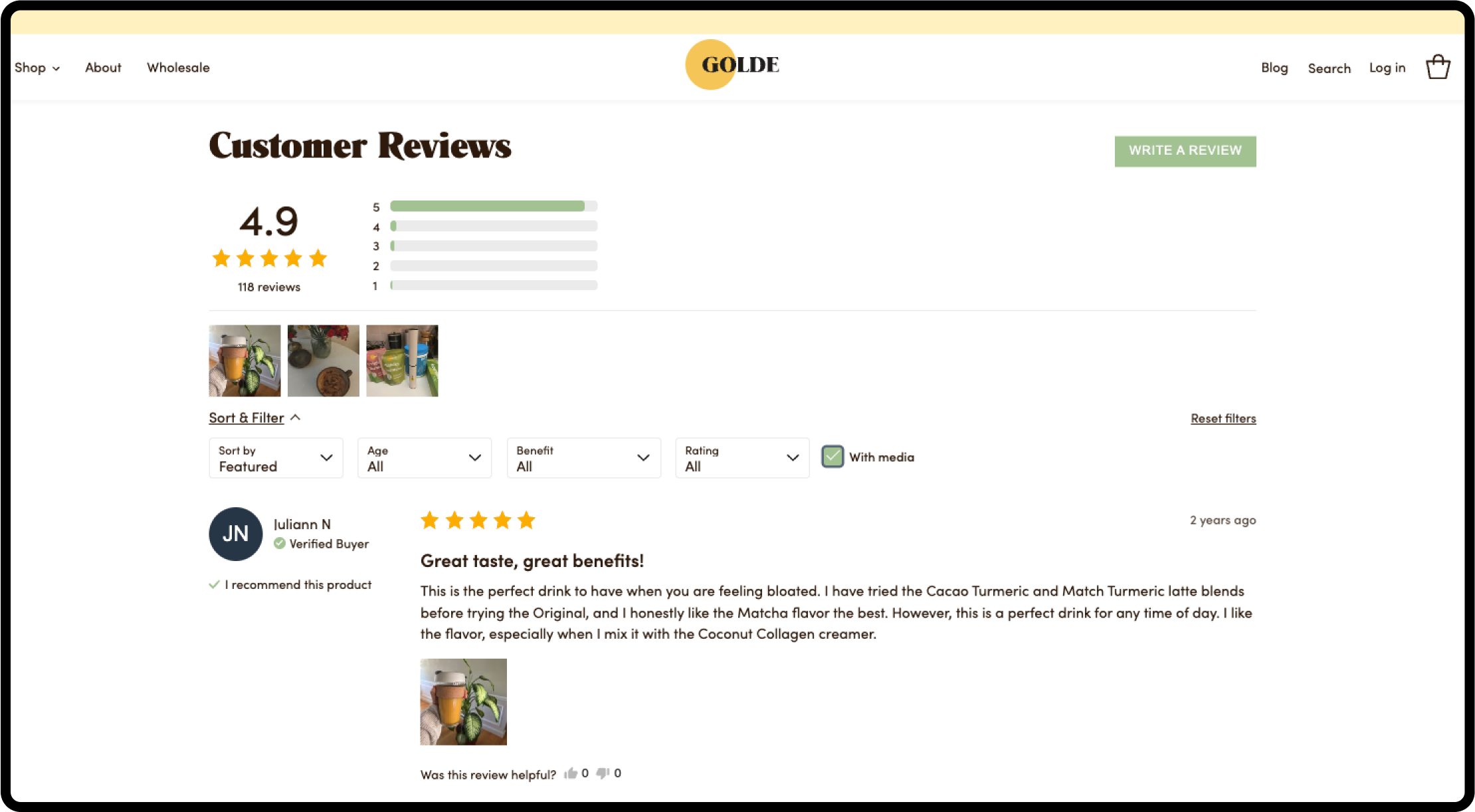
The desire section is a key component in the user journey. This section allows space for social proof, such as quotes, reviews, or partnership logos, to instill trust that the product or service truly provides value. This section can be displayed a few different ways such as a carousel slider, logos scroll, or with a connection to repost actual reviews directly from products.
In this Golde example, you can see the review section features filters by benefit, which speaks to problems that customers might be looking for. There’s also a section to add imagery or media, which adds further validity to the product. The point here is to solidify trust with the user.
Action
The final block helps to drive the point home with a final call-to-action block. By strategically placing another call to action button at the end of the page, it directs users to remember to take action. Oftentimes, adding a frequently asked questions section before the final action block can also help answer any common concerns users might have that might help them convert and again establish more trust.
2. Speaking to the Right Audience
Another key principle when it comes to conversion design is always speaking to the right audience.
This could mean designing different landing pages with slightly different messaging and imagery that speaks to specific value props that an audience group is looking for.
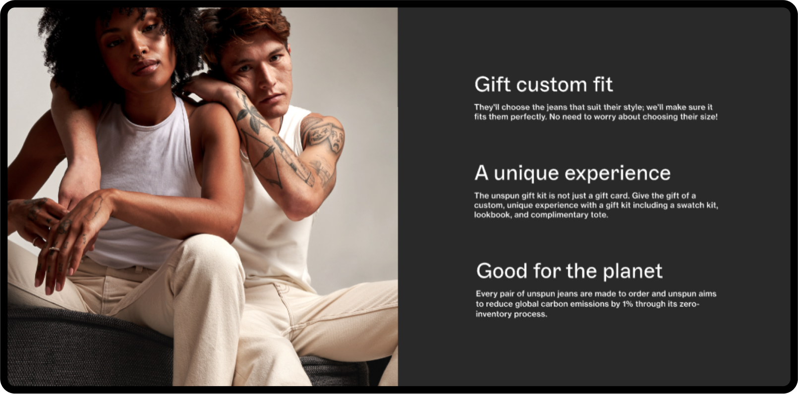
In NoGood’s case study with Unspun, a sustainable denim wear brand, the strategy used zero party data form forms to determine some of the key values customers were looking for when shopping. For example some callouts from customers included custom fit jeans, sustainable options, or fashion-tech solutions. From there customized landing pages were created to address these different audience callouts and interests.
3. Consistency
There is also an opportunity to create a more consistent and cohesive user journey from various touchpoints that user interacts with a brand. For instance, if an ad that a user clicks on has certain visuals and messaging, the landing page they end up on can have similar messaging and should maintain a consistent look and feel. This means ensuring brand guidelines are cohesive across all digital platforms so that users start to recognize the brand’s visual presence and feel a sense of trust when they are taken to the landing page.
4. UI Visual Indicators
When thinking about conversion design in terms of best user interface (UI) design components and best practices, there are several visual indicators that can support the conversion journey.
When looking at typography, it is important to have a clear visual structure so users can quickly scan the H1 and H2s on any given landing page and extract the key items they should be focusing on. Information that needs to be emphasized might be bolded or in a different font entirely to direct users’ eyes on what to focus on.
Other design components that are critical to design for are the call to action button style that is used. This means ensuring there is enough color contrast between the foreground and background, and making sure the button is large enough so that the button can be easily accessible.
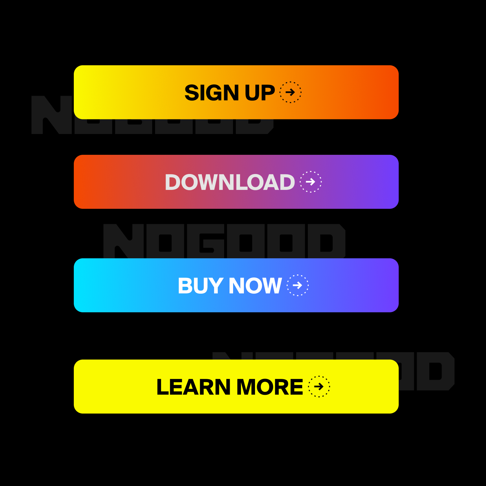
Other design components such as icons, data visualization, and motion graphics can also be helpful as visual indicators of where users should address their attention. They also provide other routes of communicating a message quickly without someone having to read all the copy on a page.
5. Orientation & Navigation
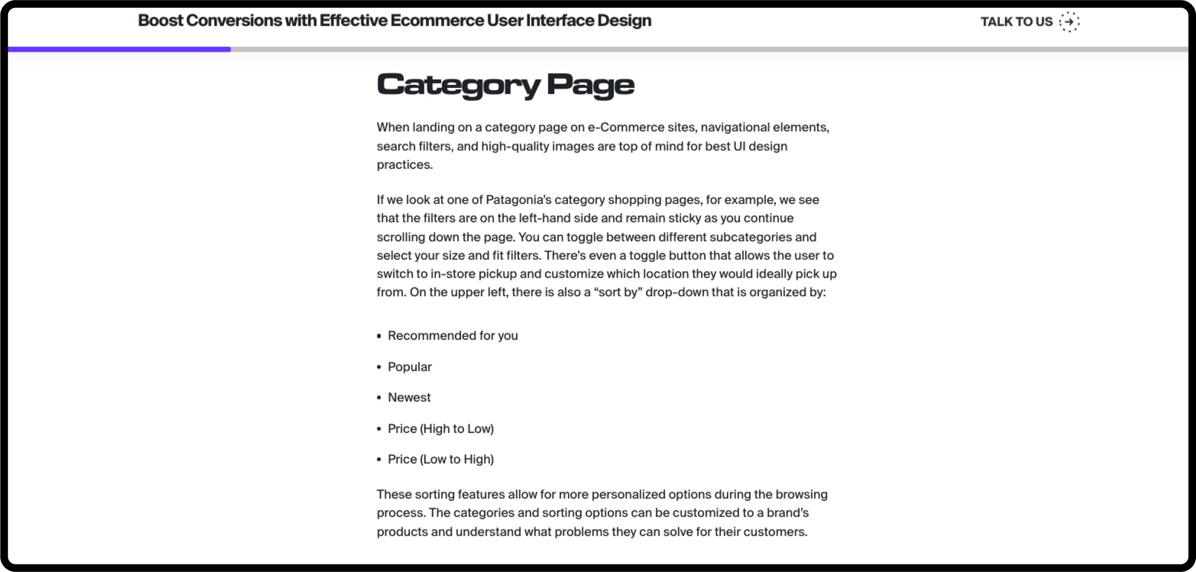
As users go through a landing page, it is also important that they stay oriented in terms of where they are on the page or how far along they are to complete an action. This means, for instance, if there are steps to create an account, there are steps that show progress close to completion, and the user is to keep them on track. On NoGood’s blog page, for example, there is a progress bar that lets you see how far you’ve read for a certain article.
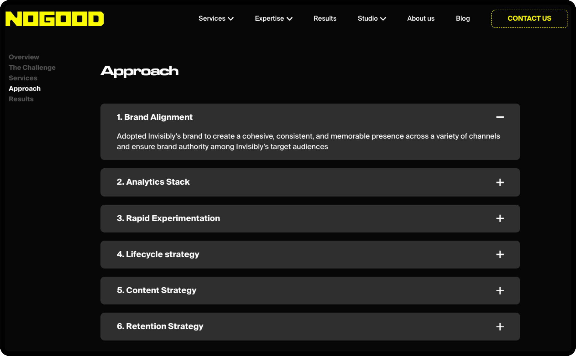
Having a clear menu navigation on a page lets users quickly find what they are looking for. This means having clear parent menu options and child options. Bead crumbs are also common to let users jump back to the previous page more easily. On NoGood’s recently redesigned case study page, a sticky sidebar was implemented to act as an index for users to easily navigate to different parts of the case study page. This is especially helpful when a page is longer, and users need to orient themselves back to the top or if they want to jump directly to a section they are interested in.
Conversion Design Takeaways
There are multiple ways to consider how design can support conversion. When looking at successful landing pages that convert, the most effective principles reflect the concepts above. Pages that have a strong layout and hierarchy of information always help to guide users through a page effectively and purposefully. Ensuring that both visuals and copy are speaking to audience segments helps to retain interest in the content.
Having consistent brand elements and effective visual indicators will further signal to users that the page they are looking at is trustworthy without losing interest. Being able to effectively navigate users’ attention through the page also supports the entire user experience. Keep these principles in mind when you are creating your next landing page design and see how they impact conversion.

