The science behind stopping the scroll
We’ve likely all been living with a form of blindness without realizing it. If you’ve ever been driving down the road and suddenly your exit, or another car, appears almost out of nowhere, or you’ve been scrolling through social media without properly processing the information in front of you as you get lost in the infinite scroll — congrats, you have experienced inattentional blindness.
Inattentional blindness is defined as, “when an individual fails to perceive an unexpected stimulus in plain sight, purely as a result of a lack of attention rather than any vision defects or deficits” — a pesky byproduct of the current landscape of infinite scrolling.
Take, for example, the below PSA for cyclist awareness:
In the video, your attention is drawn to the specific task of counting the number of passes the team in white makes, which tricks the users into not noticing the moonwalking bear despite it moving directly through the center of the screen. While it’s an incredibly clever PSA to raise awareness of distracted driving, it also beautifully illustrates how many of us consume media today, and the importance of stopping the scroll.
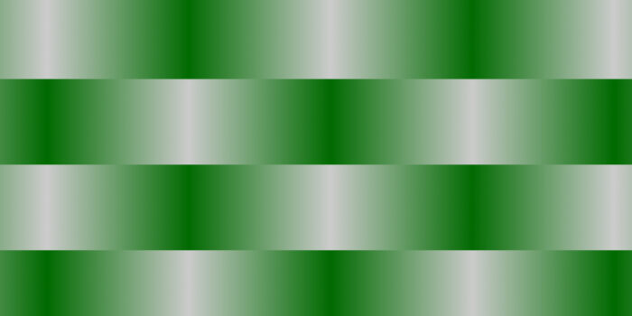
The easiest way to do this is by creating differentiation to reset the eye and force the user to focus on something new – preferably your ad.
Simple, right? Wrong.
The results tend to be somewhat homogenous with content curation and algorithms serving up both content and ads that align directly with a user’s personal preferences and tastes. The algorithm naturally serves up similar brands that use similar colors, similar fonts, and similar iconography, which leads to the blind scroll that we’ve all fallen into.
In addition to serving viewers content that is tailored to their interests, there are other ways that the algorithm structurally helps this blind scroll. From a UI/UX perspective, social media platforms have designed their interfaces to maximize user engagement and have shifted their focus to video content — especially short-form video reels — which plays a central role in the strategy to keep users on their platform.
Taking a look at the way Instagram has developed its Reel interface, it’s clear that they’ve designed it to be as immersive as possible, with videos taking up the entire screen, eliminating any distractions and making it harder to exit than it is to scroll on to the next video. Additionally, these short-form videos are designed to deliver dopamine hits with stimulating video content, making it easier to get even more sucked into the experience.
Knowing this sets a strong foundation for approaching scroll-stopping content, as it frames the practice as the challenge of breaking the blind scroll, grabbing users’ attention, and most importantly creating differentiation in a user’s feed that might otherwise be fairly same-same.
Here are our best tactics:
- Use motion
- Put brand and product first
- Make it human
- Utilize UGC and repurpose content
- Utilize space and adhere to hierarchies
- Add captions and overlay text
- Optimize with data
- Optimize for audience and platform
- Lead with a bold CTA or offer
- Create intrigue
- Try something different
Use Motion Whenever Possible
Short-form video is the new queen of social media, so it’s only natural that animation and video take a more prominent role in ads as well. In addition to the dopamine hits, these short-form videos offer a sense of unpredictable discovery where users never know what’s coming next. “Wow” the scrolling viewer with something that they’ll want to watch fully and not instantly recognize as an ad and scroll on past.
As with traditional video content, particularly on social media, the same principles apply to ads as they do with organic content in that it’s important to grab attention, grab it early, and keep it.
Here are a few go-to ways to incorporate motion:
Animate Buttons, Text, & Gifs
We’re pulling this one right from the social media playbooks since, well, it’s simple, it works, and it’s great in a pinch.
Let’s say you’re preparing your ad assets and there’s no time for going through, chopping the static images you were given, bringing them into after effects, animating them, and then exporting them. But you also have the task of pulling people out of their blind scroll and don’t want people to just click through your ad.
What do you do?
In the same way we add gifs and stickers to our social media assets, we can add simple touches of animation to draw attention to the important bits of our ad with relatively minimal effort.
This can take the form of adding an animated arrow pointing to your product to create differentiation in the user’s feed, making CTA buttons shake, vibrate, or otherwise move to draw attention, or simply masking out a gif to overlay in some way that interacts with the composition of your static asset. In the example above, products scroll through the frame forming a conveyor belt that seems to be endlessly looping. This is by design and adds a lot of simple intrigue for the viewer to stop the scroll and look at this ad.
While we absolutely support going deep on the animation process, that’s something best saved for after you’ve done substantial testing, found what works best, and there’s enough data to validate the time and cost for the extra work.
Animate a Single Element
Motion doesn’t necessarily mean a full-on video production, as much as it means adding movement to an element, or elements, in your ad.
This is taking the first tactic a step further, going beyond just pulling in an existing animation to creatively supplement your ad by giving life to the ad creative itself.
As an example, a garment featured in the ad that’s sold in different colorways can be masked out, recolored in the various colorways, and then animated to cycle through to catch users’ attention as they scroll through their feeds. Even if the garment simply changes colors, animating it as a simple stop-motion video can have huge effects on increasing the time people spend viewing the ad.
Similar techniques include isolating an element of the ad and rotating it, scaling it in size, or similarly manipulating it in a simple fashion that will easily grab people’s attention.
Full Video
Video-based ads have taken a far more prominent place in the advertising landscape with the addition of TikTok to the media mix. Though video has been a part of the mix for some time, the vertical video treatment and the methods for grabbing attention, and stopping the scroll, have definitely shifted now that brands have grown their TikTok accounts to huge followings.
Traditionally, video ads were non-negotiable, whether being served as a commercial on traditional media platforms or as an unskippable ad on YouTube before consuming a piece of content. And while this didn’t necessarily mean that brands didn’t have to put in as much effort with their ad offerings, considering people were forced to endure them, they weren’t being faced with the same challenges we are today in having to grab the attention of audiences.
So while old school TV ads were once 30-second pieces that told whole stories and held audiences’ attention hostage, the new format is changing things dramatically – and at a much lower production value. Ads disguised as influencers or content creators subtly selling a product might trick viewers into watching the full ad, since it doesn’t instantly register as an advertisement
The top formats for attention-grabbing video ads are:
- Trends
- Brand-focused
- Product-focused
- Informative/Educational
- UGC
While there’s still something to be said for long-form video ads, there’s an equal challenge to maintaining attention as there is with getting it. Our best advice: get it, hold it, and get out since every second you add to a video is an opportunity to bounce.
Put Brand & Product First
While authenticity is important with ads and content alike, brand recognition and recall are equally as valuable — particularly with early-stage companies.
If it’s going to take multiple impressions across ads and content in order to win audiences and drive action, then it’s far more fruitful that those audiences are being exposed to and becoming familiar with your brand or product in those first two seconds of your ad.
Leading with a product is similarly effective for those brands that are visually driven. Users with an interest in products driven by style or aesthetic will be more likely to immediately respond to a well-designed product and have better product recall in the future as they are driven down-funnel.
For example, Oura Ring excels at this by promoting their brand philosophy of “committing to your body” and “self love” in addition to highlighting their product front and center. The minimalist design and premium product and lifestyle imagery immediately communicate what they’re selling, making it easy for users to recognize and remember the innovative smart ring.”
The important thing here is that you’re building awareness, and making sure that your product is being featured first in order to grab users’ attention and pull them out of their scroll.
Make It Human
Yes, you should lead with the brand or product, but incorporating a human element can grab attention and also doesn’t necessarily have to be in place of the brand or product, but an addition to it!
Let’s pose two scenarios for an ad for an orchard:
Scenario 1: The ad opens, and in the first two seconds, you’re shown a beautifully crisp apple sitting on a branch, swaying in the breeze, waiting to be plucked.
Scenario 2: That same ad opens and instead of the apple waiting to be plucked, a hand reaches in from off-screen and picks it.
While effectively the same ad, you’re able to add a level of relatability that wasn’t previously present by including the human element.
Handvertizing, a term coined by Trend Hunter, is defined as, “The use of hands as a canvas to convey an advertising message or artistic expression.”
And while there is absolutely something to be said about incorporating an entire human into your ads, or at the very least their torso, hands tend to do just the trick.
In the landscape where diversity, equity, and inclusion are becoming the main focus of ads, and advertisers and brands are seeking to better represent a full spectrum of humanity in their content and ad offerings, hands tend to go further.
This is simply because outside of any particularly strong identifiers, hands allow viewers to see themselves in the ad, as if they’re the ones reaching out to grab the apple or interacting with products – or at least more so than showing a full person. Audiences can immediately attach themselves mentally to whatever it is the hands are doing in those crucial first seconds.
Is the phantom hand picking an apple? No. The user is. Is the phantom hand chopping veggies with their brand-new knife? No. The user is.
The same tactic is still in play with showing full people, where users transport themselves into the mindset of the person being represented in the ad. But while there are many hands – there’s only one of each of us.
Utilize UGC & Repurpose Content
From an analytical perspective, the best bet is a sure thing. This is why we’re such huge proponents of both utilizing user-generated content (UGC) for ads and repurposing existing content because we already know that it works.
It’s not necessarily a guarantee that content that has done well once will perform well again as an ad, but it’s still a safer and validated approach than creating something new and untested.
Familiarity is also a huge driver in this scenario for stopping the scroll since people will be drawn to things that they already know and recognize.
In the case of UGC, users will recognize their favorite creator in their feed and stop to see what content they’re offering – thus establishing a mental connection between that creator and your brand.
Did you know that ad campaigns that include UGC posts get 28% higher web conversions than websites and campaigns without them? There’s something to be said about including a relatable person in a campaign who can speak passionately about the product and what it’s done for them that instills a sense of trust and connection to the brand and product. The authenticity that comes with UGC is something that shouldn’t be sidelined by companies trying to sell products.
Ultimately, the tactic of utilizing previously proven content is just that: it’s already proven. While there may be a need to add a CTA or some new information to drive users to take action through the ad format, the brunt of having to concept and create is relieved by already having the creative, and to a degree already knowing that it performs.
Utilize Space & Adhere to Hierarchies
With Jazz, the saying is, “It’s more about the notes you don’t play.” With ads, it’s kind of about the space you use and the adherence to the tried and true design principles of whitespace and text hierarchy.
While there might be the initial instinct to make the text size larger and fill the page with flashy graphics, remember that sometimes, less is more.
Think of it like the unreasonably loud commercial that sometimes comes on the TV. Although the marketing team and producers might increase the volume of the ad in hopes of grabbing your attention, the effect does more harm than good. Viewers might change the channel or mute their TV, not able to hear the message at all. Even worse, viewers might associate your brand with being cheap or not premium, harming your brand reputation.
Yes, let the product shine, but don’t shove it down our throats. Approach the design of an ad with adequate type hierarchy to create order for viewers to be guided through the messaging in the right order. Using plenty of white space will have more positive effects than you think. Give them something they want to see, and don’t stress them out with overwhelming graphics.
In this example, basic design principles are followed that ensure the message is coming across in a comprehensible way. On first glance, the viewer might look at the Headline, especially since the first word has high contrast, framed within a white pill shape. With only around two words per line, the viewer easily reads through the text. If this line spanned the entire width of the frame, it would be a less effective way to captivate viewers attention and let them easily navigate through copy.
After that, viewers might look at the image, which has high contrast and a 3D effect, overlaid on more opaque background elements. Showing just one card is less stressful for viewers and gives them the space to focus on what’s happening within the card. On first glance, what do you think this ad means, and do you think the design spacing and hierarchy helps you understand it?
Add Captions & Overlay Text
This is another one pulled from our content creation best practices, but as we’ve mentioned, the line between ad and content is blurring and honestly, if it works, it works.
This tactic is implemented to recognize that we, as a collective, consume content everywhere. We consume content on the train, at dinner while our guests are using the washroom, at the movies (rude), in bed, while on walks, and everywhere. And while we do live in an era where the content is always on, the sound isn’t.
There are few things worse than crafting an immaculate script, shooting an incredible video, and then getting passed by because the viewer can’t hear what’s being said.
That compelling script with the masterfully crafted CTA? Never heard of it.
So, please, add captions. Always use bold, easy-to-read text that complements your visuals without overwhelming them. It not only broadens your audience significantly and makes sure your message is being heard, but it’s more inclusive for those with impaired hearing, and also conveniently helps you fill some of that real estate you’re not using.
Optimize With Data
If you’ve ever been told, “If it ain’t broke, don’t fix it,” you’ve unfortunately been lied to. For ads, content, and growth, the reality is, “If it ain’t broke, make it better.”
This may be something of a secondary tactic as it requires a bit of upfront experimentation, but the reality is that when you find what works – repeat it and make it better.
Let’s say you’re a brand running an ad group of 15 variations on TikTok. You find that of those 15, 3 are performing better than others in terms of view time and actions are taken. They’ve proven to be scroll-stopping, effective, high-conversion ads. So you’re good right?
Absolutely not.
To truly master the art of stopping the scroll, continue to iterate on successful ads to determine what exactly is driving their performance, and then distill that into a replicable formula for your brand.
If the top performing ad set has the logo animated in the first 2 seconds and a bold CTA displayed in the bottom lower third, then you can experiment with the location of the CTA and move it to the upper third, or swap it to the center and move the logo, or make it larger, or potentially make the logo animation faster, or change the color of the CTA button – the possibilities are nearly endless, and every element of the ad can be considered when iterating and optimizing on the first version.
Ultimately, as you repeat this process, you’ll be able to determine what exactly stops the scroll for your brand and then implement that into all of your brand creative moving forward to promote positive results. Through ad experimentation, you can make a hypothesis on what will get even more clicks next time. Who knew marketing came with a lab coat?!
Optimize for Audience & Platform
While TikTok, YouTube, Meta, Instagram, and even LinkedIn are all leaning heavily into short-form video content and ads, it’s important to recognize the nuances between platforms as you create or even repurpose ad creative across channels.
This tactic is a natural partner to the previous tactic in that your audience and platform optimizations will be heavily influenced by their accompanying data.
For example, a luxury D2C company may find that its audience makeup looks like this:
Meta (Facebook):
- Lifetime customers
- Aged 45+
- High LTV
- Love a deal
- Respond to loyalty rewards
Instagram:
- Legacy customers
- Mid-bottom funnel
- Lifestyle aspirations
- Need to be wooed to make first purchase
TikTok:
- New generation with disposable income
- Not brand aware
- Need to be educated
- Need to build trust
- Rely on social validation to inform purchases
LinkedIn:
- High-net-worth professionals
- Interested in quality, craftsmanship, and brand prestige
- Value thought leadership and industry credibility
- Respond to exclusivity and executive-level perks
Looking at the above, our ad stack may look something like this:
- Meta (Facebook): Seasonal discounts to drive new product purchases
- Instagram: Freemium or trial product with a visual depiction of a starter home
- TikTok: Repurposed UGC of a prominent creator talking about the benefits of the product
- LinkedIn: Testimonials from thought leaders using and promoting the product
There’s a significant nuance that can be found as your brand builds and adjusts to the preferences and optimization opportunities of each platform, but understanding these key components of your audience will help immensely to cater your ads more effectively to each channel.
Know your customer. Know their motivations and pain points. Incorporate that information directly into your ad creative. That’s the way to stop the scroll.
Lead With a Bold CTA or Offer
If the first rule of journalism is to not bury the lede, then the first rule of advertising is to not bury the offer.
If we’re looking at our ad creative as the cast of a movie, the offer is the star. It should be front and center, unmissable, unmistakable, and able to carry the show without the support of the rest of the cast.
It may seem counterintuitive, but we’ve learned to build our ad creative’s offer first, and then fill in around it. So often designers find that they create immaculate ad collateral only to find that there’s no room for the button or offer and then are in a position where they have to find space for it – it shows!
Harping once again on the first two seconds of the video, tell the viewer what they need to know immediately. Are you having a sale? Scream it!
We often find there to be two hooks in ad creative, the one that stops the scroll – ie; the immediate announcement of your promo or discount or sale or otherwise. This comes at the beginning of your creative.
Then comes the creative, the story that you’re telling, the color you’re adding to the product, and the bells and whistles of your creative to make it memorable.
The second hook then arrives at the end to drive the action once the viewer has been fully pulled in.
Break it down into steps:
- Hook (Offer/CTA)
- Engage (Information)
- Convert (Offer/CTA)
Once again, time and attention are in high demand. Go out and grab it!
Create Intrigue
This one may contradict some of the previous tactics in that creating intrigue doesn’t necessarily bludgeon the user over the head with what it is you’re trying to get them to do. It buries the lede – but cleverly and with intention.
Same as we’ve seen carousels take over our organic social, and clickbait headlines reach all far reaches of media, the reasoning behind their success and near ubiquitous use are because of intrigue.
A carousel or video ad that incorporates a little taste of what’s to come can often be enough to validate user interest and stop the scroll.
This can be achieved through a bold headline that doesn’t necessarily call the user to action but interests them enough that they click through without being told to do so. In the instance of carousels or videos, showing the user that there’s more information to be given can often drive further engagement.
This is one of the rare instances where we throw out the rules of putting the product front and center or building our ad creative around the CTA.
With this approach, you want to give the user enough information, but not too much, and present the information in a way that draws them in to start the discovery process on their own.
This can be achieved by showing part of a product, enough to recognize what it is but not enough to see the entire piece – thus encouraging the user to go further.
Alternatively, an interesting data point, date, or location can be shared that might be of significance to the user, leading them down a rabbit hole to find out why they’re being presented with this information.
Sometimes it’s helpful to leave the audience with more questions than answers.
Try Something Different
This may be the anti-tactic tactic, but it’s still worth discussing since it does have a proven track record.
If differentiation is the key to curing inattention blindness, then the best cure for the endless scroll is something unexpected, something a little weird, something different.
If every haircare brand is producing ad creative about how shiny and clean it will make your hair, then they all begin to look the same, and users will scroll right on by.
You may be asking yourself, “Okay, so how do I do something different?” And that’s a difficult question to ask, but that’s why we keep a team of incredibly talented strategists, designers, and growth marketing managers around to help guide us through these difficult questions.
If we were to distill it into a formulaic approach, the easiest way to achieve difference would be to take inventory of what your competitors are producing, what it looks like, feels like, sounds like, etc. Then do the opposite. Or maybe something less like what they’re doing. This can be in regard to colors being used, or even what value proposition they’re offering.
While yes, these decisions they’re making may be based on their data, and their audiences, it’s important to understand that finding a niche is important. It helps you build your own audience and cater your ads to that audience by not trying to directly target the same people they’re targeting and discovering how to stop the scroll in new segments.
Ok, You Can Stop!
Designing scroll-stopping ads requires a mix of creativity, psychology, and data-driven optimization. From leading with your product to leveraging UGC and maintaining some white space, these strategies can help your ads stand out in a crowded feed.
While there are a number of ways to approach ad creative, it’s important to understand the goals and intentions of each and every ad we put out in the world. If it’s unclear to you, the creator, it’s likely going to be unclear to the user as well.
As always, the second best course of action to building ad creative is to test and adjust. The first best course of action is partnering with NoGood.