

The UI design space has never looked so different. And I bet you know what I’m about to say, but… it’s because of AI.
With Claude Design recently launched, setting up and scaling a UI design system can now be achieved even if you don’t have a design background. The AI tool has significantly “democratized” the design space and created an opening for non-designers to create UI systems. However, although this makes design more accessible to non-designers, the question then remains: what distinguishes good UI from generic UI design?
Lucky for you, that’s what we’re here to cover.
In short, having a strong knowledge base and understanding of the core principles behind creating a UI design system remains fundamental. UI design best practices are the foundational principles that guide product and growth designers in creating interfaces that are intuitive, accessible, and effective. Using best practices help to ensure that users can navigate products effortlessly while driving engagement and improving conversion.
Whether you’re a new UI designer or you’ve been around for a while, it is critical to utilize UI principles (but don’t forget to also learn something new along the way).
What Is UI Design?
User interface (UI) design is the practice of designing visual and interactive elements of a digital product including full app layout flows all the way down to individual components such as buttons, icons, and color systems. UI design determines how an interface looks and how users interact with it.
UI is closely related to, but distinct from, UX (user experience) design, which focuses on the overall flow, functionality, and emotional experience of a product. Together, UI and UX work hand in hand: great UX defines what needs to happen, and great UI defines how it looks and feels when it does.
|
Category |
UI (User Interface) |
UX (User Experience) |
|---|---|---|
|
Who |
Visual designers, UI designers, product designers |
UX designers, researchers, product designers |
|
What |
The look and feel (colors, typography, buttons, layouts) |
The overall experience (usability, flow, structure, logic) |
|
Where |
Screens and touchpoints that users interact with |
Entire journey across a product or service |
|
When |
When a user is interacting with the interface |
Before, during, and after interaction |
|
Why |
To make interfaces visually appealing and consistent |
To make experiences intuitive, efficient, and satisfying |
UI Best Practices & Principles Breakdown
When first jumping into Claude Design, it prompts you to upload an optional .fig file of your existing brand system. In order to feed Claude something comprehensive, you need to make sure your UI system is structured clearly and in a way where information can be pulled efficiently. This means ensuring that your system has clearly outlined UI components and that your system can be read effectively. Though I’m saying this in the context of Claude Design, this is true even if you are handing off your design system to another designer on your team.
Here are a few key questions you should think about while you’re working through UI design updates or putting together a design system:
- Who is the primary audience you are designing for or serving?
- What UI states are needed for the user to easily understand what is happening from a visual perspective?
- How is your product, component, or layout going to scale in the future?
These questions help give you a broader perspective and put your design decisions into context. Some questions overlap with UX research, but like I mentioned above, UI and UX really go hand in hand. Understanding user goals, pain points, and how the product is intended to scale in the future will only make your UI design stronger.
7 Best Practices for UI Design (From a Designer)
Now let’s break down UI design principles that consistently produce scalable, accessible, and visually clear design components. The most common ways these best practices are applied include:
1. Use Hierarchy-Driven Layouts
Using hierarchy through typography and overall content structure helps direct users toward a clear next action to take. The goal is to make sure that the hierarchy of information reduces cognitive load for users, and helps them make decisions faster and more easily. A clear type hierarchy guides the eye from the most important information to the least important, allowing users to quickly orient themselves on a page.For instance, on a checkout page, a user should be able to clearly see the main item that is being purchased while still including eyebrow text and smaller icons as supporting trust signals on the page (as well as functioning as a guide to help support the checkout action).
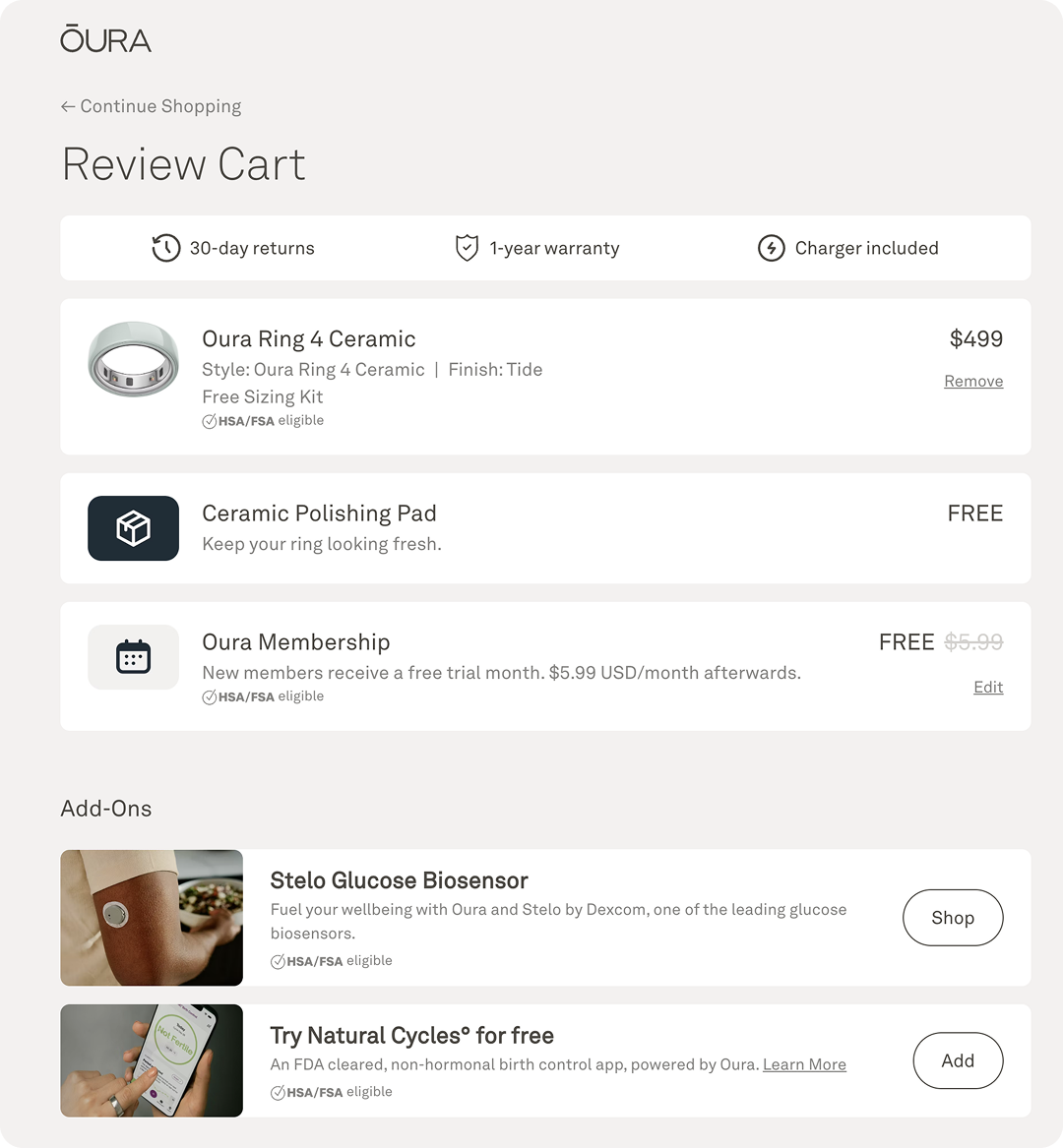
2. Embrace White Space
Creating designs that look simple can actually be hard! Visually having enough breathing room between blocks, headlines, and individual UI elements is essential. The goal here again is to not overwhelm the user.
Having enough padding and margins to make information more easily digestible can truly make or break a layout. When layouts get too crowded, or if type becomes too cramped on a page, this can lead to user frustration and confusion.
3. Design Feedback States
Creating feedback loops and UI states are so important! A few examples of feedback or confirmation states include a success page, or sonar that pops up when something is completed or changed to help reassure users that an action was registered.
For instance, having clear button states are key in communicating what the expected interaction should be. The two key things to keep in mind when it comes to buttons are:
- Hover states help users know the button is working
- Loading ensures that the action is being processed
I’ve definitely had experience on a website where there was no button hover state, and I thought that the button was broken. Although feedback states seem natural to users, they need to be accounted for in the design.
Source: Dribble
4. Maintain Consistency
Having consistency in design UI makes a system feel cohesive and intentional. This comes from things like using similar border radiuses, colors, and spacing.
Another example is having a consistent header component on a new dashboard page or to indicate the start of a table. This is where having super organized and clear component set up makes consistency much more easy to maintain in a large complex UI product or throughout a website.
When elements are styled and behave consistently across a product, users learn the pattern once and apply it everywhere.
5. Follow Familiar Patterns
Jakob’s Law states that people spend most of their time using digital products other than yours. Users’ experiences with those other products set their expectations. Failing to maintain consistency may increase the users’ cognitive load by forcing them to learn something new. Although this is considered a UX principle, this applies to thinking about UI design as well. For instance, everyone knows to look for the “X” button when trying to close out of a window, or looking for a search icon when looking something up.
Using the same iconography, or designing a pop-up with the CTA button at the bottom, creates a visual treatment that users are already used to and creates clearer design efficiency in your UI component.
6. Design for Accessibility
Ensure that your components and design elements meet WCAG standards. Some examples include:
- Having a 4.5:1 ratio for color contrast
- Including alt text for images for color contrast
- Ensuring keyboard navigation is clear and all interactive elements can be used by a keyboard
- Having large enough font size, using 16px as a baseline is a good starting point
Accessible UI design ensures that people of all abilities can use your product. These practices also help improve the overall experience for all users.

7. Design for Responsiveness
Design for various breakpoints and input methods. Interactions should feel natural for each device. Mobile users tap and swipe; desktop users click and hover.
For example, when navigating on mobile, a user will need to be able to access a hamburger menu to see all of the page options easily. Screen sizes range from small mobile phones to large desktop monitors, and a good UI design should look great and not lose functionality at various breakpoints.
Before we move on to some extra special tips from me, let’s recap:
|
Tip |
What Is It |
Why It Matters |
How to Do It |
|---|---|---|---|
|
Use Hierarchy-Driven Layouts |
Organizing content so the most important info is visually dominant |
Reduces cognitive load and helps users make decisions faster |
Use type scale to lead the eye; pair headline content with smaller supporting elements |
|
Embrace White Space |
Giving elements enough padding and margin to breathe |
Prevents overwhelm and makes layouts easier to scan |
Set consistent spacing variables in even intervals; never crowd headlines or blocks |
|
Design Feedback States |
Visual responses to user actions (hover, loading, success, error) |
Users need confirmation that something happened (or could happen, or is happening) |
Build button hover and loading states; add success or confirmation indicators for completed actions |
|
Maintain Consistency |
Using the same border radii, colors, spacing, and component patterns throughout |
Users learn patterns once and apply them everywhere; inconsistency breaks trust |
Centralize components; reuse the same header, card, and table patterns across your product |
|
Follow Familiar Patterns |
Designing UI that matches what users already expect from other products |
Forcing users to learn new conventions increases cognitive load |
Use standard iconography (X to close, magnifying glass to search); place CTAs where users expect them |
|
Design for Accessibility |
Meeting WCAG standards so all users can interact with your product |
Expands your audience and improves the experience for everyone |
Maintain 4.5:1 color contrast, use 16px+ font sizes, support keyboard navigation, and include alt text |
|
Design for Responsiveness |
Building layouts that work across screen sizes and input methods |
Users are on phones, tablets, and desktops; a good UI works on all of them |
Design for key breakpoints; use hamburger menus on mobile; adapt tap vs. click interactions per device |
Extra Design Tips From Personal Experience
Now that we’ve reviewed a few basic best practices, I also wanted to share some tips that I’ve picked up over the years!
Helena’s UI Design Tip #1: Mind the Space
When I first started working on UI layouts, I realized that my spacing was inconsistent. I realized that I needed to create spacing variables in even number intervals to even out the padding across all UI components. This has reduced guess work and helped establish a unified language with how to approach using what spacing where.
Helena’s UI Design Tip #2: The 6-3-1 Rule
Another popular UI design rule is the 6-3-1 rule. This rule of thumb comes in handy when thinking about what colors to use in your system to ensure that the accent colors highlight important information and overall the colors don’t feel overwhelming to a viewer.
- 60% of the interface uses a dominant neutral color like off-white or black (think large surfaces)
- 30% uses a secondary color (sidebars, cards, supporting elements)
- 10% uses an accent color (CTAs, highlights, interactive elements)
UI Design Final Thoughts
I’ll also say this from personal experience: It’s easy to get overwhelmed by all the different design theories and principles out there.
At the end of the day, all of these tips, tricks, and learnings come back to the same core ideas. If you have to prioritize, I would suggest starting out with remembering that less is more and having an organized, clear, and consistent UI system can make all the difference between the velocity that your design and/or product team moves and getting stuck down the road.