

Data has always told stories, but only when given the right voice. Long before dashboards and analytics tools existed, humans were drawn to the power of translating complex information into something visual, repeatable, and instantly understood.
Whether it’s a simple chart sketched on a napkin or an intricate interactive graph, data visualization sits at a fascinating crossroads between science and design, and mastering its techniques can transform the way you communicate ideas entirely.
What Is Data Visualization?
Data visualization is a broad term that spans the myriad ways in which we represent pieces of data in a visual format:
- A chart displays data points in relation to each other.
- Diagrams break down a complex system into its individual parts.
But data itself is broader than most marketers assume. Designer Giorgia Lupi’s Dear Data, The Project (in which she and Stefanie Posavec exchanged hand-drawn postcards visualizing the intimate details of their daily lives) proved that data can be personal, qualitative, and deeply human.
For marketers, that’s a powerful reframe. The numbers in your campaign reports tell only part of the story; the way you present them determines whether your audience feels informed, inspired, or lost entirely.
Importance of Data Visualization
Information design is pervasive, and it’s no wonder why: roughly 65% of the population categorizes themselves as visual learners. The average person retains 80% of what we see, compared to 20% of what we read, and just 10% of what we hear.
For marketers, that gap is everything.
Data can carry the emotional weight of a photograph, and sometimes more.
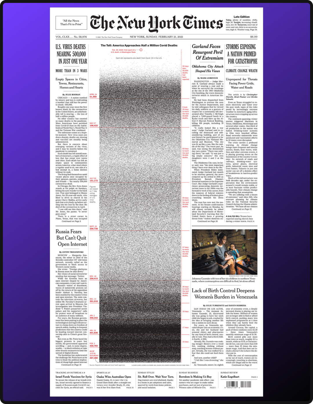
In February 2021, the New York Times dedicated its entire front page not to an image, but to a visualization of the COVID death toll, one year after the pandemic reached the US. The result was what they called a “wall of grief”: a stark, data-driven memorial that was as emotionally stirring as it was informative. The choice was deliberate. In a moment of collective uncertainty, raw data communicated something a photo couldn’t: undeniable, unfiltered reality.
This same principle applies to every deck, report, and campaign recap you put in front of a client. The data you already have (campaign performance, customer behavior, market trends) has the potential to tell a story that resonates far beyond a bar chart.
When visualized thoughtfully, it doesn’t just inform your audience; it moves them to feel, and ultimately, to act and make data-driven decisions.
Classic Data Visualization Techniques
Once you’ve defined your narrative and know the story your data needs to tell, format becomes your most important decision. Below are a few classic visualization techniques that information designers have long relied on; consider this a starting point, not a complete list.
Quantity Focus
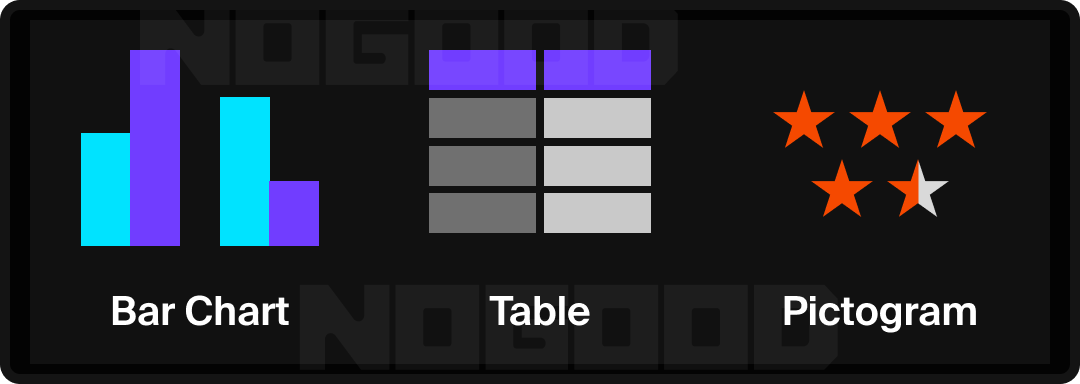
- Bar Chart: Tallies amounts over related categories and can show breakdown in nested bar charts.
- Tip: Sorting bars from highest to lowest creates a ranking narrative, making it easier for your audience to draw conclusions quickly.
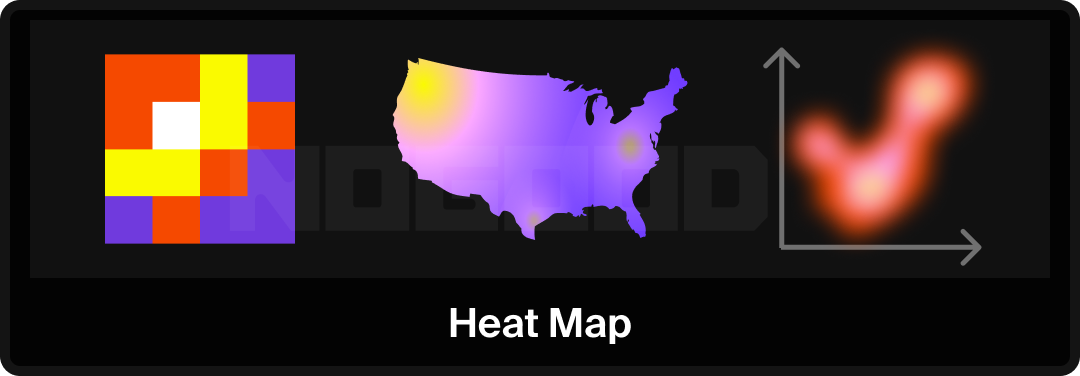
- Tables: A basic way to assign values and titles to data. Highlighting cells can create a heat map effect to draw attention to certain patterns in the data.
- Pictogram: Uses icons or symbols to represent data quantities, making abstract numbers more tangible. Works well for audiences who respond to intuitive visuals over raw figures.
Time Focus
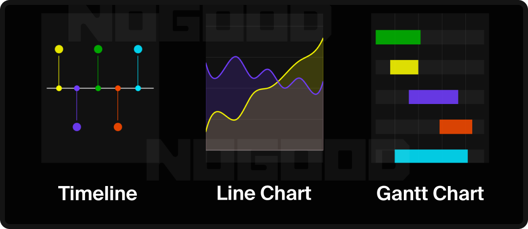
- Timeline: A classic way to show events over time in relation to one another.
- Line Chart: Draws a connection between data points over time.
- Tip: When plotting multiple lines, limiting to 3-4 maintains readability. Beyond that, the chart requires more effort to parse than the data warrants. If you’re looking to emphasize volume or cumulative trend over time, consider an Area Chart, which fills the space beneath the line, making growth or decline more visually immediate.
- Gantt Chart: Shows the progression of a journey over time, similar to a horizontal bar chart. Commonly used in project management, but applicable to any multi-phase process.
Distribution Focus
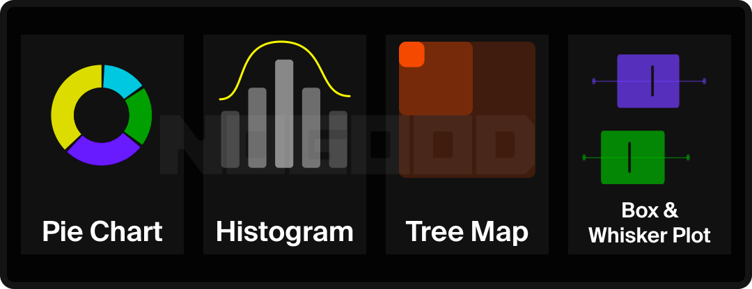
- Donut/Pie Chart: Showcases percentage, or part of a whole distribution.
- Tip: Transforming a pie chart to a donut chart helps visualize quantity distribution more clearly, and creates space in the center to call out a key data point.
- Histogram: Displays the distribution of one attribute across a collection of data.
- Treemap: Uses nested rectangles to represent hierarchical data, where the size of each rectangle corresponds to its value. Useful for showing part-to-whole relationships across multiple layers of categories simultaneously.
- Box-and-Whisker Chart: Tells the overarching story of data through its quartiles and helps determine if data is skewed.
- Tip: Effective for showing performance ranges, such as ad spend efficiency or engagement rate variance across campaigns.
Location Focus
- Heat Map: Uses a gradient to imply weighted distribution across either a geographical area or a dataset.
- Tip: In website UX analysis, overlaying a heat map on a landing page reveals where attention is concentrated and where it drops off.
Relationship Focus
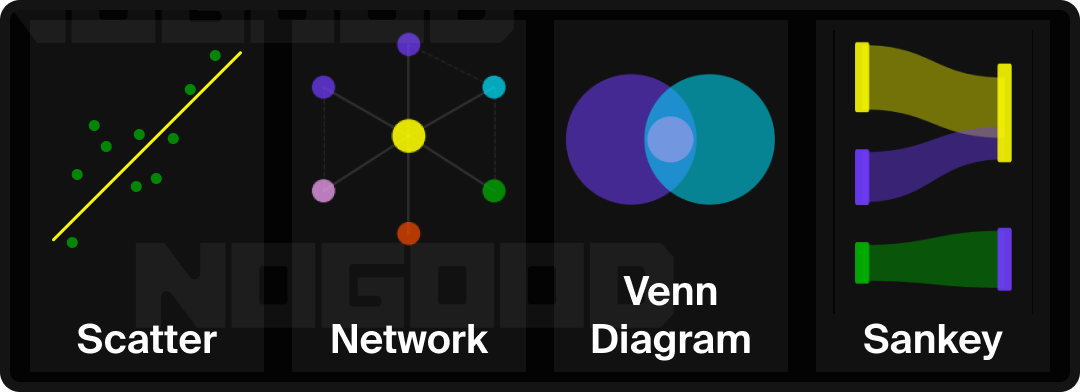
- Scatter Plot: Displays the relationship between two variables by plotting individual data points. In combination with a line of best fit, the general trend across the dataset becomes visible.
- Tip: When a third variable is relevant, a Bubble Chart extends the scatter plot by encoding that variable through bubble size, useful for visualizing audience segments across multiple dimensions at once.
- Network Diagram: Maps the connections between nodes, such as people, systems, or ideas, to show how elements relate to and influence one another. Applicable to org structures, audience ecosystems, or content relationships.
- Venn Diagram: Illustrates overlap between two or more groups, making it straightforward to identify shared attributes or audience segments.
- Sankey Diagram: Visualizes the flow and volume of data moving through a system. The thicker the line, the greater the quantity. Useful for mapping customer journeys, budget allocation, or conversion funnels.
- Tip: Effective for conversion funnel analysis. Once drop-off points are mapped visually by flow volume, they become easy to identify and act on.
Advanced Visualization Techniques
Whether you are creating in Excel or Illustrator, there are a series of strategic design choices you can make to ensure your visualization is both visually engaging and easy to digest.
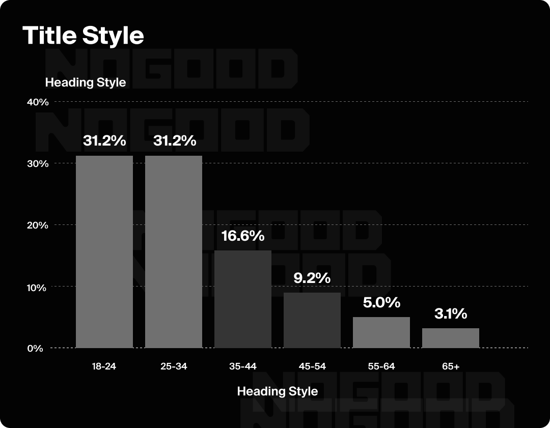
1. Type Hierarchy
Type hierarchy refers to varying the font size and/or weight of a typeface within your graphic in order to communicate levels of information. You may see the word “Display” used in the titles of some typefaces. Display means that the font is intended for larger applications, like the biggest headline on a page. These fonts are not ideal for body copy, as their decorative elements are designed to be viewed at a larger scale.
Limiting yourself to a few styles is key to a clean data visualization. A good guideline, from largest to smallest, is to have a title style, H1, H2, body text size, and a numeric size.
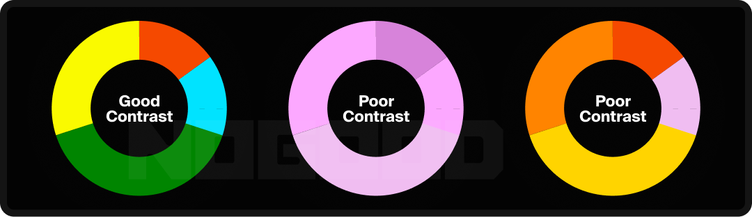
2. Color Contrast
According to WCAG standards, the recommended contrast ratio between two colors for optimal legibility is about 4.5:1. This can be tested with tools like WebAIM’s contrast checker. This standard applies to text as well as data points. For example, slices of a pie chart should have sufficient contrast so that the distinctions between segments remain clear.
3. Emphasis
Once the foundation of your visualization is in place, you can start directing attention and shaping the narrative of the visual, guiding your audience toward exactly what you want them to notice and when. This can be accomplished through a striking color choice in one area while minimizing color usage in others, or by introducing a distinct style to your type hierarchy.

4. Reduce Eye Movement
Reducing the optical journey a viewer has to take helps minimize cognitive overload. In practice, this means removing lines leading away from the graphic where possible, and not relying too heavily on a key or legend to make the graphic legible.

5. Use Illustration
When a data visualization references a familiar setting or subject, representing information in forms specific to that subject matter can make the graphic more arresting and memorable. For example, using tree rings as visual inspiration for a report about ecology, or adding icons to descriptors to enhance visual clarity.
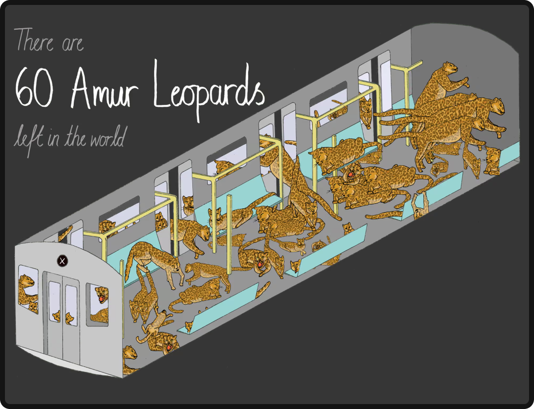
Mona Chalabi, Endangered Species on a Train, The Guardian, 2018. Pulitzer Prize-winning data journalist and illustrator Mona Chalabi used a New York City subway car as the visual container for endangered species population data, each animal drawn to scale, the subway car standing in for a bar chart. The subject matter and the format are completely inseparable.
6. Combining Approaches
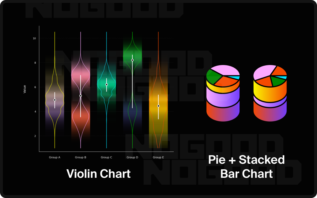
Consider the possibility of building on your data by combining classic formats to create something entirely new, bespoke to your dataset. For instance, a Violin Plot combines aspects of a scatter plot, area chart, and bar chart to show both distribution and probability across a dataset.
7. Breaking Expectations
Manipulating form to generate a surprising contrast between data points is also an effective storytelling strategy.
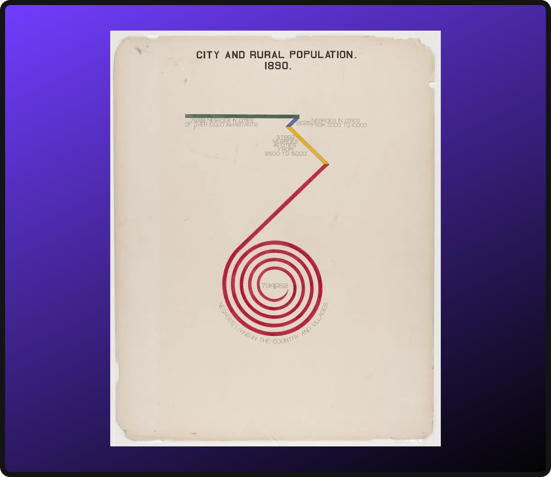
W.E.B. Du Bois, Assessed Value of Household and Kitchen Furniture Owned by Georgia Negroes, 1900. Rather than a conventional bar chart, Du Bois bent the data into a spiral; the form itself communicating the magnitude of growth in a way a straight bar could not.
Choosing the Right Technique for Your Audience
Data visualization can feel overwhelming at first, but that’s rarely a reflection of the viewer’s ability. More often, it’s a design problem. When information is presented in the wrong format, even the simplest data can become difficult to parse. Here are a few audience-centered considerations to guide your format decisions:
- Reading Direction: Western audiences read left to right, which makes horizontal layouts a natural fit for time-based concepts. Placing the earliest point on the left and the most recent on the right aligns with the viewer’s instinct, reducing the effort needed to orient themselves within the data.
- Data Literacy Level: Consider how familiar your audience is with data. A general consumer audience may need simpler, more intuitive formats like bar charts or pictograms, while an analytical or executive audience may be comfortable with more complex formats like scatter plots or box-and-whisker charts. When in doubt, lead with the simplest format that still tells the full story.
- The Size of Your Dataset: The volume of data points you are working with should inform your format choice. A small dataset may be best served by a clean table or bar chart, while a large dataset may require a format like a histogram or treemap to make patterns visible without overwhelming the viewer.
- The Medium: Where your visualization will live matters. A printed report, a presentation slide, and an interactive dashboard each have different constraints around space, resolution, and interactivity. A format that works well in one context may lose its legibility or impact in another.
- The Question You Are Answering: Every visualization should be built around a single, clearly defined question. If you find yourself unable to state in one sentence what your graphic is communicating, the format may need to be reconsidered or the data may need to be narrowed.
Where to Go From Here
Data visualization is a practice, not a destination. The techniques and frameworks covered here are a foundation, but the most effective visualizers develop their instincts over time by studying work they admire, stress-testing their own designs against real audiences, and staying curious about new formats as they emerge.
A few ways to keep building:
- Study the field. Information design leaders like Giorgia Lupi, Edward Tufte’s The Visual Display of Quantitative Information, and the Data Visualization Society are all strong starting points for going deeper.
- Audit your existing work. Pull a recent report, deck, or dashboard and run it through the principles covered here. Ask whether the format matches the story, whether the hierarchy is clear, and whether a viewer could reach the key insight without any guidance.
- Start simple. Sophistication in data visualization is not measured by complexity. The most effective visuals are often the most restrained. Pick one dataset, one question, and one format, and work to make that combination as clear and considered as possible.
Data has always had the power to inform, persuade, and move people. The role of a thoughtful visualizer is simply to make sure it gets the chance to do all three.