What is UX Writing: How to Write for the User JourneyGood writing isn’t one-size-fits-all. A well written piece of copy could drive conversions at one stage of the user journey but alienate potential users at another. Context matters, meaning that good writing starts with understanding the target user and the journey that they go through from initial acquisition to long-term loyalty. As websites and apps became increasingly complex and developed, UX writing emerged as a solution and a discipline to help marketing and product teams optimize their copy to various points in the user journey.
Let’s dive in the UX writing — what it is, why it’s important, and how to do it right.
What is UX writing?
UX writing is the art of writing for the interface of digital products (e.g. websites, mobile apps, etc.) to guide the user through the interface in an intuitive manner. This includes writing the text that shows up on CTA buttons, navigation bars, error messages, onboarding screens and more. An easy way to think about UX writing is to imagine it as a built-in product manual that is written into the experience of the user interface itself; instead of providing a standalone manual, the UX writer creates frameworks to help the user navigate the product in the most fluid and non-disruptive way possible.
The key to quality UX writing is a fundamental understanding of the user journey and the contextual differences between users’ needs and behaviors at each digital touchpoint. UX writers must align their copy with the company’s brand voice and compel action towards the company’s goals, while still resonating with the target user to build trust and fulfill their needs. In other words, UX writing acts as a bridge between users’ needs and the company’s goals by creating a cohesive experience from start to finish.
That being said, UX writing is often a process of experimentation and optimization as opposed to a one-off project. Every UX writing project should begin with UX research into the behaviors and pain points of the product’s ideal user. Much like UX and UI designers, UX writers should A/B test several versions of different copy variations to determine the most ideal way to communicate with their users. UX writers should also work closely with product teams to conduct user research and develop a better understanding of what their target users’ needs, wants and pain points are.
UX Writing v.s. Copywriting
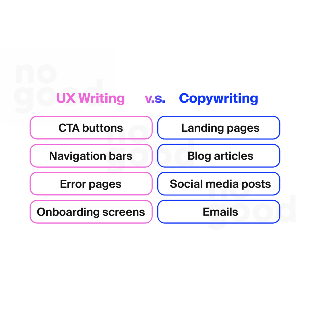
Although UX writing and copywriting require similar skills of research, outlining, and editing, the two are wholly different disciplines that sit under two different departments in a company. UX writing is embedded into the product interface itself, therefore it sits under the product design team. Copywriting aims to persuade the consumer to perform a certain action to drive engagement, revenue, or conversions, therefore it sits under the marketing team. UX writers report to product managers, while copywriters report to marketing managers or content strategists. Simply put, UX writers write copy for the product, whereas copywriters write copy about the product.
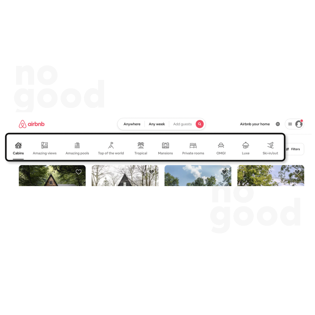
Consider these two pieces of copy from Airbnb, for example. On the left, we see an example of UX writing — copy that is built into the product itself and helps the user navigate the product. Those looking for a cozy outdoor escape can browse through a curated gallery of “cabins”, while architecture nerds can click the “OMG!” tab in the menu to explore eccentrically designed homes. Rather than highlighting more mundane features of a residence like the number of bedrooms, the amenities or the location, Airbnb’s UX writers are honing in on their users’ desire for unique experiences by writing descriptive category descriptions such as “Amazing views”, “Top of the world”, “Ski-in/out” etc. These pieces of microcopy are built into the product itself and helps the user filter through thousands of listings to find the one that best meets their needs.
On the other hand, on the right we see an example of copywriting, also from Airbnb. The combination of the imagery and the tagline “Live there. Even if it’s just for the night.” urges the viewer to book a stay with Airbnb to explore a new destination. The copy focuses on communicating the overall value of the product rather than its functionality, and aims to tell a story about what the user will get if they choose to book with Airbnb. The difference between UX writing and copywriting is subtle — but important; each requires taking a different perspective in order to best achieve the goal behind why the copy is being written. Copywriting is about storytelling — it’s persuasive, creative, and often sales-oriented. UX writing is more so about clarity, direction, and assistance.

A step-by-step guide to UX writing (with UX writing examples)
Now that you have a good understanding of what UX writing is, it’s time to get into the weeds of it and develop the ability to write for each different phase of the user experience.
Every product’s user journey is different (and it should be); however, most digital products follow a standard 5-stage process of acquisition, registration, onboarding, initial usage, and retention. Each of these stages will include different touchpoints in which the user will read and interact with different types of copy. Here is an overview of all the pieces of copy that a user might encounter along their user journey.
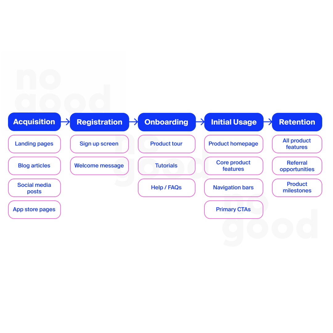
The first stage, acquisition, lies outside the realm of UX writing and falls to the responsibility of copywriters instead. Acquisition is typically a marketing-focused effort where the eventual goal is some form of conversion, whether it be an app download, a registration, or an email capture. With that said, let’s break down how to write for the following stages of registration, onboarding, initial usage, and retention.
1. Registration
The registration phase refers to the very first touchpoint a user has with your app or product. Every product has a slightly different registration flow, but this is the stage where we typically see sign up screens, welcome messages, and some form of product introduction. It’s when mobile apps will ask for permission to send push notifications, highlight subscription offerings, and ask for information to complete a user profile.
First impressions matter, and for the registration stage, it’s crucial that the brand voice is communicated clearly and consistently through every screen and every piece of microcopy. Having a clear brand voice right from the start establishes the tone of the product-user relationship going forwards, and gives the user an idea of what to expect as they continue to engage with the product. For example, the first screen a user sees after opening the Headspace app for the first time is a prompt asking the user to “breathe in” and “breathe out”, which is paired with a soothing motion graphic. Through a simple, action-oriented and brand-aligned piece of microcopy, Headspace is able to communicate the main value proposition of the meditation app and incentivizes the user to complete the registration process in order to access the full suite of the product’s features.

Another element of UX writing that Headspace does effectively is permission priming and goal-driven incentivization. Studies show that only 40% of iOS users opt-in to push, which impacts retention rates over time as apps lose the ability to directly communicate with lapsed and inactive users outside of the app. To combat this problem, Headspace uses a problem-solution framework to prime the user to approve push notifications as a way to achieve their goals. In the fourth screen, Headspace asks users to indicate their goals by answering an “I want to…” with tangible objectives such as “reduce stress”, “manage anxiety”, and “sleep better”. What this question does is it highlights the problem the user is facing, and positions Headspace as the solution to that problem. The two screens immediately after this multi-select questionnaire are the revenue and retention drivers of the app: the subscription offerings and the push notification approval buttons. In order to meet the wellness goal that they just indicated, users can either “unlock the Headspace experience” through a subscription and/or “turn on notifications to get the most out of Headspace”. Effective UX writing turns every touchpoint into a conversation, so that there’s a two-way exchange between the user and the product that drives the interaction forwards.
2. Onboarding
The next phase after registration is the onboarding flow or product tour. This phase will typically include a product tutorial, which can come in the form of pop up screens, setup checklists or interactive coach marks. On average, 1 in 4 users will abandon a mobile app after using it just once, making the onboarding phase particularly crucial in educating the user and setting them up for continued usage.
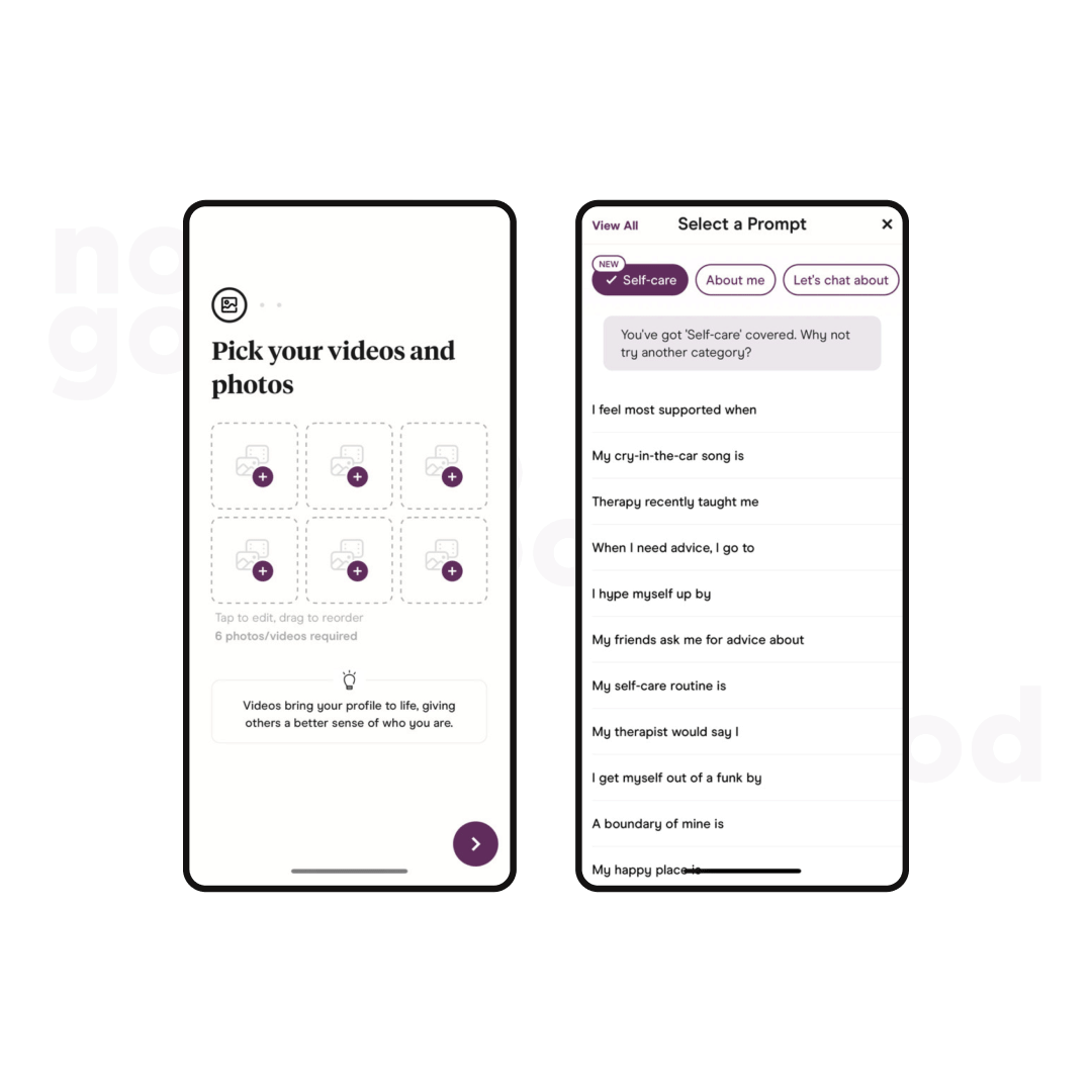
Hinge is an example of an intuitive, interactive and user-oriented onboarding experience that utilizes effective UX writing to help the user set up their account. In addition to action-oriented headers like “pick your videos and photos” and “select a prompt”, Hinge surfaces secondary microcopy to give further guidance to the user. All pieces of copy are kept short and simple to ensure clarity and quick comprehension, but what’s most unique about Hinge’s UX writing is that it places the user in a competitive mindset by setting expectations throughout the onboarding flow. Want to set up the best profile? Want to get more matches? Hinge tells users to add videos to give others “a better sense of who you are”, and encourages users to “try another category” to diversify their profile prompts. These suggestions place the user in the mindset of improvement and optimization, thus giving them a sense of control in their journey with the app. Good UX copy guides the user with what they must know, but excellent UX copy goes above and beyond to reinforce the steps that users can take in order to optimize the value they can receive from the product.
3. Initial usage
Now that the user is registered and onboarded, the key step of the user journey is the initial usage or first-time product experience. Initial usage is when the user is actively interacting with the core features of the product, through either the product’s homepage, navigation bars, or primary CTA buttons. While onboarding is more about helping the user understand how the product works and what they can gain from it, the initial usage phase is all about creating a positive experience that answers to the initial expectations users had.
Notion does a good job at using UX writing to ensure a smooth intial usage experience for the newly onboarded user. Rather than dropping users into empty pages and untitled templates, Notion welcomes new users into the platform with pre-populated notes, tasks checklists and reading lists so that users feel like they have a jumping off point to adapt off of.
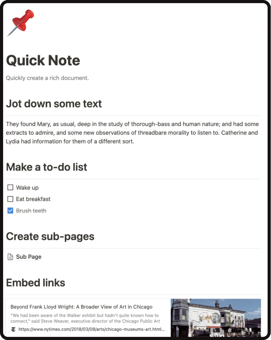
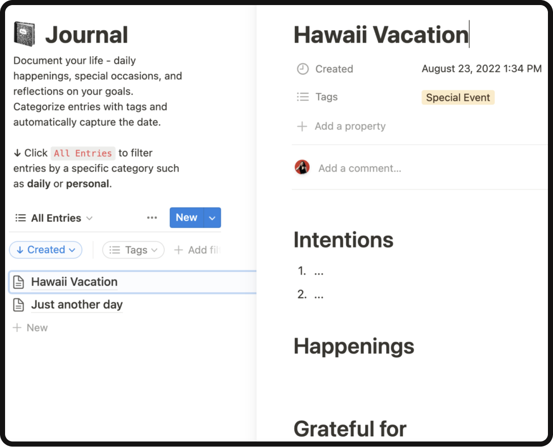
Notion’s UX writing uses a combination of straightforward instructions and practical use-case placeholders to guide the user through their initial usage of the product. You’ve heard of “show, don’t tell” — but why not do both? To-do list examples like “wake up” and “eat breakfast” show users the most basic version of what they can use Notion for, and headings like “make a to-do list” and “jot down some text” use action-oriented language to tell users on what to do. The “show” dimension demonstrates what the app can do for the user, while the “tell” dimension instructs the user on how to execute on their wants and needs.
When writing for the initial usage phase, it’s important to research and create data-backed audience personas to avoid alienating new users at the onset of their relationship with your product. These audience personas should include demographics, personality traits, pain points, behaviors, and goals, which are all components that can then define the types of use-case examples that you would want to include in your UX writing. For example, if Notion’s target user persona is struggling to keep track of the various books, podcasts, and journals that they consume, the UX microcopy should include examples of these items that are organized in a way that solves their specific pain point.

4. Retention
The last and longest phase of the user journey is retention: now that you’ve acquired your user, how do you convert them into a long-term, loyal customer? UX writing can be a key piece of the retention puzzle by communicating with users at key moments to bring them back to the product on a regular basis.
Personalization is a core component at the heart of every good retention strategy — and there’s no better example of personalization than Spotify. Spotify uses its UX writing to deepen the product-user relationship and incentivize regular usage. Through a combination of data-driven narratives and emotionally resonant storytelling, Spotify’s personalized playlist recommendations are a masterclass in how good UX writing can make the difference between one-time usage and lifetime loyalty.
The first success detail of Spotify’s UX writing is that it’s data-backed and personalized to the target user. Spotify collects large amounts of data on each user’s listening habits, and uses that data to generate recommendations catered specifically to the user’s music preferences. For example, someone who listens to a large amount of Broadway musical albums might see a section on their home screen titled “The new generation of Broadway”. If someone has been listening to a lot of sad music made by female artists (think Lana Del Ray, SZA, Gracie Abrams etc.), they might see a selection of playlists titled “sad girl anthems”.
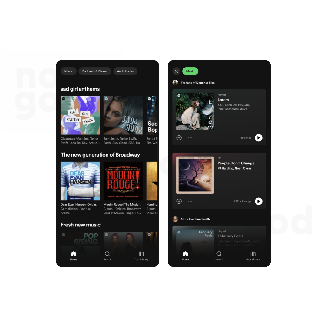
Data is a great starting point of UX writing, but it doesn’t tell the full story, nor does it guarantee retention — that’s where narrative and storytelling come in. Effective UX writing considers the narrative of how a piece of copy will play out in the real world, and sets the foundation for the problem that the product feature (which in Spotify’s case is a playlist recommendation) is going to solve. What situation and mindset is the target user in when they are met with that playlist? What is most important to emphasize? What is the subsequent behavior that you want to create?
Take the “sad girl anthems” section for example. It’s a short 3-word title, yes, but in the realm of UX writing where space is limited and clarity is preferred, every word counts. Here is a breakdown of why this piece of microcopy works:
- It’s all in lowercase, which ties the mood and the energy of the playlist curation back to the similarly all-lowercase song names that are common in the genre of sad girl indie pop (see Billie Eilish and Lizzy McApline)
- It identifies a specific persona (aka the “sad girl”) and creates a relationship with the user through a that hyper-niche mindset
- It combines misery (“sad girl”) with empowerment and strength (“anthems”) and taps into the human behavior of processing one’s emotions and healing through music
At the core of UX writing for retention is the ability to leverage data for effective and emotionally resonant storytelling. This is where attention to detail and an in-depth understanding of users’ contexts and behaviors can ensure that every word is optimized for maximal impact.
How do I become a UX writer?
Now that you understand what UX writing is and how to effectively craft copy for each stage of the user journey, you can take steps towards becoming an expertly skilled UX writer. A lot of becoming a good UX writer will naturally come with experience and exposure to relevant projects, but here are a list of potential resources to help you get started:
- Build a foundation in copywriting: A good ux writer should have sufficient background knowledge in copywriting to be able to work closely with marketing teams when optimizing a product for acquisition and retention.
- Take a UX writing course: Hone in on the technicalities of effective UX writing frameworks to set yourself up for success
- Curate your UX writing portfolio before applying for UX writing jobs: Include practical examples of work through screenshots, mockups, and case studies. Walk the reader through your design process, and highlight the outcome of how your UX writing impacted the overall product or user experience.
- Stay up to date with industry trends in the UX space: Like any other realm within marketing, UX is a constantly evolving space. Stay informed on all the trends and changes that are happening within the industry by listening to UX podcasts or reading UX-related articles.
- Familiarize yourself with AI writing tools: Learn to work with AI in your writing process or risk falling behind. Explore different AI writing tools and find the one that works for you and your brand.
If you’re looking for a partner in growth to help you take your UX content and UX design to the next level, we’ve got the tools and the experts to help you get to where you need to be.


