On average, people are spending 4.5 hours on their phones every day. This screen time has only gone up in the last few years and will likely only continue to do so as society pushes forward with a digital-first mindset.
This means that it’s essential to take a mobile-first approach when designing apps or any online environment to ensure you’re creating a positive user experience (UX). Having a strong mobile experience is also integral for businesses and brands to drive conversions and user engagement. Let’s dive into the key UX design principles for an optimized mobile experience.
Core Mobile UX Design Principles & Strategies
Users typically have two main goals: (1) complete an action with the least amount of resistance; and (2) find the key information they’re looking for. Mobile UX should ensure it’s as easy as possible for users to meet those goals.
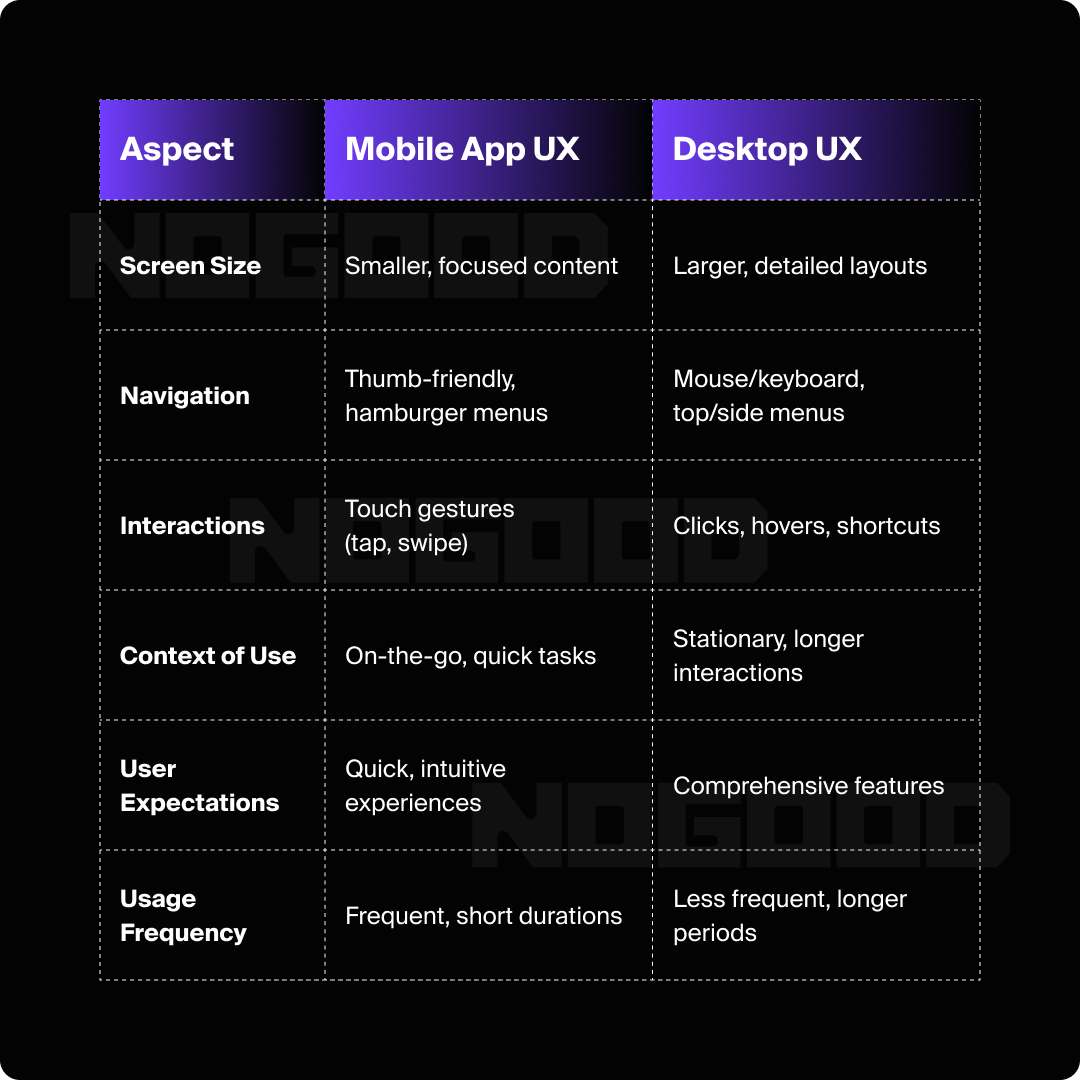
Mobile UX should be thumb-friendly, because users are typically on the go. When it comes to differentiating mobile UX from desktop design, the main differences to consider are:

Screen Size
Mobile devices have a much smaller surface area than desktop devices. It’s important to prioritize essential content and think about the hierarchy of information so users can easily see key actions.
This means thinking about decluttering information and simplifying the user interface (UI). It’s also important to think about what’s right above the fold before users keep scrolling further down. Is it going to catch the user’s attention? Is what they see first going to be enough to keep them on the site?
In terms of accessibility, making sure that font sizes are accessible on mobile devices is also important. The general rule of thumb is 16px is a good standard starting point; however, 14px is alright for smaller text where needed, based on the use case.
Navigation
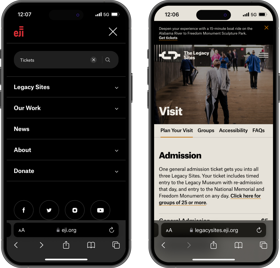
It’s crucial to have mobile friendly ways to navigate back and forth. Mobile navigation can vary in design such as hamburger menus or tappable filter selections. The main thing to consider is how many categories your user may be trying to navigate to, and what is the most seamless way to get there.
What pages are more important than others? How does that impact the hierarchy of navigation? This might also mean including a search bar, like Equal Justice Initiative does, so users can search directly within the navigation to find relevant information.

Interactions
Common motions on mobile are thumb taps, swipes, and thumb scroll. It’s important to consider the touch target size, which is the minimum surface area that users can tap to interact with their finger.
If two buttons are too close to each other, users will have more accidental taps or not be able to properly select their intended action. This is a critical part of user ease and satisfaction on mobile. Suggested spacing between mobile touch targets can range from 8-12 pixels depending on the size of the button.
Location & Context
Mobile users are typically on the go or traveling versus just sitting at their desk. If users are on the go, it also might mean they’re on data or are offline. Considering what critical information can be accessed for the user even in the offline state involves designing with intention.
Thinking about the audience and persona for a particular app is also key to understanding what other localization might need to be accounted for. For instance, Figma has offline functionality that still allows users to create layers, create new files, and change other style properties.
User Expectations
Speed and simplicity are critical for an optimized mobile user expectation. This might mean ensuring screens are simplified to have a primary task per screen and not overwhelming users with options or choices to make.
According to Hick’s Law in UX design, it takes a person more time to make a decision if there are more choices available. By using categories, grouping information, and breaking down tasks into smaller steps, you can make it easier for users to take actions quickly and make decisions.
Other design aspects, like micro-interactions, help users know that an input has been made or a state has changed, and whether or not they’re doing something correctly. For example, a micro-interaction can include notifying users when they’ve filled out a field incorrectly and what the issue is, giving the user the information they need to fix the issue.

Frequency of Use
Mobile users often have shorter sessions than desktop users. This means thinking about how quickly users might need to find something or alternative ways of taking actions such as voice commands. According to Fitt’s Law, the time it takes to interact with a link or button is in direct relation to the size and distance from the user. This means increasing the size of certain buttons on mobile will naturally increase the speed at which users interact with it.
UX Personalization with AI
Artificial intelligence continues to become more integrated into our day-to-day lives. Naturally, it has become second nature to incorporate into mobile apps to improve the personalization of those apps and overall user experiences. This can be seen in applications like ClickUp that can provide AI generated summaries of the status of tasks that have been completed.
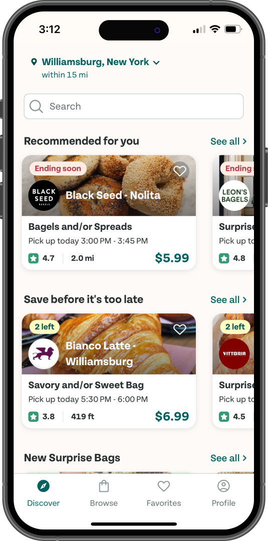
This is also seen in apps like Too Good To Go, which allows users to purchase food that may otherwise go to waste at the end of the day. It has a “Recommended for you” section, highlighting establishments that align with a user’s preferences, based either on location or previous food choices.

Similarly, e-commerce apps or consumer apps often share suggestions based on past purchases and tailor suggestions to user needs.
AI assistants, like Alexa and Siri, have also incorporated natural language processing (NLP) that make searching or completing tasks quite literally “hands off” and more integrated into the user’s day-to-day life. This can be extremely helpful for mobile users when they’re on the go or multi-tasking and can use voice commands to complete tasks without even having to touch their phone.
There have also been advanced accessibility tools like Google’s Live Transcribe, which provides real-time transcriptions for hearing or visually impaired users. There are also mobile accessibility tools, like VoiceOver or TalkBack, that can help with text to speech functionality or object identification by using a mobile camera.
AI integration can improve the user experience by making tasks easier and leaving users feeling more satisfied.
Put Users First
It’s always important to see things from the user’s perspective. Tapping into users’ feedback, either by conducting feedback sessions or sending out surveys, is the best way to keep their perspectives at the forefront of your UX design.
Other analytics tools can help you dive deeper into user behavior from a data perspective. Platforms like Google Analytics can report on number of sessions, session duration, actions taken on the page, etc. Tools like Hot Jar can show you how users are interacting with an app, where they’re looking, and how they’re navigating around your interface. These additional tools can be helpful in analyzing how users are currently behaving and give you insight to further enhance the experience.
Establishing trust with users is also important, especially when users need to enter personal data such as payment information or even more details about themselves. The user is more and more aware of how data can be utilized for marketing purposes, and ensuring there are data privacy notifications or call outs for the user is key to building trust with technology rather than deterring users from engaging with an app.
Mobile UX Takeaways
Designing for users will continue to evolve. However, the mobile UX best practices mentioned above will remain core to a truly valuable user experience. From considering user intent and accessibility to ease of navigation, user expectations will remain fundamental points to consider in the overall user experience.
When it comes to AI and establishing trust with the user, we can see these as opportunities to improve the user experience rather than shy away from these advancements. By staying ahead of these trends, designers can create mobile experiences that are not only functional but also captivating and forward-thinking.


