You know the feeling. You’re scrolling on Instagram, see a cool ad or post for Oura Ring and decide to click through to the site. You’re directed to a clear landing page, find the new generation Oura Ring 4 you’re looking for, and decide to head to the checkout.
You’re prompted to select your ring color and given an option to get a ring sizing kit to determine your exact size for their product – even though you thought you knew your ring size. This is a clear example of a well thought out user experience, anticipating the user’s needs in order to deliver a seamless transaction.
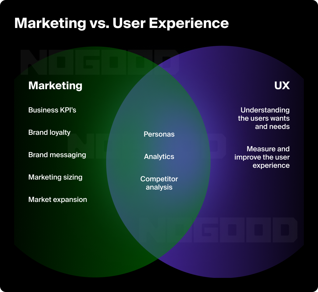
Both marketers and designers need to anticipate the overall user experience from the various touchpoints where users are interacting with their brand or service. Strategically curating those experiences helps drive user trust, engagement, and ultimately conversions.
What is UX in Marketing?
User experience in growth marketing refers to the overall experience that a user has while interacting with a company’s digital products and services, such as websites, apps, emails and social ads. It focuses on creating user experiences that grab users’ attention, are intuitive, and provide an overall positive experience for the user.
User experience starts from when a viewer sees an ad to what happens after that user clicks on an ad or button in an email. Does the ad load quickly, meet accessibility standards, and convey a clear message or action? Does the email call to action button take users to a landing page that follows best conversion rate practices?
UX in marketing focuses on the why and how of users interacting with points of conversion or awareness. By looking at the user journey, designers and marketers can see a larger, holistic view of what users are looking for and where their journey starts or ends.
It ties back to both qualitative and quantitative data and adds a third dimension to an otherwise binary process. It goes beyond tracking whether users are or aren’t clicking on an ad, a call to action button, or an email to understand why they are or aren’t.

As it relates to digital marketing, the goal of user experience is to create a seamless and enjoyable experience for users, which can lead to increased engagement, conversions, and customer satisfaction. It involves a variety of elements, such as the layout and structure of a website, the navigation and flow of information, the use of visual design, the quality of content, and the functionality of the website or app.
Why UX is Important in Marketing
When we think of marketing, we think of ads, emails, and websites designed to target a viewer and convert them into a user. However, when ads and emails fail to perform, or similarly when ads do generate clicks but websites fail to convert, the traffic data can only tell you so much.
If you truly want to solve this, you’ll have to understand your audience on a deeper level. Practicing empathy towards your potential and current users will help you understand the “why” behind their behaviors, specifically how they’re feeling throughout the journey you’ve created for them.
Focusing on crafting a frictionless user experience across every possible touchpoint of your funnel could be an easy fix to poor performance. A user experience that frustrates your customers will often result in negative effects, such as low user engagement, decreased customer loyalty, negative brand image, and lost revenue.
Types of UX Methodologies
There are key tools and techniques marketers and designers can use to get a deeper understanding of user experiences. Below are common tools that can be used on their own or in conjunction with other methods to paint a fuller picture of what users truly want or need:
Surveys
You’ve likely taken at least one survey in your lifetime. It’s a common “set it and forget it” style of asynchronous data collection that you can easily create and make available via email or as a site pop-up. A survey should also have a good user experience to collect the most accurate data, so for some questions, a multiple choice might be more appropriate to provide common answers rather than to force users to fill in their answers from scratch.
Usability Testing
What good is a website (or anything) if it’s not usable? The purpose of usability testing is to understand how your users are using a product to solve their needs and, more importantly, if a product is solving their problems to begin with. Typically conducted either in person or via video meeting, usability testing enables you to see as a user navigates their way around the product in real-time.
You’ll want to challenge users to complete a task through indirect suggestions, where you’ll synchronously observe their actions and comments for analysis later. While usability testing is best done pre-launch, user experience research is a cyclical process and should be repeated as needed.
Persona Development
User personas are characters created by digital marketers to represent their target audience. User personas are based on research, data, and insights gathered from real customers or potential customers, and are used to better understand their needs, preferences, behaviors, and motivations.
User personas typically include a variety of demographic and psychographic information such as age, gender, education level, income, job title, hobbies, interests, goals, challenges, and pain points.
By looking at patterns in the behaviors of your user personas, you can begin to craft personalized experiences for them that better solve their problems with precision rather than with a blanket, one-size-fits-all solution. This helps you to see them as the people they are, defined specifically by their attitudes and behaviors.

Empathy Mapping
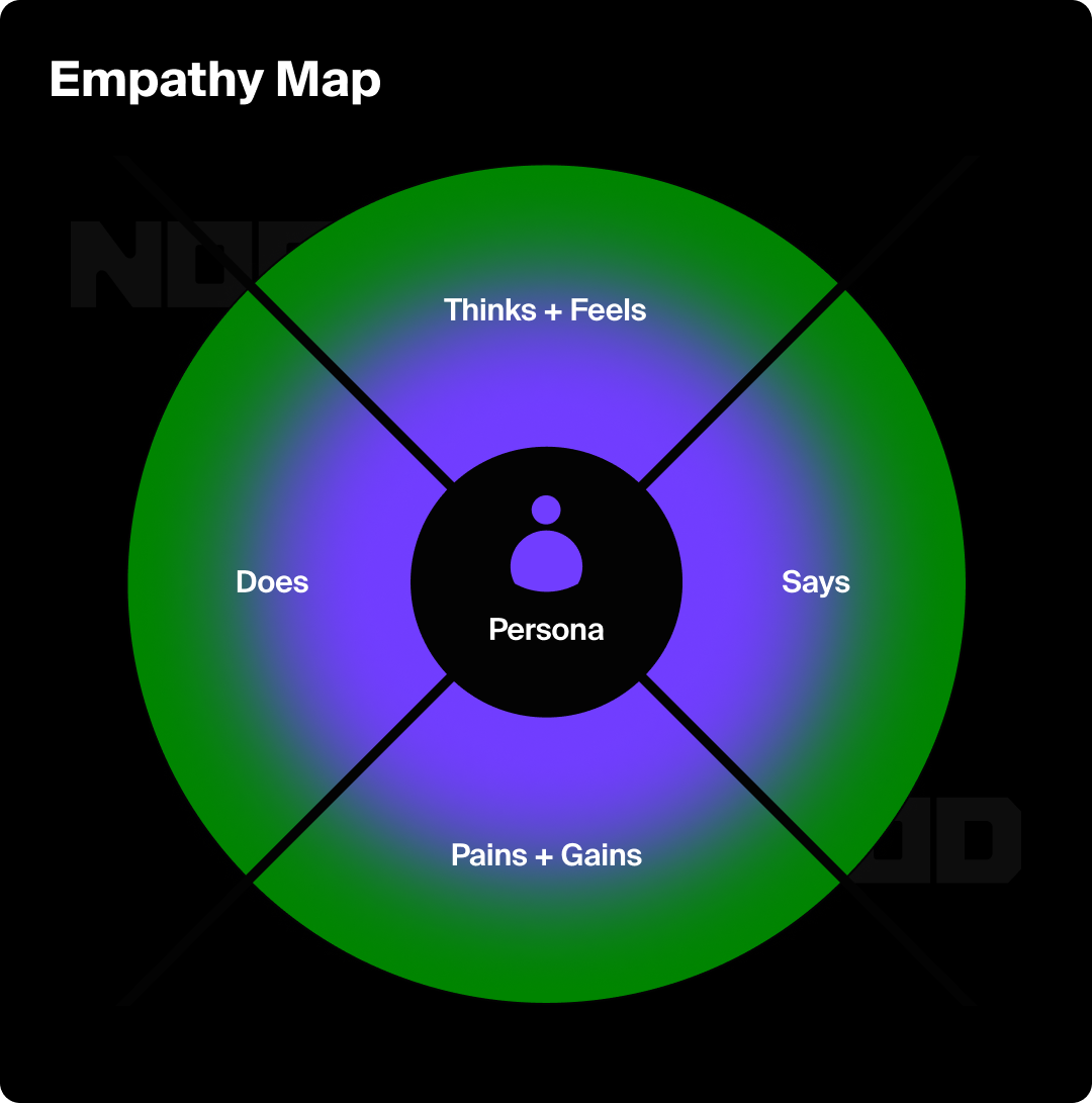
Empathy mapping is often combined with persona mapping and can be another step in understanding the mindset of your users. Here’s what you’ll want to know:
- What are they thinking and feeling?
- What are they hearing that might influence their experience?
- What are they seeing based on their natural environment and/or the visuals you’ve designed?
- What are their challenges?
- What do they define as success?
The purpose of these questions is to empathize with your users so that you can ensure you’re separating your own biases and keeping the process human- and user-centric.
Eye-Tracking and Heatmaps
This research methodology is often used in conjunction with user interviews. Understanding where a user’s eye is drawn will better help you design, or provide design recommendations, for websites and user interfaces.
By analyzing eye-tracking data, UX designers can identify areas of a digital product that may be confusing or difficult to use, and make adjustments to improve the user experience. Eye-tracking can also help designers optimize the placement and design of key elements such as navigation menus, calls to action, and forms to increase user engagement and conversion rates.
Tools like HotJar and Microsoft Clarity provide heatmaps, which provide clear indicators of where the page has driven the most engagement and where visitors click most. You’ll be able to see how much of the page your users are seeing before bouncing, which will help you understand if they’re seeing critical pieces of information.
A/B Testing
One of the most common methodologies is testing two variations that differ slightly by one variable, often either in messaging or imagery. By segmenting your audience, you’ll be able to understand the most effective means of communicating the value to them based on which variable drew the most attention.
Create Experiences, Not Deliverables
To properly understand your users, you’ll need to approach each touchpoint from their perspective. They likely don’t understand the brand like you do. To help put yourself into the shoes of your customer, ask yourself these questions:
- Is the value proposition you’re presenting clear and easy to understand within a few seconds?
- Are you communicating with consistent copy and imagery throughout the user journey? (from ad to landing page to product page, etc.)
- Are you using consistent UI elements? (i.e. if you click through a rectangular button, there should be rectangular buttons at the destination)
- Is your text in a legible size and font?
Below are some of the most common touchpoints by which your users will usually find you and tips on how to optimize the experience at that touchpoint:
Search Engines
Here’s where you can really let your copywriting skills shine. Users may turn to a search engine, such as Google or Bing, to find a solution for their problem. Your page title and meta description will show up in the search results. That brief amount of copy should entice your audience into engaging with you one step further – clicking on the link in the search results to learn more about you.
Social Media
A user may interact with a brand’s social media channels, either via organic posts or paid placements. It’s important to consider both the initial experience the user will have interacting with the ad as well as the destination that the user will end up at if, or hopefully when, they click through.
For example, you’ll want consistency in messaging, imagery, text, and button styling. This reassures the user that the destination is a continuation of the journey that initially led them there in the first place.
Landing Pages
Your ads or emails will direct prospects to a landing page. This is sometimes a specific marketing landing page or an actual page that already lives on a brand’s website. Either way, the page should serve as an extension of the value prop(s) or position you want users to understand and engage with. It should be built with the intention of driving your users towards a specific action. Ensuring accurate messaging, value propositions, and a call to action that sits above the fold are critical components to capturing your users’ attention.
Checkout Process
We’ve all been there. We find a product we want, add it to our cart, and for whatever reason, we decide we’ll get back to it later. For D2C brands, one of the most common roadblocks in converting prospecting customers is a frustrating checkout experience.
Among the most common reasons for a user abandoning their cart are no guest checkout option, lack of payment options, and hidden shipping fees. Adding additional flexibility for checkout and payment, increasing transparency, and providing more examples of social proof can help reassure the customer at checkout and instill confidence in their decision to purchase.
Remove the Guesswork
In addition to creating more positive experiences for users that generate conversions, user experience research will give you invaluable insights that quantitative metrics are limited by. Qualitative data provides insights into the nuances that pure numbers can’t.
Things like behaviors, thoughts, frustrations, attitudes, and motivations are the types of insights you can expect to find when you include this type of research in your marketing process.
Understanding your customers with qualitative methodologies will help you develop a more efficient marketing strategy and make more informed decisions.
Iterate. Iterate. Iterate.
When using marketing tactics such as websites and landing pages, it’s important to monitor user behaviors to find opportunities for additional UX improvements. See which areas of the page are neglected while others might be underutilized. Iteration is also a key part of performance creative success and strategy, by using data to inform what users want to see more of or what they might interact with more, next.
So the next time you’re analyzing data, don’t just stop at the numbers. Consider the human behind the number and seize opportunities to listen to them and understand what their experience is like.
Give proper attention to creating user experiences that are intuitive and provide a positive experience for the user and you’ll be sure to see increased engagement, conversions, and overall customer satisfaction.


