A life without Figma for most design folks may seem like something pulled from a dystopian representation of the past that we’ve pushed far from our collective memories.
However, there was a time before Figma had an impressive 4 million users to justify the hefty $20 billion price tag that Adobe has ponied up for the now ubiquitous vector-based UX/UI (but honestly almost anything) design tool — they were once a fledgling $10B company going into a pandemic with their sights set immediately on building a robust design community.
But it wasn’t just dumb luck that brought Figma to Adobe’s doorstep. Rather, it was equal parts ingenuity and intention with a focus on community that locked the design tool into its meteoric rise. If we were to oversimplify, the four main components of Figma’s success were:
- It’s Free
- It’s Communal & Collaborative
- It’s necessary
- It’s progressive
This should come as a surprise to no one who has glanced at the company’s about us page, if you scroll down you’ll discover their brand pillars are presented as:
- Collaborative
- Borderless
- Transparent
- Community-driven
- Open-sourced
Scroll a bit further and you’ll see their brand mission statement which follows, “Our vision is to make design accessible to everyone.” A bold and honorable mission by any definition and one that our team can say, firsthand, has been successful. Our own internal processes have frequently seen analysts diving into design files with designers and growth marketers — with everyone intuitively collaborating with one another in what was otherwise a siloed and inaccessible process in the past.
The Stages of a $10B Baby
Stage 1: Organic Community Outreach & Research
Before Figma was even a product, it was placing an emphasis on community and diving deep into design life in order to get direct and valuable feedback from, well, designers — the same designers they would hope to convert into their users.
This took the form of engaging first with their direct community, the designers and creatives who they knew who wouldn’t be afraid to let them know exactly what they wanted from a new design tool, and also exactly what was wrong with the tool they were building.
As the project moved along this not only encouraged advocacy for those directly involved in the process as they saw their ideas become reality but trust and a sense of ownership in Figma itself for all involved as they felt seen and heard.
As an extension of its early practices, Figma also brought on a well-known design podcaster to talk about, you guessed it, design. Rather than restrict their abilities to communicate, or throttle criticism or feedback for the project, the team at Figma leaned into the (sometimes) harsh criticism they received from what would now be the voice of the product.
This is an incredible example of embracing design culture and building trust in order to build advocacy during the early stages of a company. Figma understood that it wasn’t going to be perfect immediately and that its harshest critics were also likely to be their most steadfast advocates if they were to get the product right.
Upon launch, the team at Figma also made the clever decision to build in some gamification aspects to the platform to not only act as a teaching mechanism for new users but also moderately distract users from the imperfections by focusing on making the early build an engaging experience rather than having new users test it as a tool and becoming fixated on its shortcomings which they hadn’t had opportunity to fix yet — super smart.
Stage 2: Designer Advocacy
Building on the momentum that the team had already been developing with the design community, Figma’s next step was to take a two-pronged approach to advocacy — adjusting their focus at both a micro and macro level.
Micro(influencers):
While many brands of the period were relying heavily on influencers with large followings, Figma recognized that while their success would likely depend on adoption at an enterprise level, it was the boots on the ground that would make that shift actionable.
Continuing to spread the growth that had been budding from the previous phase, Figma continued working with designers who, for all intents and purposes, may not have been influencers at all and were just designers who did design things on social — as many designers do.
The beauty of this approach is that these designers are not only working professionally, or at least dedicated hobbyists with a meaningful following of like-minded folks, whose reach was small but mighty, but active, reputable, and trusted pillars within their immediate cultural circles.
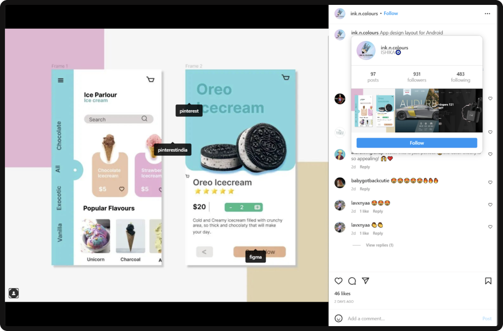
So while maybe these individuals weren’t getting Kardashian levels of engagement on their posts, they likely provided high levels of trust and engagement with their immediate communities who were prequalified to be likely adopters.
Macro(Super) Users:
More akin to the traditional influencer, Figma tapped into more prominent designers, but less so due to their social prominence, and more so due to their professional stature.
Well-established designers were folded into the community build in order to funnel feedback and begin establishing relationships directly with those who would likely be the decision-makers on an enterprise level.
The relationships being nurtured here differed greatly from those with the micro-influencers as they carried a bit more weight and their values and impact immediately drove the product development process for Figma.
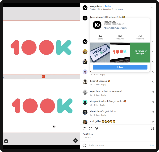
By allowing the prominent designers from within the community who had a multi-faceted understanding of the design industry and the industry needs from a cross-functional perspective they were able to refine their product in a meaningful way to suit multiple use cases while also making good with some of the biggest names in the industry.
CEO on the Road:
During this period, CEO & Co-Founder Dylan Field was out talking to folks.
And while that may seem somewhat insignificant, redundant, or inefficient, it’s important to understand those interactions, even if digital, are still driven by humans, and that not every user is going to be active in the digital refinement process, or have their comment seen on a Twitter thread cultivating feedback.
“To Scale, Do Things That Don’t Scale”
Reid Hoffman, Co-Founder of LinkedIn
The road trip took Dylan to a number of different locations, to meet with a number of different folks, from a number of different demographics, who unsurprisingly provided a number of different insights that may not have been received had the team relied exclusively on digital responses.
The big lesson here is: Talk to people in real life.
Shared Social Responsibilities:
While most of the world would shudder at the idea of sales and product teams having the keys to the social media accounts, Figma embraced having multiple perspectives present on their social channels in order to ensure that not only did all of the teams have insights into what the community was saying, but that they were able to provide useful feedback when their particular brand of expertise was needed.
Whether intentional or not, this wound up reflecting a major part of their product and the communal benefits of working in a digital environment as it gave voice and agency to every team as a part of the development process and gave them unique insights into aspects of the team environment they wouldn’t otherwise have access to — helping build a sense of ownership and community both internally and externally.
Stage 3: Config
Config was the next step in the community development process in a big way as it bridged the gap between on- and offline experiences for both teams and community members.
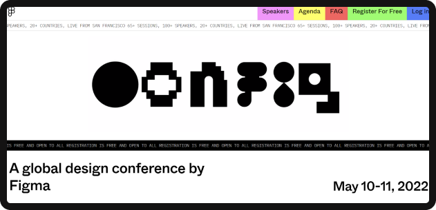
While in essence Config was (and still is) a conference, and as a conference, it has a lot of the same genetic makeup that most conferences do with breakout sessions, speakers, FAQ sessions, and other matters of programming, the approach that Figma took with the development of Config was one with a focus on making the community the keynote speakers.
Community Voices:
While typically a brand conference might have C-Suite level speakers from the brand telling the community what they’re doing, what they’re planning, or what to expect from the brand in the future — that doesn’t necessarily encourage interaction or engagement.
For Config, rather than tap into the brand itself to inform the community, Figma tapped into the community to inform the community.
Having already gone through the process of building relationships on a micro and macro level within the design community, there was no shortage of responses from those who were super enthused to partake in the conversation, share their experiences, and talk about the features they influenced or how they’ve used the product.
Unlike traditional conferences, the focus of many of the talks was not directly on the brand or product or how you SHOULD use it, but on the brands that were actively using the product, how they were using it, and how everyone else could be better designers BECAUSE of Figma.
By turning the focus outward, the conference became a communal experience that reinforced what had already brought everyone together at the conference, to begin with, the community.
From Launch to $20B Baby:
There are a few things that, in the process of building the product, solidified Figma’s sense of community and baked it into the product itself enabling it to not only earn the adoration of the community but keep it through daily use in their professional lives and maintain the rapport with the community that they had tirelessly built.
It’s free(-ish).
When you’re launching a product and your largest, and arguably only competitor has a nearly 3-decade head start over you with 9 million subscribers, making your product free, or free-ish, is quite possibly the best way to get people on board with your product – Figma knew this.
What set Figma apart, and to a large degree allowed them to succeed with their “freemium” strategy where others have failed, is their product, their market positioning, and their focus on community.
Figma came to market at a time where, despite its 9 million subscribers, public sentiment towards Adobe and its slow transition to the now stable (as of 2021) Creative Cloud (CC) subscription model was fairly dismal. Businesses, freelancers, and fair-weather creatives alike saw the introduction of a subscription model as greedy, and many users at the time were still clinging to their copies of the 2016 Creative Suite – with some still honestly still using it today.
Though, in the realm of SaaS marketing, there’s more to success than just having a better product – with trust and social validation weighing heavily on decisions to adopt new platforms. After all, like any relationship, the consumer dynamic between the public and Adobe was familiar despite being in a bit of a rocky period. Users had been using Adobe’s tools for years, if not decades, so the workflows and quirks of the platform were comfortable – despite the transitional troubles.
To combat this, Figma offered their service for free; at least at first. Something just to get users to sign up and try it. By doing so, they positioned themselves in a way where they could allow users to experience the difference they were offering firsthand, converting skeptics immediately into advocates upon arrival while offering them time to tinker, without cost – brilliant.
Taking things a step further, and adjusting for monetization, Figma also kept the good parts free — forever.
As they gained and continue to gain momentum, and become an enterprise-level solution, the core of their product is still free. While this may seem insignificant, it side-steps a major criticism that previously plagued Adobe users who often had the following experience with their subscriptions.
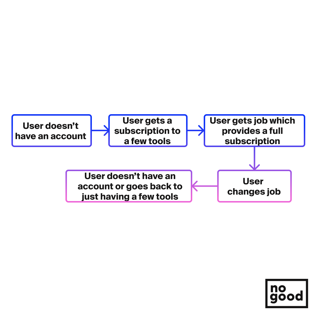
The byproduct of this process is that, while businesses will typically carry a certain number of licenses that they activate and trade between their staff as they’re needed, individual licenses likely fluctuate wildly depending on the employment status of users.
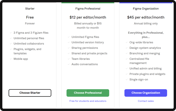
Figma, on the other hand, by keeping the core of their product free, created a model for their business that likely retained users at a higher volume, as employment gaps, job or role changes, or other factors that historically would affect licenses and accounts for Adobe, would have no impact on usage for Figma users.
This made (and makes) Figma a tool that is easy to advocate for as users are always guaranteed access, no matter what. Lost a job? No big deal, you can still update your portfolio or continue honing your skills. No longer have a design position? No big deal, you can still be a hobbyist without any significant cost. Trying to get your first job in design? Here’s the tool that you’ll likely be using — free of charge.
Editor’s note: The freemium strategy is product-first. Giving away frozen quiche at Costco won’t put boxes in carts unless they’re tasty.
It’s collaborative:
Two words: Cursor. Chat.
Something so simple, but that changed the game, was the communal aspect of Figma and the opportunity to not only share work but collaborate in what would become the world according to COVID soon after launch.
Pandemics aside, Figma offered not only designers, but community managers, strategists, copywriters, and all cross-functional members of any team to be a part of the design process – a process that had previously been fractured and siloed with Adobe XD and other design software.
This was particularly true because Figma is:
- Web-based
- Intuitive
- Open-source
While Creative Cloud did introduce a number of web-driven features, allowing multiple team members to access files remotely by saving to the cloud, it was still missing the communal feeling of sharing work in flux.
Teams suddenly unlocked the ability to receive feedback in real-time, rather than going through multiple feedback rounds both internally or with clients, making the process of creating far more collaborative and engaging than previous models – though it did also introduce the hover cursor which brought the anxiety of someone standing and watching you work to a digital space.
Designing was now, true to the mission statement, for everyone. Everyone could participate, and everyone could help in some way or another by just being a cursor in the room while pixels were being manipulated – bringing a new sense of agency and ownership to team members who were historically left out and embedding a sense of community into the process.
It’s communal:
It’s been said time and time again that, “Sharing is caring.” And Figma embraces this sentiment wholeheartedly through their product to win users through the communal creative economy they have developed.
Building on the foundation and precedent that now-massive names like The Noun Project, GitHub, Canva, and to some degree even Adobe Stock & Express have set for communal asset libraries, Figma embraced not only open source in its growth structure but shared assets.
In fact, Figma’s community programs are something of a hybrid between the models of all of the above-mentioned platforms and services.
Community Files & Templates
Figma is one part Adobe Stock & Express with its community portfolio of files and templates.
Need a button? You can find one. Need a home screen UI template? You can find one. Need an animation of a turtle crossing the street? You can probably find one.

The beauty, and massive driver for adoption from designers in the community, of Figma’s community-driven asset library, is that there is an enterprise-wide acknowledgment of design redundancies within the field and the asset library not only encourages collaboration, but the communal building of arguably any asset that you would ever need for any project — meaning designers are no longer bogged down by recreating buttons or other assets that most likely already exist in the community.
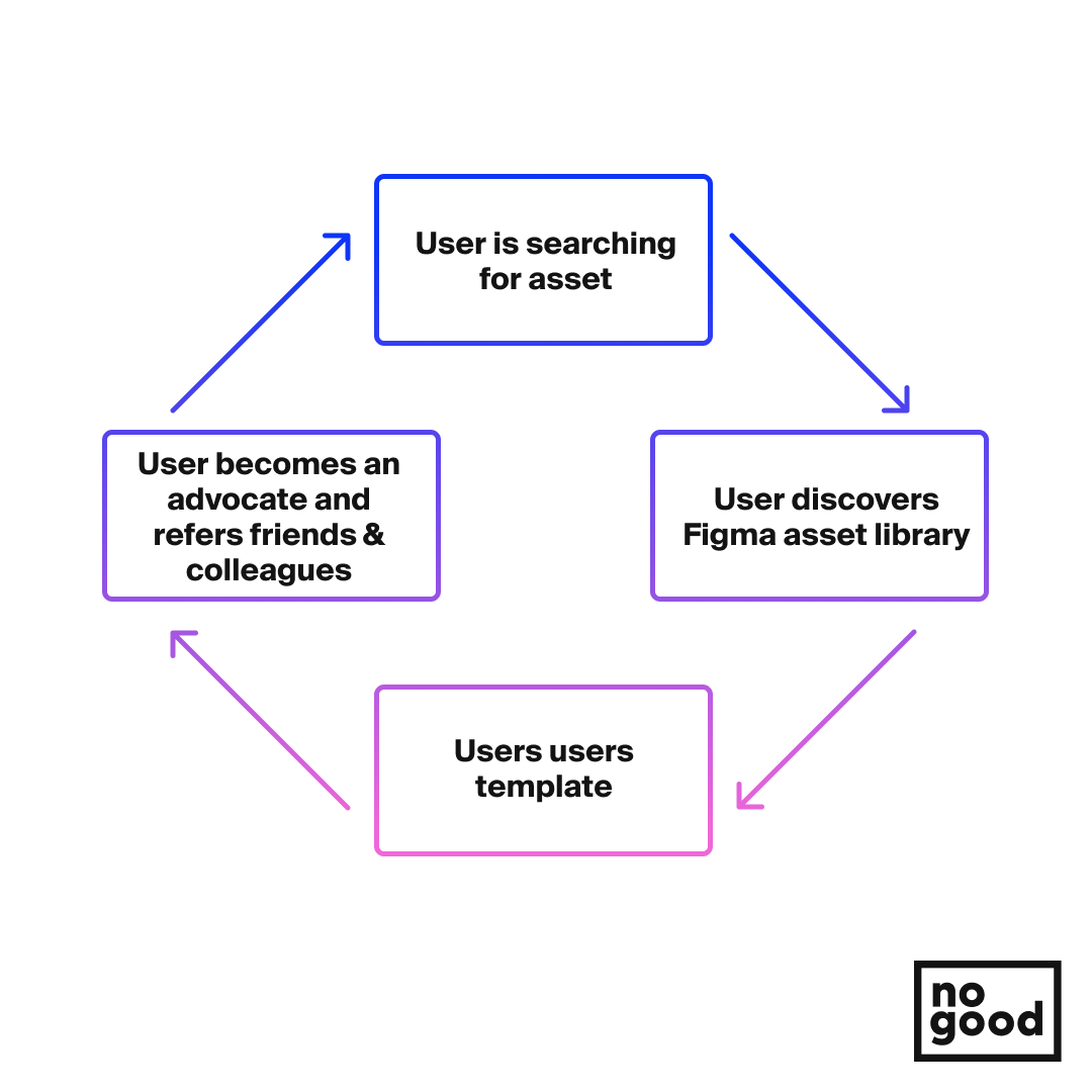
This drives adoption for new users through not only discovery, from those designers who are likely scrambling to find an asset that they don’t have time (or patience, let’s be real) to make yet another button animation for a project they’re currently working on and stumble upon Figma and the massive library that comes with it — instant fans.
Plugins and Widgets
Once again making a push to set themselves apart from competitors by listening to the design community, Figma fully embraced the community of code tinkerers and CYMK hackers with the implementation of customization as a principle of their platform.
Every designer worth their salt has been in a situation where a piece of software lacks a particular tool, or a particular tool that it does have doesn’t necessarily work the way it should — or at least how you specifically think it should.
This is where Figma takes a page from Github in their open-source approach to optimizing and innovating their platform by allowing users to share plugins to customize their experience to their exact needs.
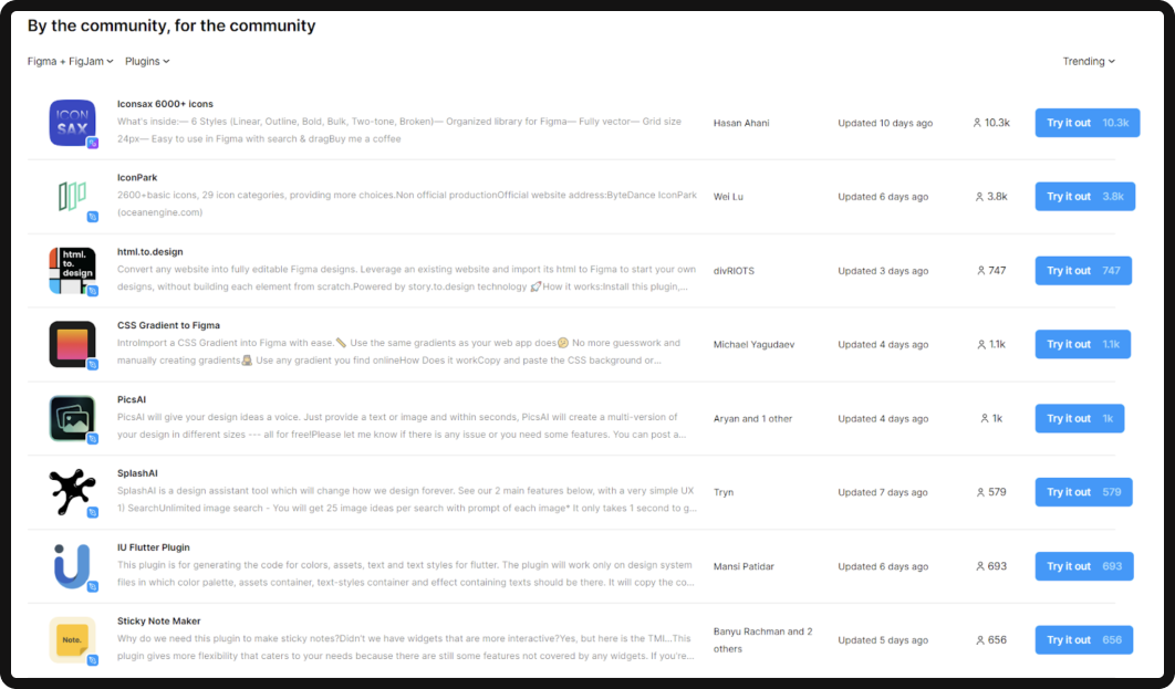
While this may seem as though it exists just to serve the community, it is also a neat little mechanism for discovery and social validation — particularly through dark funnels.
Let’s say there’s a designer who’s looking for a solution to their workflow in illustrator, they Google to find a tool that solves the particular dilemma that they’re facing and discover a Reddit thread posted by the developer of the plugin that solves this issue on Figma. The designer in question suddenly is signing up for their free trial and telling all their design friends in their WhatsApp group about the plugin they found and being called out for being so late to the Figma party.
Extra Credit
Skill plateaus are the silent killer of not only creativity but even careers.
It’s likely that this is the main driver behind the skill and community (specifically) based initiatives that Figma has brought on as it continues to grow.
In addition to regular events and live streams, Figma themselves have a comprehensive archive of best practices, an education program (making it free for students and educators to promote early adoption to then be used throughout an individual’s career), and user groups to continue the discovery and learning process by way of the community.
Similar to the plugins and widgets, the groups and focus on agency in the design process encourage social validation by way of sharing discoveries through the communities in the groups, or showing off learnings that were gained through the best practices or even ways that they have found to improve upon current knowledge.
Ultimately, by encouraging growth and doing so in a way that is seeded and nurtured through the community, the platform also drives new adoptions through social validation when users share their work and experiences, and of course, teach others.
The $20B Baby
If we were to leave this conversation by saying that nothing that Figma has done to become the revolutionary product that it is today was revolutionary, we’d likely get a lot of side-eye — but it’s true.
There are a number of products today that we can’t live without that when looking back on them, seem to be an inevitability — ie; it was only a matter of time until they came along. Figma is very much one of those things, and we love it for that.
And it’s honestly the key to a lot of their success. Obviously, those behind Figma could have made a number of different decisions as they built it and fallen into similar holes that Adobe has been in recent history (we won’t get into it), but they succeeded in the same way that Instagram has been in taking the best aspects of the best things and putting them together and letting people make of it what they will.
