

In marketing, we think of our audiences as people at varying stages of commitment to our brands. How much they value our voice correlates to their position in the marketing funnel, so we design for them and build formats around where we meet them.
A paid ad targets cold leads at the top of the funnel. Organic social posts target a community that’s slightly more bought in. Lifecycle marketing (in-app messaging, email campaigns, and SMS for example) is anchored at the bottom of the funnel, yet email is the rare format that spans the whole thing: the same channel can attract a cold lead or bring new value to a loyal customer, shifting entirely based on intent. That range is exactly what makes it challenging to design for.
Email is also the only channel that a brand fully owns. There’s no algorithm deciding who sees it and no per-impression ad spend gating reach. That ownership is why design decisions here compound: a strong, repeatable system pays off across every send you’ll ever make.

What Is Email Design?
Email design in marketing is when a brand sends out campaigns straight to their audience’s email inbox. They can vary from cart abandonment emails to product launch emails. A designed email shows off a brand’s personality, while a plain-text email feels more personal, so the choice between them is strategic.
As a rule of thumb, go for plain-text in moments that should feel one-to-one (customer support or a founder’s message) and opt for designed templates when the goal is promotional, an announcement, or a brand-building story.

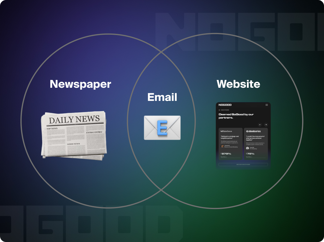
Before we start thinking about specific email design principles, we must first understand how an email is read. To do so, we’ll look at two formats that bookend it in time:
The first predates email by centuries: the newspaper. We inherited more from print than we tend to notice. A reader moves top to bottom, assumes they’ve seen the previous edition, and takes in each block as its own unit of information (similar to the way articles sit on a page). Even our email strategy language pays homage to the lineage: “above the fold,” the design term for everything visible before a reader scrolls, comes from the days when newspapers were literally folded in half on the newsstand. An email works the same way: a self-contained snapshot of where your brand stands the moment it’s opened.
The second format is the one email design shares craft with: the website. This is the more familiar comparison, and it’s where email stops behaving like print. A newspaper is a closed object; an email is a launch point. Its CTAs send readers outward to other brand touchpoints: a product page, a blog post, a specific screen in your app, so every block doubles as a potential door. Emails are the hybrid: read like a newspaper but built and functions like a website.
The web parallel breaks in one important place, and it’s the thing that surprises designers coming from web development most: email clients don’t support modern CSS. Outlook in particular still renders with a layout engine that forces table-based structure, limited web-safe fonts, and inconsistent results from client to client.
When you’re designing an email, you aren’t building a web page; you’re building something that has to survive being rendered a dozen different ways.
So, how do we design within these constraints without sacrificing performance or aesthetics?
4 Key Elements of a Well-Designed Email
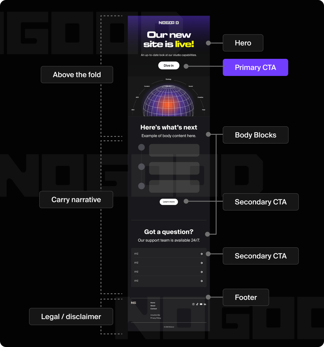
Emails tend to follow a formula that mirrors websites. Roughly, it goes: Hero, Body, Footer. The most important information goes at the beginning. Save the harder upsells, tertiary FAQs, and disclaimers for the footer near the bottom.
To design an email following best practices, It helps to know what each part consists of, and the goal that said part is driving:
- Preheader Text: The snippet that appears next to or below the subject line in the inbox preview. Together with the subject line, it’s the inbox-level content that a reader weighs before deciding to open. Design these as a pair: the subject line and preheader earn the click, and the hero rewards it, picking up that promise the moment the email opens.
- Hero: The first visual block above the fold, carrying the core message and primary CTA. A countdown bar up top can drive urgency, and an attractive hero can buy you the viewer’s scroll, earning their attention long enough to deliver the message.
- Primary CTA: Part of the hero section, this is the single most important action, styled as a button above the fold.
- Body Blocks: The stacked, modular content sections that carry the narrative. Examples of these blocks include (but are not limited to):
- Left-Right-Left Blocks: Show a set of information and visual tie-in
- Single Image: Less content = more scannable
- Icon List: For when photography may be outside of brand purview, or icons communicate the ideas better
- Product Grids: Show off a product to sell, can dynamically change based on information we know about the user
- Testimonial: Provides social proof to support other sells
- Footer: This can contain FAQ lists, unsubscribe link, address, secondary navigation, and disclaimers.
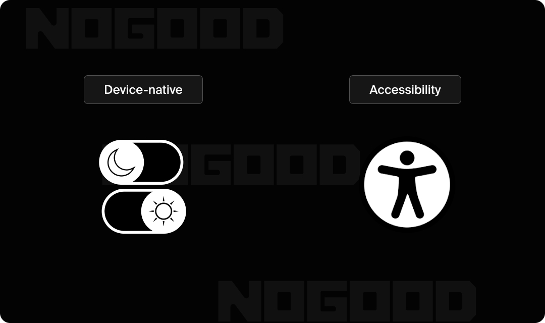
User-proofing decisions help with designing emails that survive the myriad circumstances beyond our immediate control. Designing for accessibility and flexibility from the start, rather than as an afterthought, is what keeps an email intact when it leaves your hands.
- Dark Mode: 35% of measurable email opens occur in dark mode, which can invert your logo, flatten transparent PNGs, or turn a clean layout muddy. Design and test for it deliberately by laying out what happens when a device enters each mode. What colors may change for icons, and if a certain block style may work better for adaptability.
- Accessibility: Add alt text to images, keep sufficient color contrast, and favor real text over text baked into images. It’s worth treating these as design fundamentals rather than accommodations. The same choices that help readers at the edges tend to improve the email for everyone: real text scales and renders reliably where image-text fails, strong contrast holds up across devices and lighting, and alt text keeps your message intact when images don’t load.
As a general takeaway, when you design for the harder cases, the easy ones usually take care of themselves.
What Is a Modular Email Design System?
Designing modularly means that the pieces are swappable within the system itself. Think Lego bricks that snap together in various combinations, not puzzle pieces where every jagged edge only fits one correct neighbor. Like web design, email design works by building individual blocks and stacking them vertically.
The payoff is operational, and it’s the part worth bringing to leadership. A modular system:
- Cuts build time
- Removes the designer as a bottleneck on every send
- Keeps brand output consistent even when a designer (or a growth marketer) assembles the email
Once the blocks exist, building a campaign becomes assembly rather than design from scratch.
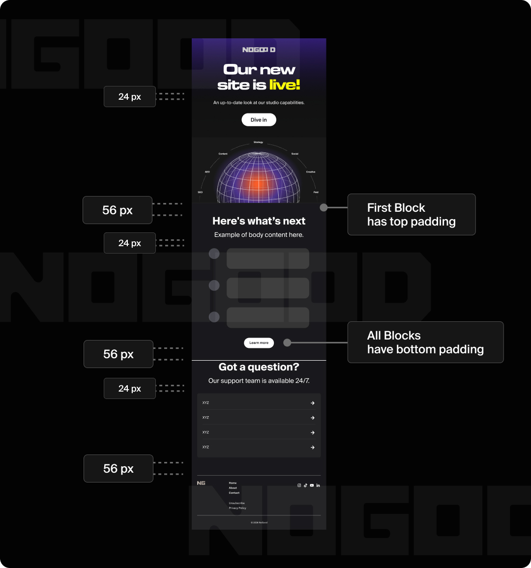
For email specifically, best practice is to keep padding, spacing, and corner radii consistent across blocks. Here’s the starting point I use rather than a universal law: keep the hero to roughly 700px tall for the above-the-fold (first body) block. This is just enough to pique interest without burying everything else. For the body blocks below it, set the top padding to 0 and let the bottom padding create the space between blocks, keeping that bottom value consistent throughout. Pick your values once, save them as tokens, and never eyeball spacing again.
While the design is modular, the narrative arc within the email should still be clear and defined. The story works like a website; the design is a system running in parallel to support it.
Email Design FAQs
How wide should a marketing email be?
To keep users from having to side-scroll, design to a width of 600px for desktop and 375px for mobile. 600px is the long-established standard precisely because it renders reliably across nearly every email client, including older versions of Outlook.
The 375px mobile figure maps to the standard iPhone viewport, so designing according to it means your layout holds on the most common screen your email will land on.
How do I make my emails mobile-friendly?
Over 55% of email opens happen on mobile, so “mobile-friendly” is really “mobile-first”, a framing worth carrying into every design review. In practice that means:
- Scale CTA buttons up so they’re easy to tap. Aim for a tap target of at least ~44px tall, the widely cited minimum for a comfortable touch.
- Build designs modularly so a horizontal, multi-column layout can collapse and stack vertically on smaller screens.
- Make sure any text baked into images doesn’t shrink to the point of being unreadable (another reason to prefer real text).
- Keep text scaling, margins, and the overall harmony of elements consistent across platforms.
What makes a good email CTA button?
A good CTA has exciting copy that makes you want to click, such as “Claim Offer” instead of “Visit Site.”
Because this is a design guide, the visual rules matter as much as the copy:
- One primary CTA. Make it a button; demote secondary actions to text links so the main path stays obvious.
- High contrast. The button should stand out clearly against its background.
- White space around it. Give the CTA room so it reads as the unmistakable next step, not one option among many.
- A secondary CTA on each block (when it fits). Beyond the single primary button, give each block its own low-emphasis link that follows through on that block’s intent. Kept consistent, these punctuate the end of each section and offer a path forward.
How do I test my email design before sending?
Testing your designs are important for understanding how your product feels to the user by putting yourself in the user’s position. Similar to when a painter steps back to look at the painting from afar, this will allow you to see where things start to feel “off.”
Figma lets you test mobile sizing through the prototype tool. Be sure to also open that prototype in the Figma mobile app to give you a good sense of staging on a mobile device.
But the biggest real-world testing risk isn’t sizing; it’s that even a Figma-perfect email can render broken in Outlook, Gmail, or Apple Mail. Cross-client render-testing tools like Litmus or Email on Acid exist specifically to catch this, and they’re worth knowing about before you ship.
For a real test-flight email that lands in your actual inbox, you can build out the HTML and send yourself a test through whatever email service provider your team uses (Klaviyo, Mailchimp, Customer.io, and similar platforms all support test sends).
Closing Thoughts
There are no hard and fast rules for what makes a design successful. It varies with brand voice, intent, and your own perspective. But there are decisions you can make that lead to a more intuitive end product. Email design matters because emails are a direct message to an inbox, and campaigns exist as a system that narrates your brand as a whole.
The real test of a designed email is simple: does it move the metric you built it for (opens, clicks, or conversions)? That’s the throughline from craft to outcome, and it’s where good design earns its keep.