Mobile SEO isn’t just a buzzword, it’s a necessity in SEO methodology. As users have shifted to browsing and shopping on their smartphones, optimizing your website for mobile devices is a critical component of digital success. But mobile SEO is more than just making sure your site fits on smaller screens. It’s about enhancing user experience, improving load speeds, and adapting your content for a mobile-first world.
Today, search engines like Google are placing more emphasis on mobile-friendly sites, and the impact on your rankings is significant. We’ll guide you through the essentials of mobile SEO, highlighting key strategies, common mistakes to avoid, and best practices to help your site thrive on mobile devices.
Why is Mobile SEO important?

SEO for mobile is crucial because an increasing number of users access the internet primarily through mobile devices. Google has even shifted to mobile-first indexing, meaning it prioritizes the mobile version of your site for ranking and indexing, rather than the desktop version.
If your website isn’t optimized for mobile, it can lead to slower load times, poor user experience, and lower rankings in search results. A mobile-friendly website ensures visitors have a seamless experience, regardless of the device they’re using, leading to higher engagement, lower bounce rates, and ultimately more conversions.
Additionally, as mobile search traffic continues to rise, sites that aren’t optimized for mobile risk falling behind competitors offering a smoother, more responsive mobile experience.
How is Mobile SEO Different?
While mobile SEO relies on similar concepts to regular (desktop) SEO – both aim to reach audiences and convert them into paying customers – mobile SEO has a few distinct tactics.
Mobile User Experience
Mobile SEO places a strong emphasis on user experience tailored to mobile devices. This includes ensuring that websites are easy to navigate on smaller screens, buttons are easily clickable, and content is readable without zooming. Desktop SEO, while still concerned with user experience, often caters to a larger screen format, allowing for more complex layouts and interactions.
Search Engine Results Pages (SERPs)
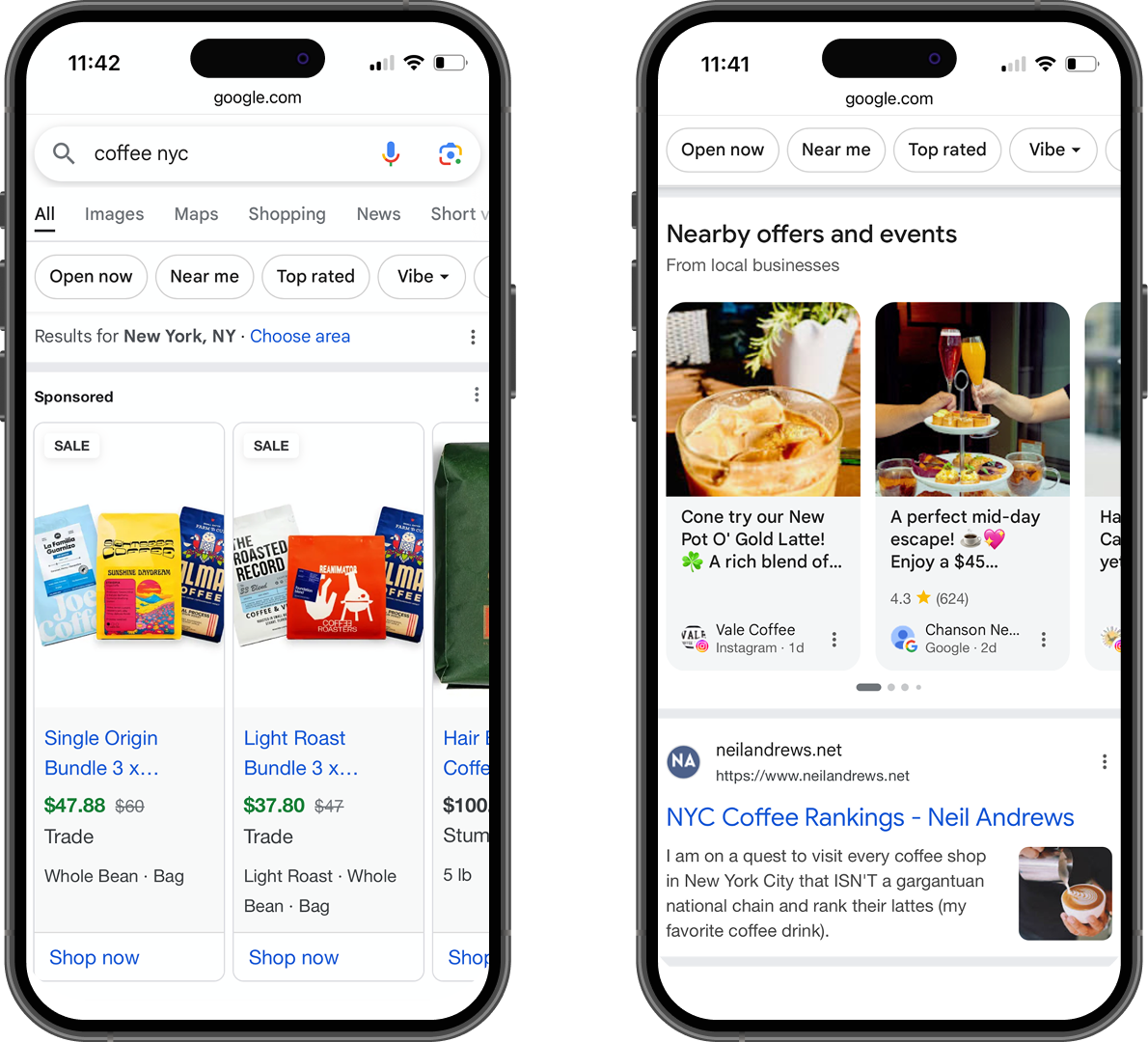
The search results presented on mobile devices can vary significantly from the results shown for desktop users due to how Google understands user intent and the limitations that come with mobile screens.
Mobile users are often looking for quick solutions to their queries and may not be willing to do deep research, which is why Google prioritizes interactive snippets, maps, and direct answers in the main real estate of the SERP. This results in fewer blue links and content being integrated into the search results, offering immediate access to the information users are looking for.
In contrast, desktop SEO favors traditional search results because users work with larger screens and are more likely to engage in longer research sessions. While desktop searches can still display interactive elements like snippets, they usually provide more comprehensive results requiring users to click through multiple pages to gather detailed information.
Mobile SEO, therefore, requires optimizing for quick, actionable results that make it easier for users to get the information they need without leaving the search results page.
Local Search Optimization
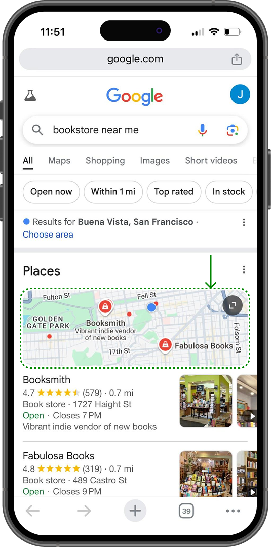
Mobile SEO incorporates more of a local focus, as many mobile searches are performed on the go, and users frequently search for nearby businesses or services. This makes it essential to optimize for local keywords, set up Google Business Profiles, and ensure NAP (Name, Address, Phone) consistency.
Google Maps plays a central role here, as it helps businesses show up in local search results when users search for terms like “restaurants near me” or “plumbers in [city name].” Ensuring your business is correctly listed and optimized on Google Maps improves visibility in location-based searches.
For mobile users, Google Maps is often integrated directly into search results, providing immediate access to directions, reviews, hours, and other relevant business details. Therefore, ensuring your profile is up to date is crucial for mobile and local SEO success.
On the other hand, desktop SEO generally has a broader audience focus and doesn’t prioritize local search results as heavily. While local search results still appear on desktops, Google Maps and local search results are often less prominent compared to mobile search, where users are more likely to need immediate location-based information.
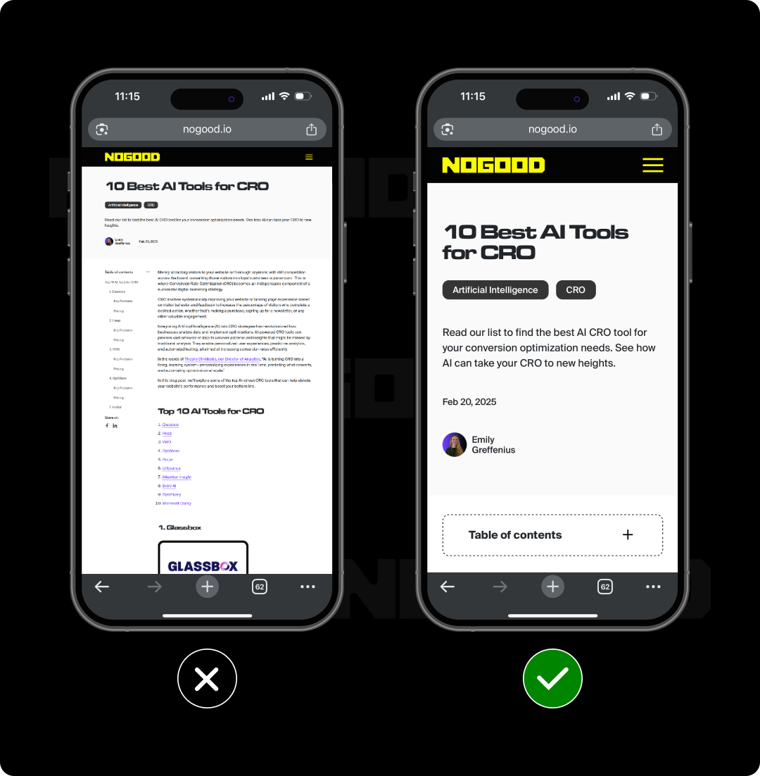
Content Presentation
Content has to be presented differently on mobile devices to enhance readability and engagement. Techniques such as shorter paragraphs, bullet points, and concise headlines are often more effective in mobile SEO. In desktop SEO, there’s generally more flexibility in content layout, allowing for longer, more detailed content without the same concerns over user scroll fatigue.
Performance Optimization
Mobile users expect fast loading times due to varying internet speeds and potential data limitations. Due to this user expectation, mobile SEO prioritizes optimizing site speed and performance to minimize load times, such as using compressed images and minimizing redirects. While desktop SEO also values performance, page speed remains important, as slow load times can still affect user experience and search rankings, even though users typically have faster, more stable connections.
Emerging Technologies
Mobile SEO increasingly incorporates emerging technologies such as voice search and AI assistants, as many mobile users utilize voice commands to perform searches. This necessitates different keyword strategies and content optimization techniques. Meanwhile, desktop SEO has traditionally focused on text-based searches and may not prioritize voice search optimization to the same degree as mobile SEO.
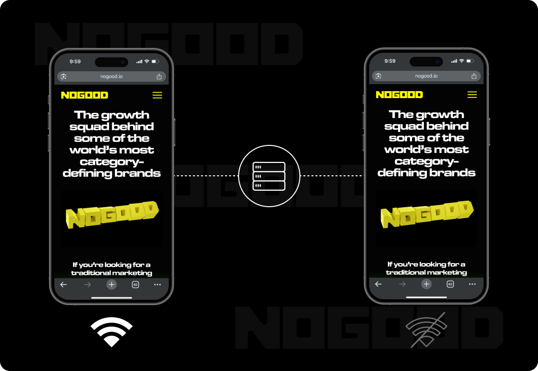
Responsive Design and Mobile SEO: The Perfect Pairing

Google explicitly recommends responsive design in its mobile-first indexing page. Responsive design is an approach to the web design process. It focuses on ensuring a website’s layout, content, and functionality automatically adjust to fit the screen size and resolution of the device being used.
Whether your website visitor is on a smartphone, tablet, or desktop computer, a responsive design ensures your website looks and performs optimally, regardless of the device medium.
This methodology achieves its flexibility through the use of CSS media queries, flexible grid layouts, and flexible images. The main goal is to provide an excellent user experience, regardless of the device being used.
Here are some key areas that make responsive design the best strategy for mobile SEO:
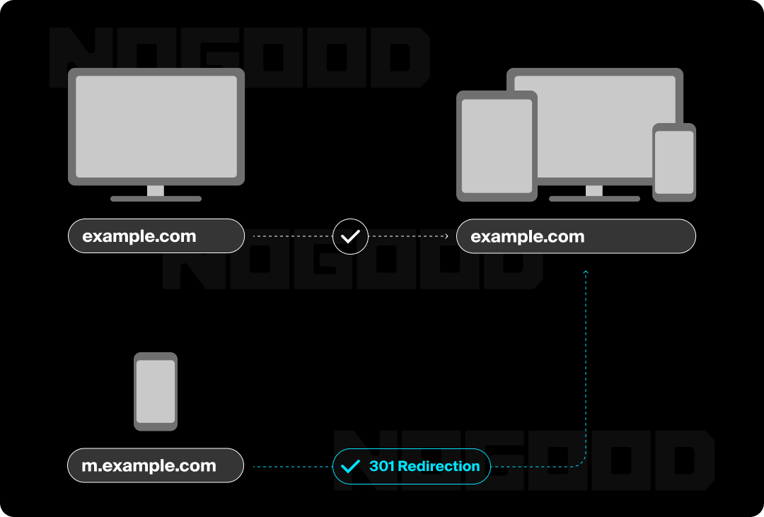
- Single URL for All Devices: You only need one URL for both mobile and desktop users, avoiding the treatment of both versions as separate entities. This can lead to confusion and possible ranking penalties.
- Improved User Experience: Responsive design ensures your website is accessible and easy to use on any device, which is critical for user engagement. Google considers user experience (UX) as a ranking factor, and a site that works well on mobile reduces bounce rates and increases time spent on your website.
- Faster Page Load Times: Page speed is another ranking factor, and responsive design streamlines your content for faster load times across devices. With responsive design, you can serve optimized images and content that adapt to the device, avoiding large, slow-loading elements on mobile.
Other Ways to Configure Your Website for Mobile
While responsive design is typically the go-to solution for mobile optimization, there are specific use cases where other methods might be more suitable. Let’s look at the advantages and situations where one of the alternative methods could outperform responsive design.
Separate Mobile Website (M-dot Sites)
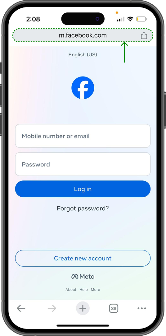
A separate mobile website (often denoted with an “m” in the URL, like m.example.com) is a version of your website specifically designed for mobile users. It’s a separate site from your desktop version, with its own HTML and often simplified features and content to improve the mobile experience.
Separate mobile websites might be ideal for businesses with very different needs between their mobile and desktop audiences. This approach is often used when a highly customized mobile experience is required, and the mobile site’s features are significantly different from the desktop site, such as with some eCommerce sites or websites with heavy device-specific functionality (specific mobile gestures, geo-location-based services, or mobile-specific media content).
Most companies that have at one point utilized the M-dot format have done away with it in place of responsive design, but there are still a few unicorns out there, such as Facebook’s mobile web version.
This strategy offers complete control over both the mobile and desktop versions of your website. Additionally, for websites that weren’t originally built with mobile in mind, it may be easier to create a separate mobile version as a starting point.
Progressive Web App (PWA)
Progressive Web Apps are a type of web application that combines the best features of responsive design, mobile apps, and web apps. It’s like a website you’ve bookmarked that behaves like an app. You save the page to your home screen, just like you would with an app, except it gets opened within a browser. What differentiates it from a regular website page is that it can be used offline and it will still load quickly, even if you have a slow internet connection.
PWAs also allow you to send users notifications just like an app would, which is a great way to connect with customers and boost engagement. However, a PWA bypasses the need to have your developers request app approval from platforms like Apple’s App Store or Google Play. PWAs also work across all devices and platforms so developers don’t have to create multiple versions optimized for different mobile devices or accommodate iOS or Android.
PWAs are ideal for sites that aim to provide an app-like experience without requiring users to download a native app. This is particularly beneficial for businesses with frequent mobile engagement, like news sites, content-heavy platforms, or social media apps. A great example of a PWA use case is Starbucks. While they offer a successful app, they also leverage a PWA so users can easily place orders, find a location, and access account features without requiring an internet connection.
Accelerated Mobile Pages (AMP)
Accelerated mobile pages are another common alternative to responsive design. AMP is an open-source project by Google designed to make mobile web pages load faster. AMP pages are stripped-down versions of your regular web pages that prioritize speed by reducing heavy JavaScript, simplifying HTML, and using cached content.
AMP is best for websites focused on delivering fast-loading content, such as news articles, blogs, or information-heavy websites where the user experience needs to be quick and streamlined.
In these circumstances, AMP can outperform responsive websites with their lightning-fast load times, improving user experience, reducing bounce rates, and boosting SEO. AMP content often gets special placement in search results, especially for news-related queries. Plus, AMP’s fast-loading times can increase the likelihood of users interacting with your content, improving key metrics such as time on site.
How to Check if Your Website is Optimized for Mobile
Whatever methodology you decide to employ for mobile SEO, you need to monitor how your website is working on a variety of device mediums. Here are some methods to check if your site is optimized for mobile SEO:
Google’s Lighthouse
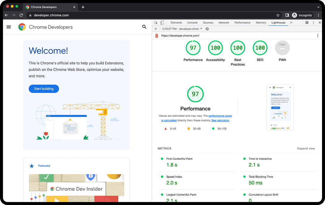
Because of how important mobile-friendly websites are to Google, it’s no surprise that they offer their own tool to check how mobile-friendly a website is. Google Lighthouse is a comprehensive tool that analyzes various aspects of your site, including mobile usability, performance, accessibility, and SEO. It gives you detailed insights into how well your site is optimized for mobile devices, focusing on speed, responsiveness, and user interaction.
To use it, you can run Lighthouse directly in Google Chrome DevTools. Just open your site in Chrome, right-click, and select Inspect. Then, go to the Lighthouse tab, select the “Mobile” option, and click Generate Report. Alternatively, you can use the online version of Lighthouse through the PageSpeed Insights tool, which integrates Lighthouse metrics.
Google Search Console Mobile Usability Report
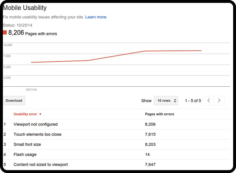
Google Search Console provides a mobile usability report where you can glean insights on factors impacting your mobile SEO strategy, such as small tap targets, unplayable content, and more.
Tap targets are buttons on a website page that either trigger an action or lead users to another page. A tap target that’s too small or too big are both unlikely to be pressed and can harm the user experience by getting in the way or being too difficult to select.
Additionally, sometimes multimedia like videos or audio included within your content become inaccessible due to changing URLs, deletion, and more. If content is unplayable, this can also frustrate your website visitors and harm your mobile rankings.
To get information from this tool, go to Search Console and select Enhancements. From there, head to the Mobile Usability section. This will list any mobile usability issues affecting your site, along with links to pages that need attention.
Test Your Site’s Responsiveness
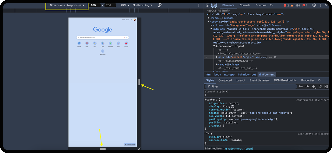
To test your mobile responsiveness, open your site in a browser (preferably Chrome). Right-click on the page and select Inspect (or press Ctrl + Shift + I). In Chrome, click on the mobile device icon in the top-left corner of the developer tools panel, and you can toggle between different device screens (phones, tablets, etc.).
Best Practices for Mobile SEO
Render Your Website
To render your website for mobile SEO, limit the use of external CSS and JavaScript files that can cause delays. Where possible, inline critical CSS and defer non-essential scripts. You can also leverage a content delivery network (CDN) to speed up the delivery of your content by serving it from locations closer to the user, reducing load time and improving rendering speed.
Another technique commonly used to render websites for mobile is implementing lazy loading. The lazy loading technique loads images and video content as they’re needed (e.g., when they enter the viewport), significantly reducing initial load times and improving rendering performance.
Improve Interaction to Next Paint (INP)
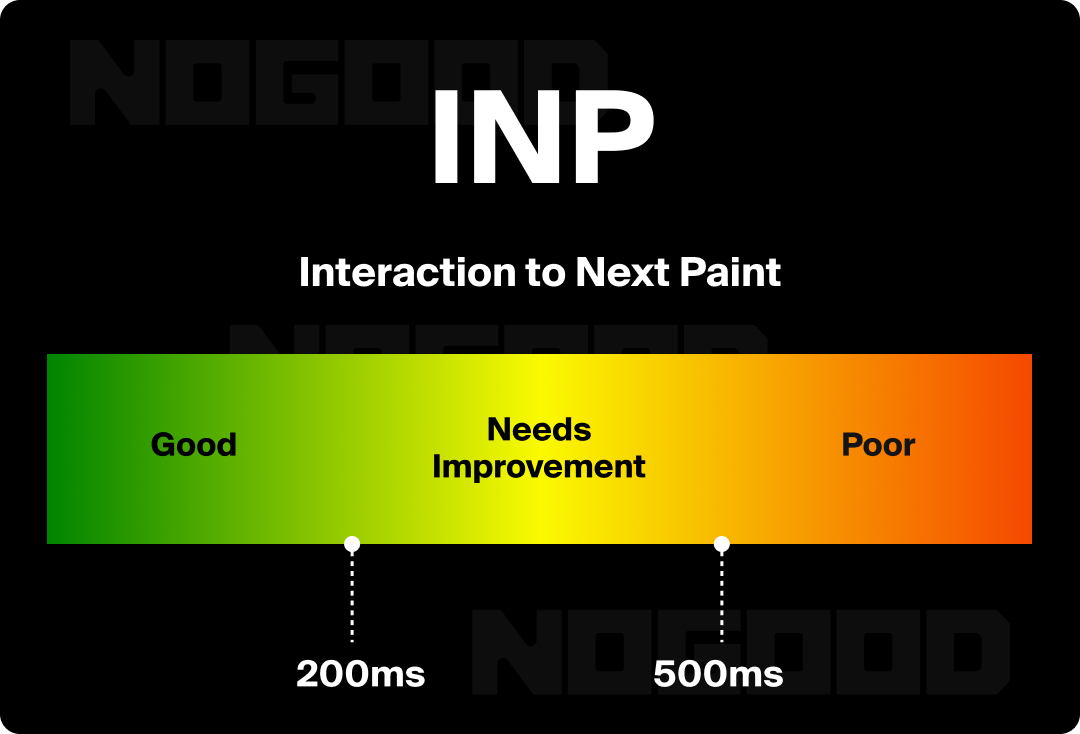
INP is a website performance metric used to measure how responsive a web page is to user interactions, specifically how quickly the page responds to a user’s first input, such as a tap, click, or keyboard action. INP is an important component of mobile SEO because it’s part of Google’s Core Web Vitals, the set of metrics Google uses to measure user experience.
To improve INP for mobile SEO, start by making your website’s JavaScript (website code that makes the page interactive) load faster. You can do this by making the JavaScript files smaller, delaying non-essential code from loading, and breaking up the code into smaller pieces. Also, you can reduce the amount of work your website has to do as a user interacts with it by splitting up longer tasks and avoiding heavy calculations on the back end while users browse your website.
Remember to regularly test INP using tools like Google’s PageSpeed Insights and conduct real user monitoring (RUM) to identify performance issues. You can also improve server response times by optimizing server configurations and using a Content Delivery Network (CDN) to reduce latency and deliver content quickly.
Optimize Your Load Speed
To reduce loading times, you can again leverage Google’s PageSpeed Insights to analyze and improve your site’s loading time. Based on the information you get, consider optimizing images, leveraging browser caching, and minimizing CSS and JavaScript. Faster loading times enhance user satisfaction, reduce bounce rates, and improve your site’s ranking in search results.
Avoid Intrusive Interstitials
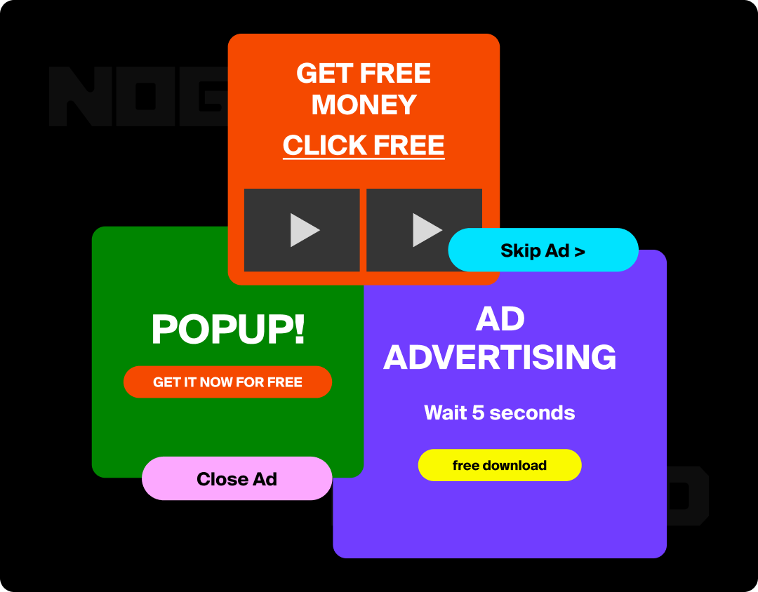
To improve mobile user experience concerning pop-up ads, limit their size to no more than 50% of the screen to avoid frustration and potential Google penalties. Use trigger-based pop-ups that appear after a user action, such as scrolling halfway down the page or after a time delay, rather than popping up immediately. Additionally, consider less intrusive alternatives altogether, like in-line forms or banners, which don’t obstruct content.
When utilizing interstitials, ensure pop-ups have clear, easily accessible close buttons for quick dismissal. Regularly test pop-ups on mobile devices, gather user feedback, and make adjustments as needed. Analytics can help you track how pop-ups affect bounce rates and conversions, and prioritize those that provide clear value, like discounts or relevant content.
Utilize Structured Data
Structured data enhances mobile SEO by helping search engines better understand the context of each page on your website. This clarity makes it easier for search engines to index and display your content in more useful, user-friendly ways, particularly in mobile search results. For mobile users, who often look for quick and relevant information, structured data enables features like rich snippets, local search results, and even voice search optimization. These features improve visibility and engagement, making your website more accessible and attractive to mobile users.
To improve mobile SEO using structured data, implement relevant schema types such as product schema for eCommerce sites (including details like pricing, availability, and product images), local business schema for physical locations (address, phone number, reviews), and breadcrumb schema to enhance site navigation.
Next, ensure your website is mobile-friendly by using clear and intuitive navigation, such as hamburger menus. You can further enhance user engagement by implementing rich snippets, such as review schema, potentially increasing click-through rates by displaying ratings and reviews in search results, increasing visibility and trust. This also encourages other visitors to leave their own feedback, continuing the cycle of engagement. Remember to regularly test your structured data using tools like Google’s Structured Data Testing Tool to verify proper implementation.
Re-Evaluate Your Content Style

Your content styling also needs to be optimized for mobile SEO. To ensure your website provides an optimal experience to users and improves rankings, there are some key areas to consider.
For one, your copy should focus on user intent and engagement. Mobile users are typically looking for quick and concise answers to their questions, so cater to them accordingly with bite-sized sections. Using descriptive headings, subheadings, and bullet points makes your content easy to scan.
Another popular structuring method for mobile SEO is the inverted pyramid because it aligns with how users interact with content on mobile devices – quickly scanning to find the most relevant information. The Inverted Pyramid methodology states that the most important information should be focused at the top of your content, followed by supporting details, and finally, background information or less critical facts at the bottom.
Enhance Tap Targets

Tap targets are clickable elements on your website, specifically its mobile version. This can mean buttons, links, forms, or navigation items. Anything a user would tap. Tap targets can significantly impact your mobile SEO due to their effect on user experience and search engine rankings if not properly optimized.
To ensure your tap targets perform well on your mobile website, consider these key areas:
- Size: A good rule of thumb for tap targets is that they should be at least 48×48 pixels (according to Google’s Mobile Usability guidelines). This ensures they’re big enough for users to tap comfortably with a finger.
- Spacing: Ensure there’s enough space between your tap targets to prevent accidental taps on adjacent elements. Crowded buttons or links can be frustrating, leading to a poor UX.
- Visibility: Your tap targets should be easily identifiable, clearly labeled, and well-contrasted compared to the rest of your page. A button that’s hard to see or read won’t perform well, especially if your website visitors can’t immediately figure out what it does.
- Functionality: Obviously, you want to ensure your tap targets are responsive and leading users to your intended conversion or page. For example, if your tap target is to sign up for your newsletter, the button should clearly indicate the action, with text like “sign up for our newsletter.”
Take Your Mobile SEO to New Heights
Mastering mobile SEO is a strategic move that directly impacts your site’s performance, user engagement, and search engine rankings. By prioritizing mobile-friendly design, optimizing page speed, and refining your content for a mobile-first experience, you can ensure that your site is not only accessible but also appealing to the growing mobile audience.
It’s clear that our mobile phones are a solidified aspect of our daily lives, so capitalizing on the users that shop and search from their phones is an essential market. Adapting your business’s website to Google’s Mobile-First methodology will help drive more traffic and conversions to your site. Keep testing, optimizing, and adapting your website for mobile screens, and you’ll be well on your way to mastering mobile SEO and achieving long-term success.