A quick glimpse of our insights
@media (max-width: 499px) {
.white-bg-nww {
background-color: White;
width: 128%;
margin-left: -14%;
padding-left: 50px;
padding-right: 50px;
}
}
@media (min-width: 500px) {
.white-bg-nww {
background-color: White;
width: 125%;
margin-left: -13%;
padding-left: 60px;
padding-right: 60px;
}
}
@media (min-width: 640px) {
.white-bg-nww {
background-color: White;
width: 150%;
margin-left: -25%;
padding-left: 100px;
padding-right: 100px;
}
}
@media (min-width: 760px) {
.white-bg-nww {
padding-left: 125px;
background-color: White;
width: 156%;
margin-left: -29%;
padding-right: 125px;
}
}
@media (min-width: 768px) {
.white-bg-nww {
padding-left: 125px;
background-color: White;
width: 137%;
margin-left: -19%;
padding-right: 125px;
}
}
@media (min-width: 799px) {
.white-bg-nww {
background-color: White;
width: 300%;
margin-left: -100%;
padding-left:100%;
padding-right:100%;
}
}
@media (max-width: 768px){
.acf-block-list-in-columns__content {
font-size: 14px !important;
text-align: center;
}
.entry-content>ul:not(.wp-block-gallery) li:before, .wp-bootstrap-blocks-container>ul:not(.wp-block-gallery) li:before, .wp-bootstrap-blocks-row [class*=col-]>ul:not(.wp-block-gallery) li:before {
content: “” !important;
position: absolute;
left: -11px;
width: 0.375rem;
height: 0.375rem;
/* border-radius: 50%; */
background-color: transparent !important;
top: 0rem;
}
.col-12.text-left {
text-align: center !important;
}
.row.justify-content-start.c-mt-only-4 {
justify-content: center !important;
}
.c-pb-5 {
padding-bottom: 1rem;
text-align:center;
}
.col-6 {
-webkit-flex: 0 0 100%;
flex: 0 0 100%;
max-width: 100%;
margin-bottom: 20px;
}
.wp-block-bicb-carousel .bicbCarousel {
display: inline-block;
max-width: 100%;
overflow: hidden;
position: relative;
padding-bottom:80px !important;
width: 100%;
}}
.wp-block-bicb-carousel .bicbCarousel {
display: inline-block;
max-width: 100%;
overflow: hidden;
position: relative;
padding-bottom:110px;
width: 100%;
padding-top:20px
}
.wp-block-bicb-carousel .bicbCarousel .swiper-wrapper .carousel img{
width:auto;
height:auto;}
@media (max-width: 499px) {
.carousel-newsletter {
background-color: White !important;
width: 128% !important;
margin-left: -14% !important;
padding-left: 50px !important;
padding-right: 50px !important;
}
}
@media (min-width: 500px) {
.carousel-newsletter {
background-color: White !important;
width: 125% !important;
margin-left: -13% !important;
padding-left: 60px !important;
padding-right: 60px !important;
}
}
@media (min-width: 640px) {
.carousel-newsletter {
background-color: White !important;
width: 150% !important;
margin-left: -25% !important;
padding-left: 100px !important;
padding-right: 100px !important;
}
}
@media (min-width: 760px) {
.carousel-newsletter {
padding-left: 125px !important;
background-color: White !important;
width: 156% !important;
margin-left: -29% !important;
padding-right: 125px !important;
}
}
@media (min-width: 768px) {
.carousel-newsletter {
padding-left: 125px !important;
background-color: White !important;
width: 137% !important;
margin-left: -19% !important;
padding-right: 125px !important;
}
}
@media (min-width: 799px) {
.carousel-newsletter {
background-color: White !important;
width: 300% !important;
margin-left: -100% !important;
padding-left:100% !important;
padding-right:100% !important;
}
}
.entry-content>ul:not(.wp-block-gallery) li:before, .wp-bootstrap-blocks-container>ul:not(.wp-block-gallery) li:before, .wp-bootstrap-blocks-row [class*=col-]>ul:not(.wp-block-gallery) li:before {
content: “\2713″;
position: absolute;
left: -11px;
width: 0.375rem;
height: 0.375rem;
/* border-radius: 50%; */
background-color: transparent !important;
top: 0rem;
}
.heading-newsletter-1{
background-color:#ffff;}
@media (max-width: 499px) {
.heading-newsletter-1 {
background-color: White;
width: 128% !important;
margin-left: -14% !important;
padding-left: 50px !important;
padding-right: 50px !important;
}
}
@media (min-width: 500px) {
.heading-newsletter-1 {
background-color: White;
width: 125% !important;
margin-left: -13% !important;
padding-left: 60px !important;
padding-right: 60px !important;
}
}
@media (min-width: 640px) {
.heading-newsletter-1 {
background-color: White;
width: 150% !important;
margin-left: -25% !important;
padding-left: 100px !important;
padding-right: 100px !important;
}
}
@media (min-width: 760px) {
.heading-newsletter-1 {
padding-left: 125px !important;
background-color: White;
width: 156% !important;
margin-left: -29% !important;
padding-right: 125px !important;
}
}
@media (min-width: 768px) {
.heading-newsletter-1 {
padding-left: 125px;
background-color: White;
width: 137% !important;
margin-left: -19% !important;
padding-right: 125px !important;
}
}
@media (min-width: 799px) {
.heading-newsletter-1 {
background-color: White;
width: 300% !important;
margin-left: -100% !important;
padding-left:100% !important;
padding-right:100% !important;
}
}
@media (min-width: 768px){
.acf-block-list-in-columns__content p{
padding-left:18px;}
.acf-block-list-in-columns__content ul{
padding-left:11px;}}
.block-list-in-columns__line {
height: 0.25rem;
margin-top: 60px !important;
}
hr.acf-block-list-in-columns__line.border-0.w-100.d-block.bg-primary.c-mt-13.c-mb-0.bg-white {
margin-top: 60px !important;
}
@media (min-width:768px) {
.gform_wrapper.newsletter_wrapper form div.gform_footer {
margin-top: 0!important;
width: 16rem !important;
}}
.gform_wrapper.newsletter_wrapper
form
div.gform_body
ul.gform_fields
li.gfield
div.black
input:not([type=”radio”]):not([type=”checkbox”]):not([type=”submit”]):not(
[type=”button”]
):not([type=”image”]):not([type=”file”]):not(.chosen-focus-input):not(
.chosen-search-input
) {
overflow: hidden;
height: 3.125rem;
padding: 0 1rem !important;
border: 0.25rem solid #141313 !important;
color: #141313 !important;
font-size: 1.125rem !important;
line-height: 1.125rem !important;
text-overflow: ellipsis;
white-space: nowrap;
}
.gform_wrapper.newsletter_wrapper .black:after {
border-color:#141313 ;
border-image: linear-gradient(180deg, #141313, #141313) 1;
}
}
}
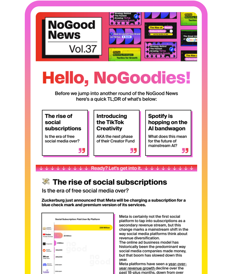
Join our growing community of 100,000+ growth marketers, growth leads,
CMOs, and brand founders.