

When you are using an app, software product, or even a website, you intuitively start to understand what is good versus bad UI (user interface). Looking a level deeper, all of these product screens are actually built on a foundational design system.
Before we go further, let’s take a step back and remind ourselves what the differences are between UI and UX (user experience).
- User interface refers to the actual design elements and interface screens that make up a product. These are design elements that you see like colors, buttons, layouts and how they relate back to the overall look and feel of a brand.
- User experience refers to the intention behind those designs. This includes considerations such as what audience the product is for, the flow of how users will get to a specific action, what the overall information architecture is of how the page is laid out.
These two principles go hand in hand to create something users actually find visually appealing to using and intuitive for them to navigate.
What Is a UI Design System?
UI design systems are building blocks of reusable components that designers and developers reference to create robust products. This creates a consistent source of truth for scaling and adapting products that will improve the velocity of future product features or updates. Every UI/UX designer builds design systems a little differently, but the foundational setup typically follows the same logic. It can seem a little daunting to start to build out a UI design system.
Let’s break it down into phases:

Phase 1: Creating Design Tokens
This is essentially your foundation layer; if we thought about it how we thought about baking a cake, we would start by gathering all of our raw ingredients. We are doing the same thing here by establishing a hierarchical token structure that includes specific raw values like hex color codes, typography, spacing. These are sometimes referred to as primitive variables.
From there, you create semantic tokens which reference the primitive variable. The semantic layer helps tie a certain set of primitive foundations back to how they will be used in context.
Perhaps this means a specific color is being used in a primary versus a secondary button. Perhaps your product has a light versus dark mode system; essentially, this is where categorizing and naming these variables in a systematic way helps to create a language that is custom to your design system.

Phase 2: Creating Components
From here, the components are ready to be defined and built. This is essentially the filling of the cake where you are mixing the ingredients together. Typically, this can be the most time sensitive portion of the system build, as product designers are ensuring that all variant states are being considered from an interaction perspective: default, hover, pressed, empty, failed across all several components.
- At a macro level, this also requires collaboration from product managers and developers to ensure that various user needs and product intentions are factored in to make the system as robust as possible.
- At a micro level, this also means creating multiple variants of a same component such as multiple sizes of one component such as an avatar to be compatible across different parts of the product.
Usually this process starts from smaller components into more complex templates. This chart helps to break down the levels:
|
Level |
Components |
Purpose |
|---|---|---|
|
Atoms (basic building blocks) |
Buttons, checkboxes, toggles, chips, badges, avatars, icons, dividers |
Single-purpose elements documented with variants, states (default, hover, focus, active, disabled, loading, error, success), and sizes (small, medium, large) |
|
Molecules (simple combinations) |
Form fields, search bars, cards, navigation items, breadcrumbs |
Creates simple functional units |
|
Organisms (complex components) |
Sidebar navigation, data tables, dashboard structure, carousels, complex forms |
Brings together composition and how components work within each other to create complete interface sections |
Phase 3: Creating Templates & Flows
Now, we’re finally putting all the pieces together (or assembling our cake); because we did all of the pre-work, designers can now create larger flows and templates.
Let’s take an example where we combine various components to create an actual checkout flow. If the product lives in a dashboard, there can be several dashboard views, table views, and flows that can then be easily referenced. This is also the time to ensure that these larger templates work across responsive breakpoints.
Phase 4: Development
Developers’ roles are key in bringing design systems to life, and it’s important to collaborate with them along the way. In order to integrate the system, developers will typically:
- Set up design tokens in code often using a code program like React.
- Build components with token variables, and settings applicable to the component.
- Use tools like Storybook; it’s essentially a testing environment with a visual catalog library of all the components created.
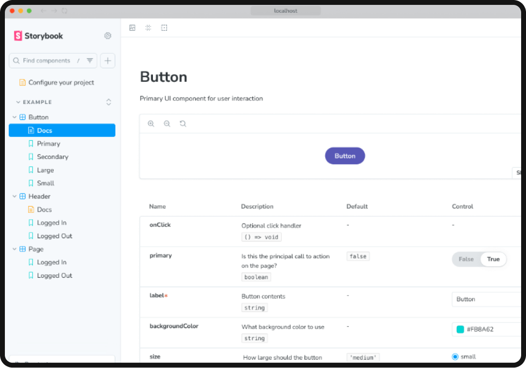
This allows developers and designers to test and QA the components and easily make edits where needed, before the components are used in a live environment.
Phase 5: Scaling
It’s also important to think about components being flexible, and having the right building blocks but not necessarily creating hundreds of unique variants that are edge cases. In order to scale for future use, building governance and documentation of who can add components, review proposed system changes, and how changes ultimately get shared across the team are key.
Having guidelines for how components should be used provides clarity and reminders for you or teammates in the future. Whether this looks like a version change document, or a design systems guidelines, this will save teams headaches in the future.
Design System Resources & Tools
Luckily, today there are several resources to help get you started building a design system so that you don’t always need to start from scratch.
- Google Material Design System: The most well-known and comprehensive design system with clear usage guidelines to plug into.
- ShadCN: Another functional system often a developer favorite, but still allows for customization.
- Atlassian Design System: Often used for productivity and collaboration tools.
- Polaris Design System (by Shopify): Well known for eCommerce products.
- Primer (by Github): Another UI system that works well with developers.

With all of the tools available above, you might be wondering: when is it best to start building from an existing system, versus building one from scratch? This will vary case by case for each brand based on business needs, capacity and end goals. To decide where you stand, here are some things to consider:
|
Approach |
When to Use |
Speed to Market |
Brand Control |
Effort Required |
|---|---|---|---|---|
|
Use As-Is |
MVPs, internal tools, flexible brand requirements |
Fastest (days-weeks) |
Low |
Minimal |
|
Low Customization |
Need brand differentiation but want foundation handled |
Fast (weeks-months) |
Medium-high |
Low-medium |
|
Heavy Customization |
Unique interactions needed, strong brand requirements |
Medium (months) |
High |
Medium |
|
Build From Scratch |
Extremely unique domain, no existing system fits |
Slowest (6+ months) |
Complete |
High |
At the end of the day, starting from a resource foundation will always help increase the speed of the project versus creating from zero. The decision also depends on a company’s resources and scale of the team:
- Startups will likely go for the low customization option.
- Later-stage startups or scaleups may go the more highly customized route.
- Mature companies typically have their own proprietary design system.
There are also numerous YouTube creators and additional Medium writers (I’m personally a big fan of Christopher Deane) who offer tutorials and speak even more in-depth on approaching design systems, as well as recommending specific Figma plugins that can help the process.
All of this to say, no resource is too limited to help anyone start tackling system building!
Why Do UI Design Systems Matter?
Now that we’ve covered how systems are set up, it’s also important to zoom out and understand the value behind a strong UI design system. At the end of the day, every design system should serve your unique product’s or team’s needs.
With feature launches going to market in record speed accelerated by AI, having a clear system foundation also allows teams to ship features and updates faster.
They serve to create a unified user experience, and act as a source of truth for how components in the product interact, look like, and should be used. There is a reduction of design debt when components have already been tested. Having a strong system setup allows for edits to be made more easily universally. They create consistency across products, allow for a way to onboard new designers and developers more quickly and for these teams to collaborate more effectively. This allows designers to focus their time on high impact solutions and allow time to focus more on optimizing the user experience.