Design doesn’t get expensive when you explore, it gets expensive when you assume. Treating prototyping as merely “the design phase” and user testing as optional is one of the fastest ways to burn budget: ship first, learn later. That order makes no sense in a world where customer experience directly drives revenue. PwC reports that 73% of customers say experience is a key factor in purchasing decisions.
Pulling from my years of experience as a designer:
- Prototyping is how loose ideas turn into something tangible: layout, hierarchy, interaction, etc.
- User testing is how we validate that the experience actually works: clear paths, fewer errors, faster completion rate.
Don’t confuse a prototype with a polished mockup; rather, think of it as a working simulation of the product. That simulation is what separates thoughtful design from guesswork. The math is straightforward: the later you uncover issues, the more expensive they are to fix.
At a macro level, a 2022 study from the National Institute of Standards and Technology estimated that inadequate software testing costs the U.S. $59.5B annually (with $22.2B potentially recoverable through better practices). Not to mention, noting that this study is from 2022, we can assume that the lightspeed pace of technology and AI has widened this gap in the last few years.
7 Benefits of Prototyping
- Reduces risk before development; Catch structural, usability, and logic flaws before engineering time is invested.
- Speeds up decision-making: A tangible prototype removes ambiguity and aligns stakeholders faster than static decks.
- Clarifies product thinking: Turning ideas into flows forces teams to define hierarchy, states, and edge cases.
- Improves cross-functional alignment: Designers, PMs, engineers, and marketers react to the same artifact, not different interpretations.
- Encourages iteration over perfection: Lo- and mid-fidelity prototypes (we’ll talk more about fidelity in just a second) make it easier to test ideas without ego attachment.
- Supports smarter prioritization: You can validate which features matter before building everything on the roadmap.
- Strengthens stakeholder buy-in: High-fidelity prototypes make abstract ideas feel real, which is especially useful for execs and investors.
7 Benefits of User Testing
- Replaces assumptions with evidence: Real users could invalidate your favorite idea in minutes, which would ultimately be a good thing.
- Identifies usability friction early: Confusion, hesitation, and misclicks reveal gaps that analytics alone can’t.
- Improves conversion and retention: Small UX adjustments discovered in testing often have outsized impact on performance.
- Builds empathy across teams: Watching someone struggle with your interface changes internal conversations instantly.
- Prevents costly rework: Fixing a problem in a prototype is exponentially cheaper than fixing it post-launch.
- Sharpens messaging and positioning: Testing copy, hierarchy, and value props clarifies whether users actually understand what you’re offering.
- Creates a culture of continuous improvement: Testing turns product development into an ongoing feedback loop instead of a one-time launch.
Commonly Used Prototyping & User Testing Terms
Before we move into more technical definitions and concepts, let’s review what we’ve covered so far. Here are the key terms we’ve already talked about and a few new ones that we’ll get to soon!
- Prototype: A model that simulates how the final product works so that we can test usability and feasibility.
- Adobe is blunt here: static assets like sketches, wireframes, and mockups aren’t prototypes because they don’t simulate interaction.
- Interaction Design Foundation makes the same point more broadly: prototypes simulate design and functionality, and fidelity can range from lo-fi (paper) to hi-fi (digital).
- User testing / Usability Testing: Giving people realistic tasks and measuring whether they can complete them, how long it takes, what mistakes happen, and how it feels.
- Nielsen Norman Group highlights the core usability metrics: success rate, time on task, error rate, and subjective satisfaction.
- Usability: Achieving specified goals with effectiveness, efficiency, and satisfaction, in a specified context.
- Moderated vs. Unmoderated:
- In moderated remote tests, I am next to the participant and can probe with “why” questions (I’m not there to help them figure it out, I’m simply there to understand how they’re experiencing the prototype)
- In unmoderated tests, my tasks and prototype have to carry the whole experience
What Are the 3 Types of Prototyping?
Prototypes are typically characterized into three types based on something called fidelity: the three types are low-fidelity, mid-fidelity, and high-fidelity prototypes.
What does that mean, though? A prototype doesn’t exist to look impressive or show off your design chops; the ultimate purpose of a prototype is to answer a question. Fidelity (low, mid, or high) simply describes how accurate the prototype is to the final product. The degree of fidelity depends on what stage of user testing you are in.
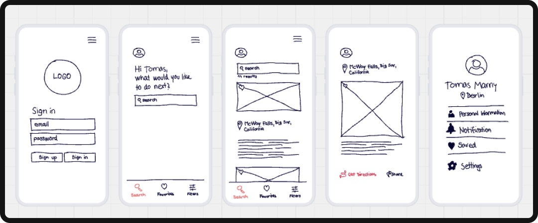
1. Low‑Fidelity Prototypes
Low‑fidelity (or lo-fi) prototypes are simplified, early representations that prioritize flow and functionality over visual polish. They’re often created with pen and paper, whiteboards, or basic digital wireframes.
Practical Examples
- A paper onboarding flow with 6-10 hand‑drawn screens with a facilitator swapping pages.
- A FigJam or Miro wireflow with boxes + labels + arrows for key paths (signup, search, checkout).
When to use Lo-Fi Prototyping
- You’re validating structure, IA (information architecture), and flow (“Is this the right sequence?”).
- Stakeholders need to align on scope before UI polish starts.
- You want feedback on concepts without users nitpicking colors and typography.
2. Mid‑Fidelity Prototypes
Mid‑fidelity (mid-fi) prototypes sit between wireframes and pixel‑perfect UI. They typically include real layout, hierarchy, and key components (buttons, inputs, navigation), but with limited branding, simplified visuals, and fewer edge‑case interactions.
Note: The takeaway here is that this “middle” is less about a strict definition and more about an intent: realistic enough to test behavior, light enough to iterate fast.
Practical Examples
- A grayscale clickable checkout flow with real form fields and validation states (happy path + a couple of errors).
- A mid‑fi dashboard prototype focusing on navigation, filters, and table interactions, not final data viz styling.
When to Use Mid-Fi Prototyping
- You’re testing comprehension (“Do people understand what this control does?”).
- You need cleaner usability metrics than low‑fi can support (task success, misclick paths).
- Product + engineering teams need enough detail to estimate complexity without treating a prototype as a contract.

3. High‑Fidelity Prototypes
High‑fidelity (hi-fi) prototypes are closest to the final product in visual design, content realism, and interactive behavior. They’re what you use when the decision depends on nuance: microcopy, hierarchy, motion, accessibility states, and stakeholder confidence.
Practical Examples
- A Figma prototype using real typography, design system components, and near‑final copy.
- A ProtoPie prototype that simulates device behaviors (text input, gestures, camera, voice), such that it “feels real” to users and stakeholders.
When to Use Hi-Fi
- You’re validating UI clarity at speed (unmoderated tests, preference tests, prototype tasks).
- You need stakeholder alignment on the “final direction” before build.
- You’re de‑risking complex interaction models (conditional logic, states, multi‑step flows) that static mockups can’t represent.
Let’s add all of this information into a nice table for you to reference later:
|
Criteria |
Low-Fidelity (Lo-Fi) |
Mid-Fidelity (Mid-Fi) |
High-Fidelity (Hi-Fi) |
|---|---|---|---|
|
Definition |
Rough, simplified representations of a concept |
Structured layouts with clearer hierarchy and interactions |
Fully designed, interactive representations that closely mirror the final product |
|
Visual Detail |
Minimal (shapes, placeholders, basic text) |
Moderate (real layout, limited styling, some real copy) |
High (brand colors, typography, imagery, polished UI) |
|
Interactivity |
Little to none (static screens or paper) |
Basic click-through flows |
Advanced interactions, animations, transitions |
|
Speed to Create |
Very fast |
Moderate |
Slower, more time-intensive |
|
Cost |
Low |
Medium |
High |
|
Primary Goal |
Validate ideas and flows quickly |
Test structure, usability, and hierarchy |
Test realism, micro-interactions, and emotional response |
|
Best For |
Early ideation, stakeholder alignment |
Usability testing, flow validation |
Pre-development validation, stakeholder buy-in, investor demos |
|
Tools Commonly Used |
Paper sketches, whiteboards, FigJam |
Figma wireframes, Adobe XD, Sketch |
Figma interactive prototypes, Framer, Webflow, InVision |
|
Risk Level |
Low commitment, easy to pivot |
Moderate commitment |
Higher commitment, closer to final build |
|
Feedback Focus |
Concept clarity |
Usability and navigation |
UX polish, visual appeal, conversion optimization |
Prototyping & Testing Tools Comparison
When it comes to prototyping and user testing, tool choice is less about “the best one out there” and more about fit: team size, complexity, collaboration model, and how close your prototype needs to behave like production.
Pricing and packaging also change fast, so treat any plan breakdown as time‑stamped, not timeless.
|
Tool |
Best For |
Fidelity Supported |
Platform |
Pricing |
Strengths |
Weaknesses |
|---|---|---|---|---|---|---|
|
Figma |
End-to-end design + prototyping hub for product teams (design → feedback → dev handoff) |
Low → High |
Browser + macOS/Windows apps |
Free starter; paid per seat tiers |
|
|
|
Sketch |
UI design + prototyping for Mac-centric teams |
Mid → High |
Native Mac app + browser review |
Subscription per editor |
|
|
|
Axure RP |
Advanced, logic-heavy prototypes for enterprise flows and complex systems |
Mid → High |
macOS + Windows |
Pro and Team subscriptions |
|
|
|
ProtoPie |
High-fidelity interaction design (mobile, IoT, realistic device behaviors) |
High |
macOS + Windows |
Free and paid tiers |
|
Requires importing designs from other tools |
|
Framer |
Interactive website prototypes + publishable web MVPs |
Mid → High |
Browser + desktop apps |
Free; paid for custom domains/features |
|
|
|
UXPin |
Logic-rich SaaS dashboards + state-driven app prototypes |
Mid → High |
Browser + macOS/Windows |
Free + paid tiers |
|
|
|
Penpot |
Open-source design + prototyping for teams prioritizing governance/self-hosting |
Low → Mid |
Web-based / self-hosted |
Free + paid tiers |
|
|
|
Miro |
Low-fidelity wireflows, journey maps, early discovery workshops |
Low |
Web + desktop apps |
Free + paid plans |
|
|
|
Maze |
Unmoderated prototype testing + rapid validation loops |
Low → High |
SaaS |
Public plans (limits vary) |
|
|
|
Lyssna |
Quick usability studies (first-click tests, prototype tasks, surveys) |
Prototype tasks + surveys |
SaaS |
Free + paid; panel separate |
|
|
Airbnb: A Prototyping Case Study That Sits Right With Me
When Airbnb launched in 2008 (then called “Airbed & Breakfast”), it didn’t debut with a robust booking engine, trust framework, or scalable infrastructure. It launched with a simple website, a few photos of air mattresses in the founders’ apartment, and a clear question:
Would anyone actually pay to stay in a stranger’s home?
That early site wasn’t a polished product… It was a test. During a design conference in San Francisco (when hotels were sold out) the founders listed their apartment. Three guests booked at $80 per night. That moment wasn’t just revenue; it was validation. The core behavior worked. Strangers were willing to trust the concept (and more importantly, they were willing to pay).
Before building dashboards, reviews, payment automation, or growth loops, Airbnb validated demand. Here’s why it worked.
They Tested the Riskiest Assumption First
The early prototype answered the questions that mattered most:
- Would people trust a peer-to-peer lodging model?
- Would hosts be willing to list their homes?
- Would guests pay for the experience?
- Was this about price or about connection and locality?
Instead of investing heavily in engineering, the team invested in exposure to real users. The prototype reduced uncertainty around the business model itself. That’s what effective prototyping does: it surfaces behavioral truth before operational complexity.
Iteration in the Real World
As Airbnb grew, the team encountered another friction point: listings in New York weren’t converting well. Rather than immediately panicking and reworking the product, the founders looked closer at the experience. The problem wasn’t the platform. It was photography (aka, the fact that it sucked).
So, they flew to New York, met with hosts, and personally retook listing photos. And you know what? Conversion rates improved almost immediately. It wasn’t a massive feature release. It was a small, informed iteration based on observing real user behavior.
Why This Example Still Matters
Airbnb’s early success wasn’t driven by product polish, but by disciplined validation. They resisted the urge to build first and test later. They tested the concept before building at scale.
For modern product teams, the lesson is straightforward: prototyping = de-risking decisions, not showing off aesthetics. The goal isn’t to make something look finished but rather to confirm that it’s worth finishing in the first place. Airbnb’s first “prototype” answered the most important question in the room, meaning that everything that followed was built on evidence, not assumption.
Prototyping & User Testing: Final Thoughts
Stop thinking of prototyping and user testing as extra steps in the process, when in fact they are the process. It’s how teams replace opinion with evidence, polish with proof, and assumptions with insight.
Focus your attention from shipping the fastest and towards learning the fastest. Prototypes create clarity before code; user testing creates confidence before scale. And both are continuous. Ready to build products that people actually want to use?