
It might feel unnatural to connect data to design, but data is a critical component of the designer’s role. From interiors to graphic design, marketing, experiential design, and beyond, designers are constantly creating using more than just guesswork—they’re leveraging real user behavior.
This is the reality of data-driven design—and it’s not just a buzzword. It’s a vital part of any designer’s role to connect visual storytelling with the science of audience insights. Finding a balance between analytics, data, and creativity within a field that is so creative might not sound intuitive, but it is the reality of the design industry today.
For creatives, it opens the door to informed experimentation, understanding audience desires, and creating designs that don’t just look good, but actually serve their intended purpose.
What Is Data-Driven Design?
Data-driven design is simply the practice of using real-world data to inform decisions in a designer’s creative process. This data could come from the analysis of user behavior, their preferences, and the outcomes of previous experimentation.
It’s the difference between making assumptions and “using your best judgement” and knowing what truly works, rather than relying on instinct, visual preference, or—for lack of a better term—vibes. Designers who use this method back their choices with hard evidence.
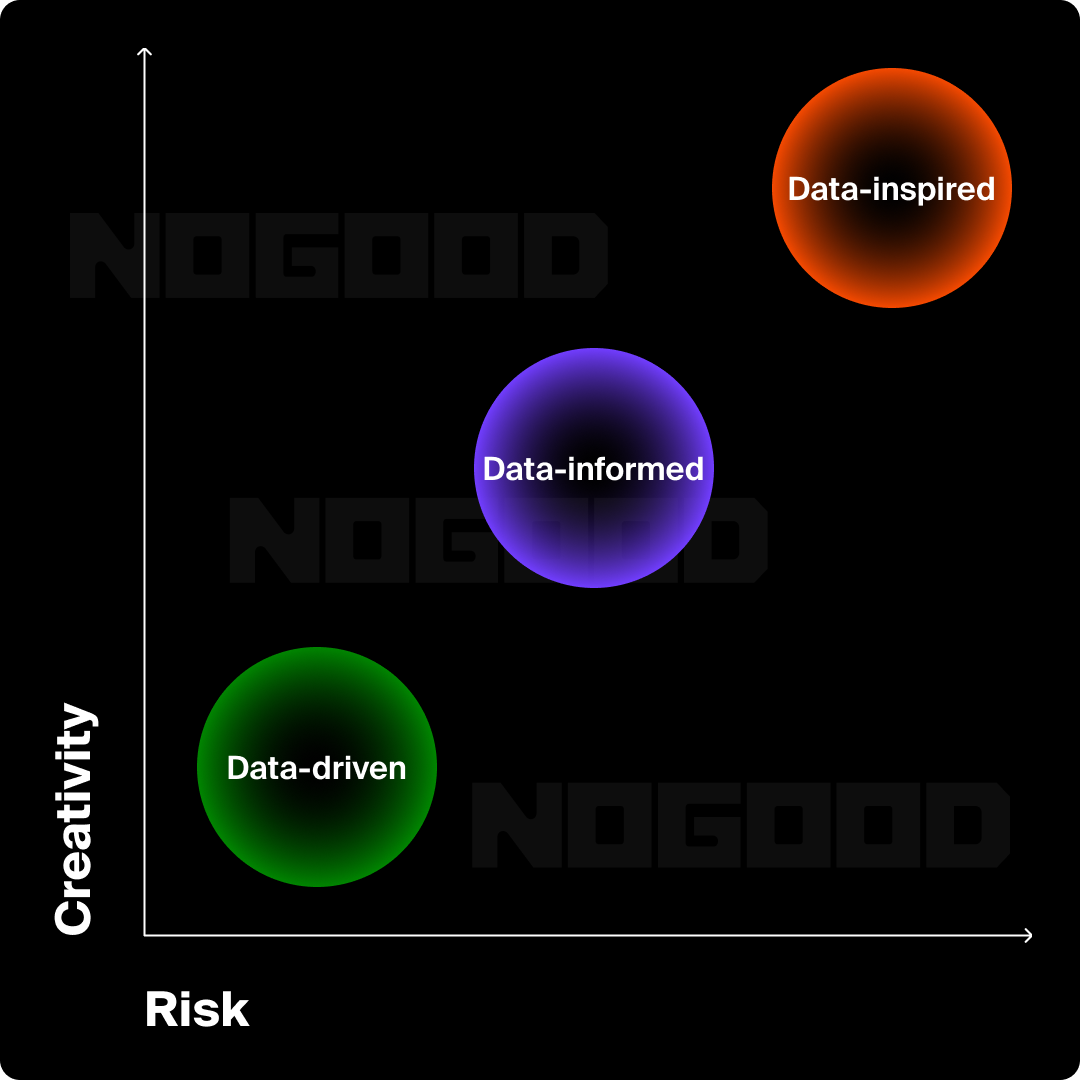
There are a few variations of data-driven design methodologies, listed below in decreasing order of the amount of weight that each puts on the data component:
- Data-Driven: Design choices are guided by data insights and performance metrics.
- Data-Informed: Data supports decisions, but designers may also rely on intuition and creative exploration.
- Data-Inspired: Designers use data as a spark for ideation but prioritize bold creativity and experimentation.
There is no one right way to use data, but these approaches to interacting with data have different purposes and use cases. Within this scale of different approaches, you can also view it as a trade-off wherein overall risk increases as the reliance on data decreases.
Data-Driven Design
Let’s create an example—when creating an ad, you might opt to continue using video formats given the insight that videos tend to perform well for a particular business. You might also consider more specific components of the video, such as format, delivery style for voiceovers or scripts, tone, and animations or overlays. In this case, you, as the designed,r would be implementing a data-driven approach.
A common method of incorporating data into design is simply looking at historical top-performers and comparing what did and didn’t work. This helps chart a course for design teams to be able to come to conclusions about their ads. These takeaways should also frame the process for any net new creative in the future.
Data-Informed Design
Using a more data-informed approach, however, might work better when designing for organic social media purposes. Instead of doing the same thing over and over, like the data-driven approach above, designers would take more generalized insights on what is performing well and use them to keep iterating on new and creative ways to expand on top performers.
In this scenario, if a designer posts a funny meme that performs well, it doesn’t necessarily mean that they should only design memes for the social media account moving forward. It’s important to remain true to the brand’s tone and sprinkle in some new content every so often.
The main takeaway here would be that memes tend to perform well, and that this kind of format should be integrated into future batches for that company. Organic social is a great way to incorporate a data-informed process (since the ultimate goal remains for the post to perform well), but also keep viewers on their toes with new content that inspires.
Data-Inspired Design
Designers should consider using a data-inspired process when starting a new project that prioritizes creativity—think larger-scale creative ideation for a new campaign rather than designing a run-of-the-mill organic post or social media ad.
To illustrate data-inspired design, we’ll imagine a design team that is tasked with creating a marketing campaign for the holiday season. During their ideation, they should throw out any and all creative ideas they think might be relevant or interesting—there are no “bad ideas” at this stage—and often, the more absurd, the better.
This is a classic example of a situation where bold creativity and experimentation take precedence over performance metrics. Say the team creates a campaign at this scale every year—they should think about what worked well previously, but it shouldn’t by any means be a rinse and repeat from the previous campaign. Excite and create a lasting impression with novel ideas, and that might just deliver better insights than a variation on a previous top performer.
Smart teams use a combination of all three approaches, keeping a pulse on when they can be more risky, but taking insights based on what has worked before. Here at NoGood, our Creative Studio develops designs that are grounded in both what resonates and what performs. For every ad launched, we analyze messaging, visual treatments, media formats, scroll behavior, and conversion data. These insights feed directly into future campaigns, creating a feedback loop that makes every design even smarter than the last.
Data’s role in User Experience (UX) Design
For years, UX design was driven largely by intuition and best practices, because, well, the field didn’t exist. UX design was brought about when some of the first user-friendly computers were released in the 1980s, and Graphical User Interface (GUI) design began taking shape. But with today’s access to real-time analytics and user testing platforms, things have changed.
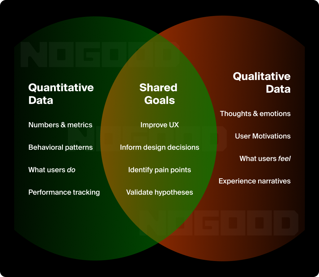
UX design today incorporates:
- Quantitative Data: Quantitative data is numerical data. Think heatmaps, click data, engagement time, events recorded, and bounce rates.
Qualitative Data: Qualitative data usually takes the format of words, particularly direct user feedback. Think user interviews, open-text survey responses, and social media comments.
Even without using these UX testing or analytics platforms, widespread access to digital software has integrated itself deeply in our world, so much so that we can easily make decisions based on what is more user-friendly just by taking a look at what our competitors are doing.
There’s a reason that so many user interfaces look similar. Take the login flow to get into your account. On so many different websites, there is a similar pattern to it. For lack of a better term, “if it ain’t broke, don’t fix it” really does apply with UX design. Some basic functionalities don’t need reinventing, and this repetition of the same look and feel to these user experiences helps users navigate a new application.
But these UX design decisions aren’t based on nothing. It’s a combination of each company doing extensive research and experimentation on how to maintain customer interaction with the product while lowering the learning curve for new users, just as much as it is new companies trusting what competitors have implemented as industry standard.
A classic example of this is the Facebook like button, which has revolutionized user interaction and incentivized users to post. What once started as a simple way for users to quickly engage with each other has more recently shifted into something with much more power. It has informed algorithms to distribute posts and media more frequently as the likes and comments rise. This is fuel for brands to create posts that go viral and reach new audiences.
This is a perfect case study showing how a feature that seems so simple can lead to so much more interaction for users. Beyond that, the concept of the like button also provided an avenue for companies to gain insights to see how their users are responding to content. It’s no wonder that almost every digital software has some sort of like button now—Microsoft has even added this feature to its email.
The research and data that have gone into shaping the modern user experience manifest themselves everywhere, in every digital experience you interact with. Taking a look at what other websites, apps, and products are doing well is based on teams spending considerable time testing and iterating to make the most intuitive and familiar-feeling product. When doing research into a new product, take a look at your brand’s competitors and audit what you like and don’t like about their design system. Taking inspiration from their design decisions will only create more delight and familiarity for your users, just as it has done for you.
Benefits of Data-Driven Design
Data collection in the design process often happens through methods like usability testing, heatmaps, or A/B testing. These tools provide concrete evidence of what’s working and what isn’t for the designers to iterate from. For example, a common design learning for websites is through heatmaps, revealing that users aren’t scrolling far enough to see a key call-to-action, prompting a redesign of page hierarchy, and moving the CTA above the scrollable area.
Session recordings of users interacting with a product might show repeated confusion around a specific element of the digital product, suggesting a need to rethink that design. For example, users hesitating around a form input could mean unclear labeling or poor interaction states for the input. These insights allow designers to move beyond guesswork and make targeted adjustments based on how users actually interact with a product, not how they’re expected to.
Carrying out data-driven design is always worth the extra time and attention it requires. In general, it helps make a smarter design and has some really impactful benefits for the company:
- Greater User Engagement
Consider the A/B testing of two ad headlines—one is playful, while the other is more direct. This type of test can reveal tone preferences for your target audience. When design decisions are backed by data, marketers can dial into what resonates with their audience, whether that’s a color scheme, layout, headline, copy tone, or format.
- Higher Satisfaction & Retention
When users are shown ads and landing pages that reflect their needs, preferences, or past behaviors, they feel understood and satisfied with your brand. Data helps refine not just what’s said, but how and when it’s said. Using this data can personalize a customer’s experience with the brand, which can create a long-term brand affinity.
- Alignment of User & Business Goals
Data can overlap in a designer’s responsibility to comply with business objectives. Hypothetically, if 60% of users are bouncing from a landing page once they get to a specific section, like a pricing table, that insight becomes an invitation for creative problem-solving. Designers can use this friction point to rethink layout, visual hierarchy, or simplify messaging.
- Faster Iteration Cycles
Traditional design cycles often rely on delayed feedback, but data-driven workflows collapse those timelines. With analytics available in real-time, creative teams can spot what’s working and what’s falling flat—and course-correct quickly.
For example, if a static Instagram ad underperforms, the team might test a punchier caption, add movement, or swap in a different call-to-action. This cycle of testing and refinement helps teams evolve their creative instinct into a test-and-learn system. The more cycles a team goes through, the sharper their creative instincts get, and the faster they can scale what works.
The Big Takeaway
Data-driven design is more than a methodology—it’s a mindset shift that invites creatives to leave their ego at the door, listen to what the data is telling them, and create work that resonates deeply with the audience. At agencies like NoGood, it’s baked into every stage of the creative process—from ideation, to execution, to optimization.
Like most things in life, data-driven design is a balancing act. The right blend of creativity and data can unlock substantial growth opportunities for a company. Leaning too far to one side might stifle creativity or push out ideas that are too “out there” and don’t resonate with your audience.
Maintaining this balance and understanding when to lean to one side versus the other takes time and experience. So, start with the data—it might just be the most powerful creative tool you have.


I designed the original “thumbs up, thumbs down” feature for TiVo in 1999 that allowed users to voice their preferences. This feature was also included as buttons on the remote control. Facebook came along years and borrowed the metaphor by creating a like button on their application.