Design isn’t just about aesthetics; it’s about understanding how humans perceive and interact with visuals. Whether you’re designing a website, crafting a logo, or developing a product, integrating principles from psychology can significantly enhance the effectiveness and appeal of your creations. Let’s walk through the definition of design psychology and explore five key principles rooted in psychology that can elevate your design game.
What is Design Psychology
Design psychology bridges the gap between human psychology and creative practice, examining how people perceive, process, and respond to visual and interactive elements. At its core, it’s the study of how psychological theories and cognitive biases influence user behavior, decision-making, and emotional responses to design.
What Does a Design Psychologist Do?
To maximize the impact of your designs, it helps to think like a design psychologist: someone who applies the psychology of design, human psychology, and insights into cognitive processing to user interfaces and visual elements. This perspective focuses on anticipating user behavior and designing experiences that are intuitive, engaging, and aligned with how people naturally perceive and process information.
In practical application, designers leverage this psychological knowledge throughout their design process, from reducing cognitive load in user interface layouts to strategically applying color psychology in branding decisions.By understanding principles like Hick’s Law, Gestalt theory, color psychology, typography, and Cognitive Load Theory, designers create visual elements and experiences that feel intuitive, minimize friction, and guide users toward desired outcomes without conscious effort. Let’s start by exploring the first principle and its application: Hick’s Law.
1. Hick’s Law
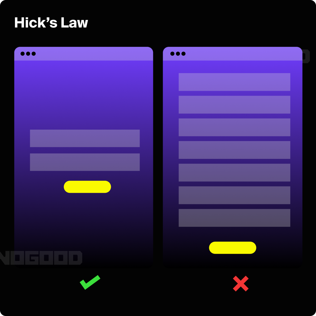
Design should always aim for clarity to avoid overwhelming users. Hick’s law states:
“The time it takes to make a decision increases with the number and complexity of choices available.”
Therefore, when designing, it is important to keep in mind the concept of cognitive load, especially in relation to Hick’s Law and how users make choices. Cognitive load refers to the mental effort required by our working memory; just as computer processors have limited capacity, our brains do, too. The goal of clean design is to reduce this mental effort by keeping only the elements that add value and support clear information processing.
In UX design, it is essential to stay focused on the primary goal of the user and include only the components that help support that goal. Designers should reduce unnecessary steps in the user flow, avoid choice overload, and remove elements that distract from the main objective. This approach improves usability, strengthens visual hierarchy, and aligns with the psychology of design.
2. Gestalt Principles
Gestalt principles, established nearly a century ago, continue to remain highly relevant today. The term “gestalt” means “unified whole” in this context, and the theory examines how people perceive visual elements in relation to each other. These seven principles explain how humans instinctively group and connect elements. For designers, this knowledge is crucial as it directs the viewer’s attention, clarifies the hierarchy of elements, and effectively communicates the design’s intent.
Applying Gestalt principles helps designers create harmonious and easily comprehensible compositions that guide the viewer’s eye and convey information effectively.
Similarity
The principle of similarity suggests that when elements look alike, people group them together and assume they serve similar functions. Similarity can be defined by attributes such as shape, color, size, texture, or value, helping to indicate relatedness or differences among elements.For example, in UX design, your primary brand color is often linked to components that are interactive, such as button CTAs. This relates to color psychology, and helps create clear affordance within the user interface. Using one consistent color signals to the user that these elements allow action and supports the psychology of design by reducing cognitive effort. As the user continues to interact with the product, they form a stronger mental model that action and interactive components are always connected to this primary brand color, which improves cognitive processing and makes the experience feel more intuitive.

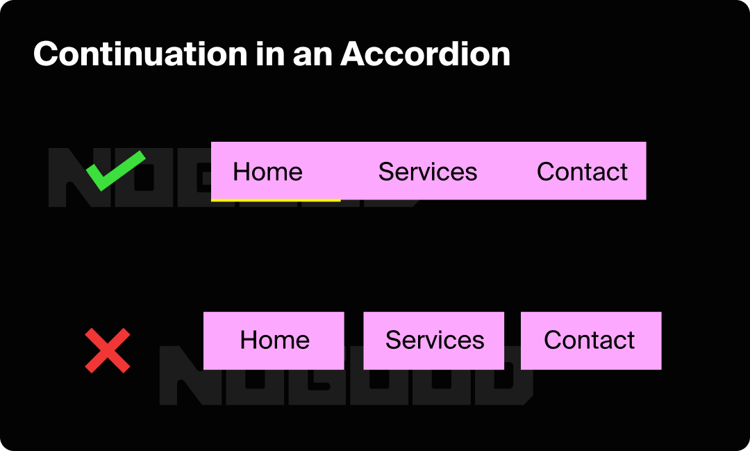
Continuity
Continuity refers to the natural tendency of the human eye to follow a smooth path from one object to another. When designing, use this principle to guide the viewer’s eye along a desired path by placing important elements along this route.
In the UI design example below, the first accordion separates each selection chip, which can create dissonance for the user by making it seem as if the chips have separate functions. The second example uses a continuous fill and stroke, signaling that these visual elements are part of a single user interface component. This reduces the number of separate components on the screen, decreasing cognitive load by turning multiple elements into one.

Consider the Pinterest UI. Image blocks are all different sizes, however, they’re arranged in columns, creating unbroken vertical lines of negative space between the pictures. The continuity principle is apparent here, encouraging users to move up and down to view more content.
Closure
Closure is based on the eye’s inclination to perceive complete shapes even when parts are missing. Our minds fill in gaps to form coherent shapes, showing our preference for completeness. For example, we can still see the circle and rectangle below, even though the lines are broken.
Proximity
The principle of proximity states that elements placed close to each other are perceived as related, even if they differ in color or shape. Proximity helps group elements together and can enhance clarity. This is evident in form design, where text near a field indicates what information is needed. If text were placed farther away, it could lead to confusion.
Common Regions
The principle of common region builds on the idea of proximity by emphasizing the role of spatial boundaries in grouping elements. According to this principle, objects that are enclosed within the same visual boundary or region are perceived as belonging together, regardless of their individual characteristics. This principle highlights the importance of visual containers, such as boxes, backgrounds, or any form of delimiters that group elements. By using borders or distinct backgrounds, you create a clear visual separation between different sections or categories, making it easier for users to understand and navigate the content.
For example, in a user interface, placing form fields within a shaded box or a bordered area helps users to see that these fields are part of a specific task or section, such as contact information or payment details. This grouping can prevent confusion and streamline the user experience by clearly delineating different parts of a form or page.
Focal Point
The focal point is a crucial design element that draws the viewer’s attention to the most important part of a composition. It is the area of a design that stands out visually, commanding immediate attention and guiding the viewer’s focus. This principle is essential for ensuring that key information or calls to action are not overlooked.
To create an effective focal point, designers use various techniques to make certain elements stand out from the rest. These techniques include:
- Contrast: Utilizing strong contrasts in color, size, or brightness can make an element more noticeable. For example, a bright, bold button on a neutral background will attract more attention than a subdued one.
- Size and Scale: Larger elements tend to draw more attention. By making a key feature significantly bigger than other elements, you ensure it becomes the focal point of the design.
- Position: Placing important elements in prominent positions, such as the center of a layout or the top of a page, can naturally draw the viewer’s eye. The top-left corner is often where viewers start looking, so placing crucial information there can be effective.
- Color: Using vibrant or contrasting colors for key elements can make them stand out. For instance, a call-to-action button in a bright, contrasting color will catch the viewer’s eye more readily than a button that blends in with the background.
- Whitespace: Surrounding an element with ample whitespace can also create a focal point. By isolating an element from other content, you make it more noticeable and important.
It is important to be intentional when applying these techniques and to avoid overwhelming the audience with “technique stuffing.” Focusing on 2-3 techniques at a time helps maintain clarity and effective psychological processing. In the example below, the design strategically uses color psychology and display fonts as visual elements to guide the user to the primary message of the social ad, supporting core principles of UX design and the psychology of design.

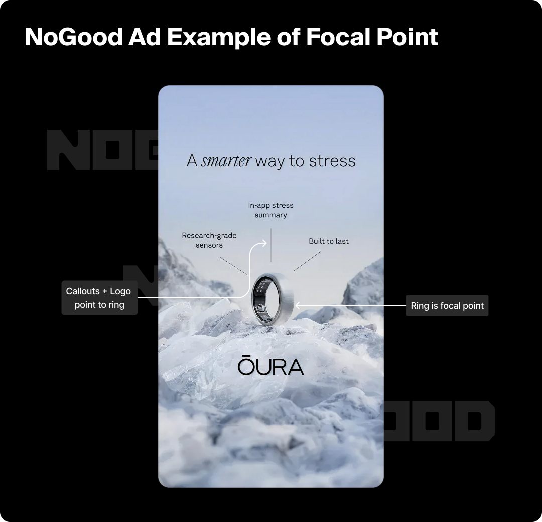
Figure-Ground
The figure-ground principle is central to visual perception, distinguishing between an object (the figure) and its background (the ground). This principle helps us interpret and prioritize what we see by clearly defining the focal point and its surrounding context. In design, effectively applying figure-ground ensures that key elements stand out and are easily identifiable against their backdrop.
The Enduring Relevance of Gestalt
The remarkable longevity of these principles, nearly a century after their establishment, demonstrates their fundamental truth about these principles and how they remain as relevant in today’s digital interfaces as they were in early 20th-century print design.Whether you’re designing a website, mobile app, or print advertisement, these principles form the foundation for clear, effective communication that resonates with how humans are wired to see and interpret the world around them.
3. Color Psychology
The study of color psychology is relatively recent, yet the fascination with color and its effects has ancient roots. Warm colors, such as red, orange, and yellow, fall within the red spectrum and are known to elicit a range of emotions. These hues can create feelings of warmth and comfort, but they may also provoke feelings of anger and aggression.In contrast, cool colors like blue, purple, and green, which are found on the blue end of the spectrum, are often associated with calmness. However, they can also evoke emotions such as sadness or detachment.
Understanding color psychology helps designers select appropriate color schemes that align with the intended message and audience preferences.


4. Typography & Readability
Typography affects how information is perceived and understood. Key considerations include:
Font Type & Size
Selecting an appropriate font type is crucial for readability. Serif fonts, with their distinctive strokes and lines, are often used in print for their classic and formal appearance, whereas sans-serif fonts offer a clean and modern look, making them popular for digital screens. Font size should be large enough to read comfortably without straining the eyes.
🌟 Best Practice: Generally, body text should be between 16-18 pixels for web content to ensure legibility across various devices. Additionally to ensure adequate hierarchy between body fonts and headers, try to maintain at least a 1.5x-3x difference in size between the body text and header.
Line Spacing & Length
Proper line spacing, or leading, improves readability by preventing the text from appearing too dense. Adequate spacing between lines helps guide the reader’s eye smoothly from one line to the next. Similarly, line length should be optimal; text lines that are too long can cause eye strain and disrupt the reading flow, while excessively short lines can make reading cumbersome.
🌟 Best Practice: It’s recommended to keep line lengths between 50-75 characters. This equates to a container size of anywhere from 600-800px when designing to ensure adhering to best practices for scannability.
Contrast & Color
High contrast between text and background is essential for readability. Ensure that there is sufficient contrast to make the text stand out, particularly for users with visual impairments. Many designers will refer to authoritative sources such as WCAG AA Guidelines to make sure that colors are color compliant. Many design platforms such as Figma also have built-in functionality to help you check the readability of your text.
🌟 Best Practice: Using a dark font on a light background or vice versa is a common practice. Additionally, avoid using too many different colors or font styles in a single piece of content, as this can distract or confuse readers.
Hierarchy & Emphasis
Effective typography also involves creating a clear hierarchy to guide readers through the content. This helps readers navigate and understand the content structure, making it easier to find key information. Establishing typography guidelines that denote the primary headers, body text, footer text, call out text is essential to establish before designing for a brand.
🌟 Best Practice: Use different font sizes, weights, and styles to differentiate headings, subheadings, and body text.
Whitespace & Alignment
Incorporating whitespace around text elements prevents visual clutter and enhances readability. Proper alignment of text (whether left-aligned, right-aligned, centered, or justified) affects how easily readers can follow and absorb the information. Consistent alignment contributes to a clean and organized appearance, improving the overall reading experience.
🌟 Best Practice: Use left-alignment for body text in Western languages, as it creates a consistent starting point that’s easier for the eye to track. Reserve centered alignment for short headlines or callouts, and avoid justified text in narrow columns as it can create awkward spacing gaps.

5. Cognitive Load Theory
At its core, Cognitive Load Theory aims to enhance learning and problem-solving by understanding the constraints of human memory. It divides cognitive load into three types: intrinsic, extraneous, and germane, and each impacts how we process and retain information.
- Intrinsic load pertains to the inherent difficulty of the content or task.
- Extraneous load refers to the way that information is presented.
- Germane load relates to the effort invested in understanding and integrating new knowledge.
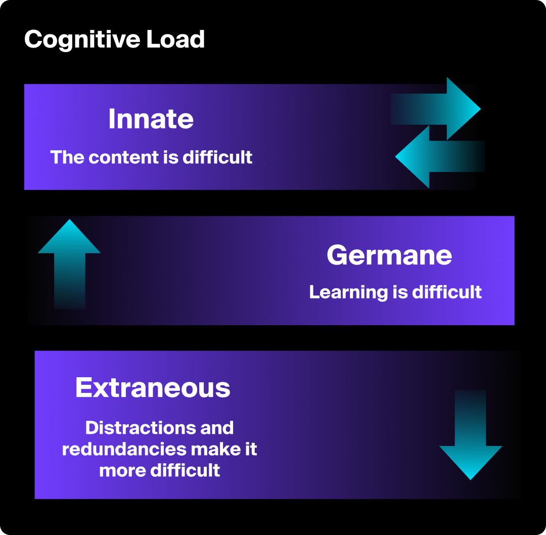
In the context of design, applying CLT means creating interfaces and interactions that align with these cognitive constraints. By managing and reducing unnecessary cognitive load, designers can make information more accessible, learning processes more efficient, and user experiences more intuitive. Effective design guided by CLT not only enhances usability, but also promotes clearer communication and better decision-making. Understanding and applying these principles helps create environments where users can focus on the task at hand without being bogged down by cognitive overload.
Design Strategies to Manage Cognitive Load
- Simplify & Prioritize Information: Present only the most relevant information and prioritize content to avoid overwhelming users. Use progressive disclosure to reveal details gradually as needed.
- Utilize Visual Hierarchies: Organize information with clear headings, bullet points, and visual cues to guide users through the content. Effective use of typography, colors, and spacing can enhance readability and comprehension.
- Incorporate Consistent Design Patterns: Consistency in layout and navigation reduces the cognitive effort needed to understand how to interact with the interface. Familiar patterns help users quickly learn how to use the system without having to relearn different elements.
- Leverage Data-Driven Insights: Use analytics, user testing, and behavioral data to inform design decisions that align with user mental models. By understanding how users naturally think and navigate, you can create layouts and interactions that feel intuitive and reduce the learning curve with data-driven design.
- Leverage Multimedia: Motion graphics, when used purposefully, can break down complex processes into digestible animated sequences that reduce cognitive load and improve information retention.”
- Incorporate AI Feedback: As designers navigate the complexity of managing cognitive load, AI-powered tools are increasingly helping to analyze user behavior patterns, predict potential friction points, and suggest optimizations that align with how users naturally process information. AI tools can also help super-charge your design workflow by speeding up monotonous processes.
An Excerpt on Emotional Design
Don Norman’s Emotional Design set the standard for defining how emotions have a crucial role in the human ability to understand the world, and how we learn new things. According to Norman, emotional design is pivotal in creating products that not only function well but also resonate with users on an emotional level. He identifies three levels of emotional response: visceral, behavioral, and reflective
- The visceral level relates to immediate, automatic reactions to a product’s appearance, such as whether it is visually appealing or aesthetically pleasing.
- The behavioral level focuses on the usability and functionality of a product, emphasizing the importance of ease of use and effectiveness.
- The reflective level pertains to the personal significance and long-term impact of the product, including how it aligns with users’ values and self-image.
Conclusion
By applying Hick’s Law, Gestalt principles, color psychology, typography, and Cognitive Load Theory throughout your design process, you create experiences that align with natural human perception and behavior. Design psychology should inform your work from the earliest concepts through final execution, ensuring every decision reduces friction and guides users intuitively toward their goals. As these concepts become second nature in your thinking, you’ll find yourself creating work that truly resonates with users and boosting conversions in performance creatives.