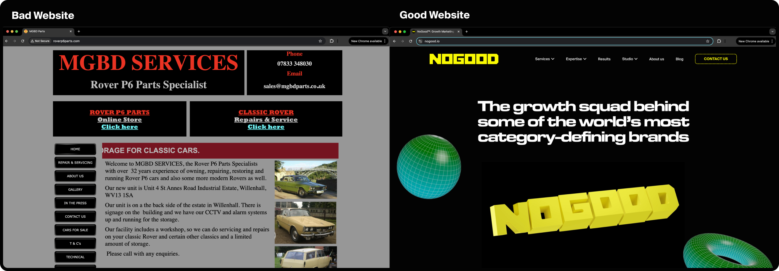
Most websites don’t have a traffic problem, they have a usefulness problem.
People land on your website, get confused, and bounce before they’ve even scrolled. Or worse, they stick around… and still don’t convert. Whether your business is selling software, launching a new product, or if you’re just trying to prove that you exist in 2025, your website must pull its weight.
So, what actually makes a website good?
Let’s break down the real must-haves: from UX, to SEO, to the things that get people to trust your business and take action on your website.
The Core Qualities of a Good Website
What separates a website that’s just there, from a website that actually works? The internet is full of websites that technically function, but still manage to be confusing, slow, or just… off. A good website is the kind people want to use and trust, and for that, you need to get the fundamentals right.
Whether you’re building a brand new website or are just wondering why you have a bounce rate that you’re sobbing yourself to sleep over, here are the qualities every good, high-performing website should have:
1. It’s Built for Actual Humans (Not Just Your CEO)
Is your website all beauty and no brains? You’ve got a problem. If users can’t find basic necessities like a “Contact” button without a treasure map, they’re going to look for a different resource. A good website is intuitive, easy to navigate, and guides your visitors toward what they need; no guesswork required.
Think of it like a really good party host. It doesn’t just look nice, it helps you feel like you belong and know where to go.
2. It Loads Fast (Because in 2025, We’re Not Waiting Around)
Users are impatient. We’re all one slow-loading page away from giving up and Googling your competitor. A good website feels snappy and seamless, especially on mobile.
- Aim for less than 3 seconds of load time
- Optimize your imagery and cut the fluff
- No surprise autoplay videos (especially with the sound on), we beg you 😭
3. It’s Findable (Hey, Google 😉)
Your website can’t soar if no one can find you. Good websites are built with SEO in mind; not keyword stuffing, but clean structure, logical content, and metadata that helps search engines understand what you’re about.
- Headers that actually mean something
- URLs that don’t look like alphabet soup
- A site structure that both a robot and a person can understand
4. It Says What It Needs to Say, Clearly
People aren’t reading websites like novels. They scan, skim, and click based on gut instinct. Great content doesn’t beat around the bush. It says who you are, what you do, and why it matters in language that sounds like a real person wrote it.
- Lead with your value, not your org chart
- Skip the buzzwords and use real language
- Make your CTAs obvious (but don’t be desperate)
5. It Feels Trustworthy
No one is handing over their email (let alone their credit card) if your website feels sketchy; except maybe your grandparents. Good websites signal credibility from the jump. That means secure connections, real contact info, and a healthy dose of social proof.
- HTTPS and SSL are the bare minimum
- Testimonials, case studies, and partner logos? Use ‘em
- Let people know that there are real humans behind your brand
6. It’s Easy to Update & Grow
Your website shouldn’t feel like a Jenga tower on its last bottom block whenever you touch it. A good website is built on a system that makes updating it painless; whether you’re adding a new blog post or launching a new product line.
- Flexible CMS (WordPress is our favorite)
- Modular content blocks
- Easy-to-manage workflows (so you’re not bottlenecked by your dev every time you want to change a comma)
Essentials Every Good Website Needs
Now that we know what good feels like, let’s break down what it actually looks like. These are the building blocks of a website that not only looks good, but actually performs. This is the checklist you need to review to ensure your website works for your business and your audience.
If you’re re-building your homepage or just wondering why traffic is flatter than last week’s soda, here’s what you need to know:
UX & UI Design
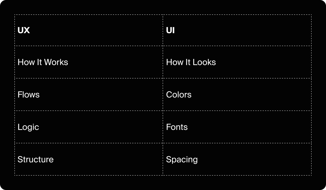
Design is not just about looking pretty (though that’s certainly important, too). It’s about making sure your website feels effortless to use. When things are intuitive, users stay longer, click more, and actually enjoy being there (maybe even enough to come back 🥹). Here’s what separates a “meh” user experience from a great one.
Pro tip: Google indexes mobile versions first. So if your mobile UX is bad, your desktop performance and SEO are probably suffering as a result.
Simple, Intuitive Navigation
Users shouldn’t need your sitemap to find your dang pricing page! A clean, clear, and hierarchical navigation menu helps people find what they need, fast.
- Use recognizable labels (e.g., “About,” not, “Our Origin Story”)
- Keep it shallow; aim for no more than three clicks needed to reach a key page
- Consider sticky navs for better mobile flow
Visual Hierarchy & Readability
A good layout gently nudges users through your content. Think bold headlines, easy-to-read fonts, and just enough white space to let your users breathe.
- Don’t overcrowd
- Break up text with visuals or dividers
- Use buttons that actually look like buttons
Performance & Technical Features
A beautiful website that loads like it’s stuck in 2007 isn’t winning you any points. Under the hood, your website should be fast, secure, and built to handle whatever traffic comes its way. These are the behind-the-scenes details that make or break the user experience.
Fast Load Times
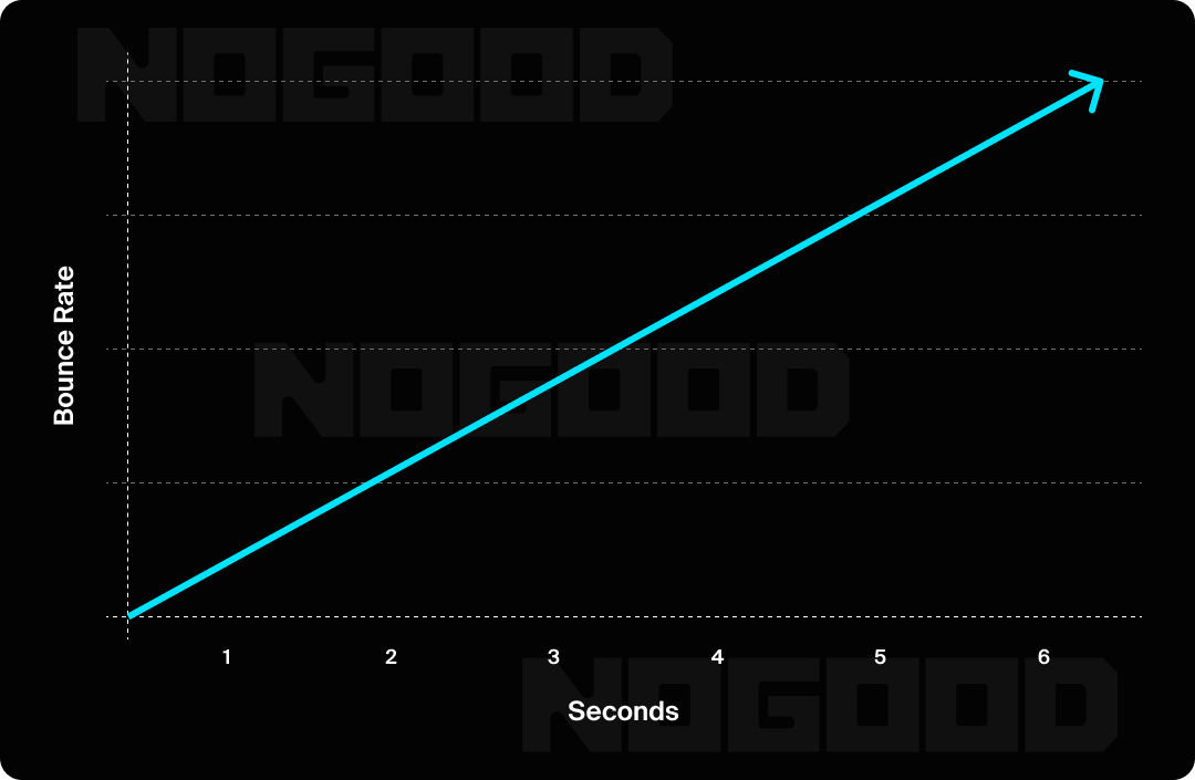
Speed affects everything: user experience, bounce rate, and even search rankings. Consider your users gone if your site takes longer than three seconds to load. Here’s how to ensure fast load times:
- Compress images
- Limit third-party scripts
- Use lazy loading for media-heavy pages
Secure Hosting + SSL Certificate
Security is table stakes. HTTPS and SSL not only protect your users, they also tell browsers (and Google) that your site can be trusted.
- Look for that padlock in the address bar
- Update plugins and CMS regularly
- Add CAPTCHAs to forms to fend off spam bots
Accessibility (Everyone Deserves a Good Experience)
Accessibility = better UX for everyone, not just screen reader users. A few key accessibility must-haves to keep in mind are:
- Descriptive alt text for images
- Keyboard navigation
- Color contrast that doesn’t require superhero vision
Search Optimization Features
Your website could be the best the internet has to offer, but what good is it if no one’s there to see it? Good SEO isn’t just about paying homage to the algorithmic gods, it’s about helping the right people discover you at the right time.
These features make your website not just searchable, but actually worth showing up for:
Clean SEO Infrastructure
A site that can’t be crawled won’t get clicks. Build good SEO habits from the start.
- Use descriptive meta titles and descriptions
- Optimize images with alt tags and filenames
- Add schema markup for enhanced listings (BlogPosting, FAQs, Reviews)
Logical URL Structure
Good URLs are like good headlines: clear, short, and human-friendly.
✅ yourdomain.com/services
🚫 yourdomain.com/index.php?page=10293
Internal Linking
Guide users (and search engines) through your site with smart linking between related pages.
- Helps with SEO
- Keeps people on site longer
- Makes you look like you’ve got your content strategy together (because you do)
Content & Conversion Features
Your website isn’t just there to inform; it’s there to do something. Whether that’s getting signups, demo requests, or actual sales, your content and CTAs should guide users toward action without feeling like a hard sell. This is where words meet results.
Clear, Benefit-Focused Copy
Your content should answer your audience’s questions before they even ask. Lead with benefits, speak in plain language, and don’t be afraid to cut the fluff.
- Make your value prop impossible to miss
- Use bullets and short paragraphs for scannability
- Write like a person, not a pitch deck
Strong, Contextual CTAs
If a user has to search for a button that says “Get Started,” something’s off. But it’s not just about slapping buttons everywhere; the best CTAs feel like the natural next step in the user’s journey.
- Place CTAs where they make sense contextually (e.g., after explaining your value prop, not randomly in the hero)
- Using language that feels human and clear (“Book a Demo,” “See Pricing,” “Try It Free”)
- Design them to stand out visually without hijacking the whole page
- A/B test different wording and placements (conversion is part science, part magic)
Trust-Building Elements
People don’t trust brands by default, you have to earn it. That means showing receipts. The kind that look like glowing testimonials, real customer logos, media mentions, or performance results.
Add credibility with:
- Customer testimonials that speak to outcomes, not just “great service”
- Case studies with actual numbers (even rough ones!)
- Media features or client logos in a clean trust bar
- Human touches like team photos or founder blurbs (real people beat stock photos every time; and trust me, your users can tell)
Tip: Don’t bury these on a “Testimonials” page that no one visits. Rather, sprinkle them across the site where they matter (homepage, product pages, pricing, etc.).
Easy Contact or Conversion Paths
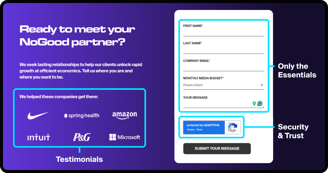
If filling out your form feels like applying for a passport, you’ve already lost the lead. Friction kills conversions; so make it stupid-simple for people to reach out, sign up, or buy.
Keep it frictionless by:
- Limiting forms to only the essential fields (you can always qualify leads later)
- Ensuring everything works on mobile, especially inputs and dropdowns
- Offering multiple contact paths: forms, live chat, a direct email, even social
- Using post-submit pages to confirm next steps and reduce ghosting (“Thanks! We’ll get back to you within 24 hours.”)
Localization & Global Readiness (If Applicable)

If your audience goes beyond one country or language, your site needs to reflect that; and not just with a tiny flag icon in the footer. Great global websites meet users where they are, with content, currency, and UX tailored to local expectations.
What this looks like in practice:
- Multilingual support with proper hreflang tags (so search engines show the right version to the right user)
- Country-specific pages with tailored messaging, offers, or products
- Local currencies, shipping policies, and legal disclaimers where relevant
- Cultural awareness in design, tone, and imagery (what plays in one market might flop in another)
Bonus: International SEO is a real thing. If you’re not optimizing for your global traffic, you’re probably leaving conversions on the table.
Analytics & Measurement
You can’t improve on what you don’t measure. Good websites don’t just launch and hope for the best. They’re set up to track what’s working, what’s not, and what’s worth doubling down on.
At a minimum, you should:
- Have Google Analytics 4 (or an equivalent) set up with conversion goals
- Track on-page behaviors with heatmaps or session recording tools (like Hotjar or Microsoft Clarity)
- Tag your CTAs with UTMs so you actually know what’s driving action
- Use data to inform decisions, not just to check a box
Pro move: Set up custom dashboards that surface what actually matters to your team, not just pageviews and bounce rates, but funnel insights, conversion leaks, and return visitors.
Steps to Building a Great Website
There are two ways to build a website:
- Throw everything into Webflow and pray
- Follow a structured process that doesn’t make your dev team cry and instead actually leads to results
We’re aiming for the second option.
Below is the full, start-to-launch roadmap even we use, whether you’re building from scratch or dragging your website out of the 2010s.
Step 1: Set Clear, Non-Vague Goals
“We need a website” is technically a goal, but not a helpful one. Are you trying to increase conversions? Get more qualified traffic? Reduce support tickets? Launch a new product? These things impact everything else.
What this step actually includes:
- Identify your primary website purpose (conversion, education, lead generation, etc.)
- Map key user types and their main jobs-to-be-done
- Align on KPIs that matter (bounce rate, conversion rate, time on page; not just “pageviews”)
Avoid:
- Letting every department insert their wishlist without prioritization
- Defining success as “just make it look better”
Step 2: Map the Site Architecture
Now that you know what you’re trying to do, figure out how the site will be structured. This step is about creating flow, not just making a sitemap to feel productive and because that’s what this article told you to do.
What this step actually includes:
- Listing every page you need and why it exists
- Grouping pages logically into sections (nav, footer, hidden, or landing)
- Planning internal linking for SEO and usability
- Identifying key user journeys: where do they start, and what’s the ideal end?
Avoid:
- Making every page a top-level nav item
- Forgetting things like legal pages, redirect rules, or 404s
Step 3: Wireframe With Intent
Think of wireframes as the no-makeup version of your site. No colors, no typeface drama, just structure. This step saves a ton of time later by forcing clarity before the polish.
What this step actually includes:
- Blocking out each template (homepage, product page, blog post, etc.)
- Defining key sections and conversion points
- Aligning copy and UX: what content goes where and why
Avoid:
- Treating wireframes like an afterthought
- Adding lorem ipsum and deciding that “we’ll figure out copy later”
Step 4: Design With Real Content (or At Least Real-ish)
Now the visual layer comes in, but it’s not just “make it pretty” folks! This step is where branding, hierarchy, usability, and vibe all need to click.
What this step actually includes:
- Designing for clarity first, wow-factor second
- Using real (or semi-real) content to stress-test the layout
- Prioritizing mobile-first design
- Collaborating closely with content, not handing off blindly
Avoid:
- Designing beautiful pages with no room for flexible content
- Using placeholder CTAs like “Button Text Here”
Step 5: Build to Scale (Not Just Launch)
Now, dev takes over. And it’s not just about making the designs functional. It’s about building for longevity and ease of use by everyone (not just the people who know how to write code).
What this step actually includes:
- Choosing a CMS or stack based on your real team, not what’s trendy
- Making components modular so content can be reused easily
- Ensuring accessibility and performance best practices are baked in
- QA’ing everything: browser testing, mobile views, form validation, load speed
Avoid:
- Hardcoding things you’ll want to update later
- Forgetting form notifications, error states, or alt text
Step 6: Optimize the Hell Out of It
Before launch, you’re tuning the engine. This is where you get rid of the slow, the clunky, the confusing, and the stuff that breaks trust.
What this step actually includes:
- Compressing images and removing unused scripts (something to watch out for with web design templates)
- Finalizing metadata, HTML tags, and canonical tags
- Setting up 301 redirects where needed and checking 404s
- Testing every CTA path and tracking setup
- Setting up analytics goals (GA4, Hotjar, etc.)
Avoid:
- Rushing to launch without QA
- Forgetting to test mobile on actual devices, not just browser resize
Step 7: Launch (& Keep Iterating)
Pop the champagne, but don’t log off forever. A website isn’t done when it goes live; that’s when the real feedback loop begins. Use real data to evolve.
What this step actually includes:
- Watching how people use the site (session recordings, heatmaps, scroll depth)
- Tracking performance and conversions
- Shipping updates based on actual behavior
- Setting a regular cadence to review, test, and iterate
Avoid:
- Leaving things untouched for months (or years; yes, this actually happens)
- Letting “we’ll fix that later” become your team’s internal motto
Quick Audit: Is Your Website Actually Good?
If you’re wondering whether your current site holds up, here’s your gut check.
Answer honestly (or better yet, have someone who’s not on your team do it). If you’re saying “no” to more than a few of these… it might be time for a refresh.
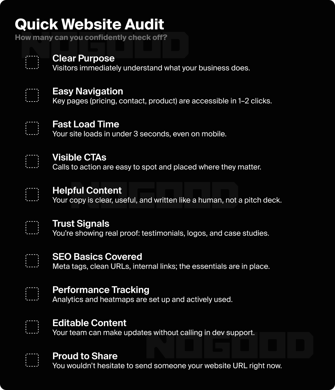
If that last one made you pause… you already know.
If Your Website Isn’t Working, Neither Is Your Growth
To be blunt: if your website is slow, confusing, or simply forgettable, it doesn’t matter how good your product is; people won’t stick around long enough to find out.
The good news? You don’t have to do a complete overhaul to start making improvements. Start with the essentials, fix the friction, and treat your website like a growth tool, not just a digital business card.
Because in 2025, a “good enough” website just isn’t.