In the digital age, the foundation of a successful online presence lies in the careful construction of website architecture. From creating a seamless user experience to optimizing search engine visibility, how your website is structured plays a pivotal role in achieving your goals. This article delves into the critical aspects of website architecture, providing insights into how to set up, maintain, and optimize your website’s structure for the best results.
Website architecture is not a mere technicality; it’s the blueprint that shapes your users’ journey and influences your site’s performance in the digital landscape. We explore concepts such as user-friendly URLs, the pillar-cluster internal linking model, and maintaining a consistent design pattern. We’ll also discuss the tools that can aid you in this endeavor, making the complex task of website architecture more manageable.
By the time you finish reading, you’ll have a comprehensive understanding of the elements that define an exceptional website architecture, and you’ll be well-equipped to enhance your online presence and meet your business goals.
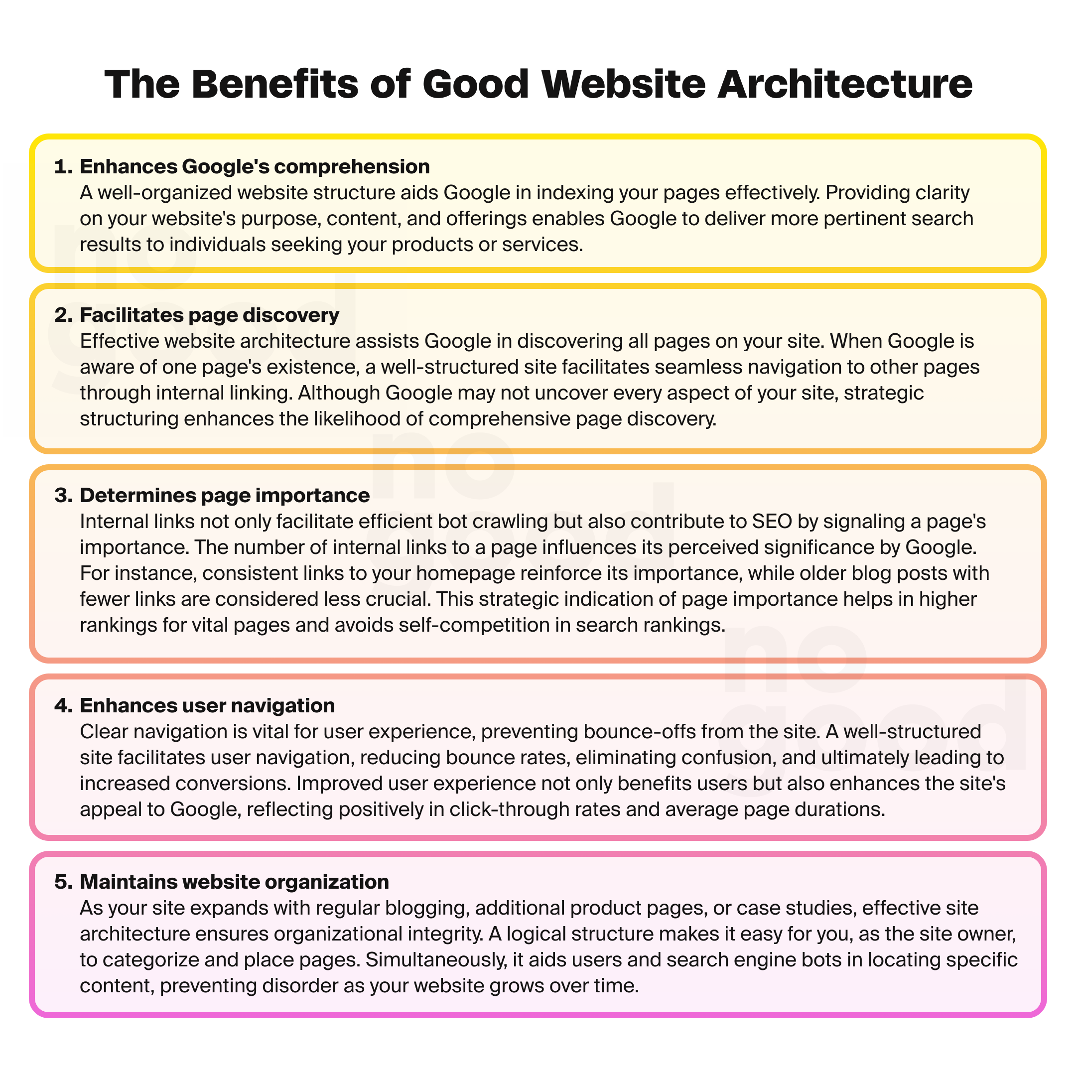
Looking for assistance structuring your website?
What is website architecture?
Website architecture is the underlying framework that determines how your website is organized and navigated by search engines and your users. It is not just a technical concept for page ranking but a crucial element in retaining users and increasing conversions. Think of it as the blueprint that shapes your website’s user experience.
Imagine a website’s structure as a rooted tree graph, with the home page as the central root. The pages directly linked from the home page are like branches, and each page gives rise to additional branches. These branches, in turn, connect to one another, creating a network of interconnected content.
The primary purpose of website architecture is to facilitate a seamless and intuitive user experience. You may have exceptional content, but if users struggle to find what they are looking for, they will likely leave in favor of a competitor’s site. In essence, website architecture is the roadmap that guides visitors through your site, ensuring they can access the information they seek efficiently.
Here’s what it normally looks like:
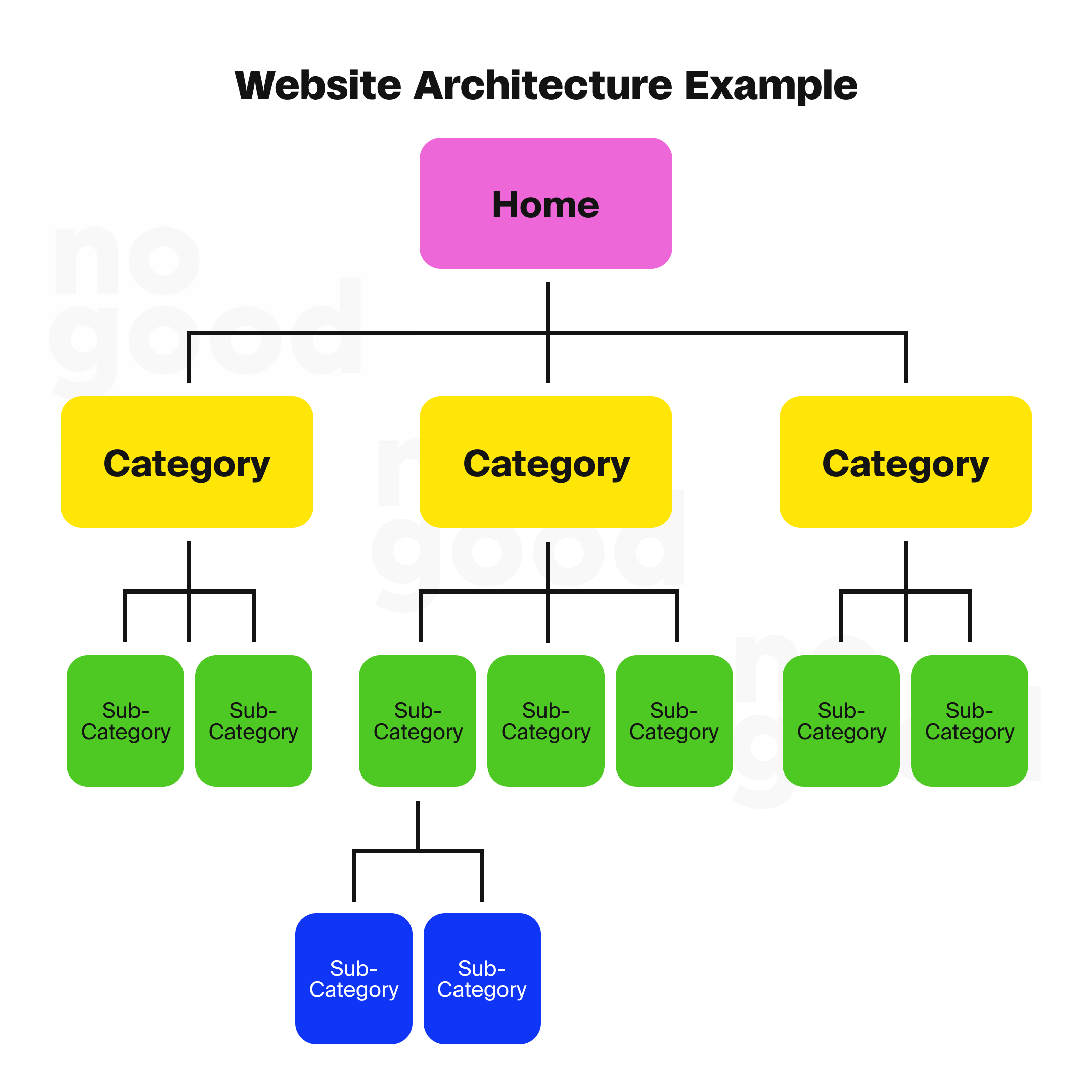
The importance of website architecture for SEO
Website architecture holds significant importance, with SEO in mind, due to its direct impact on search engine rankings and user experience.
Search engine rankings
Excellent website architecture is crucial in how major search engines, like Google search, evaluate and rank your pages. It directly influences Google’s ability to discover, index, and comprehend the content and the purpose of your website. This understanding is the first step toward achieving visibility in search results.
Think of it as entering a new place. You might not know the layout immediately, but you can infer certain expectations based on context. Similarly, Google search relies on the hierarchical structure of your website to understand the context and relationships between your web pages. If your site’s architecture is disorganized and illogical, Google may struggle to grasp the purpose of your pages and where they should appear in search results.
Here is an example of disorganized website architecture:
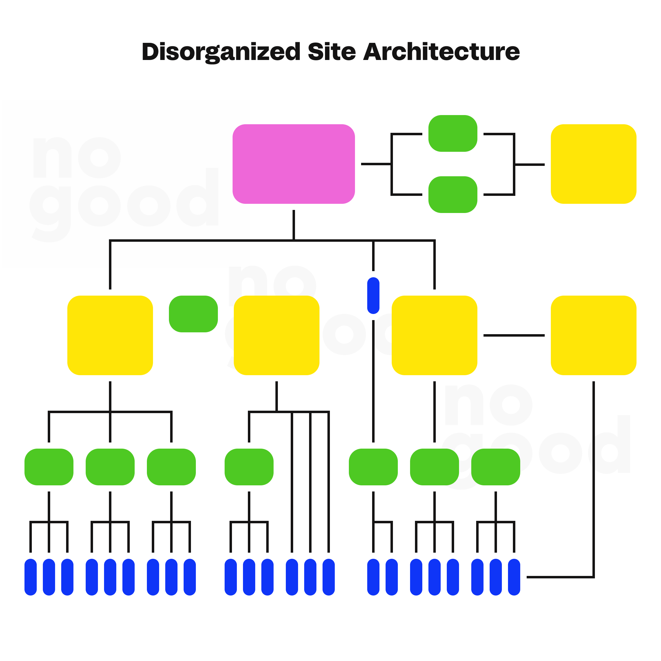
Bad website architecture lacks context, hindering Google’s ability to rank your pages effectively. The internal links within your site are the building blocks of this architecture. The more organized and coherent your internal linking strategy, the better Google can understand the relationships between your pages. Consistent linking from one page to another communicates to Google the importance and relevance of each page.
User experience
In addition to its direct impact on SEO, website architecture plays a pivotal role in shaping user experience. An intelligently organized structure enhances search engine visibility and facilitates seamless navigation for users. A user-friendly layout simplifies finding product categories, services, or critical information, directly aligning with Google’s emphasis on helpful and accessible content.
For example, the renowned makeup retailer Sephora stands out in user-friendly navigation, aligning with Google’s content guidelines. By grouping products into clear categories, Sephora ensures users can easily find what they need with minimal clicks. The chosen website structure enhances user interaction and influences desired actions, such as converting visitors into customers or encouraging engagement with your content. This interconnected approach underscores the importance of harmonizing user experience and SEO strategies within your website architecture.
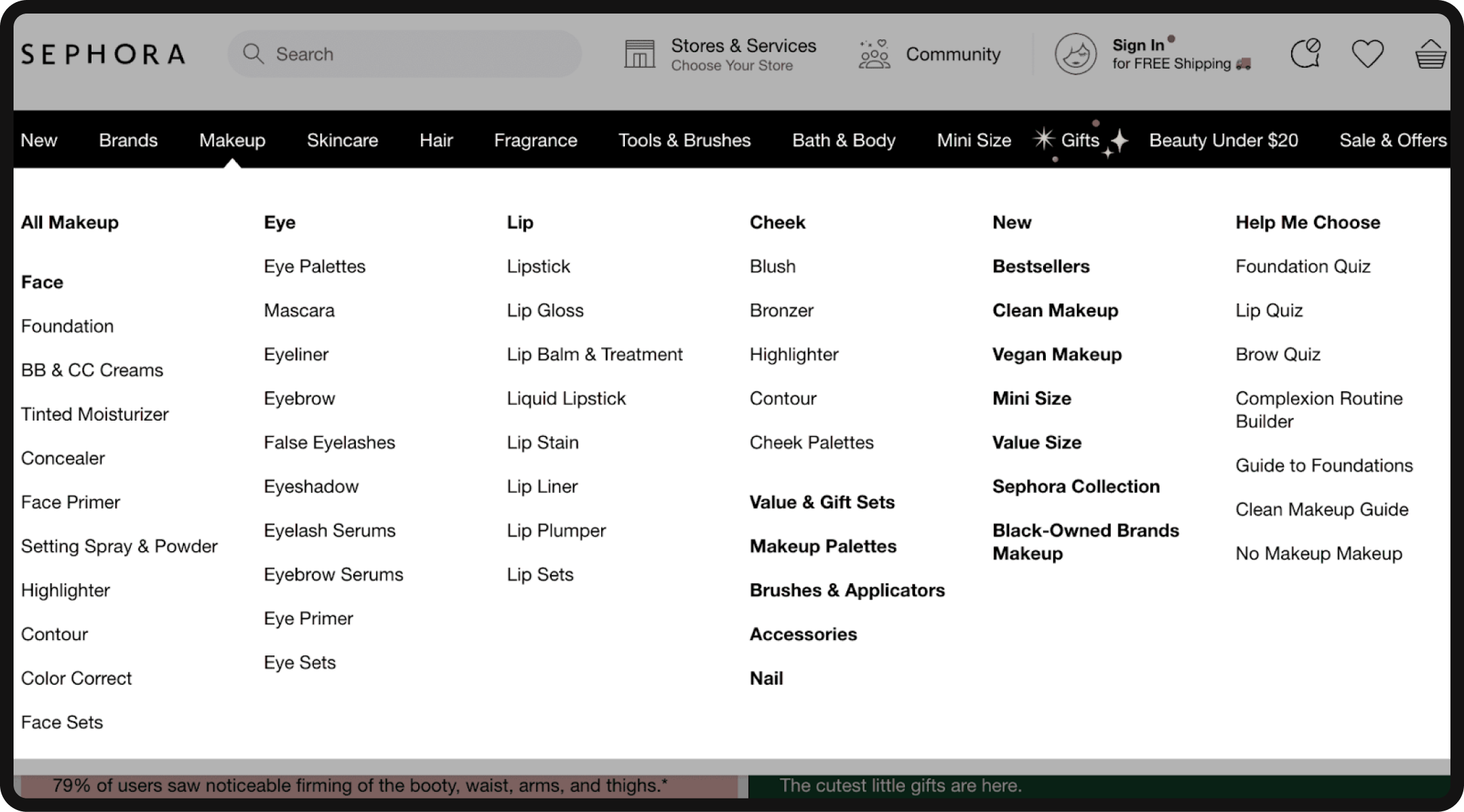
Architectural design, exemplified by the choice between pagination and infinite scroll, profoundly influences user experience with applications across various industries. Pagination benefits content-rich platforms like news websites, offering precise user control and straightforward navigation. Users can easily backtrack to previous articles, enhancing overall engagement.
Conversely, infinite scroll proves advantageous for e-commerce sites, reducing clicks to find specific products and enhancing the seamless browsing experience. For instance, in the fashion industry, where visual appeal matters, infinite scroll enables users to explore an extensive product catalog effortlessly.
The decision between these design options hinges on your site’s business goals and the nature of your content. Recognizing these nuances ensures that your architectural choices align with your industry’s unique demands and user expectations.
In summary, website architecture is pivotal for Search Engine Optimization as it not only influences search engine rankings but also greatly impacts the user experience, which is a key factor in converting visitors into customers or engaged users. A well-structured website not only helps search engine crawlers understand your list of content but also ensures that users can easily find and interact with what they came for on your site.
Effective website architecture: What does this look like?
Effective website architecture is critical to successful SEO and overall user experience. To create an excellent website architecture that aligns with both your SEO goals and user needs, you should consider the following key aspects:
1. Topical grouping and logical hierarchy: A well-structured website architecture groups topically related content together and organizes these groups in a logical hierarchy. This hierarchical structure ensures that your website is organized in a way that makes sense to both major search engines and users. It allows for easy navigation and a clear understanding of the relationships between different pieces of content on websites.
- Example: Implement pillar pages that serve as comprehensive hubs for broad topics. For instance, a fitness website’s pillar page on “Healthy Living” can logically branch out into subcategories like “Nutrition” and “Fitness Routines,” creating a hierarchical structure that resonates with both users and search engines.
2. Highlighting important pages: It’s essential to highlight the most important pages within your website architecture. These are the pages that are central to your business goals and user objectives. Effective website architecture ensures that these critical pages are easily accessible and prominently featured in the navigation menu, making them readily available to users and search engine crawlers.
- Example: Feature critical pages prominently in your navigation menu. An e-commerce site, for instance, can prioritize the “Best Sellers” page to align with business goals, ensuring easy access for users seeking popular products.
3. Flat architecture vs. deep architecture: When designing your website’s architecture, it’s crucial to consider the depth of the structure, which refers to how many clicks it takes to reach the subcategories or individual pages on your site. A flat website architecture, where it takes fewer clicks to reach any page (ideally fewer than four), is preferred. This approach ensures that users can access your content with minimal effort, providing an excellent user experience.
- Example: Opt for a flat architecture to minimize clicks. In an online magazine, a flat structure ensures that articles on diverse topics are directly accessible from the homepage, keeping user engagement efficient.
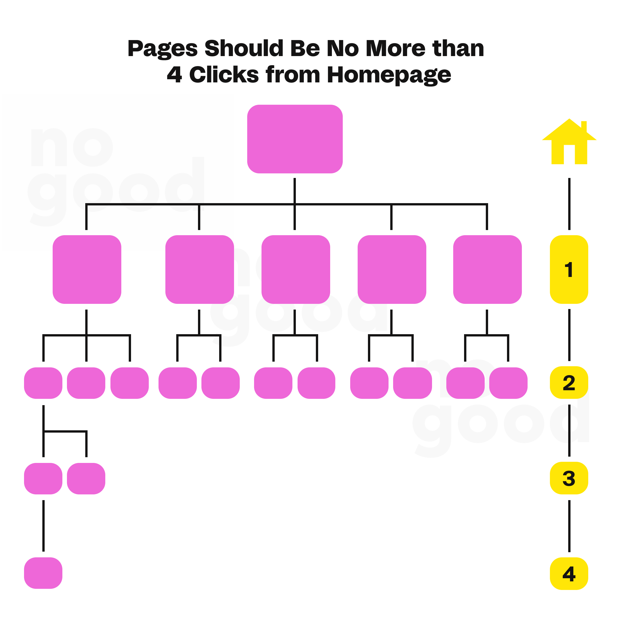
4. Internal linking structure: Internal links are crucial in website architecture. They connect different parts of your site, helping users navigate, and search engine bots discover and index your content. To create an excellent website architecture, every important page should be part of the architecture and have at least one incoming link from another page on your site. Pages without internal links are called orphan pages, and they may not get the visibility they deserve in search engine rankings.
- Example: Ensure every significant page is linked within the architecture. In a travel blog, the “Destinations” page can internally link to specific city pages, preventing orphan pages and boosting their visibility in search engine rankings.
5. User experience (UX): An effective website architecture goes hand in hand with a positive user experience. It ensures that users can easily navigate your website, find the information they need, and achieve their goals efficiently. A user-friendly architecture can lead to higher conversion rates and lower bounce rates, positively impacting your business objectives.
- Example: Streamline navigation for users. A consulting firm’s website can feature a clean layout, allowing businesses to explore services easily and fostering a positive user experience that translates into higher conversion rates.
In summary, an excellent website architecture is a fundamental element of a successful SEO strategy. It involves grouping related content, creating a logical hierarchy, and emphasizing critical pages. By adopting a flat architecture, incorporating internal linking, and implementing topic clusters, you can enhance your website’s search engine rankings and provide a superior user experience. Combining these principles with clear navigation menus and breadcrumb trails creates a well-structured website that caters to both user needs and search engine requirements, ultimately contributing to the achievement of your online business goals.
Tools for setting up your website architecture
Setting up your website architecture efficiently often requires specialized tools to aid in the planning, analysis, and optimization process. Among the many tools available, SEMrush and Ahrefs are valuable options, and here’s how you can use them to enhance your website architecture:
1. SEMrush
- Site audit: SEMrush’s Site Audit feature allows you to conduct a comprehensive analysis of your website’s structure. It can identify issues related to crawlability, indexing, and overall site health. This tool helps you discover broken links, duplicate content, and other structural problems impacting your website’s performance. It’s an excellent resource for identifying areas that need improvement in your website’s architecture.
- Keyword research: While not directly related to architecture, SEMrush’s keyword research tools can help you understand the search intent of your target audience. This information is valuable for organizing your content and structuring your website to align with the keywords and topics your audience is searching for.
- Backlink analysis: Backlinks are an essential aspect of website authority and SEO. SEMrush’s backlink analysis tools can help you assess the quality and quantity of backlinks pointing to your site and specific pages. This information can guide your internal linking strategy and architecture design by highlighting which pages have the most link authority.
2. Ahrefs
- Site audit: Ahrefs offers a robust Site Audit feature similar to SEMrush. It checks for technical SEO issues within your website, including crawlability, internal linking, and other architectural elements. You can identify issues such as broken links, redirect chains, and missing meta tags, which are critical for a well-structured website.
- Content gap analysis: Ahrefs’ Content Gap analysis tool can help you understand what content is missing from your website compared to your competitors. This information is valuable for expanding your content and enhancing the structure of your website by addressing gaps in your topic coverage.
- Internal link analysis: Ahrefs provides insights into your internal linking structure, allowing you to see which pages link to others and the distribution of internal link equity. You can use this information to optimize your internal linking strategy and ensure that important pages receive the necessary link authority.
By leveraging SEMrush and Ahrefs, you can gain a comprehensive view of your website’s architecture and its impact on SEO. These tools provide valuable data for identifying issues, conducting keyword research, and enhancing your internal linking strategy. Ultimately, they empower you to create a well-structured website that is search engine-friendly and aligned with the needs and preferences of your target audience.
Setting up your website architecture for SEO
- Establish a straightforward top-level navigation menu
- KISS method
- Maintain user-friendly and concise URLs
- Emulate the website structure of industry leaders
- Ensure a uniform and cohesive website design
- Employ the pillar-cluster internal linking model
- Ensure most pages are accessible within 3-4 clicks
- Implement breadcrumb navigation
- Develop both HTML and XML sitemaps for your website
1. Establish a straightforward top-level navigation menu
Establishing a straightforward top-level navigation menu is a fundamental element of creating a user-friendly and effective website architecture. To achieve this, you should keep the following key principles in mind:
1. Keep it simple: Limit the number of top-level menu items you provide. Too many menu items can overwhelm users and make navigation confusing. Instead, aim for simplicity and clarity. Your top-level menu should present a concise selection of essential categories or sections that reflect the core aspects of your website.
2. Menu item relevance: Ensure that each top-level menu item accurately represents the content or features it leads to. Users should immediately understand what they can expect when they click on a menu item. For example, if your menu includes an “Email Marketing” tab, clicking on it should lead users to a page dedicated to email marketing content. It’s essential to deliver the content promised by the menu item’s name.
3. Clear navigation path: Once users click on a top-level menu item and explore the associated content, it’s crucial to provide a simple and intuitive navigation path back to the main sections of your website. This includes clear options to return to your blog’s homepage or the website’s main homepage. Users should never feel trapped within a specific section of your site without a straightforward way to navigate elsewhere.
4. Learn from examples: Study examples of well-structured top-level navigation menus to gain insights. They usually divide their menu into three simple items: “Software,” “Pricing,” and “Resources.” The “Resources” tab further categorizes content for easy access, maintaining clarity and simplicity.
A straightforward top-level navigation menu is essential to enhance user experience and reduce bounce rates on your website. By offering a simple, well-organized menu with clear, relevant labels and ensuring that users can easily navigate between sections, you create an intuitive web experience that encourages users to explore and engage with your content, benefiting your website’s architecture and user retention.
2. KISS method
First noted by the U.S. Navy in 1960, The KISS method, which stands for “Keep It Simple Stupid,” is a fundamental principle in website architecture, mainly for websites with many pages. The KISS method emphasizes the importance of simplicity, clarity, and a well-organized structure in your website design. Here’s why it’s crucial and how to implement it:
1. Importance of simplicity: Simplicity is vital when your website begins to scale, especially if you have thousands or tens of thousands of pages. A complex site architecture, as shown in the example of a tangled mess, can have negative implications both for SEO and the user experience.
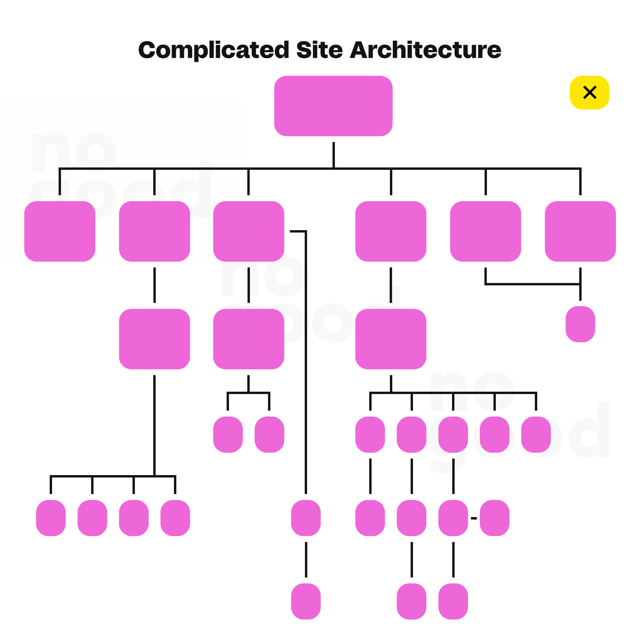
2. User experience: Imagine landing on a website with a complicated architecture. Navigating it becomes challenging, and the likelihood of finding the specific page or content you need decreases significantly. A simple site architecture, conversely, ensures that users can effortlessly move around your site, locate the content they are looking for, and have a positive experience.
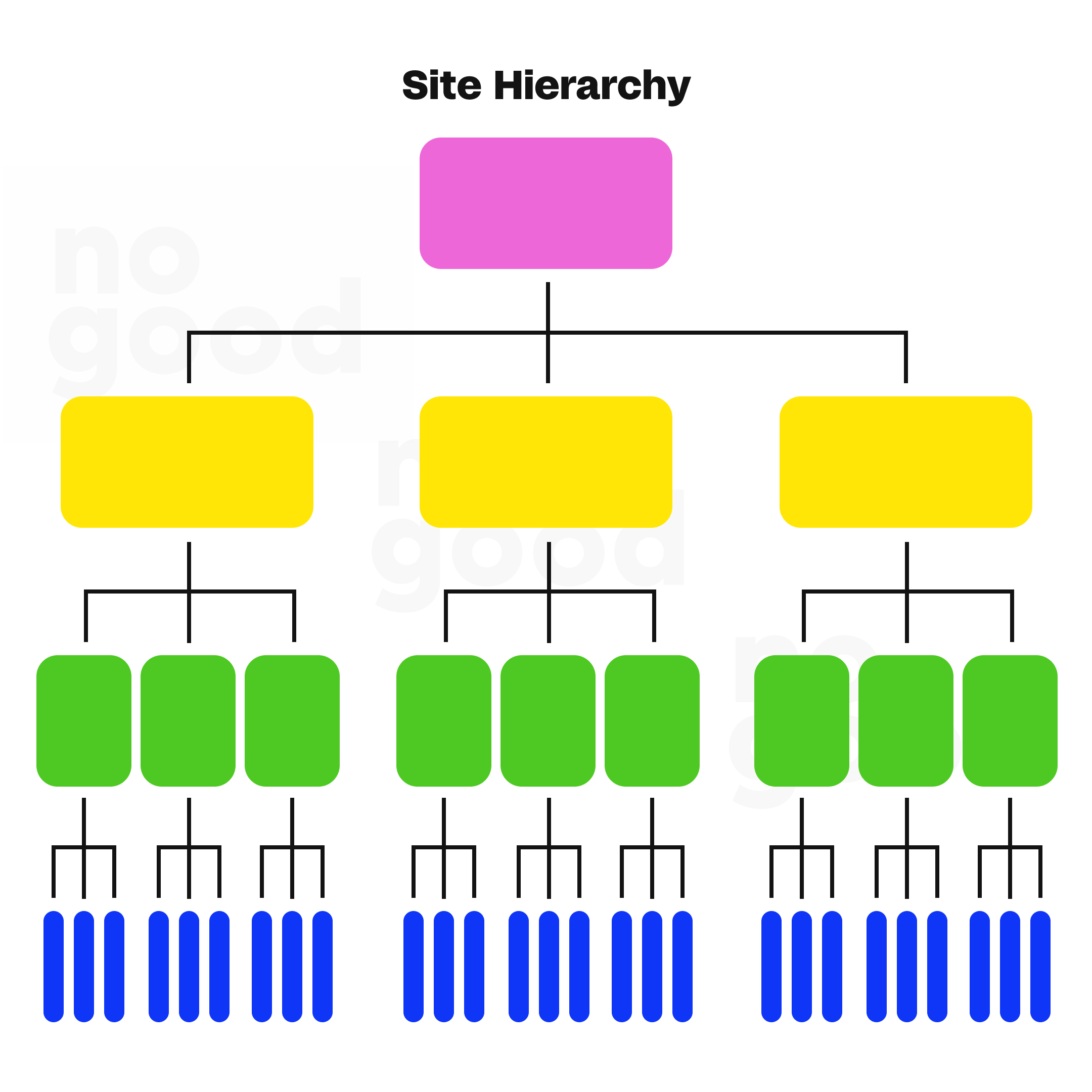
3. Early establishment of hierarchy: The key to implementing the KISS method is to establish a website hierarchy from the outset and adhere to it as your site expands. A well-structured hierarchy provides a clear framework for organizing your content, making it easier for both users and search engines to understand the relationships between different sections and pages on your site.
4. Example of a site hierarchy: Your site hierarchy should have a straightforward and logical structure. The example of a site hierarchy illustrates how different sections and categories relate. This hierarchy guides users to relevant content and ensures a consistent, user-friendly experience throughout your website.
3. Maintain user-friendly and concise URLs
Maintaining user-friendly and concise URLs is a crucial aspect of website architecture that greatly impacts user experience and SEO. Here’s why it’s essential and how you can achieve it:
1. User-friendly URLs: URLs that are long, convoluted, and filled with incomprehensible parameters can be off-putting for users. A user-friendly URL is concise, easy to read, and provides a clear indication of the page’s content. Users should immediately understand what to expect when they click on a URL.
2. Automatic URL generation: Many Content Management Systems (CMS), such as CMS Hub and WordPress, automatically create user-friendly URLs based on the page’s title. These URLs typically follow a simple structure like “example.com/page-title.” This feature simplifies URL creation and ensures that URLs are intuitive for users.
3. Structured subdirectories: Another approach to user-friendly URLs is to create structured subdirectories. This format, such as “example.com/topic/subtopic/page-title,” allows users to navigate through categories and subcategories, making it easier for them to find relevant content.
4. URL and site architecture: While user-friendly URLs are essential, they are not the sole focus of your site’s architecture. Internal linking is equally crucial. This means that you can structure your URLs in a hierarchy like “example.com/topic” or “example.com/subtopic” and connect them to their parent pages and to one another using internal links. The internal linking structure reinforces the relationships between pages, making it easier for both users and search engines to navigate your site.
4. Emulate the website structure of industry leaders
Emulating the website structure of industry leaders is a strategic approach to improving your website’s architecture and user experience. By analyzing and adopting the structural elements of well-established brands within your industry, you can create a more familiar and user-friendly website. Here’s why this practice is important and how you can benefit from it:
1. Familiarity and user expectations: Industry leaders have already established a familiar and recognized website structure their customers are accustomed to. When you mirror this organized structure, you align with user expectations, making it easier for visitors to navigate your website. Users tend to feel more at ease when encountering a layout and navigation system they are familiar with, as it reduces the learning curve and potential confusion.
2. Improved navigation: Established brands often invest in user experience research and design, resulting in an intuitive and efficient website architecture. By emulating their structure, you can leverage the proven navigation patterns and organization industry leaders have fine-tuned over time. This can lead to a smoother and more effective user journey on your site.
3. Competitive advantage: Adopting the architecture of industry leaders can give you a competitive edge. It allows you to showcase your professionalism and align your brand with successful companies in your sector. This association can instill trust and credibility in your visitors, which is particularly valuable for building your brand’s reputation.
4. Best practices: Industry leaders often employ industry best practices in their website architecture. Emulating them means you are more likely to incorporate these best practices into your own site design. This includes clear navigation bars, organized major category structures, and user-friendly interfaces.
5. Continuous improvement: As industry leaders evolve and optimize their website architecture to meet changing user needs, you can stay up-to-date by following their example. This practice encourages continuous improvement and adaptability to industry trends, keeping your website architecture relevant and competitive.
5. Ensure a uniform and cohesive website design
Ensuring a uniform and cohesive website design is paramount to creating a positive user experience and optimizing your deep website architecture. Here’s why consistency in architecture design matters and how it benefits your website:
1. Enhances user experience: A uniform and cohesive design creates a consistent look and feel throughout your website. Users appreciate predictability, and when they encounter a familiar design pattern on each page, they can confidently navigate. This consistency reduces the learning curve and minimizes potential confusion, resulting in a more pleasant user experience.
2. Facilitates navigation: Consistency in design extends to your website’s navigation format, which plays a critical role in helping users find information and explore your site. When your navigation elements, such as drop-down menus and contextual links, follow a consistent pattern, users can quickly and easily move between pages. This faceted navigation efficiency encourages users to explore more content, keeping them on your site longer.
3. Promotes trust and credibility: A consistent design conveys professionalism and reliability. When users see a cohesive and polished design, it instills trust and credibility in your brand. This can increase user confidence in the information you provide and potentially higher conversion rates.
4. Encourages engagement: When your design elements, such as buttons, calls to action, and link displays, maintain a uniform appearance, users are more likely to interact with them. A consistent visual style for interactive elements encourages users to click on links, fill out forms, and engage with your content pieces, contributing to higher user engagement.
5. Reinforces brand identity: A uniform design aligns with your brand identity and helps reinforce it. Consistency in colors, typography, and branding elements ensures that your website reflects your brand’s personality and message cohesively.
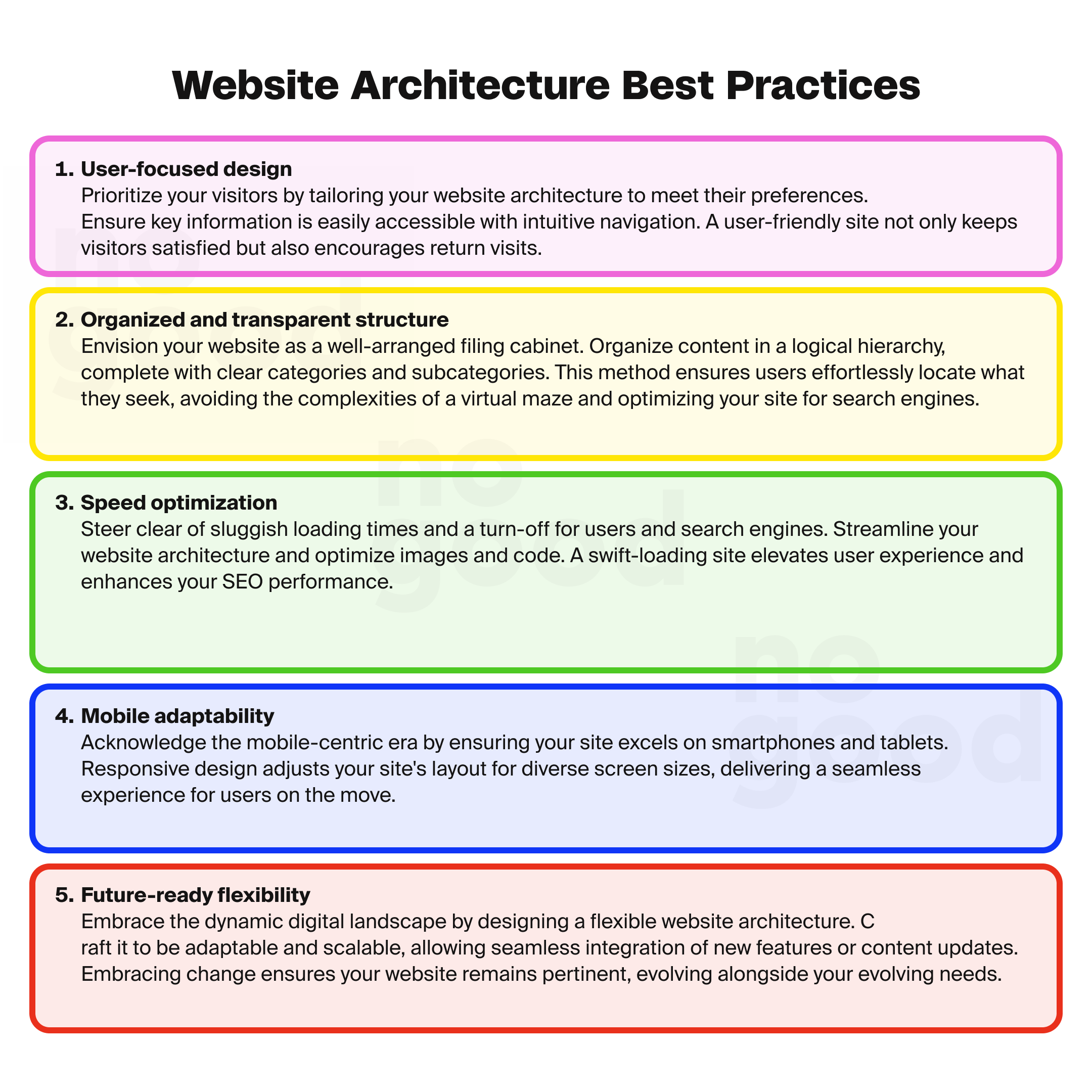
6. Simplifies maintenance: A consistent design simplifies the maintenance of your website. When design elements follow a pattern, making updates, adding new pages, or expanding your website is more efficient and less prone to errors.
6. Employ the pillar-cluster internal linking model
The pillar-cluster internal linking model is a strategic approach to structuring your website’s content and internal links. It involves creating a hierarchical relationship between your content pages, making it easier for users to navigate and understand the connections between related pieces of content. Here’s how the pillar-cluster model works and why it’s beneficial for your website architecture:
1. Pillar and cluster pages: In the pillar-cluster model, you have two types of pages: pillar and cluster. The pillar page is like the main hub, covering a broad topic or theme. Cluster pages, however, delve deeper into specific aspects of that topic. The pillar page links to the cluster pages, creating a clear parent-child relationship.
2. Clear internal linking practices: This model provides a clear and structured internal linking hierarchy. When users click on an internal link, they immediately understand which piece of content the link will direct them to. This clarity is essential for a seamless and intuitive user experience.
3. Enhanced user engagement: By connecting related content through pillar-cluster links, you make it easier for users to discover and explore additional information on topics that interest them. This encourages users to engage with more of your content, reducing bounce rates and increasing time spent on your site.
4. SEO benefits: The pillar-cluster model also offers SEO advantages. It helps major search engines like Google understand the relationships between your content pages, contributing to better search rankings. When search engines recognize the depth and breadth of your content on a particular topic, it can boost your site’s authority and visibility in search results.
5. Logical content organization: This model promotes a logical and organized content structure, which is crucial for website architecture. By grouping related content under pillar pages and their respective clusters, you create a cohesive and structured content hierarchy.
6. Improved content relevance: Internal linking based on the pillar-cluster model ensures that users are directed to content that is highly relevant to their interests. This relevancy enhances user satisfaction and helps them find the information they seek more efficiently.
7. Ensure most pages are accessible within 3-4 clicks
Ensuring that most pages on your website are accessible within 3-4 clicks is a crucial aspect of website architecture that significantly impacts user experience and navigation. Here’s why it’s important and how to achieve it:
1. Improved user experience: A 3-4 click accessibility rule ensures users can easily find and access the information or content they want. When users can navigate your website efficiently and reach their desired pages in a few clicks, it enhances their experience and reduces frustration.
2. Faster information retrieval: Quick access to content is vital in the digital age. Users expect to find information rapidly, and a well-structured architecture that adheres to the 3-4 click rule meets this expectation. It allows users to swiftly move through your site and discover relevant content with minimal effort.
3. Encourages exploration: When most pages are accessible within a few clicks, users can explore more of your content. They are more likely to navigate deeper into your site, discover related topics, and engage more with your content.
4. Clear navigation: Achieving this level of accessibility typically involves creating a top-level navigation menu that provides direct links to your website’s primary categories. From these main category pages, users can then easily click through to sub-categories and individual pages. This logical and clear navigation structure simplifies the user’s path to content.
5. Reduced bounce rate: A well-structured architecture that facilitates quick access to content helps reduce the bounce rate. When users can promptly find what they need, they are less likely to leave your site in frustration, resulting in longer visit durations and increased engagement.
6. SEO benefits: Search engines favor websites with clear and accessible architecture. When your pages are well-linked and structured, it enhances search engine crawlers’ ability to index your content effectively, potentially leading to better rankings.
8. Implement breadcrumb navigation
Implement breadcrumb navigation to display your website’s architecture, showing the path from the current page to the home page. Breadcrumbs are typically positioned above the page’s title, providing a clear visual representation of the page’s position within the site’s hierarchy. You can add breadcrumbs to your CMS Hub website by using an advanced menu module.
Here is an example of Newegg, showing the breadcrumb trails of the items displayed on different pages:

9. Develop both HTML and XML sitemaps for your website
Developing both HTML and XML sitemaps for your website is essential for effective website architecture and search engine optimization.
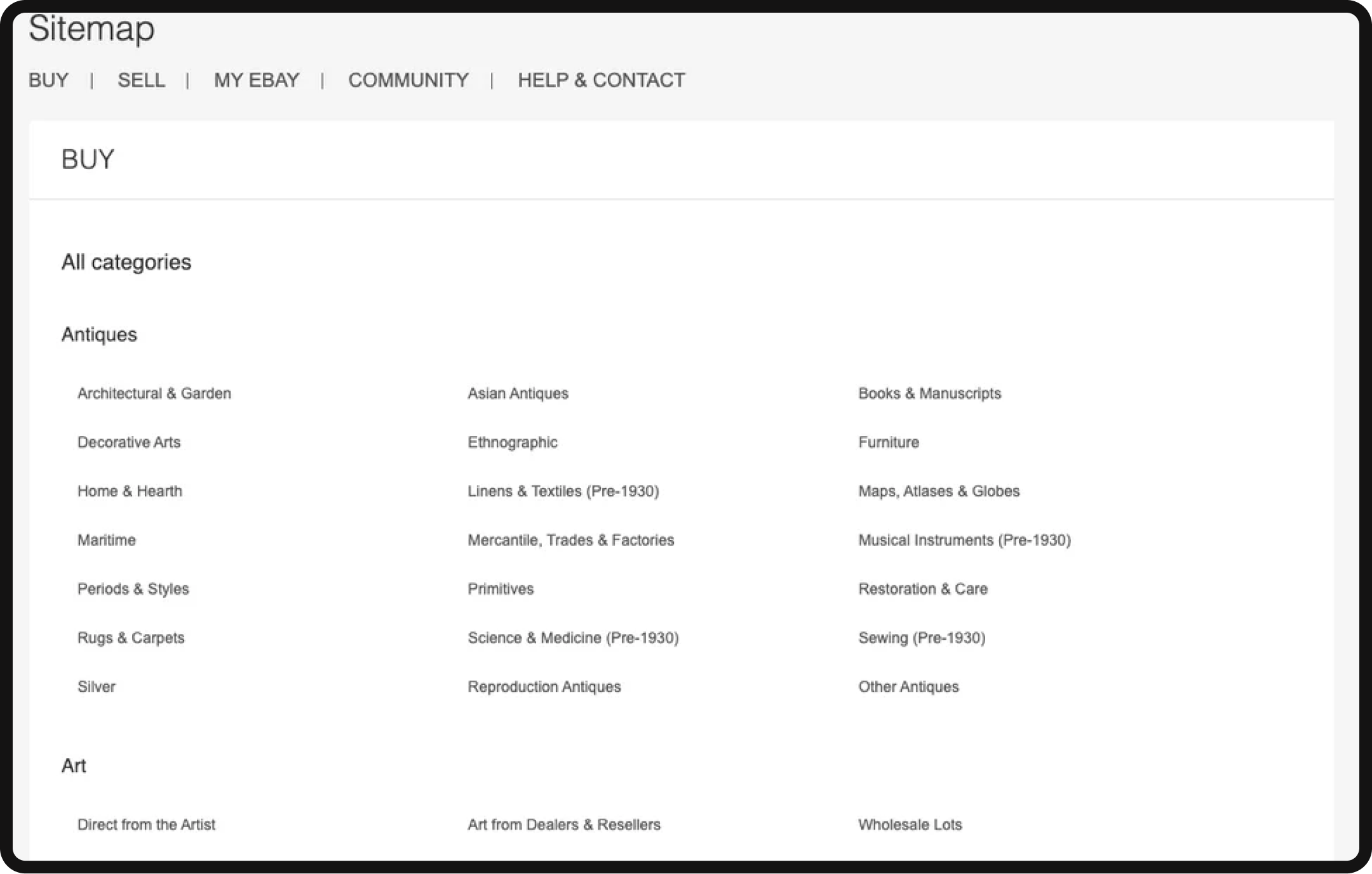
- HTML sitemap: An HTML sitemap is designed for users and mirrors your website’s design. It provides an easy-to-navigate list of all your pages, helping users find specific content efficiently. It’s especially useful when users can’t locate a particular page, offering them an alternative way to explore your site.
- XML sitemap: On the other hand, an XML sitemap is meant for search engines. It’s a machine-readable document that lists all your crawlable pages. XML sitemaps help search engines understand your website’s structure, prioritize pages, and index them more effectively.
Here’s how to create HTML and XML sitemaps
An HTML sitemap is user-centric, aligning with your website’s design to offer an intuitive directory of all your pages. Creating an HTML sitemap involves the following steps:
- Utilize website builders or CMS platforms: Many website builders and content management systems (CMS), such as WordPress, have built-in tools or plugins that automatically generate HTML sitemaps.
- Manual creation: If needed, create an HTML sitemap by listing all your pages and organizing them logically. Ensure the sitemap is easily accessible, typically linked in the footer or main navigation menu.
- Update regularly: Keep your HTML sitemap up-to-date as you add or modify content on your site. This ensures users always have an accurate guide to navigate your website.
An XML sitemap is machine-readable, tailored for search engines to understand and index your site effectively. Creating an XML sitemap involves the following steps:
- Use online generators: Several online tools, such as Screaming Frog SEO Spider and Google Search Console, allow you to generate XML sitemaps by entering your website URL. These tools crawl your site and create a comprehensive XML file.
- CMS plugins: If you’re using a CMS, explore plugins that automatically generate and update XML sitemaps. For example, Yoast SEO for WordPress simplifies this process.
- Manual creation (advanced): Advanced users can create XML sitemaps manually by following the XML protocol guidelines. Ensure the correct syntax and structure are maintained for search engine readability.
By having both HTML and XML sitemaps, you cater to the needs of both users and search engines, contributing to a well-organized and easily navigable website architecture while also enhancing your site’s discoverability and search engine rankings.
Here is an example of eBay’s HTML sitemap:
Final thoughts
Your website’s architecture is the silent conductor that orchestrates user experiences and determines your online success. It’s the structural framework that makes navigation intuitive, content discoverable, and SEO optimization achievable. In this article, we’ve unraveled the intricacies of website architecture, from user-friendly URLs to the pillar-cluster model and beyond.
Armed with this knowledge, you can shape your digital presence to provide an outstanding user experience, one that not only retains visitors but also ensures their engagement and satisfaction. Remember that website architecture is not a static blueprint; it’s a dynamic map that evolves as your content and audience do. By implementing best practices and the right tools, you can continually refine your website’s structure and keep it aligned with your objectives.
As you embark on the journey of building and optimizing your website architecture, keep in mind that it’s not just a technical task but a strategic approach to achieving your digital goals and ensuring your online presence remains both accessible and effective.


