Accessibility in the digital marketing world has become increasingly popular as brands strive to build more inclusiveness into their communications efforts. Leading brands like Walmart, BBC, and Amazon have made concentrated efforts in order to ramp up their digital accessibility across all their properties.
So why exactly is accessibility so important? And what are some tips to ensure your digital properties are fully optimized to reach any and all audiences? Before we dive into some accessibility best practices, let’s explore accessibility in broader terms.
What is digital accessibility?
Digital accessibility refers to how usable a website, app or other digital experience is by all possible users, regardless of their ability or disability. Digital accessibility is ensuring all of your online properties are optimized for people with disabilities and/or impairments. In an ideal world, this is something every organization should be doing, but unfortunately, this is not always the case.
Countless organizations still create content that is incompatible for so many of their target audiences because of outdated design practices or even a lack of awareness on the importance of these digital best practices. Many are aware of the need to create more accessible content but continue to fall behind due to the fear of not knowing where to start or hesitations around the time and money required to make their work more available to everyone.
It’s easy to think of web accessibility as something that exists just on websites and mobile apps. In reality, it pops up everywhere. For example, when a company like Netflix is thinking about digital accessibility, the streaming giant can’t just think of its platform, and making sure people can scroll around easily. It also needs to think of the actual content it shares with its audiences. That’s why Netflix offers closed captioning and audio description — so viewers who are hearing or visually impaired can follow along on their own.
Digital accessibility also helps people who don’t consider themselves disabled. If you’ve ever enlarged the text on your smartphone, for instance, you’ve enjoyed the fruits of digital accessibility.
Ensuring your work is fully compatible for all can be time consuming and expensive depending on your product, so why should people care about making their digital properties more accessible?
Let’s break down the top three reasons:
- Ethical Purposes
- The first (and most important) reason to increase accessibility in your digital products is to ensure fair and equitable access of your information to everyone. We shouldn’t create barriers to access for certain communities solely because we weren’t thoughtful in our initial planning. Web accessibility is important because so many people rely on the web to do critical day-to-day life activities. Not to mention, creating an accessible web is a moral and just thing to do!
- Less accessibility = less engagement/conversions
- In the US alone, 48 million people are deaf and hard of hearing, and there are 32.2 million people who have some degree of vision loss. One in four adults in the U.S. have some type of disability, according to the Centers for Disease Control. That number is only growing. Basically, if you’re not optimizing your content to be accessible, you’re losing on engagement and sales from millions of people who can’t properly access your product. This is another reason it’s important to spend some additional money to optimize your content across your digital properties.
- Legal Ramifications
- Believe it or not, you can get in legal trouble if your website or product isn’t properly optimized for accessibility. The Americans with Disabilities Act (ADA) requires that most businesses make modifications for people with disabilities. This is to ensure that people using devices like voice and screen readers can properly navigate across your website.
- If costs for making your work accessible are a concern, the alternative price of a lawsuit for violating the ADA can be a good reminder to push your team to meet these guidelines.
- The most notable example of this comes from 2019, when a blind man named Guillermo Robles sued Domino’s Pizza for being unable to make an order on their website and mobile app utilizing his screen reader. The lawsuit went all the way to the Supreme Court and the lower court sided with Robles, signifying a historic win for the American Disabilities Act and increasing pressure on other organizations to step up their accessibility game.
- Other large organizations have suffered similar consequences for lack of accessible features for their business.
- In 2017, Five Guys was hit with a class action lawsuit by a woman named Lucia Marett claiming the website made it near impossible to perform any specific actions for the blind. The court sided with Marett claiming a violation of the ADA.
- In 2018, Dennis Haynes sued Dunkin Donuts because their website wasn’t compatible with screen readers for the blind. The United States Court of Appeals for the Eleventh Circuit sided with Haynes, claiming that “the ADA prohibits discrimination against the disabled by preventing their full enjoyment of goods, services, facilities, privileges, or accommodations at places of public accommodation.”
Digital Accessibility = Huge Boost for Business
“In the U.S., working-age people with disabilities control nearly $500 billion worth of disposable income. Those people are much more likely to spend their hard-earned cash with businesses whose platforms they can easily access. It’s not just consumers with disabilities either! Seventy percent of millennials actively consider a company’s values when making a purchase. Translation: digital accessibility is not only good for the world — it’s smart business.”
But designing an accessible digital presence isn’t only about people with disabilities using your website with ease. While 71% of web users with a disability will simply leave a website that is not accessible, users without disabilities find accessibility features help them navigate your site more effectively.
So you want to make your work more accessible for disabled persons and everyone. Where do you begin? Below are a few tips for ensuring you’re optimizing for your digital properties:
Accessibility for your website

Since the ADA doesn’t have a clear list of accessibility requirements for websites, most organizations utilize the Web Content Accessibility Guidelines (WCAG), which includes a long list of tips and requirements in order to ensure your website is accessible (that we highly recommend you fully audit for your website projects). These guidelines should be at the forefront of your website creation projects and be ingrained in the planning stages of any new online digital properties.
Below are a few key takeaways from the full WCAG list:
- Make sure your entire website is easily accessible using a screen reader
- The overall website functionality should be available using only a keyboard
- Ensure all non-text content (including images) has a text alternative that serves the equivalent purpose
- Create text transcripts for all video and audio content on your website
- All videos on your website should contain closed captions
- Avoid videos or audio on your website that play automatically
- If there are elements that need to be played automatically, ensure there are easy methods to pause or stop
- Avoid images on text unless necessary
- Color contrast on website needs to be legible, especially when placed on top of each other (here is a helpful guide on optimizing color contrast for your website)
- Text can be resized without assistive technology up to 200% without loss of content or functionality
- Any time limits on the website can be paused or turned off
- Use a straightforward layout for your website that’s easy to follow and understand
- Make all of your website forms accessible (label each form field, try to decrease amount of fields as much as you can)
- Label each form error clearly
- Include multiple ways your users can access different pages (navigation menu, search bar, footer sitemap)
- Write descriptive and meaningful hyperlinks
- All headings and labels are clearly descriptive
- Web pages have titles that describe topic or purpose
Get assistive on-site technology: Also, consider incorporating assistive technology into your site to provide additional accessibility features. Every visitor is different, so it’s all the more crucial that you give all of your users the ability to customize their preferences according to their needs.
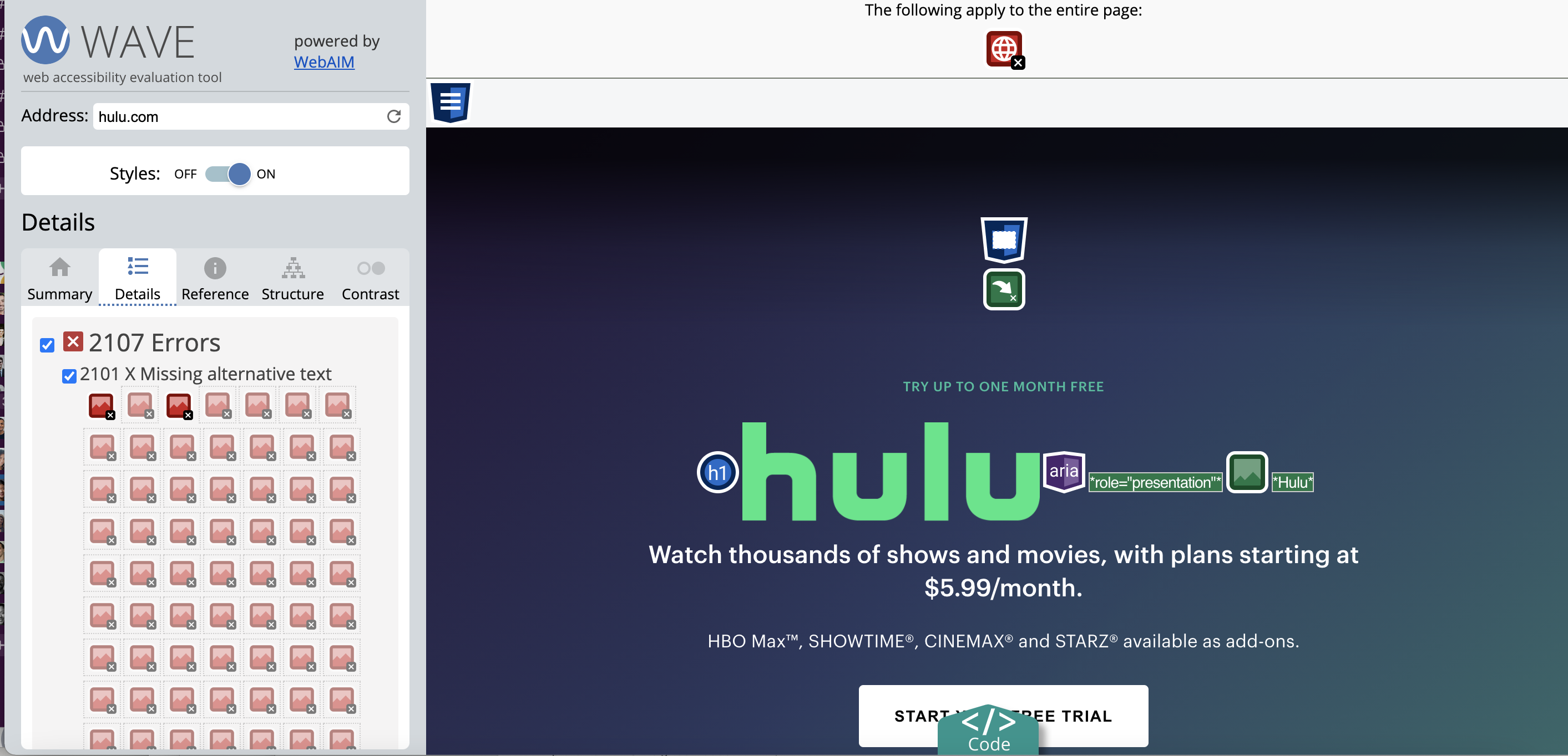
Want to check how accessible your current live website is? Use a website accessibility evaluation tool like WAVE to see all the current accessibility issues that are live on your site. This will be a great checklist to send over to your developers and designers in order to put a spotlight on all of the website issue areas.
The guidelines can apply to any of your website, landing page, and app properties whenever applicable. If your website is already following the majority of these guidelines, then you can optimize your existing content to ensure you’re hitting all of the different categories listed. If your site is lagging in the majority of these recommendations, take a look and assess if these issues can be optimized on the current site while justifying the costs. If not, this where a potential site relaunch could be on the table.
It’s important to remember to audit all of your current website properties in order to be able to make any of the necessary changes to meet some of these recommendations.
Accessibility for social media
Accessibility doesn’t end with your website — it’s vital that brands ensure their social and paid content is also optimized for all of its audiences. Social media channels are increasingly adding new features to their platforms that increase accessibility features for the end user. To learn more about these specific features, you can visit accessibility pages on each of the platforms:
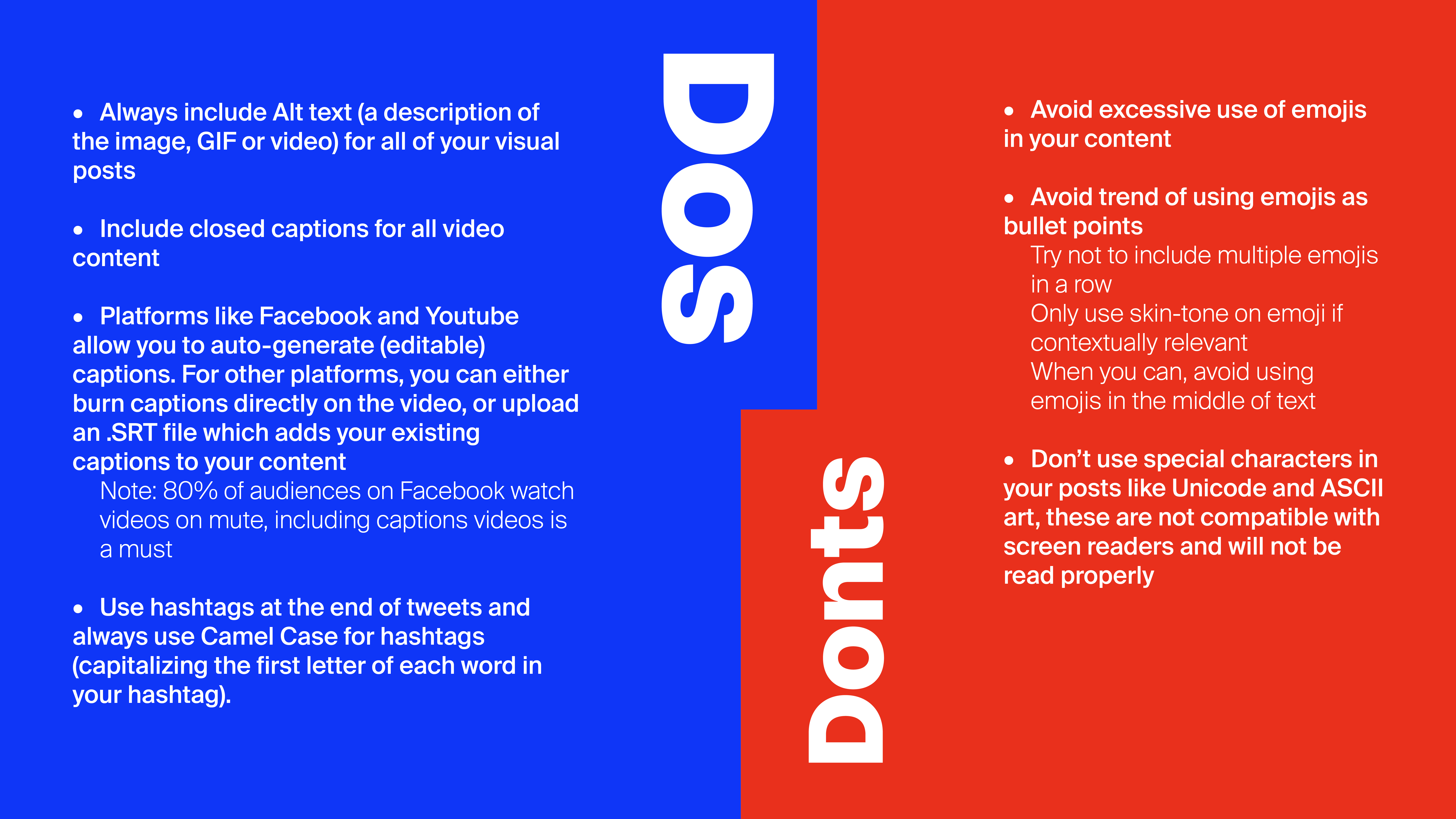
Keeping up to date with new accessibility features each channel offers is important, so we advise to constantly check for any new updates. Now that we’ve taken a look at the available accessibility features on each platform, it’s time we ensure the social media content you’re producing is accessible. Below are a few tips:

Reminder that the above tips should also apply to all social advertising content across your different platforms whenever applicable. It’s important to keep an eye on any new and upcoming social media trends and assess their accessibility, more often than not, most new meme formats aren’t properly optimized for everyone.
Takeaway
In our current day and age, it’s more important than ever to ensure all of our content is inclusive and accessible to everyone. The internet has been designed to work for all people, whatever their hardware, software, language, culture, location, or physical or mental ability. While an ideal, it has not always succeeded. The above tips are only a few of the different ways to make your digital content accessible for your audience. We highly recommend including your accessibility planning conversations in the early stages of any project in order to ensure you’re building content around these measures.
Accessibility shouldn’t be a one-and-done deal, even after you’ve audited your website and social properties and implemented certain changes. All of your upcoming work should be created through an accessibility lens. Everyone on your team — from designers, to writers to developers — should be thinking about accessibility while executing their work. Once this process becomes ingrained into your every day work, creating accessible content becomes less tiresome and challenging to execute.
Keeping these recommendations in mind, you can start diminishing barriers to access for consumers and create a more inclusive and equitable digital experience for all.


